UX and site usability are two important Google ranking factors that help make content relevant.
To help users find answers to their questions in an easier and faster manner, Google promotes websites that offer an impressive user experience (UX).
UX and site usability are two important Google ranking factors that help make content relevant.
Backlinks have long been the number ranking factor but with the rise of artificial intelligence and Google’s RankBrain, a better UX is gaining ground and fast. It helps people to stay on your site longer and find what they are looking for.
Download our Individual Member Resource – Improving results from your website guide
This guide helps you to get the balance right, through explaining many inspiring examples of best practices from different sectors including B2B, retail e-commerce, travel and financial services.
Access the
Good UX decreases bounce rate while improving time on site and conversions. All these metrics are critical to your SEO success.
In the words of Google:
"The goal of good UX is to help users do what they want to do when interacting with your business."
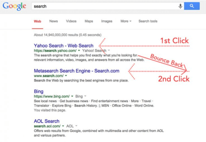
For example, if a user asks a question on Google, spends some time looking for the answer on your site and then goes straight back to Google to find another site, we call this Pogo Sticking. It happens when people visit your site but are unable to find the information they are looking for and go back to the search results to find a different site. This is bad for Search Engine Optimization or rather Search Experience Optimization.
It becomes increasingly important to improve your UX so that people stay on your site and find what they need. This fulfills Google’s motto of “
focus on the user and all else will follow”. Additionally, it will help you to improve your rankings and increase conversions.
Here are five cognitive processes to improve UX:
1. Attention
People should be able to view your information easily. You need to avoid clutter and maximize search experience optimization; you need to serve a single user intent per page.
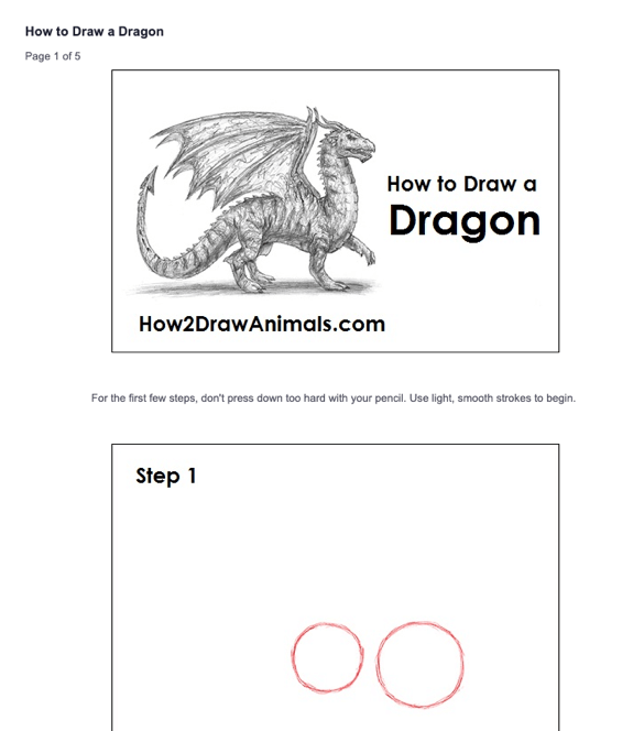
If a page targets the user intent “how to draw a dragon” then the page should contain information related to drawing dragons. The page should not have information related to drawing an elephant, tiger, mouse, etc. The entire attention of the audience should be given to focus on one single object.
If you want a user to complete a specific task after they land on your site, then properly instruct them how they can do so. The image below illustrates how to provide instructions to your audiences.
The core principle at play here is to reduce the cognitive load on the user. It’s been scientifically proven that living organisms (animals included) always take the path of least resistance to a goal.
Want your users to fill a contact form? Here’s one way to help them focus and complete the task:
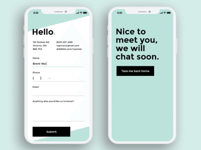
And here’s another way:
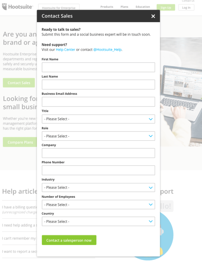
See how the former reduces the cognitive load on the user, whereas the latter is more likely to lead in process abandonment.
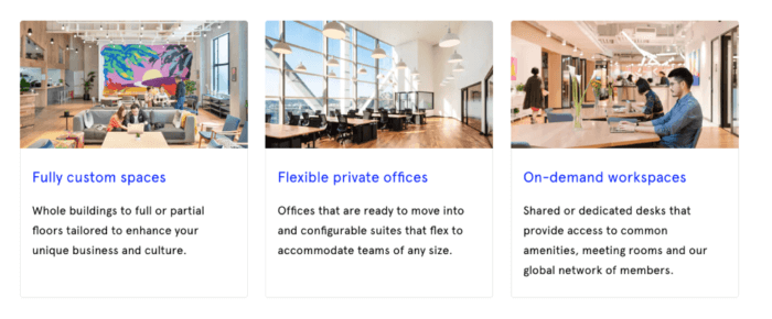
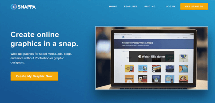
The same principle is at play in the landing page design of many successful web brands.
Observe how the person in the image above is drawing the viewer's attention towards the action you want them to take - subscribe, buy, ask, try.
2. Perception
Perception is the representation of information like text, images, audio and video in a manner that is easily distinguishable by users.
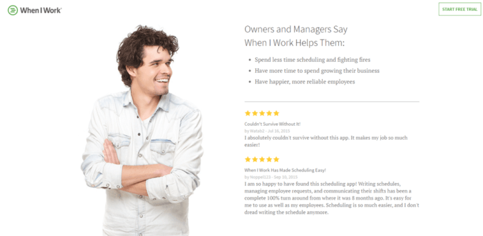
A great way to improve perception in your design is to group the important parts of information together so users don’t need to scan the whole page to look for individual pieces of information.
Have a look at the screenshot below from Wework. It groups the important pieces of information together so that the user attention remains intact.
To bolster your website’s UX in sync with how the human sense of perception has evolved, you need to understand the concept of saccades.
Think of a saccade as the ‘jumping’ of the eye’s focus from one portion of visual representation to the other.
Here are some dependable conclusions drawn out of several studies done on the human eye’s saccades, that UX designers can leverage to organize content on pages.
- We see the whole of something before perceiving the constituent parts. (also called the Gestalt Principle).
- The eye is trained to break visual fields into features such as colors, angles, combinations, etc.
- After perceiving features, the eye weaves them into patterns.
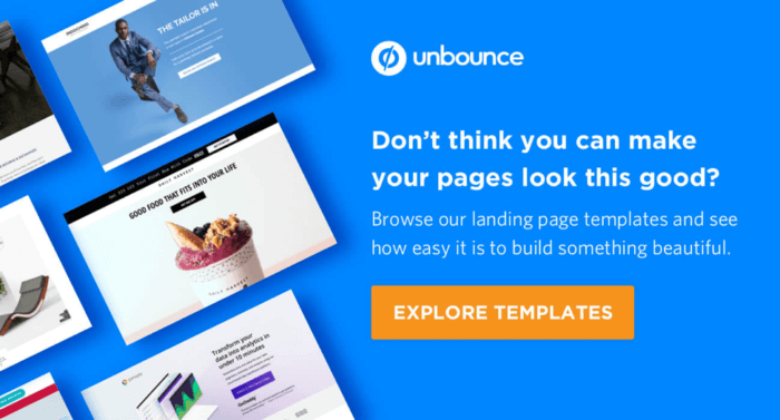
Take this example, observe how the call-to-action buttons have a similar design. Also, this colour is in utter contrast to the rest of the page in order to appeal to the eye.
Now consider this, how “empty space” is used to group representational visuals together, even though there’s no clear demarcation.
3. Memory
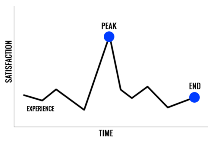
You need to design experiences that last longer in the human brain. Nobel prize-winning psychologist Daniel Kahneman found that people’s memories of an experience are based on a rule known as the ‘Peak-End Rule’. This rule states that people remember the most intense moment and the end. The time spent in between is not remembered by the human brain.
If you are able to offer a truly mesmerizing experience to the user once they land on your website (the first impression should be the most intense moment) and also offer a lasting impression once they performed an action, then you would be able to leave a lasting impression in the memory of the visitors leading to more engagement, visits and conversions.
One example of creating a memorable experience that converts is through a content upgrade. This is where the user is so impressed by your content, that they are willing to trade in their email address and time, for a bonus or upgraded content.
In fact, content upgrades have been a bit of a secret weapon for successful digital marketers, helping them:
- Grow email lists
- Get repeat traffic
- Establish authority
- Re-activate popularity of pages when the buzz starts dwindling
Check out a very basic example of content upgrade; offering your long-form content in the form of a downloadable PDF.
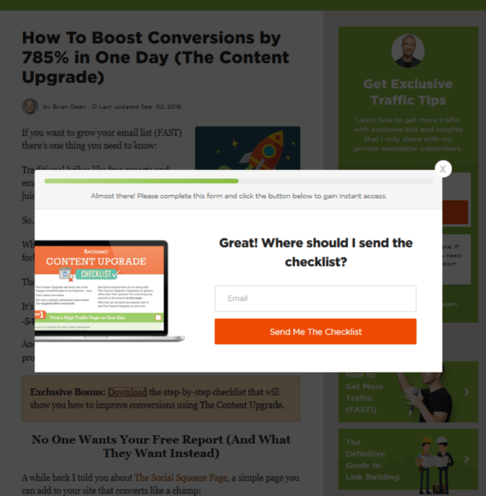
Here’s another example:

Other content upgrades you can leverage:
- An audio version of the article
- Cheat sheets and checklists
- Transcriptions
- Videos
- Workbooks
- Templates
4. Language
Language is the process through which we all understand and communicate. In a website, users can understand a language in three ways - by reading (text or images), by hearing (audio) and by watching and hearing both (video).
You can mimic the language of your users so that it becomes easier for them to read and understand your content. You must aim for clarity and succinctness. Write shorter paragraphs, shorter sentences, layman language, use proper bullet points wherever necessary and use images and videos where it makes it easier for the user to scan and understand your content.
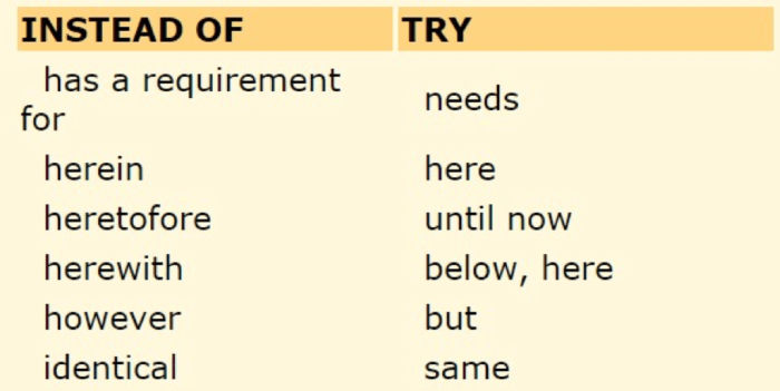
Picking the right words in your content copy or videos keeps the users coming back to your site. Don’t make the users stop and think about what you have written. Here are some common alternatives to difficult words that are easy to understand:
Always remember that your content must be engaging, compelling and at times, strategic. People must be able to find what they need, understand what they find and act appropriately. Language is the base of user-centric design.
5. Learning
Every visitor on your site has a vision in mind - they want to learn something. This can be acquiring more information related to a product they wish to buy or learning how to cook a recipe. Whatever the need, learning plays a key role.
Connect new information and experiences with the knowledge your users already have. You can offer a free guide, a video that explains to the users how to use a product, a webinar to introduce new users to your platform, an infographic to make them understand technical concepts easily.
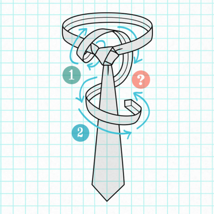
For example, Ties.com has a guide to help users know how to tie a necktie. People come to the site looking to learn how to tie a tie and end up becoming customers. Impressive, isn’t it?
Learning should be fun, and it must pull the customers deeper into the purchase funnel. Remember, don’t push the customer or they will leave. The main idea behind learning is to empower the user to use your products.
First, you need to add your product as an option in the mind when your prospects are researching your industry and learning, and second, you need to remove all other alternatives from your prospect’s mind, so that your product becomes irresistible. Or to put another way, you need to serve first and sell second.
Final thoughts
Cognitive processes use existing knowledge to generate new knowledge. This article highlights the need to have an easier onboarding process for your customer. The design of your website and the content used plays an important role in converting a visitor into a customer.
Focus on the user intent and apply the five cognitive processes to your website’s look and feel. By serving your customers’ needs first, this will improve the UX, make your site more trustworthy and ultimately generate more sales.
Joe Williams is an SEO trainer for
Tribe SEO. He’s on a mission to make SEO easy, fun and profitable. You can follow him on
Twitter and
LinkedIn.