Examples of how website designs must be optimized to support the way we hold and interact with smartphones
Our compilation of statistics showing the growth in smartphone usage highlights the well-known need to create effective mobile experiences. With mobile minutes accounting for more than two-thirds of online interactions in many countries, there is an obvious need to optimize designs so they are consistent with consumer behaviour as they use their phones. This need is also suggested by statistics showing lower conversion rates on smartphone (they’re typically between one half and one third of those on desktop).
Consumer behaviour of mobile interaction
I was recently running a training course looking at improving mobile customer journeys and experiences where our focus was on Millennial and Gen Z personas. I discovered this great new-to-me research on mobile interaction based on how a phone is held and interactions occur with a mobile handset using fingers and thumbs based on different ways it is held.
It's likely designers are aware of this type of research, but marketers and site-owners are less-likely to know about it, so I thought it was useful to share since budget holders should base their website optimization questions and re-design requirements based on user-behaviour rather than their personal behaviour!
This research summary of How Do Users Really Hold Mobile Devices? has some great summaries of common one and two-handed smartphone interactions. These are:
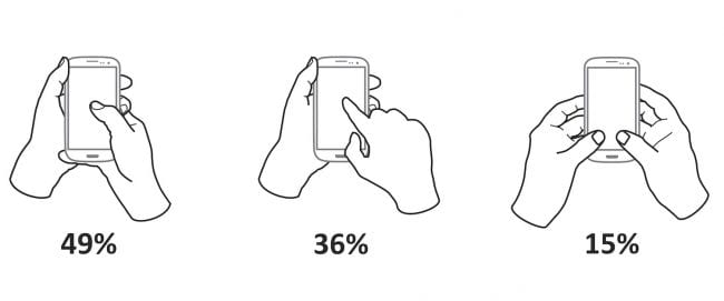
1. One-handed vs two-handed usage?
Smartphone users were observed touching their phone’s screens or buttons and holding their phones in three basic ways:
- One-handed - 49%
- Cradled - 36%
- Two-handed - 15%
2. Left or right-handedness?
For one-handed use, the most common usage was:
- Right thumb on the screen - 67%
- Left thumb on the screen - 33%
The researcher, Stephen Doober comments:
“I am not sure what to make of these handedness figures. The rate of left-handedness for one-handed use doesn’t seem to correlate with the rate of left-handedness in the general population - about 10% - especially in comparison to the very different left-handed rate for cradling - 21%".
3. Common cradling behaviour?
Cradling is where the phone is supported with two hands. The split of behaviours here is:
- Thumb on the screen - 72%
- Finger on the screen - 28%
So thumbs win, we are designing mainly for thumbs. I have noticed that more savvy, typically younger phone users use the thumb-based cradling approach, likely because they’re using thumbs for touch-thumb texting, so are more familiar with this.
Of course, there are one thumb and two thumbed behaviours as follows:
4. Priority screen interaction zones
This article on The Thumb Zone: Designing For Mobile Users has the best summary of the behaviours, which should inform design based on the original research.
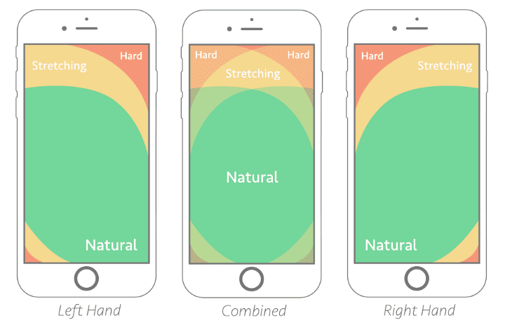 This summary suggests a 'best practice' design of screen interaction points, i.e. calls-to-action (CTAs) should focus in the natural green areas and avoid the red 'hard areas'. Incidentally these red areas are where the navigation menu is often located, so alternatives to this on page load should be provided, highlighting the priority customer journeys as suggested by the next examples.
Examples of good and poor mobile interaction design
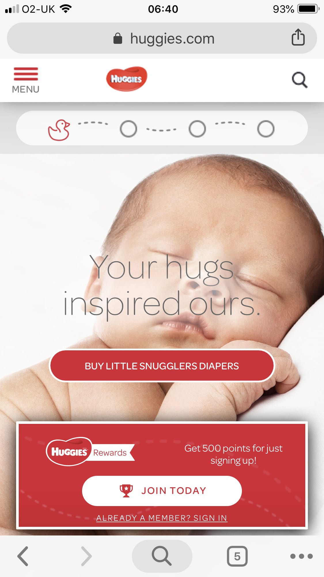
In the training workshop we were benchmarking against this comparator brand where we noticed that it the US site was well optimized for mobile interactions compared to the UK site which wasn’t, so I thought it was a good example to share...
First, here is the UK brand site, which uses Mobile responsive web design (RWD), so content fits within the mobile viewport, yet it is far from mobile optimized; you can see it doesn’t have a ‘hamburger menu icon’, which has become a standard, but much discussed feature in mobile UX. It also doesn’t have any other navigation above the fold in terms of calls-to-action. Equally poor, it doesn’t show the digital value proposition beyond the generic ‘Welcome to the home of’.

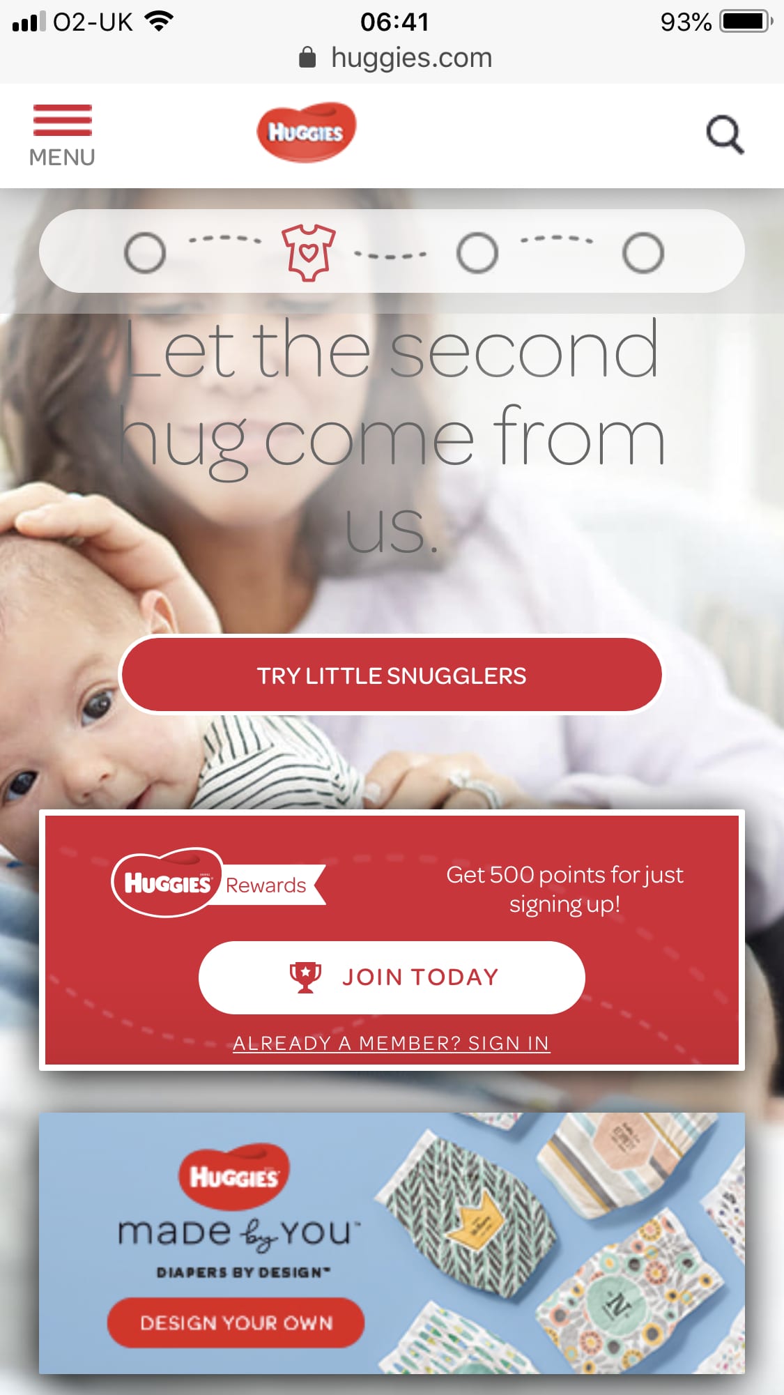
Compare this with the US site, which I think has a great mobile RWD that is an example of a ‘Mobile-first’ design, where the main interactions with a user on the home page are well-thought through.
There are clear ‘thumbs-ready’ CTAs for the two priority site goals, which are to support purchase behaviour and encourage customers to join the rewards programme.
This design also has an interesting element that visually shows the customer journey for older babies, as this second design on scroll shows. I’m not sure this will be obvious and it creates a strange repetition of CTAs on scroll.
To benchmark your mobile design, I recommend a simple technique we used in the workshop where you create a table with columns listing the visual hierarchy of messages, visuals and calls-to-action as a user scrolls on smartphone. These can be compared to competitors and for reviewing whether you have the goals set up in Google Analytics.
Accessible implications of mobile RWD
Mobile site design is also ‘close to my heart’ at the moment since I have recently started volunteering for AbilityNet and am helping visually impaired people with setting up their browsers on tablet and smartphone so they can see and interact with them more readily.
Another benefit for optimizing site design to be ‘mobile-first’ is that accessibility should improve if you follow best practices about scaling text and imagery. For example, this article on mobile accessible styles from Google Developers on WebFundamentals recommends:
- Setting a minimum recommend touch target size (recommends as 48 pixels minimum in article)
- Using the viewport meta tag and width settings correctly for text scaling (RWD sites that get this wrong have tiny text no one can read)
- Designing with a responsive grid with relative rather than absolute values (content reflows and scales)
- Highlighting the focus of interface elements (e.g. input fields)
Changing browser design to support mobile interactions
As a final side-note, I was prompted to write this article because of the latest update to the Chrome browser where the primary Next-previous, Search, tab management and other options features are now at the foot of the screen rather than the top. This is a great improvement I find, which will likely prompt some to change their behaviour to a more ‘thumbs-based navigation’. I have changed my behaviour already prompted by this.
In this case, Google are behind Apple who updated Safari to a footer-based smartphone browser navigation previously. Clearly both have lagged user behaviour by some time, as many businesses have with their site designs.
I hope you agree that research is a really nice visual summary of behaviour, but note that the research shown here isn’t within the last year, which we usually feature in chart-of-the-day. Instead it’s from 2013, so note that the interactions may have changed in this time. Let me know by social if you know of any more recent research, which also has a demographic breakdown.
Research source
- Source: UX Matters article by Steven Hoober - How Do Users Really Hold Mobile Devices?
- Sample: For two months, ending on January 8, 2013, I—and a few other researchers—made 1,333 observations of people using mobile devices on the street, in airports, at bus stops, in cafes, on trains and busses—wherever we might see them. Of these people, 780 were touching the screen to scroll or to type, tap, or use other gestures to enter data. The rest were just listening to, looking at, or talking on their mobile devices.
- Recommended Smart Insights resource: E-commerce design pattern guide


