The best Christmas Website designs and landing pages of 2017
Christmas time is upon us and if you’re a retailer, then I’m willing to bet that you have put up some Christmas decorations somewhere. If you have a brick-and-mortar shop, then you might have a tree up with some presents underneath. After all, you’re in the Christmas spirit and you want your shoppers to be in a jolly mood while browsing around your shop. Your website should be no different! Getting your browsers into the Christmas spirit is essential, after all, the more festive they are the happier they are, and the happier they are the more likely they are to purchase your products.
Download Business Resource – Web design project plan template
Ensure you plan the key marketing activities for your new site project.
Access the Web design project plan template
There are lots of strategies out there for you to use this Christmas to motivate shoppers. Let’s look at a few examples and see why they work.
The Christmas promotion
Paula & Chlo
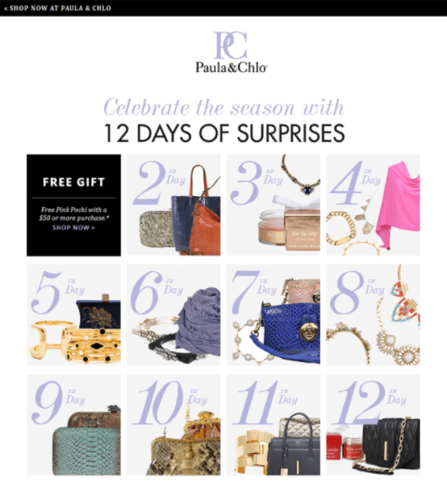
A new gift for each day of Christmas can ensure some repeat visitors/buyers
Paula & Chlo has been running these “12 Days of Christmas” campaigns for a few years now with much success. They will generally give away a free gift with qualifying orders on specific days (e.g. Get X gift for every order over £50). What’s interesting is that they will actually tell you what the free gift is for each day so shoppers can plan ahead. Pure genius! Some of the shoppers might want more than one free gift, so this can lead them to split their order into two visits. If the customer had only planned on purchasing £80 worth of goods, but needs another £20 in order to get those two gifts, they might end up spending a little more to qualify for that second free gift. Besides that, this promotion will probably lead to more page visits overall and thus, increase the chances of a shopper finding more products that they love if they’re visiting for the second time.
The subtle Christmas design
United Colors of Benetton
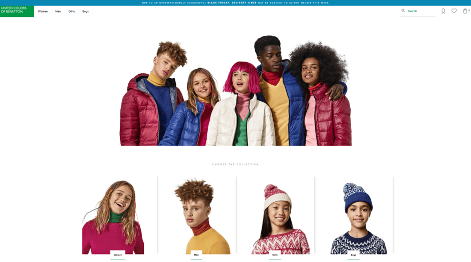
Colourful yet Christmasy (without ever mentioning the holiday!)
Their homepage doesn’t actually mention Christmas anywhere, although they did hold a Black Friday sale. Famous for their minimalistic, yet colourful design, their homepage reflects this perfectly. No strangers to controversy, it’s likely the lack of any specific holiday being mentioned was very intentional as United Colors of Benetton likes to promote peace between religions, cultures, and lifestyles, so they probably don’t want to polarize any demographic. Still, despite the absence of tinsel, Christmas ornaments, and Santa Claus, this basic design still instills a Christmas feel with the subtle reds and greens.
The B2B free gift site
Trusted Shops
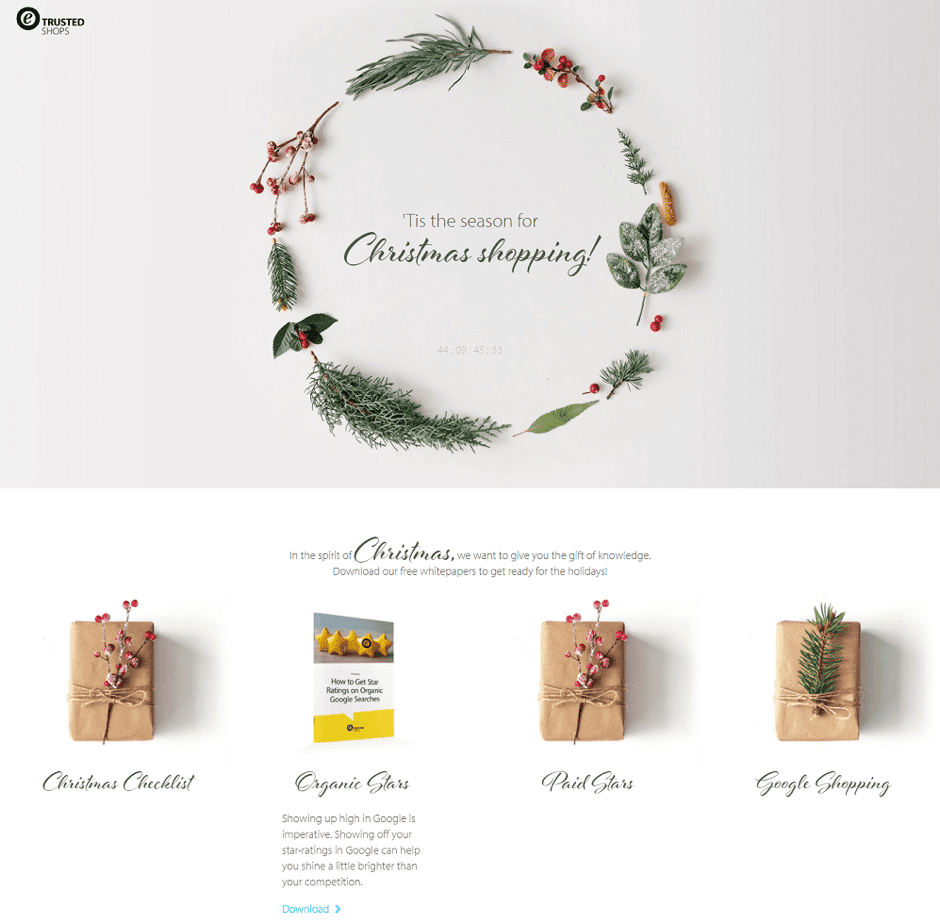
Unwrap the gift by hovering your mouse over them
Marketing yourself to other businesses can be challenging sometimes. In B2B, Christmas marketing starts even earlier than for B2C shops. Trusted Shops has created a Christmas landing page to offer some free whitepapers as “gifts” to small- and medium-sized businesses. The design is minimalistic as well, but undoubtedly “Christmasy”. It's fun and interactive as hovering over the wrapped packages leads to an unwrapped version making it feel like you've unwrapped a present.
Using meaningful graphics and minimizing the menu options (which is one technique we advise in our perfect landing pages article) are some of the strategies used with this page in order to increase conversions. Graphics need no explanation, but why no menu options? Sometimes less is more. Giving customers fewer options on where to click will help them click on the intended links. The Christmas countdown timer on top of the page also adds a bit of urgency to the customer’s decision making process by utilizing the opportunity cost concept, where time is a strong factor in decision making.
Fully integrated Christmas campaign
John Lewis
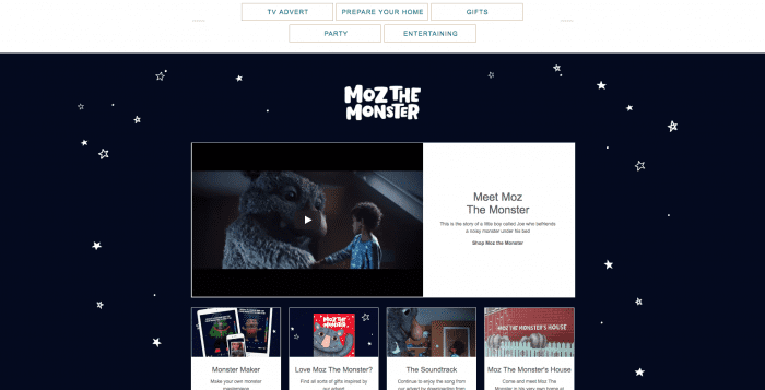
Their iconic TV advert is integrated into a full online Christmas campaign
John Lewis is famous for creating a build-up that has the British public eagerly awaiting their new festive Christmas TV advert, often featuring an iconic song, from The Bear and the Hare to Monty the Penguin to this year's Moz the Monster. They have a dedicated landing page for Moz, which features all parts of their Christmas campaign, integrating offline advertising with online marketing. Their landing page design fits the same design and style as their advert and together creates a well-rounded and beautiful landing page that captivates the hearts of the British public. This year John Lewis teamed up with Barnardo's, a UK children's charity, to raise awareness and funds from sales from Moz mugs and their Moz soft toy. Overall, their landing page creates a full experience of the whole campaign - and if you're one of the few that haven't seen the TV ad, they have it on their landing page to help you follow the story of Moz. The emotional connection can lead people to purchase - having all the products associated with Moz will increase sales.
Simply inspiring
Starbucks
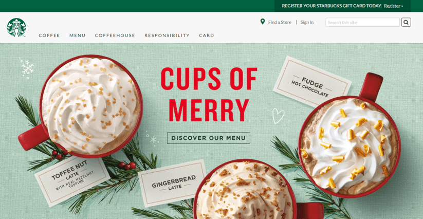
Can’t you just smell the Christmas spirit when looking at this image?
Sure, Starbucks promotes their non-profit endeavors. In fact, “Responsibility” is even in their navigation bar, which reveals an almost endless supply of charities and projects that Starbucks is involved with, ranging from nutrition to the environment – something every big brand should strive for. However, when it comes to design, their amazing product images make me smell the cinnamon and gingerbread drift through the air. The headline is clear, simple and compelling as well. Either it’s the post-lunch sleepies speaking or it’s clever marketing. Either way, I totally want a tall “cup of merry” right now!
Promotional
Paperchase
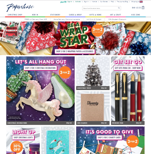
This is a classic Christmas page in many ways. Wrapped gifts, Christmas trees, and Christmas ornaments. What else is missing besides Santa? With tons of cute products designed especially for the holidays, they have a lot to promote. To bring a uniform feel to their thousands of items, they are heavily promoting the “3 for 2” Christmas promotion throughout their homepage and website with those orange stickers that are pretty hard to ignore.
Conclusion
There are a lot of ideas out there for redesigning your website for Christmas. You can inspire your customers in so many ways: be subtle, be direct, promote a sale, or simply make them hungry (or thirsty!). Either way, Christmas “decorations” for your homepage or landing pages can really motivate them to take action this holiday season if done properly.