If there’s one thing CROs could use more of, it’s psychology.
I’m all for testing crazy ideas. It’s how some of the most counterintuitive and surprising discoveries are made.
But we still need to build our landing pages on a solid foundation, and since it’s human behavior that our landing pages are attempting to influence, psychology is central to that foundation.
There’s no shortage of articles about psychology marketing out there, but I wanted to share three powerful ideas that I don’t think get enough attention in these discussions.
Let’s take a look.
1. Single Option Aversion
You’ve probably heard of “the paradox of choice”, the theory that if you are presented with too many options, you are less likely to make a decision. Well, it turns out that most experiments attempting to replicate that effect don’t actually find it. The effect may be real, but it seems to only occur in idiosyncratic circumstances that nobody yet fully understands.
There does seem to be a more reliable and opposite effect, however, according to experiments conducted by Daniel Mochon.
In one experiment, he asked participants if they would buy a Sony DVD player if it were the only one at the store. Only 9% said they would. But if they had a Philips DVD player to compare it to, amazingly that number shot up to 32%. That’s right, the number quadrupled.
He was able to replicate the effect with experiments involving TVs and donations.
In one well-known anecdote, Williams-Sonoma was having trouble selling a $279 bread maker. In a counter-intuitive move, they decided to start selling a $429 bread maker too. Nobody bought the overpriced bread maker, but sales for the $279 model doubled.
So while it’s certainly important for landing page design to be simple and clear, it’s almost certainly a bad idea to give your consumers too few options, especially only one.
Take Shopify, for example:
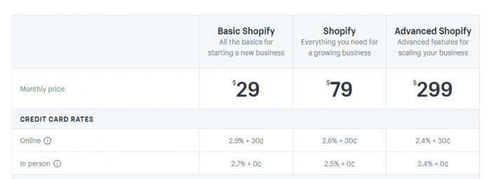
Does anybody buy “Advanced Shopify?” Probably. Either way, $29 a month looks a lot better when stacked against it, and the high priced option’s mere existence likely boosts sales for the $79 option.
Being aware of single option aversion means not only that you should offer multiple options, but also that you need to make it very clear that there are multiple options. If users have to poke around half a dozen pages on your site to discover that there’s more choices than appeared at the outset, they’re not going to choose any of them.
This also means that you shouldn’t just have more than one product – you should also, at the very least, test adding a minimum of one alternative for every conversion-related CTA.
Mobile commerce brand Crutchfield found that adding a PayPal mobile express checkout option certainly didn’t give their users choice paralysis. Instead, it boosted conversions by 33.7%.
Likewise, Amazon surely has a reason for doing this:
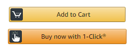
I wouldn’t be at all surprised to learn that 1-Click results in increased conversions even when people don’t use it.
2. Opportunity Cost
This idea comes from economics, but its psychological effects have also been empirically investigated.
Opportunity cost is all about comparing potential losses with potential gains when making a decision. Time is particularly important here because it’s a factor in every decision. The more time you spend forming a strategy and executing it, the more profits you sacrifice from other things that might fetch you return on investment.
It hardly needs to be proclaimed that time weighs heavily on decisions made online, so a psychological experiment by Duke University investigating how time pressure impacts decision-making is certainly something worth paying attention to.
In the experiment, the participants were asked to make a choice between various “gambles” in which they would win real money. They were given information to help them estimate how much money they might earn for each choice and were timed on some of the tasks. They were told that less time left on the clock would mean winning less money.
The study tested and confirmed a theory: the participants would change their decision-making process when time was a factor.
When the clock was ticking, the participants used “lexicographic choice,” i.e. they compared options by their most important attributes first, then by the second most important attributes, and so on.
What does this mean for landing pages?
You need to determine what your most important differentiators are, how consumers are comparing products, and make sure that those differentiators stick out as soon as users hit your landing page.
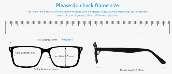
Eyeglass retailer Firmoo is one excellent example. As soon as you hit the homepage you can immediately tell they’re a discount brand, and the prices jump out as low compared to the competition.

On their product pages, they immediately address consumers’ second most important question when shopping for glasses online, “Will the glasses fit me?” They confront this very directly:
The effect applies not just to comparing brands, but to comparing products of the same brand or line. We all understand that sites should be easy to navigate, but ecommerce marketing pros know that sites end up with a confusing hierarchy even when navigability is the designer’s or developer’s top goal.
It’s important to separate ourselves from our brand, view the site with fresh eyes, and ask ourselves if we’ve really categorized our products by the factors that consumers care about the most.
3. Hyperbolic Discounting
This is an effect that has been replicated in a wide variety of experimental designs. Put simply, we humans have a bias for the present. A dollar today is worth more than two dollars next month.
According to research by George Ainslie, people prefer “smaller sooner” rewards over “larger later” rewards. We will take $50 today over $100 in six months, even though we won’t take $50 in three months over $100 in nine months, even though this is just the same choice viewed from a distance of three months.
In other words, we tend to be relatively rational about financial decisions when we’re thinking about long term decisions, but when the immediate future is involved, reason goes right out the window.
You have innumerable ways to take advantage of this with our landing pages.
Taking a leaf out of HSN’s book, you can give shoppers the option of buying something now and paying for it later:
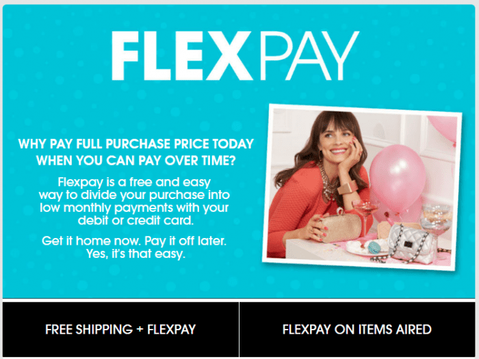
This works for straightforward reasons. Getting the product right away and paying for it later makes the product feel more valuable compared to the money spent since money spent in the future feels less valuable than money spent now.
Example time. By adding PayPal Credit to their site, small-time furniture retailer Air Beds Unlimited was able to achieve a 19% growth in sales. The PayPal Credit shoppers also spent more on average, $122 more. PayPal Credit eventually accounted for a third of ABU’s revenue.
Again, consider how Ancestry leverages a free trial – that old workhorse and savior of the SaaS industry:
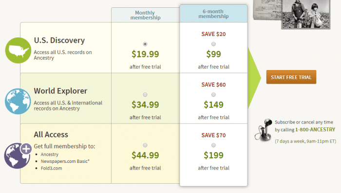
Free trials don’t just work by alleviating uncertainty about the product, they also rope in customers by letting them pay for their first month after the month is over, rather than before.
Ancestry’s landing page is also leveraging hyperbolic discounting by charging customers an extra $20 every six months for paying monthly. Paying monthly may mean spending an extra $20, but it doesn’t mean spending a bunch of money now.
By combining hyperbolic discounting and opportunity cost with single option aversion, this landing page is a winner.
Now that you understand these three concepts, I encourage you to put them to use in creative ways the next time you run an A/B tests.
Thanks to Rohan Ayyar for sharing their advice and opinion in this post. Rohan heads up the marketing team at
E2M, one of India’s premier full-service digital agencies. Rohan specializes in devising integrated, multichannel campaigns for startups, using content, email, social media and advanced SEO strategies. He also writes about the inside stuff on MarketingProfs, Social Media Today and Search Engine Journal. You can follow him on
Twitter.


