Good web design is crucial for making the right impression
First impressions are important... Presentable clothes, matching accessories, getting to meetings on time – it all matters. It shows people around you that you care.
Online, first impressions matter too. Website visitors make judgements about website credibility in as little as 50 milliseconds, and one in five website visitors will leave your website, not giving you a second chance.
Staying on top of the current trends makes it possible to create a website that will impress your audience, and will hold users attention for the first crucial 10 seconds, and beyond.
So what are the Web Design trends for 2017?
First things first. Web design is not art.
Art expresses feelings, raises questions, provokes emotions. By contrast, design helps people to find answers, take action, or complete a task.
More than ever before, everything in web design, from imagery to navigation, to content, must serve a purpose. Many websites are now decades old, and some have collected huge amounts of clutter along the way. If you are redesigning an existing website, start with a clearout (content audit), and focus on what’s important by mapping key customer journeys. If, on the other hand, you are building a website from scratch, consider wireframes, sitemaps and top tasks as your starting point. Prioritise clarity over absolute completeness.
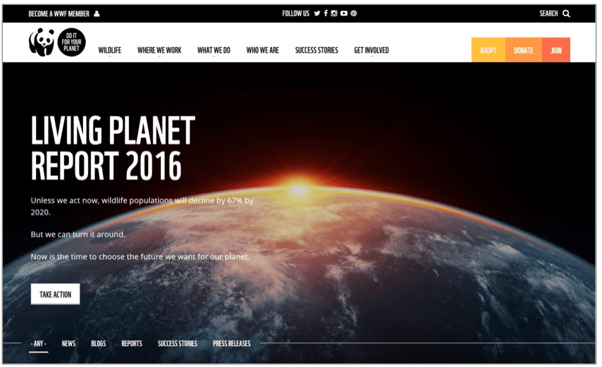
New, decluttered WWF homepage.
Persuade with numbers
Numbers project confidence. A web designer that built 60 websites comes across as more competent than the one who has ‘many years experience in the industry’. A company that has offices in 4 countries seems more established than the one with ‘international presence’. Even when the numbers are not very meaningful, being precise and specific still works. Carolyn Mendelsohn, an award winning photographer, owns 321 snow globes. How about that?
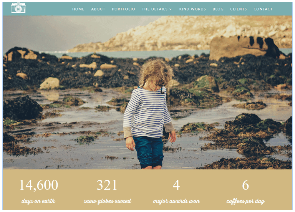
Carolyn Mendlesohn, award-winning photographer and author of widely acclaimed In Between series
Grids, frameworks and pre-made themes
As CSS frameworks and grids mature, more and more coders use them as a basis for their web development work. They allow beginner coders to step up their game and they help digital agencies to streamline their production. Frameworks might sometimes contribute to bloated code but they cut down development time and take care of responsiveness, which makes them a good choice for many digital projects.
In addition to Bootstrap, UIKit and Foundation, which have been around for a while, new front-end development frameworks such as Suzy, Jeet and Breakpoint are also getting traction.
Pre-made themes from EnvatoMarket and TemplateMonster can also be a valid choice. Developers of paid templates tend to respond to customer feedback and continuously iterate their product, so some of the most popular themes have now gone through many improvements, to become what they are today.
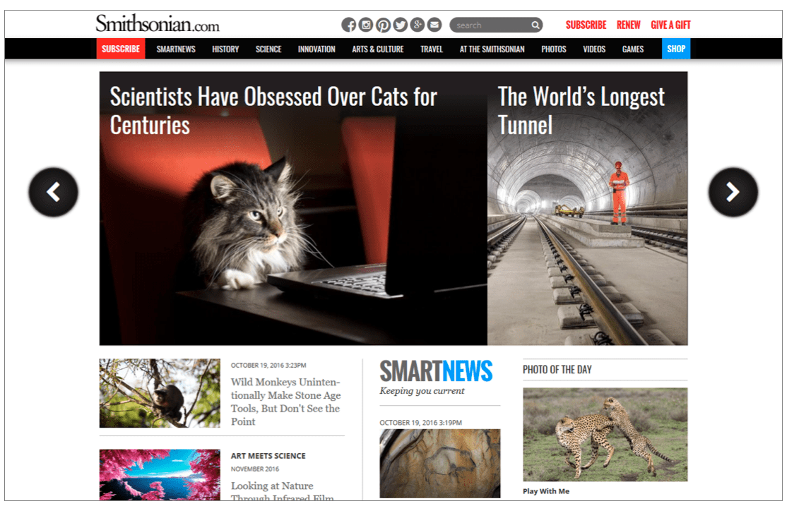
Smithsonian magazine uses Suzy framework which offers on-demand grid.
Flat Colors
Google Material Design was first introduced in 2014. It’s a set of principles and best practices for web designers and mobile app developers. Google Material Design is about going back to basics, focusing on what’s important, but still accounting for multiple resolutions and devices – an over-engineered simplicity, if you like.
Google Material Design with its flat colours isn’t the only approach to web and mobile app design but it continues to be popular and trendy. Fabulous app, Google Material Design Awards winner, is a remarkable example of Google Material Design principles at its best.
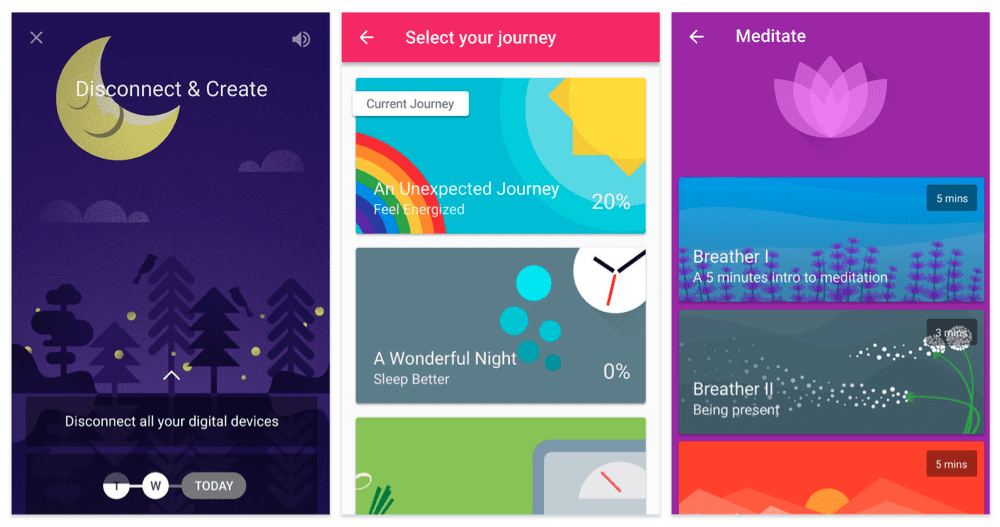
Fabulous is a mobile app that helps you to establish healthy habits.
Authentic images
The overriding rule with regards to choosing effective images for web is that they have to be relevant and genuine. When choosing images, think about the following:
- Product
Are product images appropriate and useful? If so, this should be your first choice.
- People
Can you use an authentic image to tell a believable story about people using your product and benefitting from it?
- Quality
How can you show that your product is of good, or superior, quality? Can you show the craft, the expertise or the materials that make it great?
- Ethics
Are you charitable, ethical, organic, green? Does your business give back to the community? Does it make the world a better place?
Overused staged photography will make your website look dated. Choose realistic images that portray real world and real people. Use new perspectives: selfies, feeties, drone and head-on camera pictures and videos. Try full-screen approach, with the image occupying the whole screen.
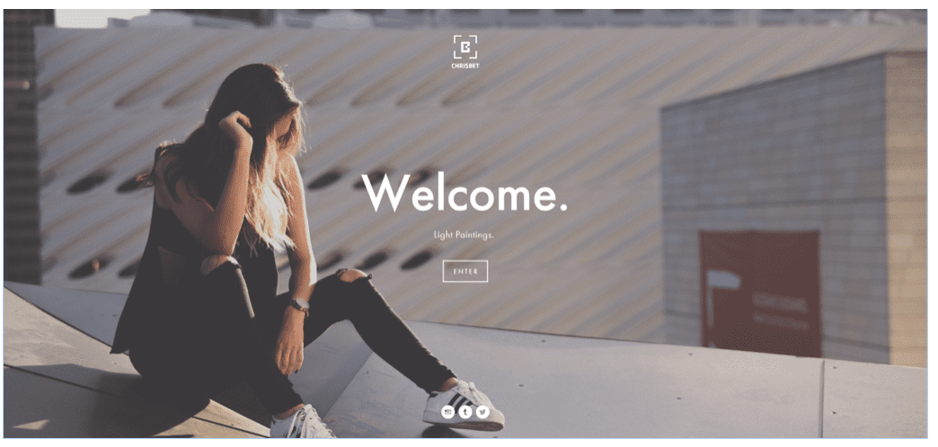
Christian Betancourt is e-sports, portrait, landscape, and lifestyle photographer
Video
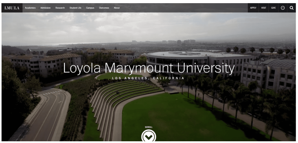
If a picture can tell a thousand words, then video must be even better, right? Homepage background videos can tell a story behind a product or service within seconds – Evernote, Airbnb and Loyola Marymount University are notable examples. For longer, more sophisticated video stories in web design, have a look at edstafford.org and silenza.it (It’s worth noting that mobile versions of these websites do not display videos.)
Navigation
Humans can hold between 5 and 9 items in their short term memory. A landline number such as 496 0926 is relatively easy to remember, but something a bit longer like 07700900546 is far more difficult to retain in your memory. That’s why, for a long time, web developers and UX designers strived for a maximum of seven menu items (7±2) in the website navigation. But that’s changing.
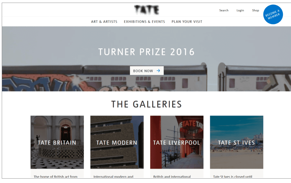
The number of visible, main menu navigation items is now reduced to the absolute minimum. Paypal has only three visible items in their primary navigation. Tate have reduced the number of items in the main navigation from 11 to just 3 during their most recent redesign in 2016. Laterooms redesigned it’s homepage in 2015 to focus solely on the booking process.
Continued influence of the mobile design means that hamburger navigation icon is more popular than ever. The jury is out on the effectiveness of this approach – it’s not just the meaning of the icon, but the size and visibility of the three lonely lines that affect the usability of the hamburger approach. Research and A/B testing seems to show that hamburger lines combined with a MENU label – such as the one on Adobe website - works significantly better than the hamburger icon alone.
Sticky navigation, such as on Pexcard by Rockpool Digital is still popular, and so are mega-menus – Museum of London built by WebCredible is a good example.
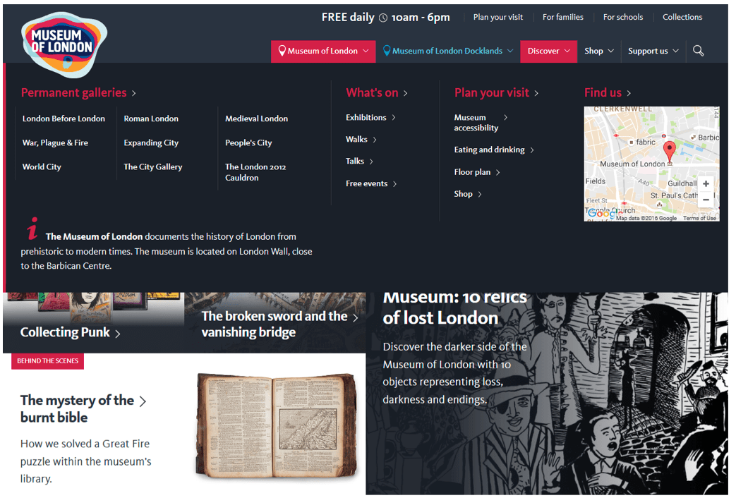
Museum of London was redesigned by Webcredible in 2016
Performance and intelligent analytics insight
Average weight of the homepage across the websites reviewed in this article is approximately 3.5MB. With all the high resolution images, interactive scripts, font replacement techniques, webpage performance requires special consideration. “If you can make the site load a second faster, you can drive engagement by 5%" according to Financial Times. Note the use of engagement as website metrics in this quote. Intelligent insight that goes beyond page views and unique visitors is increasingly important for understanding what works and what doesn’t on your website.
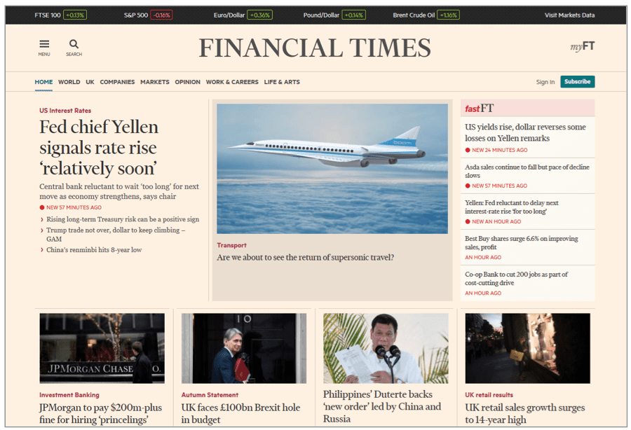
The aims of Financial Times redesign are shorter page load times, increased engagement, and better personalization.
The blend of personal and professional space, integrity, ethics
The line between the personal and professional space is not as clear as it was in the past. What we hear about business leaders on Facebook and Twitter, is often less formal and more in-the-moment than press releases and company’s own marketing materials. Integrity, ethics, telling people who you are, not just what you do, is more important than ever before.
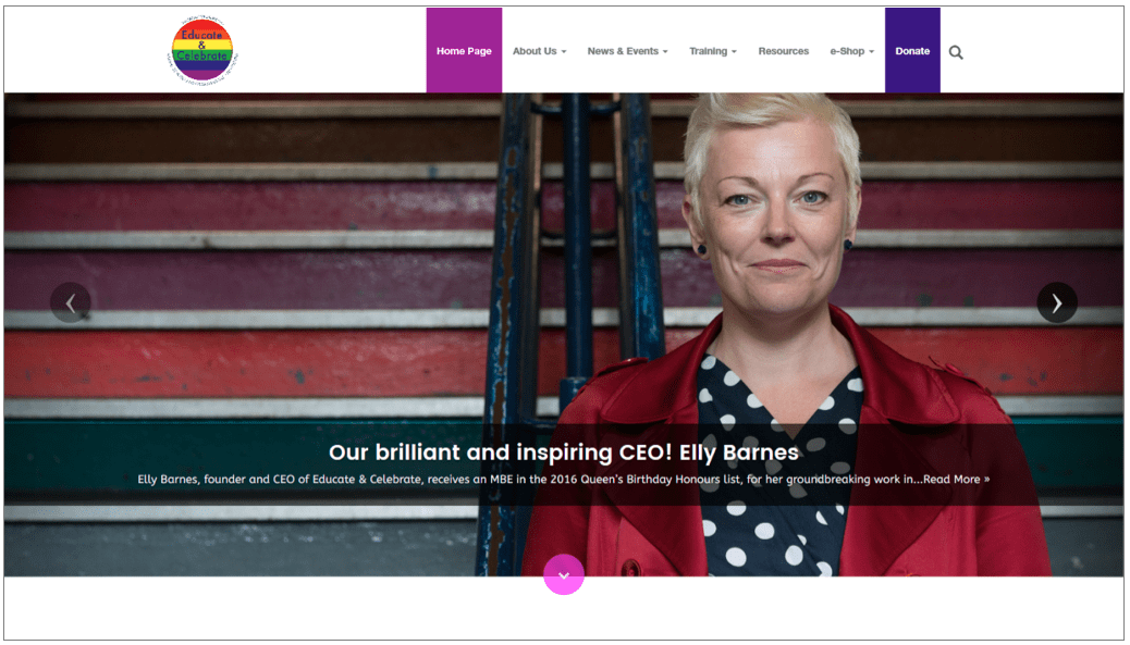
Educate & Celebrate advises schools on LGBT and inclusion best practices.
Conclusion
In summary, modern websites of 2017 will use authentic images and full-width or full-screen layout to portray genuine, passionate, ethical people and products. Primary navigation will be reduced to the very minimum, and other links will be available through the ‘hamburger’ navigation, mega-menus and contextual navigation. Great websites of 2017 will use direct, persuasive language and will use numbers to demonstrate their achievements. Responsiveness, micro interactions and large, bold images continue to dominate the web, but they are only effective if website performance and page load times are reasonable.
Best of luck and have a well designed 2017!

Thanks to
Marianne Kay for sharing her advice and opinions in this post. Marianne Kay is a Web Strategist and Web Content Management Analyst at
Digital Clarity Group You can follow her on
Twitter or connect on
LinkedIn.


