Suggestions and best practices from finance, travel, real estate and retail
Creating a compelling user experience (UX) is essential for any website. Whether you’re working in retail, finance, travel or real estate, UX is important to fulfil the user's needs and provide a positive experience that keeps people loyal to the brand.
The increasingly mobile nature of web experiences today means that UX has become more important than ever. After looking at several hundred sites, Google has developed a series of UX playbooks, tailored for different sectors. Google realized that there were certain universal UX elements that helped create a frictionless shopping experience for users and have identified key best practices and principles.
Download our Business Resource – E-commerce design pattern guide
We created this guide to give our members a definitive reference of best practice for the design of key website page templates essential in retail e-commerce websites.
Access the E-commerce design pattern guide
All of the playbooks are available in their entirety online and below is a list of six that I have found useful:
I wanted to use this post to discuss some of the stand-out best practices and suggestions,as well as provide examples of these.
Creating frictionless experiences across the funnel
Expanding on Google’s 25 Retail Principles, the best practices provide a checklist for improving your mobile site’s experience across five key areas:
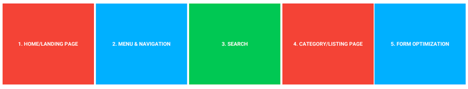
The summary of best practices for each of these five areas is slightly different for each industry, although the diagram below summarises many of the commonalities across all:
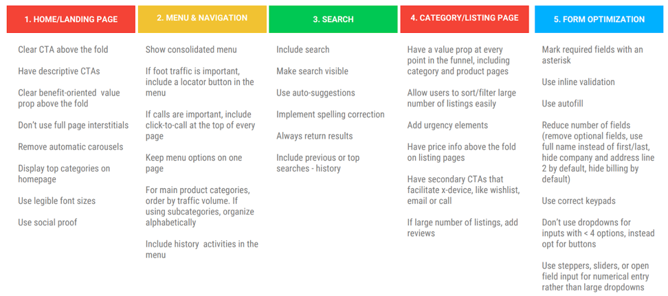
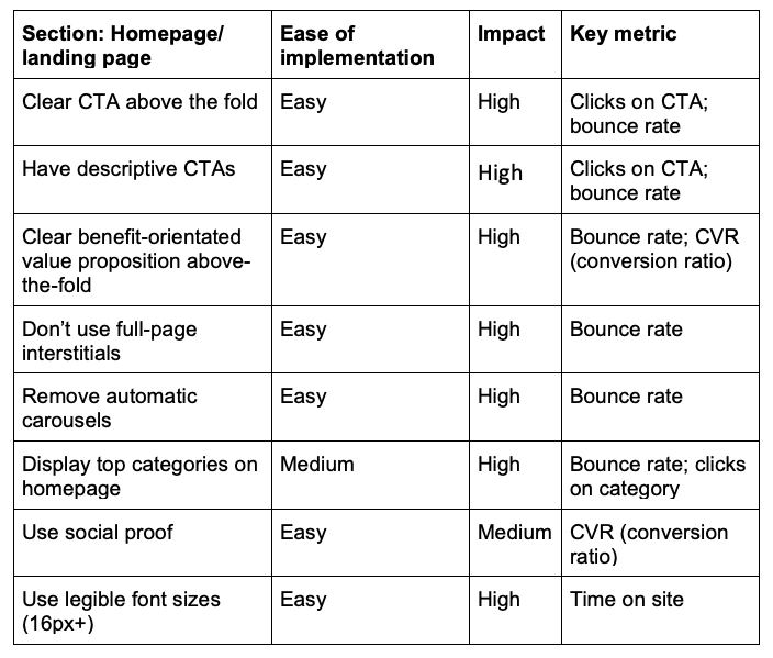
1. Homepage/ landing page
Your homepage is the 'shop window' for your site. First impressions count and can often be the difference between making a sale and losing a potential customer for good.
Problem to solve: Does my site provide what the user wants?
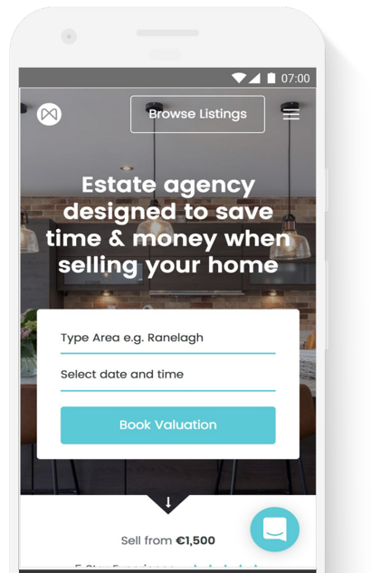
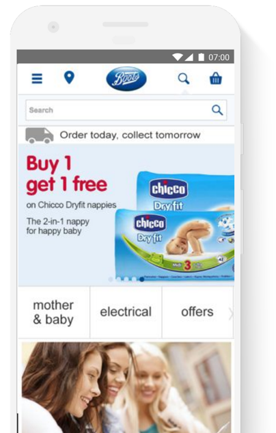
Below are two examples of very well optimized mobile homepages from Moovingo (real estate) and Boots (retail). Both sites provide a very clear CTA in an easy-to-reach area and a strong value proposition. The two brands keep things simple yet effective, with legible font sizes and consolidated menu (with hamburger):
Key suggestions:
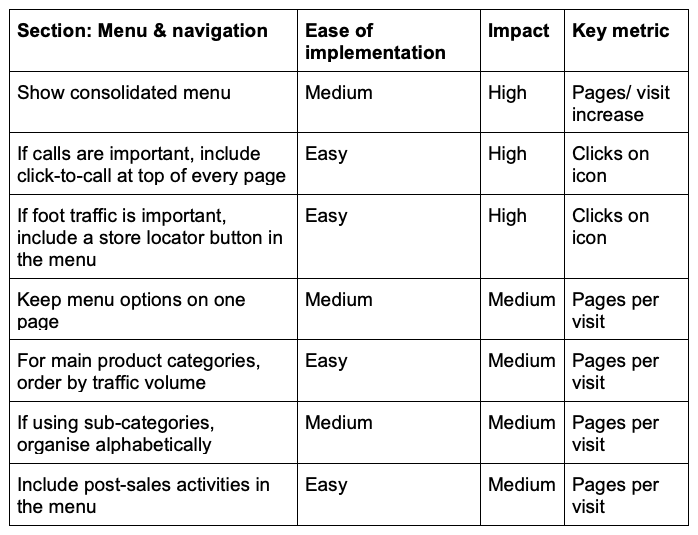
2. Menu & navigation
Navigation is one of the most important elements of any website as it enables users to complete the tasks they want to fulfil. A user must be able to easily navigate through, rather than get lost in, the numerous pages of a website.
Problem to solve: Can my user browse their interests quickly and easily?
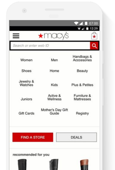
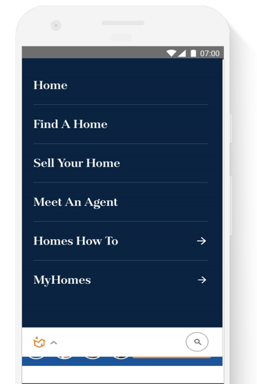
Below are two examples from Macy’s (retail) and home.com (real estate) that help users to quickly see how they can browse and navigate to the pages they need. Once again simplicity is at the heart of their effectiveness, with menu options kept to a single page and post usage actions (e.g. 'Homes How To' and 'Register') included above the fold in the menu:
Key suggestions:
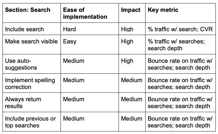
3. Search
Effective on-site search functionality is now an essential component of any mobile user experience. Whether users are simply browsing generally or searching with intent, a poorly executed on-site search can result in lower desktop average order value and decreased mobile conversion.
Problem to solve: How do I help my user find what they’re looking for quickly?
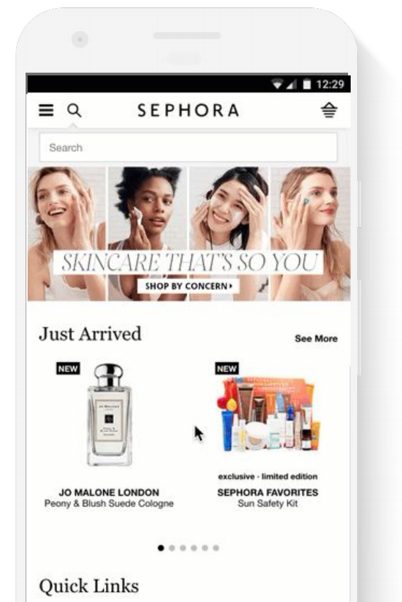
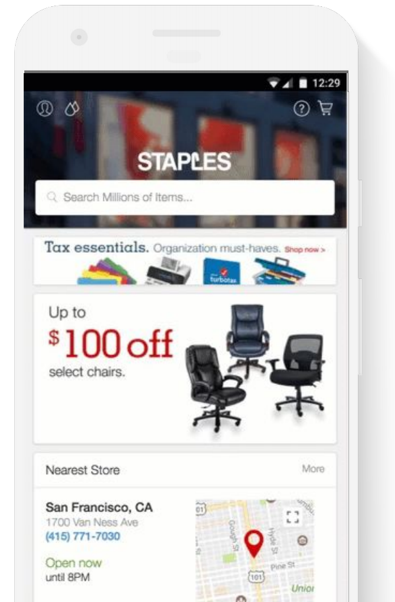
The retail examples below from Sephora and Staples demonstrate how to use on-site search in a way that enables users to find what they’re looking for quickly and easily. In both cases the search bar is clearly visible and use typing suggestions for both products and categories:
Key suggestions:
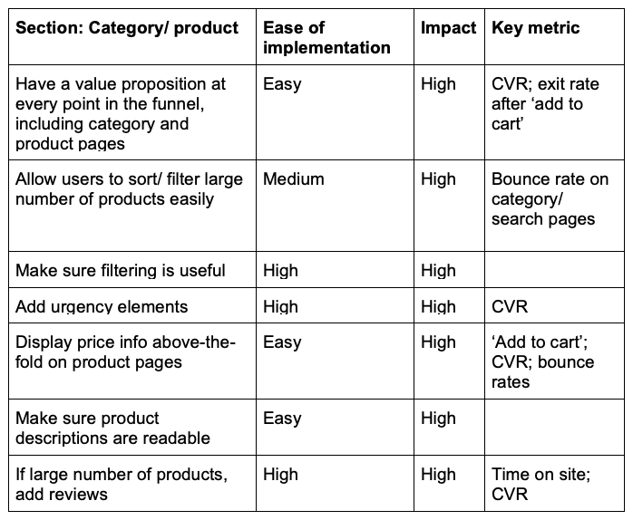
4. Category/product
Once a user has navigated their way to a product/category page, it’s important that they’re able to find what they’re looking for based on simple, intuitive filtering and clear labelling.
Problem to solve: Can my users find a product to fit their needs? How can I continue their interest if they don’t want to convert at the moment?
The two examples below from ASOS and Rex Real Estate demonstrate how good filtering can help users to refine their searches and identify the right products/properties based on their specific criteria.
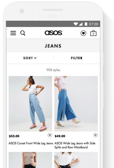
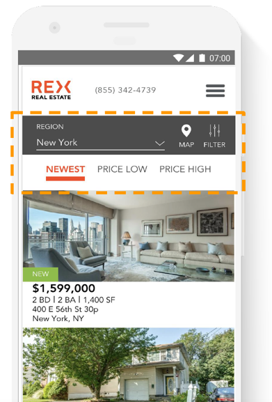
Key suggestions:
5. Form optimization
Typing on mobile is not easy and it’s therefore incumbent on those creating mobile experiences to help the user complete their task as easy and pain-free as possible.
The form on a retail, finance or real estate mobile site is often one of the final steps in the journey, so it’s essential that this works to improve conversion rate.
Problem to solve: How do I guide users through conversion flow and make forms as easy as possible?
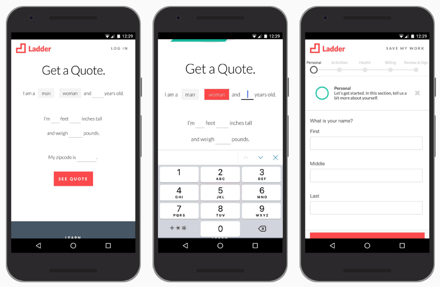
The example below is from Ladder, a US life insurance company. The three images show how the brand has created a form that contains simple inputs and allows the user to save their progress. This facilitates cross-device movement whilst adding an element of fun to the process:
Key suggestions:
Don’t forget: all recommendations should be A/B tested!
Last, but by no means least, Google recommends that all recommendations should be A/B tested! This piece of advice fits with the whole ethos of all their user experience guidance - don’t ever assume and ABT (always be testing). What might work for one site - or one element of a site - may be very different for another. So continually hypothesize, test and refine.


