Mobile experiences are now the norm
Smartphones are everywhere, and they’ve grabbed our attention. Maybe even too much! Based on seeing my teenagers’ faces almost constantly buried in their screens, I’m sure mobile website usage will ramp-up much further in the future.
So, when we do conversion design we need to be mindful of this reality. We need to realize that the smartphone is not where the conversion happens, but more often where it starts - the first or second touchpoint - especially when it comes to lead-generation usage scenarios, but also for e-commerce.
In this post, I first highlight how mobile user experiences differ from their desktop counterparts. Then I share my top four do’s, followed by my top four dont’s of mobile conversion design. Follow this guidance and other mobile best practices and your site will soon see higher conversions and revenues.
Download our Premium Resource – Mobile SEO Guide
What you need to know to win with modern mobile-first SEO.
Access the Mobile SEO guide
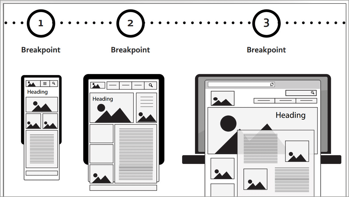
What makes mobile experiences unique
First let me define what I mean by ‘mobile’. ‘Mobile’ includes any device ranging in size from a smartphone to a phablet (a phone-tablet hybrid), to a mini tablet and a tablet. In the last couple of years, smartwatches have been added to this mobile mix.
While tablets are still widely used, it’s often in stationary situations (e.g. while couchsurfing), which don’t put as much interactive and thought burden on their users. Here I will focus on smartphones since they’re used mostly ‘in the wild’, in scenarios where the user is often:
- In motion (which decreases coordination)
- Using the phone outside (under glare-y conditions)
- Using the phone with one hand
- Multi-tasking
- Interrupted
- In a hurry
When we’re using our smartphones we’re basically poster children for ADD (attention deficit disorder). In fact, recent human factors research has shown that using a smartphone while doing another task is equivalent to being legally intoxicated. Clearly, we’re not ‘walking a straight line,’ either mentally or physically, when we’re on our phones.
4 DO’s of mobile conversion design
1. DO craft a ‘mobile first’ conversion design
Already have a responsive mobile website? That’s a great starting point. But for the best visitor engagement and conversion results, you need to design and deploy a ‘mobile first’ user experience.
This approach is often called ‘adaptive’ design since you expose different features and functionality for smaller mobile device screen sizes (what Web developers often call ‘viewports’). Basically, it’s an admission that ‘one size doesn’t fit all’ when it comes to your conversion design. So, how to do this?
First, ask yourself these questions:
- What features on my desktop experience apply in the mobile context?
- What features on my desktop site are missing (for my visitors to have a great ‘first touch’ experience with my brand)?
- What navigation and entry points are most relevant to mobile users?
- Which of my business goals can I best achieve on mobile (e.g. email capture and nurturing vs. sales)?
- How I reduce adjust my content to facilitate quick scanning and engagement?
Below are a few screenshots from the EddieBauer.com website.
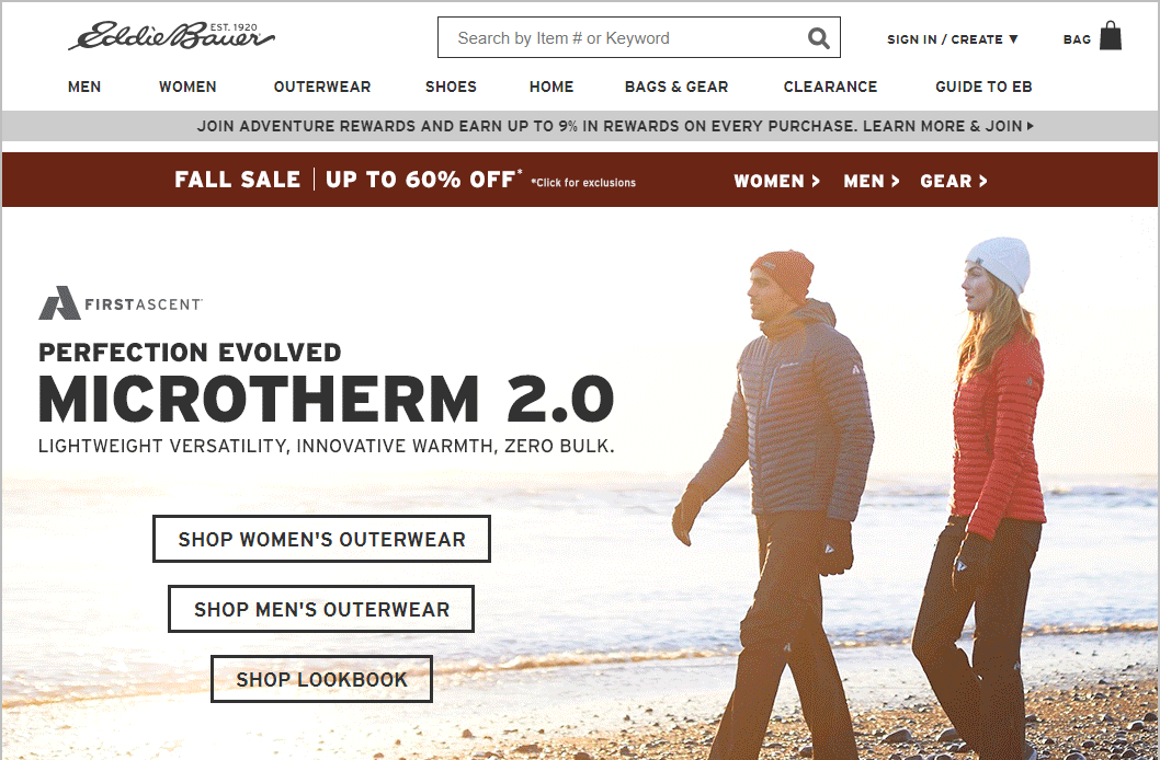


Note that on the EddieBauer.com mobile site:
- The menu collapses into a ‘hamburger’ menu so it doesn’t take up excess space.
- In order to ensure the ‘shop men’s’ and ‘shop women’s’ buttons are visible in the default view, they don’t show the ‘Join adventure awards’ bar near the top.
- The site uses an information (‘i’ icon) in the red ‘Sale’ bar and omits the ‘Men’, ‘Women’ and ‘Gear’ links - in order to reduce clutter.
- The ‘Recommended for you’ products do not auto-scroll to the right (as they do on the desktop site), which reduces visual distraction.
Clearly, while Bauer has a consistent look and feel for their desktop and mobile experiences, they have adapted the mobile site to its different usage pattern.
2. DO Fully optimize your site’s load speed
As I noted earlier, your mobile visitors are often a hurry, attempting to complete tasks in short windows of time. And sometimes they really do need the information right now. According to a 2015 study by ComScore Media Metrix:
- 53% of mobile visitors abandon if a mobile site takes longer than 3 seconds to load.
- According to Google, page speed is a key element of your landing page conversions and has a great impact on your Adwords Quality Score.
- Page speed has a major impact on a site’s Search Engine Result Page (SERP) rankings.
The bottom line: when you - or your mobile development partner - are developing your mobile site you need to ruthlessly optimize the code and data calls. Then you should test your mobile user experience under realistic conditions- for example, on 2 year-old phones connected to less-than-4G wireless networks. If you don’t you risk your visitors leaving before they even start shopping.
3. DO Make CTAs easy to see and click
In conversion design, it’s all about taking your visitors down the ‘happy path’ to a conversion (or at least a step toward a conversion). And to do this you need to have compelling, mobile-adapted content and big, clear calls to action (CTAs).
Here’s the lower portion of the product page on the same EddieBauer.com mobile site:
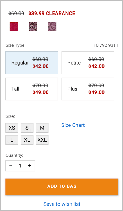
Note that the ‘Add to Bag’ button stands out clearly against the background. It would even do so if viewed on a bright sunny day. Note also that the ‘Size Type’ and ‘Size’ selections are 1-touch, saving the visitor the extra work - and interaction focus - required to use pop-up selectors.
The page also includes the ‘Save to wish list’ option, which allows this visitor to more easily ‘browse now and buy later.’
4. DO Simplify your contact form entries
Good conversion design, of course, dictates that you don’t include any non-essential fields on your contact or lead-generation forms. This is doubly true for mobile sites. That’s because:
- Every entry has an extra thought load - which are amplified when your user is in motion.
- Typing into fields is extra tricky when moving. Requiring your visitors to stop to type will lengthen their form-fill time.
Both of these factors increase the likelihood of form bailout. And if your visitor bails, who knows if they’ll ever return.
Remember your goal for early-stage visitors: to capture an email address or some other low-commitment entry in exchange for you giving them something of value. You can always get additional details in follow-up emails or other communications.
Cloud-based accounting vendor Freshbooks keeps things super simple on their ‘Try It Free’ lead form; they only ask for an email and a password.

On the next page, they say ‘to keep your information safe and secure’, you need to verify your email. That’s a clear explanation - and a good way to start building trust in their brand.
4 DON’Ts of mobile conversion design
Now that I’ve covered what you should do, I’ll highlight the top things you shouldn’t do when crafting your mobile conversion experience.
1. DON’T force your visitors to remember information
Let me first give you a quick memory primer: the latest research indicates that the brain can only hold 4 pieces of information at a time in its temporary stores, or ‘working memory’, before it fades away. (This is contrary to what George Miller’s ‘seven, plus or minus two’ research told us back in the mid-1950s). Especially when we’re busy, stressed or tired, we just can’t keep as much in our heads.
Why am I explaining this? Because too often mobile experiences expect us to remember much more than 4 pieces, for longer than the 20-30 seconds it takes us to enter this information on another screen. Here are some common memory-related issues, along with solutions:
- Longer 8th-grade-reading-level sentences tax working memory. Write shorter sentences, with more paragraph breaks, and at a lower reading level (e.g. a 5th grade level is a safer guideline).
- Phone numbers are awkward to copy and paste into forms. Save your visitors this hassle by pre-filling the number stored in the phone’s SIM (internal memory) directly into the Phone Number field.
- Entering Emails or Street Addresses is really cumbersome on mobile. Enable ‘auto-complete’ for form entries so that, as your visitor starts entering their email address, the browser-cookied email and street addresses will appear as available choices.
Here’s my personal pet peeve: mobile websites that don’t allow a click-to-call object for contact phone numbers (which, when pressed, directly open the native phone app, with the phone number pre-filled). Implementing this is easy, and can only help your conversions.
2. DON’T ‘Go for the close’ prematurely
In sales there’s a saying: ‘always be closing.’ In many physical shopping context this may make sense. But in typically early-stage mobile shopping experiences, going for the close early can be off-putting and hurt downstream conversions.
If you’re like most online sellers you have multiple lead sources: direct (branded) leads, organic leads, paid leads, social media leads. And each traffic source may need to be nurtured differently. Bear this in mind for all of your channels: your goal should first be to start a relationship, then to develop a more personalized and committed relationship, over time, with each of your prospects.
Leverage the principle of reciprocity: give them something of value in exchange for something you want to get in return. For example:
- Request an email address in exchange for a discount on their first order.
- Request more specific information (to clarify their personal preferences) in exchange for a free gift (e.g. a coffee card).
- Request free trial signup in exchange for a credit card number or other payment methods.
Go for the close too early and you’ll just alienate your prospect. Instead, define your ‘micro conversion’ goals (the conversion actions on the path to your ultimate conversion), then define email campaigns and other creative that will ‘keep ‘em clicking’. In this way, you’ll prime your visitors to buy at a later time.
3. DON’T use too much screen area for navigation
For mobile experiences, screen space - what developers call ‘viewport size’ - is at a premium. So you need to use every pixel of it wisely.
You should only expose your most-used navigation links, buttons and CTAs in the main part of your page. Put other navigation options under a ‘hamburger’ menu at the top left or right. Not sure which navigation is used most? Review your analytics to see your click statistics.
In addition, banner graphics and other controls should be as small as possible in order to put the focus on the content. After all, that’s what your visitors want to consume, and what you want them to click through.
Here’s an example of a site - for a business lawyer - that wastes a lot of screen space:

While they do have a collapsed menu, they use 90% of their default view to state the obvious, rather than stating their value proposition and a clear CTA. the visitor has to scroll down - way down - to get their questions answered.
And here’s an example of a well-known legal brand that uses their screen real estate more wisely:
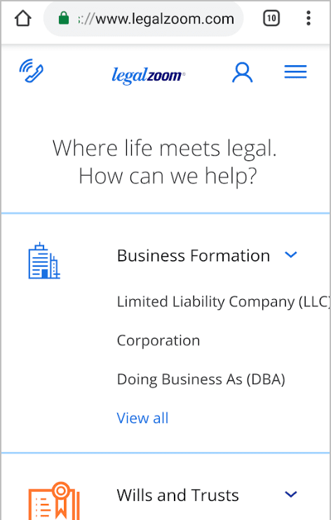
Note how they clearly state what they do, and offer direct action links to each of their service areas. Their graphics are also minimalistic, which cuts page load times.
4. DON’T strain your visitors’ eyes
I’ll admit it - I’m no spring chicken, and my eyesight isn’t what it used to be (even with glasses). But apparently it’s not just me. According to a 2016 report by the National Health Survey, 25.5 million Adult Americans 18 and older reported experiencing vision loss. Of these 25.5 million American adults, 15.3 million women and 10.1 million men report experiencing significant vision loss. This means that nearly 8% of Americans have a significant vision issue.
Even people with ‘eagle eyes’ can’t easily read small text quickly on a smartphone screen during high-glare conditions. So, what should you do?
For starters, make your default fonts larger and darker. Contrast needs to be quite high in order for words to be legible. Years ago I learned from a colleague, and typography expert, that fonts should be at least ¼ inch in height for best legibility. And they should be black text (or very dark grey) on a white (or nearly white) background. The main takeaway: make your font styles clear and large, especially if your target customers are over 40.
Give your mobile site some love
It’s a fully mobile world now, and our user experiences need to be tailored to what makes mobile sites unique. The fact is, your smartphone visitors are often moving, distracted and mentally overloaded. (We humans can’t truly multitask - that’s a myth; just search YouTube for ‘texting while walking fails’ to see proof of this).
So, if you want to capture more leads, so you can later nurture them, you need to KISS (keep it simple silly) - by optimizing your layouts for mobile, and using shorter, easy-to-read copy and big, bright buttons. And you need to reduce the thought and interaction loads your put on your visitors’ brains. Only by doing so can guide your visitors down the happy path to a downstream conversion, whether it’s on a phone or a larger screen.


