Home page examples featuring simple persuasive designs for desktop and mobile experiences
Creating simplified, focused Landing Page is a standard approach for digital campaigns, particularly for engaging a prospect to get ROI their first visit from Google AdWords.
But more and more savvy brands are applying the principles of landing page design to their home pages and optimising them by testing to see whether Less is more!
An early sign of this trend was from two presentations I listened to way back in May 2010 at theEmetrics Marketing Optimisation summit. Craig Sullivan of Autoglass and Michael Gulmann of Expedia explained how they have boosted conversion through simplifying their home designs as a results of AB and multivariate testing. Since then, the increase in smartphone usage and popularity of responsive and adaptive web design has given a further reason to simplify home pages.
We're not saying this is true in all cases. More complex product offerings may demand a more complex page. You have to test. You'll know the long-form Amazon home page, for example; they find a longer-form landing page is more effective through testing. However, 'simpler is best', was in the examples featured on this page, when testing was used to assess design.
Examples of home page as landing page
This is an example of a very simple home page at the time of the talk I mentioned. I admit it's for a product with a simple, single proposition.

In 2014 Autoglass updated its home page so it is has slightly more customer service information while retaining the landing page format with a clear Call-to-action (CTA). The 2017 design remains similar today:
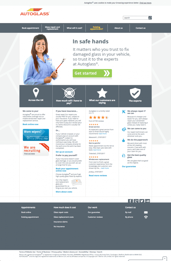
The new area is focused on answering users' key questions when selecting a service which I recommend you identify by this content-mental model mapping technique. These explain the benefits of arranging the service online as part of the online value proposition in the "Why choose us?" panel which is an important question for many services, but often missed. What are your 10 key questions that prospects may ask about your brand?
This home page is not mobile responsive, instead Autoglass prefer an adaptive approach where smartphone users are automatically served a tailored mobile experience.
Key value proposition messages
Both of these examples have clear messaging on the home page answering the "Why Us" question?
Autoglass - originally:
- Job Done: We guarantee our work for as long as you own your vehicle
Expedia:
Why it pays to book at Expedia:
- More hotels (and more deals!) in more places
- Serious savings on Flight + Hotel packages
- No Expedia change or cancel fees on hotels & more
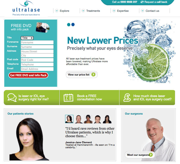
Ultralase home landing page
Ultralase was at the time, one of the UK's largest laser eye treatments companies. This was a classic simple layout before the advent of mobile responsive pages for which we will look at examples of later in this post. However, they are no longer trading although the website is available.

Here are some other features of the persuasive approach used on this page:
1. Prominent incentivised response-form
Multiple incentives and a prominent position of the form on the left hand side are consistent with eyetracking studies which show that the left-hand side of a screen has the most attention. By placing a form on the home page you will typically get a higher response than encouraging people to click through to a separate sign-up page.
2. Clear calls-to-action for main customer journeys
Prominent within the green bar, these are likely setup as conversion goals in Google Analytics. Containers blend image and text to avoid banner blindness. These containers all highlight their Online Value Proposition.
3. Key brand messages communicated
These are delivered in the carousel/slider top right covering customer concerns like pricing, surgeons, safety and experience. These "points of resolution" are often hidden in an FAQ, interesting that Ultralase highlights them on the home page.
4. Social proof
The right sidebar is used for the map to show scale through number of clinics and engaging containers for customer testimonials.
5. Prominent phone response
Vital for high value, complex products since conversion tends to be higher via the phone channel. Unique web number can be used for tracking online influence.
Of course, I have accentuated the positive and this site perhaps suffers from an over-emphasis on Direct response. Some common features are missing such as an "About" page to reassure about the history and stability of the company and a navigation to appeal to different segments - main reasons for seeking treatment.
Salesforce.com Home Page as Landing Page
Salesforce.com are one of the best known Software As Service (SaaS) CRM providers in Europe and the US. I have used their site as an example of well-balanced design with perhaps a better balance than Ultralase on brand-building, education and response.
Today Salesforce uses a mobile responsive design which is now a common approach. It's similar to their long-form landing pages . It has these persuasive features:
- Clear customer journeys with CTAs above the fold
- A carousel/slider - not the best execution to show different services - a tabbed design would work better here
- Trust through social proof and customer stories
- Use of keyword rich text in the footer for SEO purposes
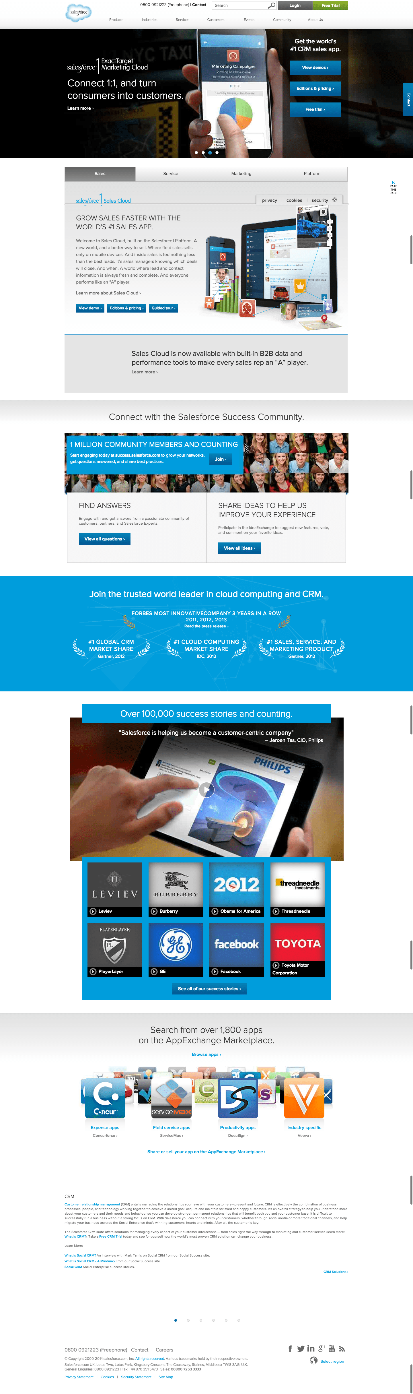
Of course Salesforce.com also use more focused landing pages with nav removed for lead generation from Google AdWords.


