How to make your landing pages generate more revenue
Do you want to sell more? Or capture relevant targeted leads? Then you need to work on your landing pages to ensure they are working hard enough for you.
Today we are going to talk about landing page optimization tips. More specifically we are going to talk about the steps we can take to improve conversions after a visitor has landed on your target page.
We want to get him to take the step we have identified as the goal for that particular landing page.
To be able to measure conversion, we first need to identify what conversion is in the first place. According to this Google AdWords page:
Conversion rates are calculated by simply taking the number of conversions and dividing that by the number of total ad clicks that can be tracked to a conversion during the same time period. For example, if you had 50 conversions from 1,000 clicks, your conversion rate would be 5%, since 50 ÷ 1,000 = 5%.
So it is the percentage of visitors who take a desirable action on your site.
According to WordStream, the average conversion rate across industries is 2.35%. The top 25% are converting at 5.31%, and the top 10% at an incredible rate of 11.45%.
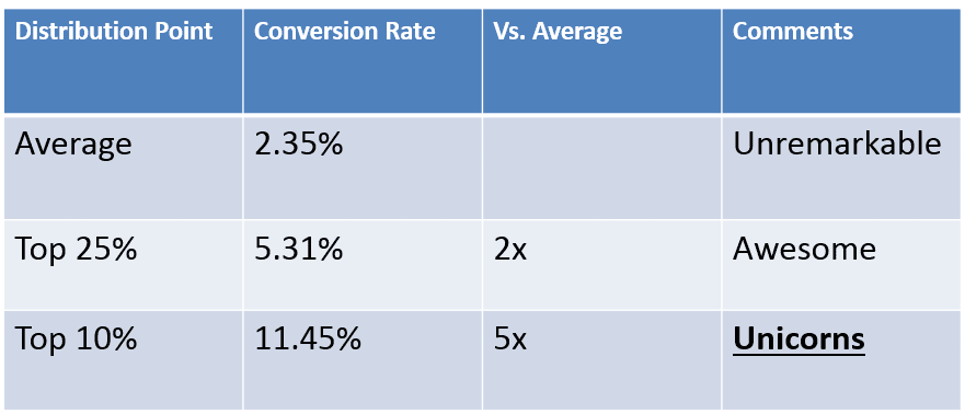
Image Credit: WordStream
So a high converting landing page is one that prompts a higher number of users to take certain desirable steps. Or complete a certain goal. The more people that take these desired actions, the better your conversion rate.
These goals could be anything from signing up to your newsletter, making a purchase, fill a contact form, or call your business phone number etc.
Let’s try to understand what a landing page actually is.
What is a landing page?
Technically speaking, a landing page is any page where users can land on your site. Well, that makes every page on your site a landing page.
But more specifically a landing page is one where you direct visitors using marketing & advertising campaigns. It is a standalone page quite different from the actual website on which it resides. I say standalone because it is different from the rest of your website pages. And different because it does not have to comply with the theme of your site.
It is more like an advertisement, a banner, focused on one single goal. Your website may cater to many services, like Web Design, SEO, Digital marketing etc. They belong to the same niche. And yet they are different, with different objectives.
A landing page, on the other hand, is focused on a single objective. And to avoid any distractions for the visitor, ideally, you would avoid the global website menu on your landing page. Anything on this page is ideally to achieve the single objective for which the visitor landed on this page.
In all probability, you are paying for visitors to land on your landing pages. And if these pages are not well optimized, you are directly losing money. As the visitors would just leave without giving you any business.
Therefore, it makes sense to take optimization seriously. So that your visitors stick around, and hopefully take the action you want them to take.
A landing page can be classified into these two types:
Click Through Landing Page
As the name suggests, these are landing pages, where visitors get detailed information about the products or services.
Here they are acquainted with the offerings. It addressed their pain points and educates them on how it would help them if they opted for these products or services.
Then they are directed to a page where they can either purchase or opt for that particular service.
Suppose if a visitor is directly sent to a “Request a quote” form. What are the changes that they would fill it up? And especially when they have not been sufficiently educated on what they are getting into in the first place?
This is where a click through page comes in handy. It helps ease the customer’s fear. Helps him educate on the product or service. And then directs them to the page, where they can opt for these services. Or request further information. Whatever the objective of the page may be.
Landing Pages For Lead Generation
The other type of landing pages is lead generation pages. All action happens on this page itself. Lead generation landing pages are used to collect user information like emails, and other contact information, in the hope of connecting with them or market to them later.
The page usually describes the offer in detail. Describing how the offer can ease the visitor’s pain points. Enticing the visitor to part with their contact information in the hope of solving their own problems.
Something of value is usually offered to the customer in lieu of their contact details. These could be free ebooks, coupons, discounts etc.
Landing Page Optimization
So a landing page plays a vital role in capturing potential customer information and generating targeted leads.
If it works well, it can generate a lot of revenue for your business.
And a poorly designed landing pages can cost you a lot more than just new customers. Remember, you are paying to get visitors to land on these pages. And if they are not converting well, then you are hurting your business.
Therefore, it is important to look at landing page best practices to get the basics right first. Implementing these landing page optimization tips will definitely push your page conversion rate higher.
Tip #1: Keep It Clean
Cut out the clutter as much as possible. Keep the page as clean as possible. Preferably a background color or pattern that does not distract, but rather accentuate the elements on the landing page.
Use Adequate White space
Making use of enough white space or sufficient blank spaces so that the eye can easily flow from one element to the other. And the visitor can concentrate on different elements on the page.
The white spaces help separate the different elements on the page. Gives the impression of a clean layout. This, in turn, encourages more interaction with the landing page. A cleaner layout also helps minimize confusion.
Visitors are able to grasp the message you are trying to give them quicker.
Also, you need a clean, distraction free background, to highlight different elements on a page. For example, your Call To Action (CTA) button.
Get Rid Of The Global Navigation Bar
Remember you are trying to focus on one goal for this landing page, which is your CTA. You need to cut out as much distraction as possible so that the visitor can concentrate on the important things that matter at this moment.
Having a navigation bar that takes the customer to all different sections of your site is not a good idea here. It will only serve to distract the customer.
Your landing page can be very different to your original site. So it does not need all the elements that your site has.
Your header & footer navigation can be done away with.
The only button that should be highlighted here is your CTA button.
Keep Only What Is Necessary
Don’t clutter up the landing page with too much information. You only need to keep the information that is important for the visitor to make an informed decision. Keep your focus on the goal you have set up for this landing page.
Tip #2: Keep The Message Consistent Throughout
When the user clicks on your ad and lands on your landing page, the messaging and goal should be consistent throughout.
The user should feel that he has landed on the right page. And that what he is seeing exactly what he expected.
To maintain consistency it is a good idea to use wording that compliments each other. Many great landing pages go as far as using the same wording on the main headline. To reinforce that idea in the supporting headlines. The same goes with supporting arguments and statements.
Remember your main headline is one of the most prominent elements on the landing page. Therefore, use is wisely. It is probably the first thing your user will read when they land on the page. Keep it precise and to the point.
Use a color for the headline that compliments the overall page color, and yet sets it apart from other page elements. But don’t make it too distinct as to overpower the CTA button.
Tip #3: Use an Appropriate Image or Video for the Hero Shot
An image is worth a thousand words. An image can captivate your audience and evoke emotions to positively influence decisions.
Humans are emotional beings and they decide with their hearts. Not with their heads.
So appealing to emotions in a positive way can favorably tip the decision in your favor. Some of the things to keep in mind:
- Choose an image that reinforces the message and portrays what the landing page wants to convey.
- Use a clean image that is easy to understand and comprehend.
- Never ever use stock images that are generic and are mostly used on low-quality sites. Avoid generic images totally if possible. Use custom images, graphics, & faces of real people that are unique to your landing page.
- Optimize images so that they load faster, at the same time maintaining image quality. There is nothing worse than a pixelated image.
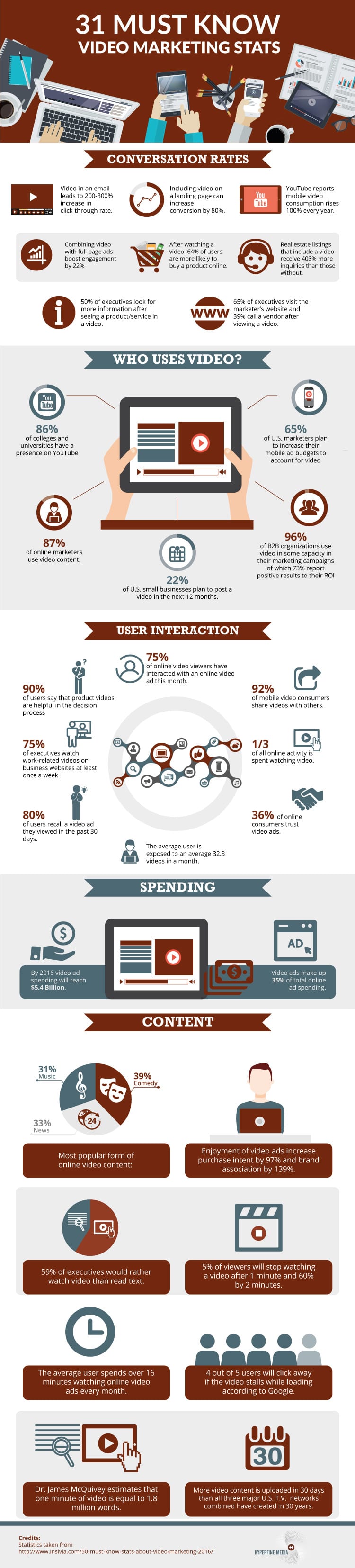
Remember video packs an even bigger punch than images. So if possible use videos instead for the header image or display. Videos actually help you show a story. Why read, when you see and hear at the same time.
A video is anytime more engaging and captivating than other media formats. It engages users in a big way. And it is well known to increase conversions when used on a landing page. See the infographic below for some interesting facts on video usage on web pages:
Tip #4: Include Social Proof
People are social animals. And they like to do things that are accepted and acknowledged by others. No one wants to be the odd one out.
Out of two shops, which one would you choose? The one with happy customers in them? Or the empty shop with no one it?
Obviously, you would choose the one with customers in it! Those customers have acknowledged and shown their trust. Other things being equal, it would only be wise to choose the one that others have already acknowledged and trusted.
Take advantage of this fact. You need to show social proof of your acceptance. These could include social metrics, like your number of Facebook fans, Twitter followers, YouTube subscribers, Instagram followers etc.
Not sure how to go about increasing your followers? Here are a few articles to get you started with Instagram campaigns & Facebook Video Ads.
Also, if you have noteworthy clients, you could list their logos on that page.
If you have been featured in prominent newspapers, magazines, or websites; they also make a good reference.
Metrics like these can instantly make you more trustworthy. And could help increase conversions many folds. So use them generously.
Tip #5: Build that Perfect CTA
That CTA is perhaps the most important element on your landing page. It just sits there, patiently, waiting to be clicked.
It is like, “Please go through the copy. And once you have finished reading, come interact with me. I will show you a whole new world.”
It is the most prominent, highlighted button on the page. It could mean the difference between a bounce and a conversion. That is how important a CTA is.
Some tips for crafting an effective CTA.
- There should be ideally one CTA on a landing page. Having too many would just confuse the visitor. The more choices you give to the customer, the more distracted and confused they will be.
- Use colors that make it stand out from the rest of the page.
- Don’t use texts like “click here”, or “submit” that explains nothing. It does not tell the user what will happen when they click the CTA.Use words that appeal to the user, like “Sign me up”, “Send my free gift”, “Send me my quote”, “Grow my traffic” etc.
- The more personalized the CTA is the more click through it will get. Therefore, avoid using generic images wherever possible. Including in your CTA
- Speak the language of your customers. Use the tone and language your customers are familiar with. That is why it is so important to know & research your customer base first.
- If you are using a form along with the CTA, ensure that it is Responsive. And that it adapts beautifully to different screen sizes on the fly. Make it easier for mobile user as much as possible. Filling up a form is not an easy task, and more so when it needs to be done on a mobile!
Conclusion
It is important to track conversions for any ad campaigns you run. You want to know what is working and what is not. And rectify the issues that are stopping you from achieving great conversion rates.
The tips will let you understand the important elements that make up a successful landing page. How those elements affect conversions, and how to optimize those elements to achieve higher conversion rates.
Please do let me know your thoughts and opinion in the comments below.

Thanks to Amrit Ray for sharing their advice and opinions in this post. Amrit Ray takes care of marketing at
Raydez &
Ray Creations, a web design company working with global clients. He is also a singer/songwriter. He tries his best balancing both his passions giving adequate time to both. You can follow him on
Google +,
LinkedIn, and
Twitter.


