With a well-performing homepage businesses get to spend less money on advertising or other traffic / lead generation methods
There is a reason why smart people spend so much time and money to optimize their homepage.
With a well-performing homepage, they get to spend less money on advertising or other traffic/lead generation methods (because the handful of people that come across their website actually convert). They don’t need to work with unsure customers who always cause troubles (too many questions, late payments, etc.) because they have customers/clients in reserve. And they don’t feel obligated to produce hundreds of web pages only because they’re not getting enough leads from their homepage. The list goes on.
But as Sam Ovens explains only practice makes you self confident. Having all those benefits I mentioned above is not an easy work -- it needs testing and measuring.
The framework is here though. There are some persuasion elements that have stood the test of time and make money no matter on the screen or paper (these are the same elements that old school copywriters used to produce millions of dollars). Simply use these elements on your homepage the way I explain and you’ll have your perfect homepage plus all the benefits I mentioned.
Read on and you’ll know what these elements are as well as how best to use them to your advantage.
Headline’s copy
Headlines are the most important copy on a homepage. They demand a special attention because they literally make the first impression in the minds of the visitors. Believe it or not we are used to looking for the big bolded statement in the middle of the page when we enter a website.
Here’s Shopify’s headline copy:
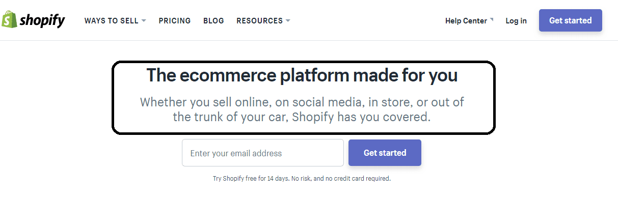
Why use a headline, you say?
Well, headlines are not a recent creation of marketing gurus. They’ve been around for a long time -- and with ample reasons. In 1983, the legendary copywriter, David Ogilvy wrote:
“on the average, five times as many people read the headlines as read the body copy. It follows that unless your headline sells your product, you have wasted 90 percent of your money.
The headlines which work best are those which promise the reader a benefit -- like a whiter wash, more miles per gallon, freedom from pimples, fewer cavities. Riffle through a magazine and count the number of ads whose headlines promise a benefit of any kind.”
Thus the importance of headlines both in print advertising and the modern conversion-focused websites. What’s more is modern homepage copywriters can learn most from old school advertising because they both have the same aim: persuading people to buy.
How to persuade people to buy through your headline?
There are two steps to take:
1. Study the product
In order to produce a money making headline, you need to know the features and functions of the product and its competitors in the market. Try to focus on the features that make the product unique compared to its competitors.
If your product is an email marketing tool or platform, maybe its on-site retargeting features make it unique. Or maybe it’s surprisingly cheaper than other email marketing tools.
Make a list of the features that you think make your product unique or at least make it look cool to people.
2. Position the product
Once you have a list of the cool and unique features of your product, it’s easier to position your product.
What’s positioning? Ogilvy’s definition of positioning is “what the product does, and who it is for”.
Here’s an example of how Ogilvy positions the Dove soaps:
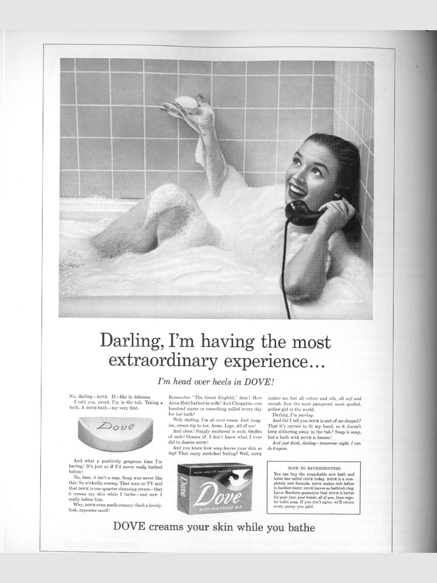
He positions Dove as a creamy soap,
“Dove creams your skin while you bathe”, for women. As Ogilvy himself says about Dove’s positioning: “I could have positioned Dove as a detergent bar for men with dirty hands, but chose chose instead to position it as a toilet bar for women with dry skin. This is still working 25 years later.”
And here’s a nice example of how SEMruch positions its product as an “all-in-one marketing toolkit” for “digital marketing professionals”:
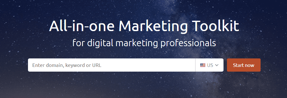
The greatest feature of their product is that it contains all the tools a professional digital marketer needs in one place. And of course it’s positioned for digital marketing professionals. The message is clear and effective.
All in all, in order to increase sales through your headlines you first need to study the product and its competitors in the market, make a list of its cool unique features, and finally position the cool or unique features as benefits for your target customers.
Here are some bonus points to consider:
- You can learn alot from the way consulting functions. Position your product as the sum of all the benefits that will transform people from their current self to their desired self.
- Don’t shy away from big unorthodox ideas such as the one in Dove’s advertising. But don’t make it vague and confusing. If you don’t have any big ideas, stick with clearity (like SEMrush).
- Don’t be afraid of texts on your homepage when it comes to positioning your product and stating its benefits and features. Although there’s much hype about people’s preference for images, videos and stuff, ConversionXL found that users noticed the value proposition more quickly and spent more time on it when it had more text.
Call to actions
If you’re spending thousands of dollars on a product and a website just to prove what a genius you are, good luck! But if you’re willing to sell more of your products and fill those bank accounts, you need to get people to do something on your website.
Call to actions (CTA’s) are the buttons that ask for those money making actions.
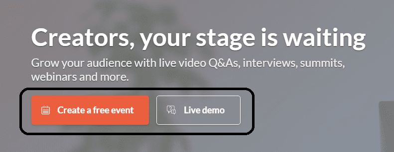
Above: Crowdcast’s CTA buttons
Having seen hundreds of websites with different CTA’s, I managed to categorize CTA’s into six types:
- More info type (e.g. learn more, watch now, find out more, read more).
- Sample type (free account, free trial, try it for free, get started, demo, get a demo).
- Download type (app, get report, report, guide, get now).
- Join type (publisher sign up, register, secure my seat, become an affiliate/advertiser).
- Buy type (see solutions/plans/products, compare plans).
- Contact type (including let's reach, contact us, schedule a meeting).
To make the best of these CTA’s, have the following tips in mind:
Early immature conversions = low-quality buyers
As a rule of thumb you need to avoid too much insistence on the “Buy Type” CTA’s upfront on your homepage.
You don’t want early immature customers because they tend to leave you very soon and more often.
In one of his Whiteboard Friday videos, Rand Fishkin explains that Moz customers that convert on the first, or second, or third visit to [their] website tend to leave early and often. They tend to be not longstanding, loyal customers who have low churn rates and those kinds of things. They tend to have a very high churn and low retention.”
To avoid early immature conversions, you need to make sure you educate your visitors before they buy from you. As for Moz, people normally visit their website 8 times before they sign-up for the free trial. And Rand states clearly that for them there is a strong correlation between the time spent on the website and customer loyalty.
Have more of more info type, sample type, and join type CTA’s on your homepage rather than just the buy type ones.
Have CTA’s above the fold
This seems to be a trite piece of advice but people have actually argued in favor of not including a CTA above the fold on your homepage.
A study by Nielsen Norman Group in 2010 showed that the 100 pixels just above the fold in a web page were viewed 102% more than the 100 pixels below the fold. The following aggregate heatmap from the study shows the concentration of looks in 57,453 eye-tracking fixations.

Red indicates where users looked the most; yellow where they looked less. White areas got virtually no looks. The top black stripe indicates the page fold in the study; subsequent black stripes represent each additional screen after scrolling.
If you want your CTA’s to be seen, you need to have your CTA’s above the fold as well as other places.
Have multiple CTA’s
Singularity in CTA’s has its own merits. For one thing you’re directing the attention of your visitors to do only and only one action you want them to do, eliminating the distracting factors.
But there’s one problem with CTA singularity: it resonates with only one intention.
When afirst-timee visitor enters your homepage, s(he)’s curious to know about your product and probably finds interest in “more info” type CTA’s. Those buttons get clicked more than other buttons by first time visitors.
Some other visitors might be interested in downloading a report or white paper, especially if you’re a B2B business. Be it as it may, you need to include a “download type” CTA offering a white paper, webinar, e-course, etc. to attract this kind of visitors.
And occasionally, some people who are well educated about your product might visit your website with the intention to buy straight in their first visit. You don’t want to let them down, do you?
Check out Hootsuite’s homepage (click on the image to see the full size). It contains four different CTA types: sample type, buy type, more info, and download type.
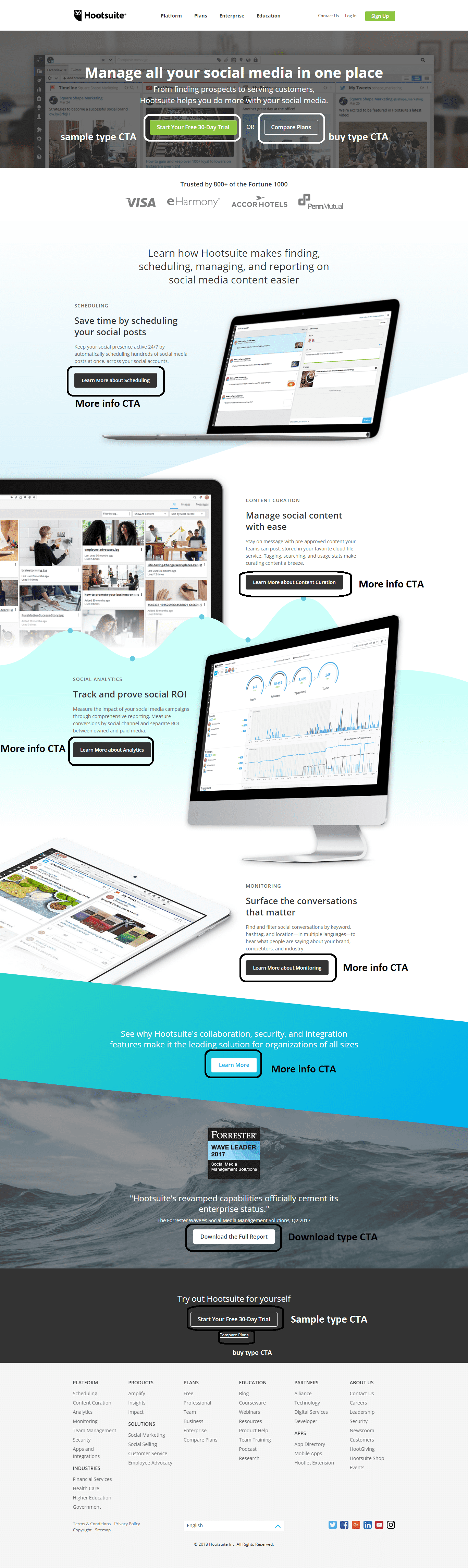
One practical conversion-related fact about Hootsuite is that it’s main CTA is well differentiated. It’s the green “start your free 30-day trial” button sitting above the fold.
Social proof
There are only two ways people would trust you. One is seeing the results you can get them, the other is your past experience. When people visit your website, the best way to make them trust you is showcasing your past experience.
Social proof is just about that and it has such a strong influence:
- Over 70% of Americans say they look at product reviews before making a purchase.
- Nearly 63% of consumers indicate they are more likely to purchase from a site if it has product ratings and reviews.
There are basically 6 social proof types:
- Case studies: You could mention the detailed success story of your clients.
- Testimonials: You could use recommendations from your happy customers.
- Reviews: You could feature real reviews of your products or services by trusted sources.
- Social Media: Showing how many followers you have or showing their positive posts about you is a good way to gain new visitors’ trust.
- Trust Icons: You can showcase the logos of the companies you’ve worked with or the publications you’ve been featured on.
- Data/Numbers: If you have worked with an impressive number of people or have achieved impressive results with them, you can show the data/numbers on your homepage.
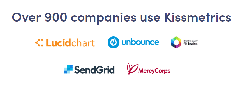
The most accessible social proof types are trust icons and testimonials. It’s easy to include a handful of your best clients’ logos on your homepage plus they are visual and easier to understand. Here are Kissmetrics’s trust icons featuring such classy clients as Unbounce and SendGrid:
Testimonials are also a great way to showcase your past results. Sam Ovens’s consulting training website is an interesting case here. It features over 3000 video testimonials from people who have actually taken his courses.
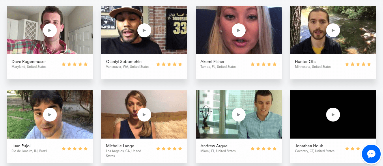 An impressive number of testimonials in the form of videos has a strong impact.
The question is how to make social proof more authentic? Here are some ways:
- Be more specific about the person giving the testimonial: Mention the person’s name, company, role, and if possible a link to his website or twitter handle.
- Feature someone your visitors know well and can relate to: don’t just use anyone. Testimonials and case studies work better from a famous guy.
- Use Videos: It goes without saying that videos are more believable and engaging.
- Avoid the general and be specific: a good testimonial or case study highlights a benefit, explains how the benefit solves a problem, and is specific in the achieved results.
- Link to off-site reviews: people know that you’re only featuring a handful of positive reviews on your website. If you link to the reviews on another website, chances are people will trust you more.
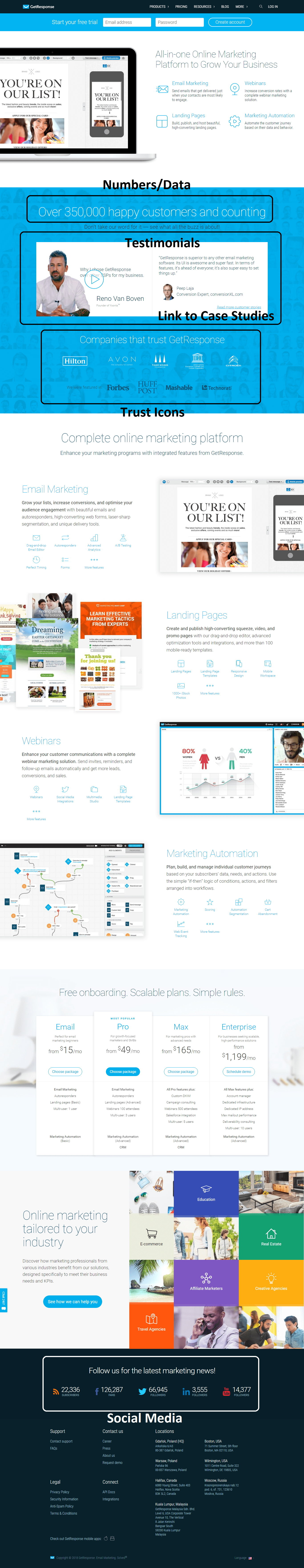
GetResponse has almost all kinds of social proof on its homepage.
One final thought
The perfect homepage is not the one with the most expensive design, nor is it the one with lots of free stuff all over it. The elements that make your homepage perfect stand the test of time and are valuable for all aesthetic preferences.
These elements are headline’s copy, call to actions, and social proof. Taking advantage of them the way I explained above can easily impress your visitors, get them to trust you, and persuade them to enter your funnel even if you’re just starting out and don’t want to spend a lot of money on your website’s design.
Mostafa Dastras is one of those people who think talking about themselves in third person is weird (but he’s cool with it). What keeps him up at nights is how he can help his clients increase sales with no BS content marketing. Visit his blog,
LiveaBusinessLife, or connect with him on
LinkedIn to get him to write for you.


