Using Adobe Edge Reflow for RWD
In a recent blog post we wrote an article on the importance of taking a content-centric approach to responsive web design (RWD) in order to future proof your site from the endless stream of new devices of various shapes, sizes and resolutions.
In this follow-up MMT Digital’s CTO, James Cannings, talks about new tools to help in this process. James spoke about this approach passionately at Internet World earlier this year. Everybody we speak to (or has responded to our blog posts) agrees with the responsive approach in principle, but there are problems with many implementations...
The reality is that many responsive websites are still built with the key breakpoints set at device specific resolutions (e.g. the pixel width of an iPad in landscape mode) rather than setting the breakpoints where your content 'breaks' (or just doesn’t look great on the page or when you feel there is space to bring in extra content).
So if everyone gets that we should be doing it this way why, as a community, are will still so poor at doing it?
There are three key reasons for poor design:
- 1. Designing for a specific device gives Designers an element of control over 'the page'. (NB: Please don’t take this as me blaming Designers).Since we moved from the fixed confines of the world of print to the crazy world of the web, Designers having been looking for ways to get back the loss of control over layout and typography.For a while we came up with the 980 grid (and before that the 750 grid or whatever it was!) which Jeremy Keith refers to as giving the web community the 'consensual hallucination' of control.For a Designer, the most comfortable approach is often to think about a desktop, an iPad and an iPhone. It’s easy to take a design in Photoshop (or Illustrator or InDesign) and frame it round one of these devices. It looks great and clients really like it. UX guys will often do the same thing with wireframes. Partially this is about the tools themselves but we’ll talk about that in a bit.
- 2. If you’re a Developer and you’re looking to get started with RWD you’ll come across a load of sample (or 'boilerplate') CSS files and tutorials. Of course most of these samples are riddled with breakpoints at common device sizes.To be fair, what else can they use? They don’t know anything about your content and where it will break. But this also sets the seed in the Developers mind that these device centric breakpoints are the right ones to choose.So now we have our Developers and our Designers converging on a device centric approach because that’s what the tutorials seem to suggest and it fits in with an approach that the Designers are comfortable with.
- 3. But the real problem is simply that we don’t have the tools to design in a content centric way. Picking breakpoints to suit your content is all well and good but most of us are not Designers, Typographers and Developers all rolled into one and we don’t build websites in an experimental, mobile first way using code.For most of us the starting point for a website is often Photoshop. But the first thing that a Designer has to do when they start a new design is pick the width of the canvas in pixels. What else are we supposed to do other than to pick pixel widths that match common device resolutions?
So what’s the solution to improve responsive web design?
Well if 2013 is supposed to be 'the year of responsive web design' then, despite the fact that we are nearly halfway through it, perhaps we might actually get some tools that help us work this way.
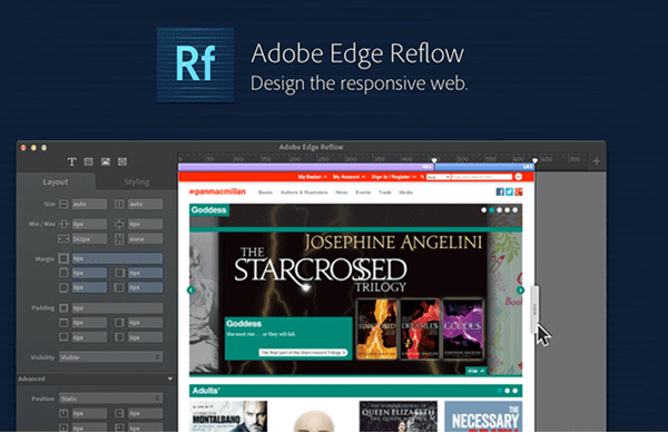
If any company has the knowhow to crack these problems it’s the legends of design applications; Adobe. A few months ago they released a preview version of a tool called Adobe Edge Reflow. You can download it for free.
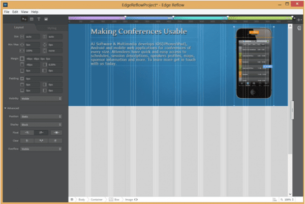
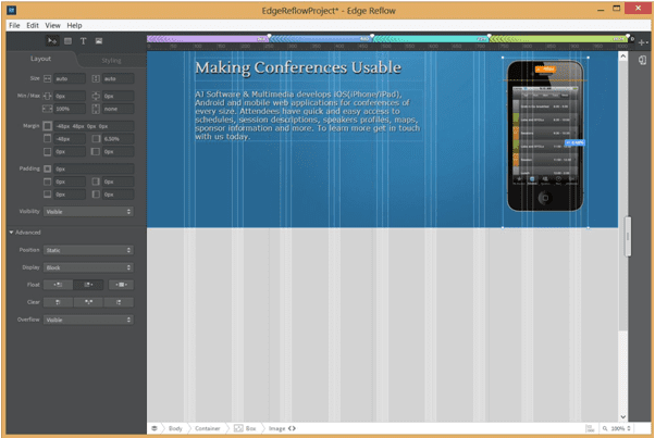
Although Designers will still create a lot of the elements in their favourite design tools they can now layout their designs on a fluid canvas in Adobe Edge Reflow. Designers can import images, create shapes and layout text.
Using a mobile first approach the Designers can stretch out the canvas and define breakpoints wherever they are no longer happy with the layout of the content. Adobe Edge Reflow is built on Webkit so the preview of what the Designer sees is a pretty good representation of how this is going to look in a browser.
You can also link the tool to Adobe Edge Inspect to look at the layouts simultaneously in multiple actual mobile devices.
Adobe Edge Reflow generates all the media queries and the CSS although I don’t really think this is about code creation for the Developers. It is just a step in the right direction towards a tool that designers can finally use to create responsive designs and this belief is coming from first-hand experience here at MMT Digital.
Responsive web designs are often presented to clients with the usual device centric 'Desktop', 'Tablet' and 'Mobile' visuals. They are often presented in the surround of the designers’ favourite devices.
With a deeper understanding of the importance of a content centric approach to responsive web design and tools like Adobe Edge Reflow, perhaps 2013 will be the year of “responsive creative”!
 Thanks to James Cannings for sharing his advice and opinions in this post James is the co-founder and CTO of a Web Development Agency called MMT Digital. James is responsible for the development team and carries out a lot of consultancy work to ensure that their clients are getting the best return from their investment in technology. You can follow him on Twitter or connect on LinkedIn.


