An in-depth step-by-step strategy for optimizing your site for mobile-first index with expert tips for 2018
It’s that time of year again. A time when we can look back over the past year and reflect on the huge amount of change in the digital marketing sphere and look ahead to what’s coming. Sometimes our predictions are stabs in the dark. Informed guesses if you like. Other times, we know exactly what’s coming.
A practical guide to creating a plan to increase the commercial contribution from mobile audiences.
Access the
2018 will be the year of mobile. Whilst many of us have been ‘mobile’ for some time now, changing to responsive sites or setting up specific m. sites, 2018 is the year that things are really going to kick off.
Why is mobile so important in 2018?
Google announced way back in November 2016 that they were going to be moving to a mobile-first index. Over the past year, they have been slowly but surely preparing for that move. At SMX Advanced in Seattle back in June, we learned from Gary Illyes that this move was likely to come in early 2018 and later reports have suggested a very soft roll out on this one (which may have already started).
So, this is why we know 2018 is going to be a huge year for companies and why it’s so important to get your mobile experience right, both for Google and for your end user.
Let’s take a look at three quick and easy steps you can take to ensure you’re ready for the mobile-first index.
What is the mobile-first index?
Just backing up a step here. Let’s first give a quick summary of what the mobile-first index actually is.
Currently, Google uses your desktop content to rank your website on both desktop and mobile. Whilst you may benefit from having a faster site on mobile and of course, having a mobile-friendly site, your rankings are still predominantly based on your desktop content.
The mobile-first index is going to flip this on its head.
For a lot of sites, there won’t be a huge shift. For anyone who has a responsive site, the content on desktop and mobile is typically exactly the same. If, however, you have an m. site, you may choose to show less content to users who visit on mobile, in order to provide a better UX. If the content you choose not to show has strong SEO benefits on desktop, you are going to need to take a close look at this and work out how to bridge that content gap whilst still providing an awesome UX.
3 tips for optimising your site for the mobile-first index
There are a number of tactics to focus on in order to be ready for the mobile-first index.
1. Site Speed
When it comes to conversions and overall user experience (UX), we recommend starting with your site speed, specifically focussing on mobile.
There are four ways we recommend speeding up your site on mobile:
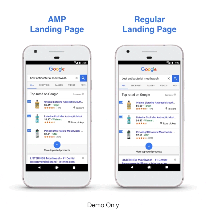
AMP – The Accelerated Mobile Pages (AMP) Project is an open source initiative to improve the mobile ecosystem. Thanks to the pared-down HTML that is used by AMP, it allows you to load your web pages much faster than regular HTML. Google also caches your content within their own cache to speed up load time even more. All this results in a much faster, sleeker user experience and should, in turn, lead to improved visibility in the search results.
Top tip: if you manage a WordPress site, there is a pretty awesome plugin that will convert your pages to AMP as well as Instant Articles for Facebook.
PWA – Progressive Web Apps (PWAs) are an alternative to moving to AMP. Their main selling points include:
Reliable – loads instantly
Fast – responds quickly to user interactions
Engaging – feels like a natural app on a device with an immersive UX
PWAMP(!) - a term first introduced by Google’s Gary Illyes at SMX Seattle, PWAMP is a combination of a PWA built on AMP HTML, JS and CSS. Whilst PWAMP sites may not validate as AMP pages, they are lightning fast and provide all the benefits of a PWA as listed above. They could be the future and one to keep an eye on.
Do nothing – if you have worked hard to get your current mobile experience (kudos to you) then there may well be very little benefit to going down any of the above routes. All Google is trying to do is ensure that the mobile web is quick, secure and provides a good user experience. If you are already doing this, there is probably very little benefit to changing anything.
2. Managing your content for mobile
The content you deliver to users on a mobile device is going to be crucial to your rankings. Whether you have a separate m. site or you show different content to mobile users on a responsive site, you need to conduct a thorough audit of both your desktop and mobile content to identify any missing gaps.
You can use the awesome Screaming Frog crawler to find out where these gaps appear. Simply crawl your site using the different user agents and then analyze these results. Moz recently published an awesome blog post on conducting parity audits that could just save your bacon.
There are of course a few things you can be doing now to make sure your site is ready for the mobile-first index. Here are four of our top tips:
Use accordion and drop down menus appropriately – Google has already said that sites will not be punished for ‘hiding’ content behind an accordion or drop-down menu (as long as the content behind them loads when the page first loads). They understand that real estate is limited on mobile so it makes sense not to show users everything all at once. They have also said that they will crawl all content that is contained within drop downs so use them wisely as part of your mobile design.
Never use Flash – this should be a given but yet we still see sites who insist on using Flash. Apple killed Flash from mobile and since a high percentage of mobile users can’t see Flash content, why continue to use it? Use HTML5 or Java to add those cool interactive elements that can be super-engaging.
Consider your use of pop-ups on mobile – there is definitely a time and a place for pop-ups. If you are a business that relies on your website for lead generation, they can be a crucial part of the UX to get people to sign up to something. They can also be completely annoying, especially when they stop a user getting to where they want to go. Consider where in the user journey you decide to display a pop-up and consider what the user is likely to be doing when one appears.
Consider the text size, tap target, and padding – there are few more annoying things than hitting the wrong button when you are trying to navigate somewhere on a mobile device. Make sure your website is ‘finger-friendly’ by sizing your tap targets appropriately and leaving enough padding between clickable elements on your site. You can read more here about designing and developing for the mobile-first index.
3. User Experience Focus
The move to a mobile-first index is driven by Google’s desire to make the mobile web a better place. It’s all well and good companies saying they are ‘mobile friendly’ and that designs are done for mobile first and desktop second, however the reality at the moment is that most of us still work the way we have always worked; design a new site/page on desktop and then to modify for mobile.
This attitude has got to change.
More and more of your customers are using a mobile device to access your content. Why prioritize their experience on desktop when it is getting less and less likely that they will visit your site from a desktop?
The only way Google can get web designers and developers to truly take a mobile-first attitude is to force our hands.
The move to the mobile-first index should change all our thinking. This should start with a complete audit of the user experience on your website on a mobile device. Think about some of these key questions:
How easy is it to find information that people are likely to be looking for?
What does the navigation look like?
How easy is the check-out process?
How do I navigate back to where I have just come from?
How easy is it to close down pop-ups?
How big is my font on mobile?
Where are your contact details?
By answering some of these key questions, you are much more likely to deliver a positive UX to visitors to your website on a mobile device.
Summary
There is no hiding from the mobile-first index; it’s coming! By following these three simple tips above and making sure you deliver a first-class experience for mobile visitors, you will be in a much stronger position when Google decides to ‘flip the switch’ to the mobile-first index, ensuring you maintain and build on those rankings you have been working so hard to achieve.
Download Premium Resource – Mobile Marketing Strategy Guide
A practical guide to creating a plan to increase the commercial contribution from mobile audiences.
Access the
Thanks to Gavin Hirst for sharing their advice and opinion in this post. Gavin is a Brit working abroad. He is a copywriter, SEO and content marketing expert working for one of Auckland’s leading digital marketing agencies Digital Hothouse, in New Zealand. Outside of work, Gavin is a keen golfer and is passionate about the outdoors – hence the move to NZ! Connect with Gavin on LinkedIn or with Digital Hothouse on Twitter and keep up to date with all the latest digital marketing news and trends in NZ and across the world.
By Expert commentator
This is a post we've invited from a digital marketing specialist who has agreed to share their expertise, opinions and case studies. Their details are given at the end of the article.
Strengthen your strategy with RACE-powered templates, frameworks and planning tools designed to help you review performance, identify improvements and build a more effective marketing approach.


