Qualified leads are your lifeblood, so here are three ways to capture more leads on your mobile landing pages
Qualified leads - in the form of emails you have captured and nurtured enough to effectively sell to - are the lifeblood of your business. Whatever your current traffic level reality, you need to capture more of these emails.
What you need to do leading up to your email forms is key, because it’s these copywriting, form presentations and calls to action (CTAs) that will grab your visitors’ attention and get them to take the next step. Better yet, you’ll be distancing yourself from competitors who don’t yet understand and apply these fundamentals.
Download our Premium Resource – Mobile SEO guide
This guide will give you a through breakdown of everything you need to know about mobile SEO. It explains different ways to configure websites, important design principles to follow, and how to evaluate your mobile site.
Access the Mobile SEO guide
Maybe you can grab a few of their stray prospects along the way.
Here are three ways to capture more leads on your mobile landing pages, whether for direct, branded traffic, organic traffic, or traffic referred from your social channels.
1. Build value with your headlines and copy
Web analytics and conversion expert Neil Patel discovered with a split test that a longer page converted 7.6% better than a shorter version. But that was for a desktop website.
On mobile sites, where screen space is precious, every word, button and visual must have an impact. You don’t have the advantage of your visitors’ peripheral vision; all of your selling needs to be done on 'main street' (one 'column' of your website).
Also, keep in mind the fact that your mobile visitor is moving, mentally taxed and distracted. Their brain’s working memory can only remember so much and for a few seconds. So the message you present had better be clear, concise and compelling.
Only include the essentials
Your goal, for content on your landing page, should be to show only the information that’s essential and relevant at that time (not to show any extra stuff).
Essential information includes:
- A compelling headline
- Quantifiable proof of your offering’s value
- Some form of social validation
- Your call to action (CTA) button
As the old marketing saying goes, 'Show me, don’t tell me'. So, instead of saying you’re ‘the best,’ prove it. Show the number of customers you’ve served. Include some testimonials from several of them. Include some case studies. State in objective language that any reasonable person outside of your company would believe.
Talk to prospect pain points
So many digital marketers are afraid of saying anything negative on a sales page. But let’s be honest, what does your prospect care most about? That’s right, their problems - which they want to get solved.
So don’t hesitate to put those pain-point questions in your headlines. Maybe then your prospect will say 'Yes, that’s me!', then actually read your benefit-related copy.
Better yet, contrast the 'current way' of doing things with products/offerings in your category with your brand’s 'new and better way' of doing it. Our brains pay attention to contrast, so messages like these will resonate better.
Don’t know your prospects’ top pain points? Either speak with them - and your customers - directly, or via short online polls. If you don’t have direct access to these people, speak those in your organization who typically talk to dozens of prospects each day, such as customer support reps and account executives.
Craft more compelling copy
Regarding how to write compelling copy, SmartBlogger shares 'flabby' words and phrases to avoid on your landing pages. Julia McCoy, the owner of ExpressWriters, shares 120 power words she’s learned through writing compelling copy for major brands over the past ten years.
If you don’t have a copywriter on your staff, seriously consider hiring one. Because in digital marketing there’s no substitute for having a resource who knows how to make your sales messaging sing.
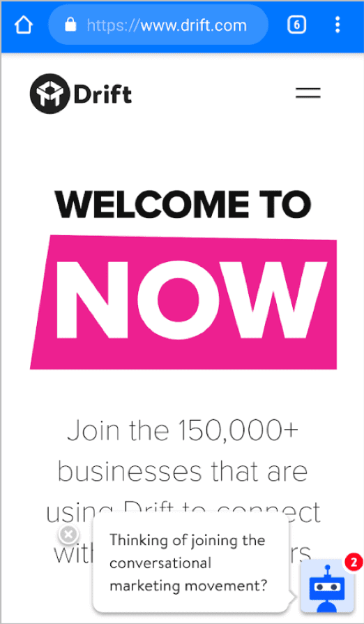
A brand that does this well: Drift
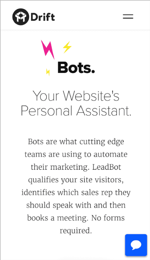
Drift.com, a provider of bot-based communication apps, does a great job with the copy on their landing pages.
Branded traffic to their site (visitors who type in 'drift' directly) see this homepage experience:
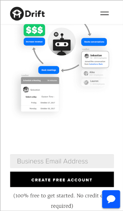
In the next two screen views, the visitor sees the 'old' way of marketing clearly and visually contrasted with the 'new' way.
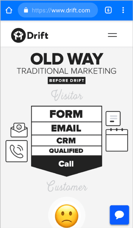
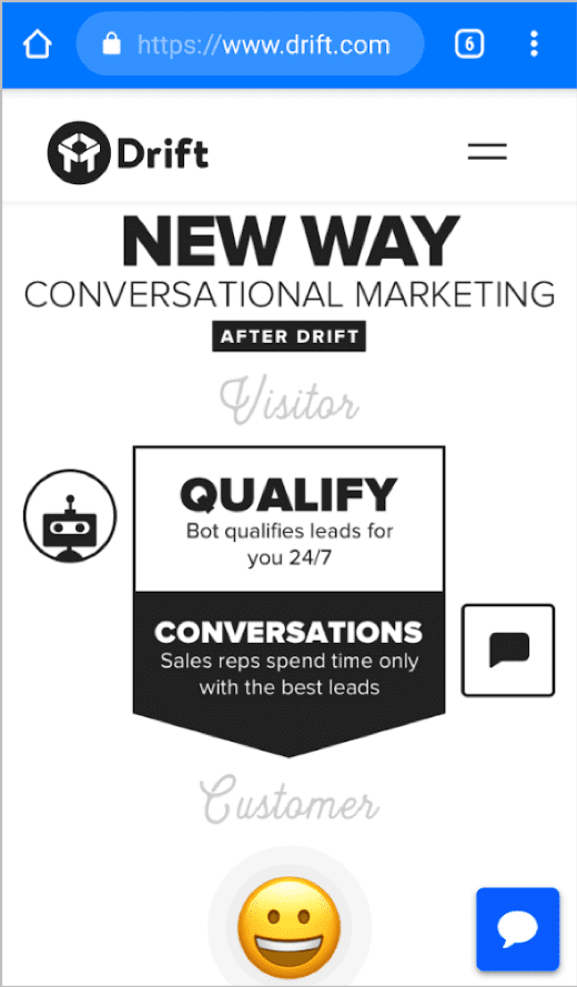
Other content on the page reinforces the bot-based automation, and personnel cost savings, their solution provides.
Further down the page, their lead form is simple, requiring only an email entry. They know they can capture the prospect’s full name, phone number and other company details at a later time.
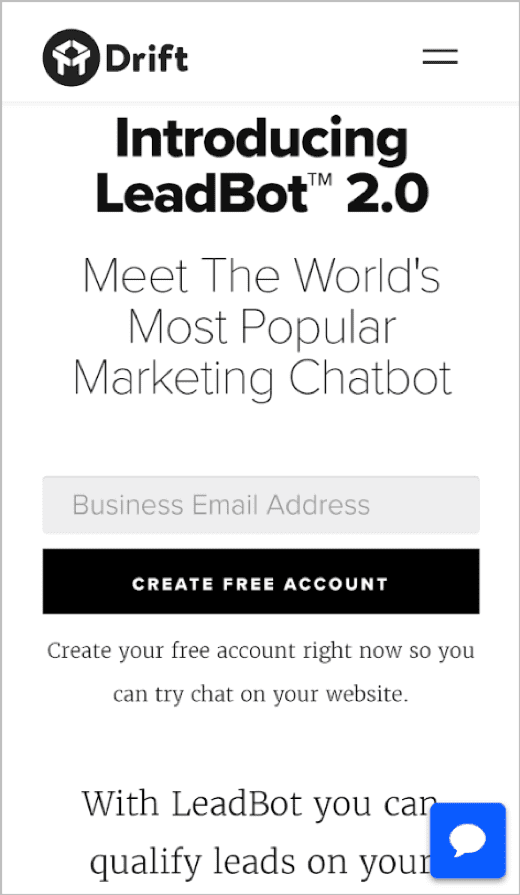
Here’s a common landing page for one of Drift’s organic traffic channels. The visitors land here after searching for 'bot-based lead qualification,' then clicking the search result link.
Also note: they use big, black easy-to-read fonts. Your mobile experience isn’t the place to use small, greyscale font styles.
2. More cleverly capture prospect emails
Raise your hand if you’re tired of those pop-ups that appear one second after you land on a sales website. Me too! The moment you enter a virtual store is definitely not the time to ask someone to complete a survey. If you’re going to offer me a discount, just tell me the deal early in my experience, then automatically apply the code if and when I decide to buy.
When it comes to asking for emails, the first psychological hurdle to overcome is 'WIFFM' (What’s in it for me)? The second hurdle is timing and technique (what I call the 'cleverly' part).
Let’s assume that you’re selling a cloud-based CRM product priced starting at $299 per month and that your typical prospect has touched your brand a few times before hitting your landing page. Your messaging has successfully answered the WIFFM part, and they're willing to act. How and when do you ask for that email?
Now’s the time to be creative, and think like a great salesperson would. Ask yourself:
- When is the best time for us to ask for personal information?
- How and when should we interrupt to ask for it?
- What privacy reassurances can we provide?
How to interrupt
We have enough interruptions in our lives these days. So when you interrupt your visitors on your landing page, be sure to use conversational language - friendly, attention-getting phrases like:
‘Hi! We noticed that you’re looking at our features. Want to see how we compare to other cloud-based CRM apps (including a few 'biggies' like Salesforce)?’
Note that this messaging:
- Is contextual: asks your visitor prospect if they want to learn more about this specific, top-of-mind topic
- Puts your prospect in control (they can easily press 'no thanks' and continue)
- Adds value - provides info that increases your prospect’s knowledge and confidence in your solution.
You can capture emails in one of two ways: via a lead-generation form or via a chat invitation (chat invites didn’t use to require emails, but I’ve noticed that they increasingly do, and this is a good practice, especially for higher-priced B2B offerings). Whenever you do capture emails, just make sure you don’t send your prospects marketing emails afterward, unless they’ve opted-in to receive them.
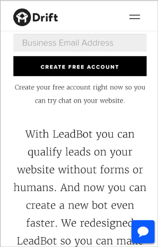
Note above that Drift places their email capture form directly on the page, after their sales copy. That’s the tried-and-true method. You can also push the form or invite your visitor under certain conditions. The mobile version of 'lightbox' layer works well for this purpose.
Ok, now that you have a sense of how to interrupt, let’s discuss the when part.
When to interrupt
Regarding when to show your lead-gen form, it’s probably not during the first touch, but after your prospect has interacted with your brand enough to be in the 'interest' or 'consideration' stage.
The way to do this is with triggering rules, rules that govern things like:
- When your email form should appear (after how many visits, interactions, seconds, etc.).
- Which message your visitor should see based on the sales or landing pages (or even portions of pages) they have viewed.
You can either manually code these rules yourself (or have a developer do it), or in an automated way (via a personalization platform). I recommend doing the latter, because a. it’ll be easier for you to manage the rules going forward, and b. the algorithms included with the latest AI-based platforms are pretty impressive and they keep getting smarter over time.
Admittedly, adding in this type of logic can get a bit complicated. So don’t get carried away when you’re first exploring these email capture form 'how' and 'when' mechanics. My main point is that you need to strategize on how to build this level of thinking into every experience you serve up. Only by doing so can it be more contextual and relevant and thus more compelling and actionable.
3. Use lower-commitment CTAs
On mobile devices, as I shared in this Quick Win, you can’t expect to get that final conversion very often. You should instead focus your mobile experience on the goal of capturing more qualified leads in the form of emails so you can start the conversation.
So, your call-to-action (CTA) buttons on your sales and landing pages shouldn’t have end-conversion labels like 'Buy Now' or 'Sign Up.' Instead, they show offer low-commitment actions like 'Explore', 'Learn More' or 'Try it for Free'.
Think of this interaction as if it were dating. After 20 seconds of chatting, you wouldn’t ask your date 'to come in for a drink' (unless you were a digital Don Juan!). You’d say something like 'Great talking with you - can I see you again next Friday?' That question is much more likely to get a positive response.
It’s the same in the digital realm. After your headline and copy have captured your prospect’s attention, and they're confidently swiping up (to move down your page), you should guide them to a reasonable next step, such as:
- The option to view more content of interest (interview or poll your prospects to discover what these things are).
- The option to fill your lead-gen form in exchange for getting something of real value (e.g. a free 'how-to' article download, video, free trial, etc.).
Be sure to include some assurances beneath these buttons (or prominent links). For example, if you offer a free trial for your SAAS, you could add:
- No credit card required
- Plans start at $99 a month
- 30 days to cancel
Lastly, make sure your CTA label completes the phrase 'I want to…' that way it’ll be in your prospect’s language rather than your marketing lingo.
Make your CTAs 'sticky'
Embedding your CTAs within your page is a great practice; you’ll just need to do it multiple times as the prospect moves down the page. But making your primary CTA persistent (always visible) is better yet.
Who does this well: Trello
Card-based project management tool provider Trello implements persistent CTAs well.
As shown in the screenshot below, their 'Sign Up' button appears in the top right part of the screen, even as the user scrolls.
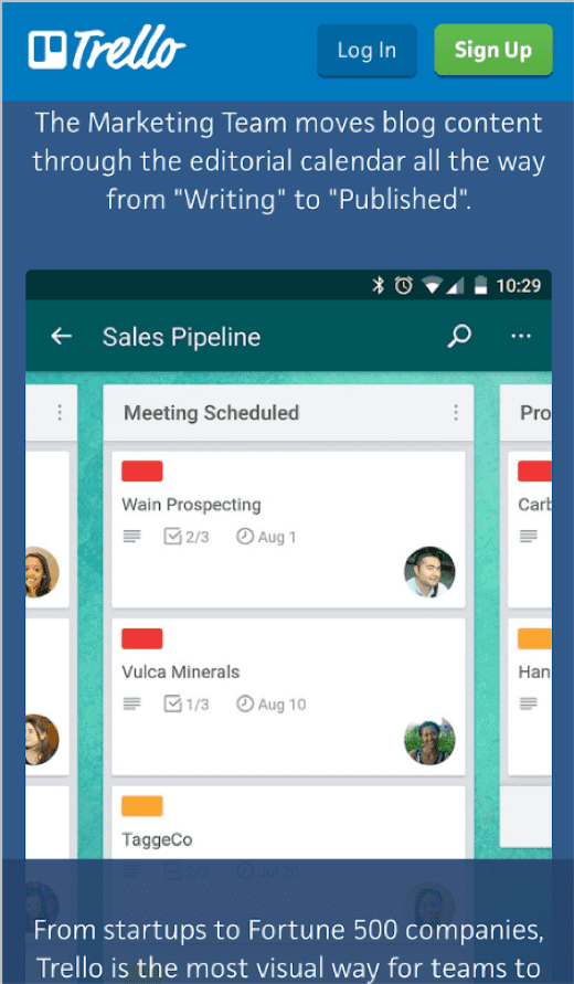
And, even though the button’s persistent, they still embed it within the page.
Redundancy’s a good thing, especially when you consider that our eyes can only focus on a small portion of the page at a time.
Take a second look at the copy Trello and Drift are using and how well it ties into their CTAs. This is the flow you’re seeking: grab attention, engage with copy, prove your case, then make your 'ask'. Simple in theory, but this admittedly takes time to master. But, as with most things in life, the only way you’ll get better is to practice, practice, practice (and continually split test variations).
Summing up
There you have it - three techniques you can implement quickly to lift the conversions of your mobile landing pages.
Our brave new mobile world offers you a great opportunity (actually, I’d call it more of an imperative) to take your marketing messaging overall - and lead generation, specifically - to the next level. So, rather than just making your desktop lead-gen site responsive and hoping for the best, now’s a great time to step back and identify the real pain points your prospects have, then drive them to more useful content, and finally on to your email capture forms.
Be a little assertive and 'push' lead-gen forms and chat invites if you want. But always remember that your visitors are in control. The better you inform them and prove how you can make their work lives better, the more likely they’ll be to buy from you down the road.