Don't forget the bigger picture
When writing emails, we do like to "optimise" each individual element of the message. Which is a good thing, provided that optimisation takes account of how those elements interact with each other.
If it doesn't, you end up with mails like this:
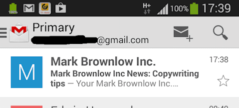
From line, subject line and preheader are all individually optimised to ensure people recognise the message. But the combined impact is over the top and ignores the potential of, say, the subject line and preheader to better highlight why someone would want to take a closer look at the mail. (And, yes, I have seen mails like this!)
There's a broader impact to consider that depends on the combined impression generated by these elements as people work their way (or not!) through the email. It's why you might ask your copywriter for a headline change and find them rewriting the rest of the text, too. It all hangs together.
By way of example, here are three ideas that acknowledge the interaction of your call-to-action button with other elements (and apply equally to non-email text, too).
Tip 1: Would a benefit reminder help?
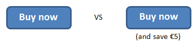
The main benefits of an offer or some information are likely expressed early on in a text or email, perhaps in the headline and first paragraph. It's worth testing whether a so-called benefit reminder in the CTA might boost response, especially if that CTA appears (much) further down the mail or page:
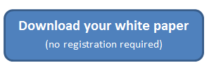
This reminder concept can also cover statements designed to address concerns or remove doubts:
Tip 2: Add dynamism
Whether something looks clickable or tappable also depends on the other elements around it. If you have a lot of small banners, button-like shapes or highlighted text, then people may find it harder to pick out your actual linked CTAs.
One option (apart from a broader redesign) is to use an arrow or "right-pointing double angle quotation mark" to indicate something that takes you somewhere:

Tip 3: Consider a CTA hierarchy
Not every email has a single CTA, and not every CTA is equally valuable. So...not every CTA should be equally prominent. You know intuitively that you wouldn't put your "Shop now" CTA in tiny light grey text next to a whopping great orange button marked "Unsubscribe".
This variable prominence helps draw readers to the most interesting or valuable of your promotional CTAs.
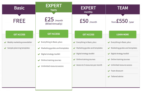
Smart Insights does this when you browse membership options, highlighting the one that makes most sense for visitors:
Don't forget...
Since each audience is unique, it's hard to predict responses to copy and design changes. There are few guarantees and different CTA approaches can lead to improvements, change nothing or make things worse. So test these suggestions out for yourself. You'll also find many more tips in the CTA module in our SmartInsights copywriting course.


