A tutorial with examples and ideas of what to test
Prominently displaying why users should buy from you rather than a competitor is extremely important for any business look to increases online sales, particularly in retail, but it applies across many other sites.
As Bryan Eisenberg, author of Always Be Testing can Call To Action explains in this punchy clip, testing value propositions can have a massive impact on conversion.
"If you're not doing this, you're wasting your time"
Given this, value propositions are something that I love to test. Smart Insights have covered the importance and examples of value propositions in other posts on their hub page, here I'm going to focus on testing, looking at retail Ecommerce examples. I will looking at testing and optimisation point of view, starting with a review of value proposition and then looking at specific examples and things that you can test. After reading this postI hope you will be buzzing with ideas that you want to test!
Types of Proposition
There are a few different types of proposition message, which should be understood and used in appropriate places.
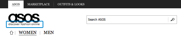
UVP - Unique Value Propositions
This should answer the question 'Why should I buy from you'. Typically this is a short statement explaining what the brand offers that is displayed prominently on the site, often as strap line. This should be distinct from your competitors. Here are a few examples:
ASOS - "Discover fashion online"
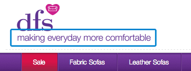
Naked Wines - "We are a customer funded wines business"
USPs - Unique Selling Proposition or OVP - Online Value Proposition
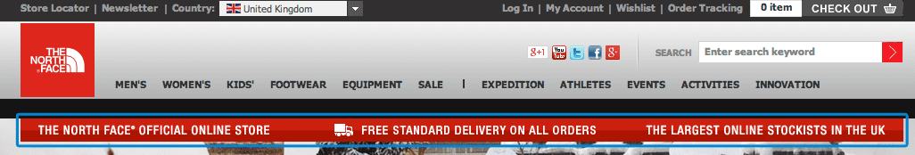
Your online service USPs are more focused on the shopping experience and what benefits visitors gain from shopping with you. They are often featured under the top navigation, so they feature on every page of the site as the M&S and North Face examples show. For example:
365 Day Returns
The Official Online Store
The UK's largest stockist
UCP - Unique Campaign Proposition
Campaign propositions tend to be more temporary in nature, highlighting the benefits of a specific campaign. For example:
Get an extra 10% off with code Jan10
Free upgrade to next day delivery this weekend only
Key Areas for Proposition Messaging
In the following sections I will highlight some areas with examples of well placed proposition messaging. Some will seem obvious, but there might be a few that you hadn't considered before.
UVP in Header
Whether tucked in with your logo or placed alongside it, it is common to see a retailers UVP somewhere in the header section of a website.
Ideas for testing:
Test adding in a UVP message
USP Bar
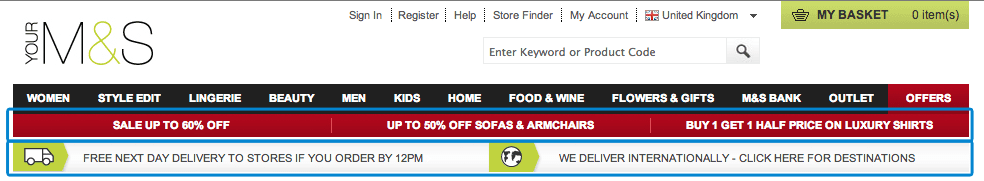
I'm sure you'll all be familiar with seeing proposition messages placed in a bar below the primary navigation. It's an area that I love to A/B test and I've seen some great results.
In the example below M&S actually have two bar with slightly different types of messaging.
Ideas for testing:
Delivery USPs
Secondary UVPs, e.g. Largest UK stockist, Exclusive online products
Include Returns USP message
Test adding UCP messages, e.g. 10% discount with code Jan10
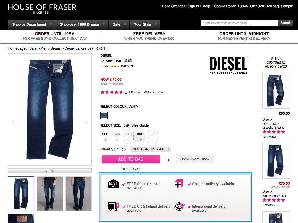
Product Detail Page
On the product page we often see messages about delivery as this is an important consideration when evaluating the cost of a product and adding up the total cost with delivery. A compelling delivery proposition is likely to stop users from looking for the same product at a better price elsewhere.
Ideas for testing:
Delivery USPs near the main price
Delivery USPs near the main CTA
Payment Methods near the primary CTA, e.g. if you have Paypal
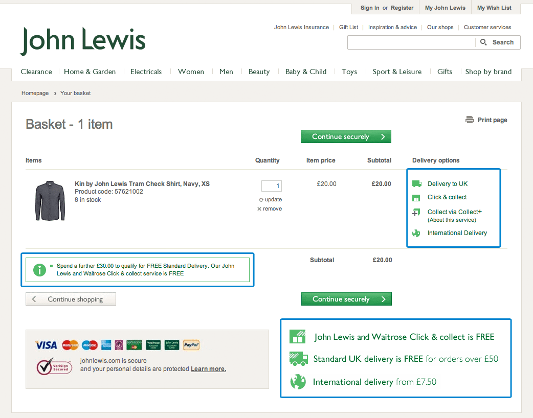
Basket
The basket is another key opportunity to persuade people who have chosen items, that they should continue on to checkout. Reducing abandoned carts through persuasive proposition messaging can greatly increase final conversions.
Ideas for testing
Test dynamic Free delivery threshold messaging, e.g. Spend £X for free/next day delivery
Test 3 for 2 type messages if items added to basket are part of bundle deals.
Checkout
Throughout checkout showing certain messages will reassure customers who may have concerns, for example, messaging about security may reassure users.
(from AO.com)
Ideas for testing
Test CTA button wording, e.g. 'Checkout Now' vs 'Checkout Securely'
Test third party security icons, e.g. Norton Secure, Comodo Secure
Mega Menu
One of the advantages of using a full width mega-menu is that there is space to structure the navigation is a clear and transparent way. I have found that it is often possible to add key products or promotions, as well as key proposition messages within the USP bar.
This example from Optical Express highlights a key service, shows that it is free and even includes a call-to-action button.
Ideas for testing:
Test adding a USP bar along the bottom of your full width mega menu
Test dedicating a column to USP messages or key products or services.
Mini-bag
Another area that you might not have considered is the mini-bag. Usually in the top right of the header and available on hover, there could be an opportunity to include a persuasive message here.
One thing I always recommend is to be clear and up-front about delivery charges. If you have free delivery by default or the user has somehow qualified for free delivery based on basket total then including a message notifying the user in the mini-bag can be very influential. Users can see at a glance that they will not be hit with a delivery charge later in the shopping journey.
Ideas for testing:
Test adding a USP message in your mini-bag
The right messages at the right time.
One thing to be careful of with proposition messaging is including relevant messages at the right time without causing too much distraction or even introducing concerns for users.
For example, in the John Lewis example, we have seen that there are a large number of security messages in the checkout. For John Lewis this might work well due to the confidence in their brand or to deal with known concerns of their target market, but in other examples introducing lots of security messaging can lead users to think about security in a more negative way. You run the risk of raising concerns that they may not have considered without the messaging.
The Good News: We can test all these messages
One of the best things about developing new test hypotheses around proposition messaging is that in many cases they can be tested really easily. If you have large traffic volumes you can also run multivariate tests to test a range of variations.
When I plan out a testing schedule I always make sure that I include a number of simple USP copy tests that can be used to fill gaps between tests with more dependency on design & development.
What’s the best proposition test you’ve run? Always on the lookout for interesting examples.
Thanks to Matt Lacey for sharing their advice and opinions in this post. Matt Lacey is Head of Optimisation at PRWD. You can follow him on Twitter or connect on LinkedIn.
By Matt Lacey
Matt Lacey is our commentator on Site Testing and Optimisation as part of Conversion Rate Optimisation. Matt Lacey is Head of Optimisation at PRWD.
You can follow him on Twitter or connect on LinkedIn.
Strengthen your strategy with RACE-powered templates, frameworks and planning tools designed to help you review performance, identify improvements and build a more effective marketing approach.
 (from AO.com)
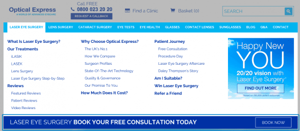
 Thanks to


