How do you make sure that your website’s user experience is on par with your visitors’ expectations?
There is a very close relationship with a website’s user experience and the conversions you generate from it. Getting traffic to your website is only the first step; from that point on, you need to provide a good enough user experience to make your visitors want to hang around for longer and even more so, convert.
But how do you make sure that your website’s user experience is on par with your visitors’ expectations?
How to run an effective CSAT survey
You may need to carry out a customer satisfaction survey to learn more about what people like and loathe about your brand. They're great ways of gaining insights that can drive your digital transformation, so use our Quick Win to learn how to quickly create an effective survey.
Access the Run an effective CSAT survey quick win
In this blog post, I’m going to share four tips to help you improve your website’s user experience and conversions.
Know what your visitors expect from your website
In order to improve your website’s user experience you first need to learn what your visitors expect from a website; below are the most important elements to consider.
- Speed: Slow websites aren’t as frequent as they used to be even just a few years ago, but unfortunately, it still happens often enough. If your website isn’t fast enough, most people will leave it almost immediately (almost half of web users tend to leave if a website doesn’t load in three seconds) – and that will definitely have a big impact on your conversion rate.
- Navigation: Another element that visitors will expect from your website, is a clear, easy website navigation. The easier you make it for them to venture through your website, the better - and the better the chance they will convert as well.
- Design: Visitors also expect a beautifully-designed website, especially when it comes to a business website. If your website looks cheap or has ugly images, it will lose you a lot of visitors (that never come back).
- Responsiveness: Is your website mobile-ready? Like speed, a mobile-ready website seems like an absolute must-have… and it is. But also speed, it’s still uncommon to see a website that has nothing to do with mobile devices or bad mobile websites where users can barely find anything of value (sometimes, mobile websites are stripped down of navigational options, which can make a visitor very frustrated).
These are the most important elements to consider; of course, there are many other small things that visitors often look for in a website but these are the first four you need to check and improve.
Understand how visitors use your website with heatmaps and scroll maps
One of the best ways to improve your website’s user experience and conversion rates is to take a good look at your website and how your visitors use it.
Heatmaps and scroll maps use colours (warm – reddish colours – to cool – blueish colours) to highlight exactly which parts of a page get the most attention from your visitors.
This type of knowledge can tell you a lot about your visitors, the user experience and what areas of your website and landing pages need work.
For example, you can use tools like Crazy Egg and Hotjar to see your own website’s heatmaps:
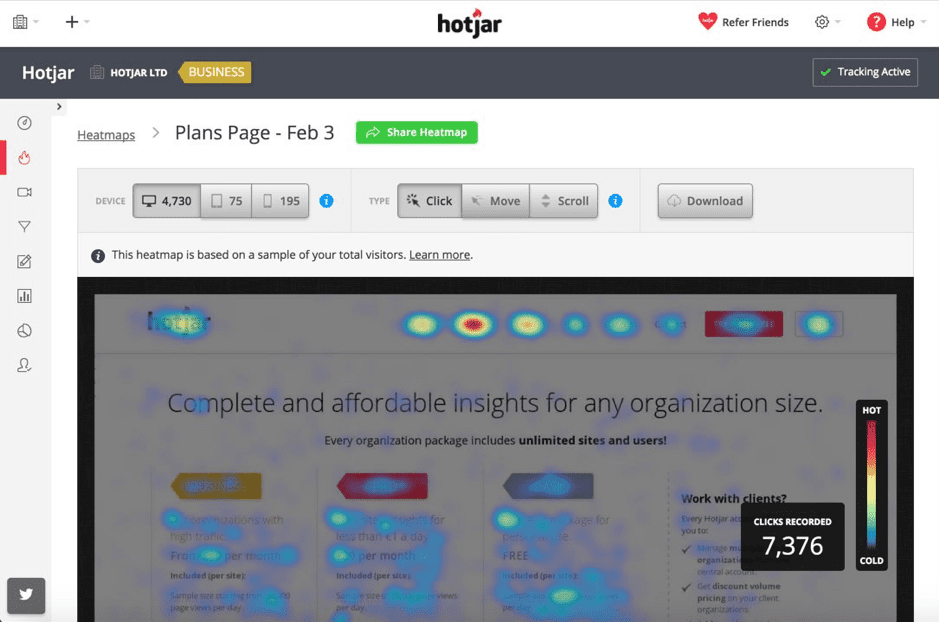
They will tell you where your visitors get stuck on your website, meaning you need to find ways to improve the user experience so that more visitors will continue past that point. They'll also show you whether your calls to action are truly visible, if your navigation system is easy to use and other important information about your visitors and website.
You can even record the sessions of your visitors to see exactly how they act on your website – this will be of huge help with finding out what needs to be changed or optimized.
Improve your website’s navigation
As I mentioned earlier, your website’s navigation is extremely tied in with the user experience and your conversion rate. Bad navigation will lead to people leaving your website – and not coming back – while good website navigation will not only keep people around for longer, but it will also help convert more users as it’s easier for them to find what they’re looking for.
For example, if we look at the Amazon homepage, everything is very easy to find.
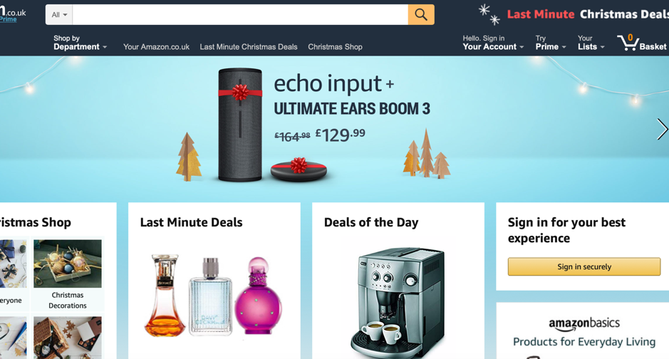
At first glance, you can see offers that are relevant to you, as well as any deals of the day or last minute deals – all you have to do is click on them to see the offers. Plus, in December, you can also see the Christmas Shop option in tw different places, as well as a tab for last minute Christmas deals. If that’s still not what you’re looking for, then you can click on "shop by department" to see an extensive but very well-organized list of all their departments.
In other words, anything you might need is readily available on the home page and is easy to get to. This is what every website (especially business or e-commerce websites) should be like.
VWO has done a very interesting case study on this subject, looking at how new and improved navigational system affects a website’s conversion rate. Turns out, it can have a pretty big impact.
The change was quite simple but incredibly effective; by using heatmaps, it was found that visitors weren’t interacting enough with the top menu. So, what they did was include a clearly visible navigation menu on the left-hand side of the screen, whereby each subcategory is clearly visible. This simple change resulted in an 8.9% increase in user engagement and what’s more, a 34% increase in people adding products to their carts.
Using heatmaps, study your own navigation menu to see whether your visitors are properly interacting with it or whether they’re facing issues and stopping.
Leverage white space on your website
On a website, white space is any empty space: on the sides, between paragraphs and so on. While it might not seem so at first glance, white space can have a pretty significant impact on both the user experience and your conversion rate.
For example, the use of white space strategically can:
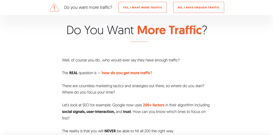
- Help you highlight a specific message that you want your visitors to see; for example, Neil Patel uses a lot of white space on this landing page so that visitors focus solely on his message.
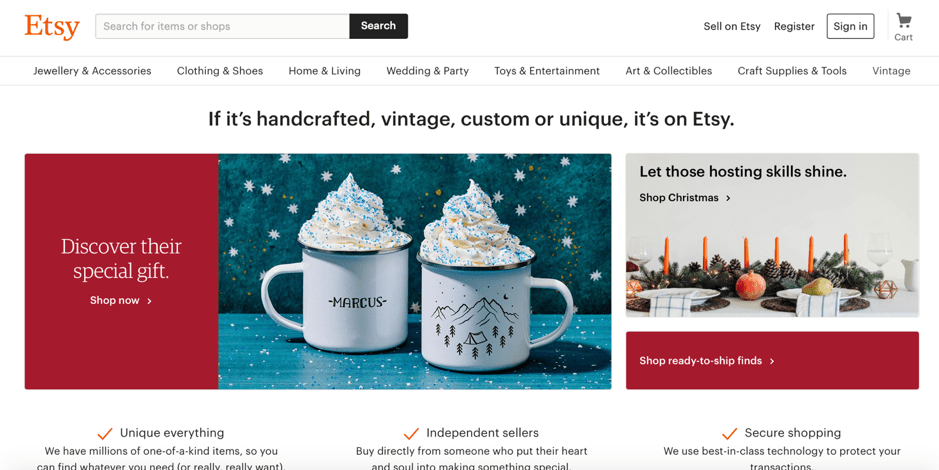
- Draw people’s attention to something: if you want people to notice something specific on your website (an offer, a specific product, etc.) you should use white space around it. For example, like Etsy wants visitors to focus on buying some Christmas gifts:
- Help you better organize your content and elements; for example, eBay uses whitespace on its homepage not only to organize the different elements but also to make things clearer and easier to find for their visitors.
Conclusion
Your website’s design will have a huge impact on your overall conversion rate, either negative or positive. To start improving your website, you first need to know what your visitors expect from you; for example.
- A speedy website
- A website that works just as well on a mobile device as it does on desktop
- An easy to navigate website
- And a beautiful clean design that’s easy to understand and beautiful to look at
However, one of the most important lessons I’ve learned about website design and conversion optimization …is that it never ends. Year by year, continue testing new strategies, improving your website and looking for ways to improve. It’s important to understand that there’s always room for improvement as expectations change and technology evolves.