Examples of high converting calls to action to inspire your own copywriting
To succeed online you need to build an effective testing and optimising strategy that will help you to maximise conversion rates. How do you know what are the most important things for a better conversion? Versatile. scientific testing, pages optimization, various payment gateways, landing pages, and more. These factors will definitely help you to improve your bottom line by getting higher conversion rates. One of the most effective ways to boost your conversion rate is to improve your calls to action by making them more compelling.
You can test many different messaging and design techniques to boost conversion, but in this article I will focus on the humble CTA to get your audience onto the next stage in the path to purchase.
You can create a great CTA of any shape, style, and size. The main thing is to create CTA buttons in keeping with the style and idea of your website. Log in, Shop now, Get Your Discount, Add to Cart are some popular examples of modern call-to-action buttons.
There are lots of tips on the web that were collected to help you make the right choice of placement, shapes, colors, text, and more. Today’s post will help you to to discover the secrets of effective and powerful call-to-action buttons. You will learn more about CTA buttons placement, their color solutions, shapes, and text.
Target Placement of Call-To-Action Buttons
How can you make your call-to-action buttons work for you? Fortunately or unfortunately, there isn’t any definitive placement system. It depends on your own website’s specialty and page template structure. You can easily find the best place for setting up your buttons by testing them with the help of A/B testing.
First of all, try placing your buttons above the fold. Although some website visitors will have the motivation to scroll down the whole page during their research, many others want. They will be impulsive and will be more likely to click through to find out more or buy if the CTA is clear. Placing your buttons above the fold will serve your customers with your solutions at a glance and will, therefore, boost your conversion rates.
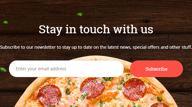
If you use various entry fields for additional info with your offers, you’d should place your call-to-action buttons in the same line. Usually, we can see that in newsletter subscriptions. People add their info, and click the button. This means the offer does not detract from the sites.
Do not ignore the power of the right amount of promotional text alongside the CTA. As we know, too little may not be persuasive enough, too much can get in the way of your offer. You can test placing up to two call-to-action buttons in promotional text to succeed. For example, you can place your buttons in a classic manner: in the beginning and in the end. It will help you to avoid an overloaded text and will make your customers to get interested, to keep interested, and to click on your offer.
Color Solutions for Call-To-Action Buttons
Colors play an important role everywhere in our life and call-to-action buttons are no exception. There aren't any rules for which colors work best, but there are three general principles you need to apply.
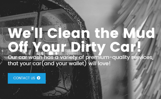
First of all, make your CTAs stand out through contrast. They should be attractive and catchy for your audience. The color should highlight the button among backgrounds and content.

Whilst they should stand out, they also need to fit the design so they don't spoil the overall aesthetic. This is a different balance to pull off, but the design above shows it can be done.
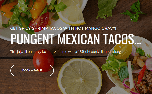
Pay attention to your audience. If you will be more attentive to people’s preferences on your website, you’ll get your target audience, so, will boost your conversion. For example, using dark colors and subtle backgrounds on a kid’s website will definitely make you a loser. Make sure, that your website’s design fits age, gender, social status, etc., of your audience. The youth adores bright colors, so, make your CTA buttons look fruitful and catchy. Professional audiences prefer shades and low-key tones, so, it’s better to create your call-to-action buttons look restrained and laconic as on the example below.
Call-To-Action Button Shape
Discard all the common tropes, and make your CTA buttons look special, extraordinary, and unique. Well-shaped call-to-action buttons will definitely help you to hit the mark.
Call-To-Action Button Text
What do you think about the text on versatile CTA buttons? Every well-done call-to-action button should have two or three words on one line, rarely more. A CTA button should have the target word that perfectly matches what the client receives after clicking on it. For example, subscribe, shop, get, buy, win, and more. Every visitor should feel the benefit they will get after your call-to-action buttons. If there is no benefit for the customer they won’t click. Action verbs work best.
Your CTA buttons should evoke a desire to act and to hurry up to get your offer. That’s why it is best to avoid overworked words that your visitors are totally sick of. Use particular text that will follow your effective words. In an ideal situation, you need to use effective verbs together with a suggestion-referred text. Book a table, try a demo, and download a freebie are pretty good examples.
Call-to-action buttons are a great solution to present your message to visitors. Furthermore, messages with CTA buttons get much more conversion than messages without them. People have different tastes, so, what captures one audience, won’t capture another one, and vice versa. That’s why you should pay attention to the kind of audience you want to send your message to. There are some basic tips on how to make your CTA buttons text hit the mark.
First, if your audience loves improving their knowledge base, start your call-to-action buttons from “Read” or “Learn” words. It will help you to evoke the interest of such kind of people and to keep them engaged.

If you deal with curious people, start your message with “See”, “Find”, “Explore”, or “View”. CTA buttons with these phrases will make your clients click on your offer because they will be too curious to skip it.

If your audience is waiting for benefits from your offers, capture them using “Get” or “Grab” in the beginning of your call-to-action button’s text.

Finally, do not hesitate to start your CTA buttons text with a frank “Buy”, or “Order” it will evoke an aim to get the offered products as soon as possible.
 Another cool way of creating effective call-to-action buttons is to brighten them up with versatile elements as shopping cart, wallets, hearts, smiles, arrows, etc.
If you want to boost your customer's motivation, add “Now”, “Right Now”, or “Today” to your call-to-action buttons. How does it work? Someone may think that he/she needs to hurry up because this offer is limited, meanwhile, someone may think that there is something extremely special and exclusive behind this kind of CTA buttons.

If you have any free products or services on your website, do not forget to highlight them for your visitors using right CTA buttons. The word “Free” is a very effective method for making your customers click through. Anyway, the most important thing is to provide your visitors with the reason to click on your call-to-action buttons. Well-done CTA buttons are pretty cool but the message above them should be captivating and worth reading more. Pay attention to your visitor's needs, their preferences, highlight reasons for buying, reading, etc., and make sure your message is clear enough to avoid surprises after clicking on them.
Summary
So, we should highlight that versatile call-to-action buttons are a final step in boosting your conversion rates. That’s why it’s so important to learn their techniques and tricks. Enrich your websites with well-done CTA buttons underpinned by laconic and motivational text, unusual shapes, correct placement, and captivating color. Do not be afraid of experiments because effective call-to-action buttons can also be a great figment of your imagination!
We hope that this article will be useful for you and will help you to take your conversion rates to the top. If you need some more examples, you can see professional and effective CTA buttons in this example of WordPress themes. We’d love to hear from you, so, you’re very welcome to share your thoughts about versatile call-to-action buttons in our community.


