Building your landing pages around the call-to-action
‘Best practice’ learning promotes placing the primary CTA (call-to-action) for your landing page near the top of the page, above the fold. At face value, this seems logical, right? You want visitors to complete the primary goal for the page, which means following your CTA.
However, there are several reasons why this basic recommendation isn’t necessarily true or accurate:
1. The ‘fold’ is a myth
The mind-numbing variety of devices (it’s estimated there are about 6,500 and counting!) means that the fold is not a fixed entity and depends entirely on the device type accessing your landing page.
2. Your CTA should be placed where an action is most likely to be taken
New visitors to your landing page may not know who you are and what you do. These people are less likely to be willing to commit to an action immediately as they need to know that you are reliable and trustworthy. Therefore, expecting them to take action as soon as they land might actually put them off staying on your landing page – it can seem like an over-zealous salesperson.
3. Putting the CTA above the fold could detract from important content
When you need to persuade visitors and address their potential barriers to conversion, you need persuasive copy to take main stage. A prominent CTA could detract from visitors seeing/reading this copy and adversely affect their likelihood to take action.
In this blog post I look at different options for placing your primary CTA and provide case studies of good and bad to help illustrate the impact of positioning.
A caveat I need to point out – without access to the web analytics data behind these landing pages, I can’t validate my analysis. My evaluation is based on my own experience of optimising landing pages and the wealth of case study material I have read over the years. Still, it would be foolish to claim to be 100% right….
What factors determine the ideal location of my CTA?
I’m going to focus on 3 key factors. There are, inevitably, more but in my experience these are the 3 that you should focus on:
- Goal of the landing page
- Audience intent
- Complexity of the offer
Factor 1 - Goal of landing page
Not every landing page is designed to generate leads or convert to sale. Some landing pages are created to educate customers and promote brand awareness. Therefore, the CTA placement needs to match the goal of the webpage – if you want people to read content, don’t distract them with a CTA that will take them away from the page. Instead, use the CTA to take them to the next level e.g. contact form for a follow-up call.
Example landing page where goal is form completion - Square
Technology start-ups commonly use simple landing pages with a prominent CTA at the top of the page, so it’s visible on most browser sizes.
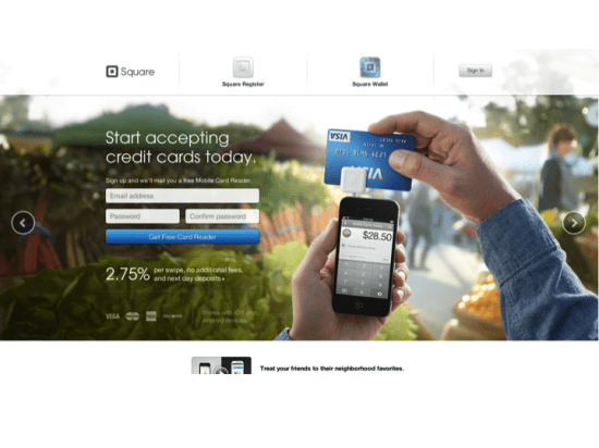
Evaluation
- Strong image makes it clear how the product works
- Simple message to explain what the product does.
- Free message reduces risks of taking action.
- Easy to use form to request free product.
- BUT no clear content about who this is for and why you would use it – assumes people know.
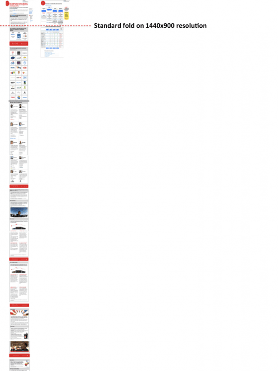
Example landing page where goal is education & conversion - Econsultancy
Econsultancy offers a wide range of products and services. They recently changed their Membership landing page to long form, breaking up the copy into different sections to promote USPs. Between each section the primary CTA is promoted. You can see from the image below just how long the page really is!
Evaluation
- Aspiration led, appealing to the business audience.
- Using visual endorsements via brand logos and testimonials.
- Quick link at top for those who don’t want to read on.
- Copy to promote their USPs and key service areas.
- No quick links at top to each content area – makes you work hard to access the content that is relevant to you.
Does it work?
Yes and no. It is successful in communicating the value and benefits of membership but the page still makes the visitor work hard to get all the relevant content. Is enforced scrolling using a "squeeze page" the best approach? From experience, we don’t think so, but that’s not to say it can’t be if additional techniques like HTML quick links or expanding content blocks (accordion JavaScript) are used to make it easier to navigate.
Factor 2- Audience intent
Why are people visiting your landing page? It’s an essential question to ask yourself. The answer will help you determine what they will expect when they get there. For example, if you have sent an email campaign asking for people to take action, then you need to make it easy for them to take this action on the landing page.
The good: example charity landing page encouraging visitors to take action - Avaaz
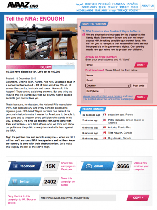
Evaluation
- Email marketing promotes a social campaign that Avaaz wants members to sign a petition for.
- Landing page provides summary of the campaign to reinforce relevance.
- Prominent and easy CTA on the right to sign the petition quickly.
- Social proof provided to encourage conversion.
The good: example landing page to promote a software download – OpenOffice
Open Office has a different challenge – it needs to convince visitors that its software is a suitable free alternative for MS office. It uses persuasive copy and reassuring messages to entice visitors and visual techniques such as down arrows to indicate there is more content available.
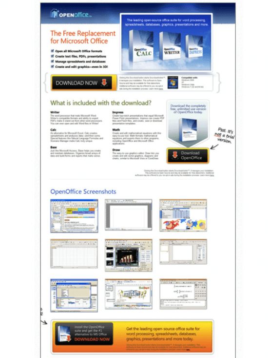
Evaluation
- Repetition of the word “free” to remove barriers to conversion.
- USP listed at top to reassure visitors the product is relevant.
- Use of product screenshots to visualize the offer.
- Conversational style copy to engage with visitors.
The bad: example landing page to promote a range of services – Club Wembley
Club Wembley is the hospitality arm of Wembley Stadium. Hospitality is meant to be exciting, fun, potentially glamorous. Take a peek at the landing page below and tell me what your first impression is.
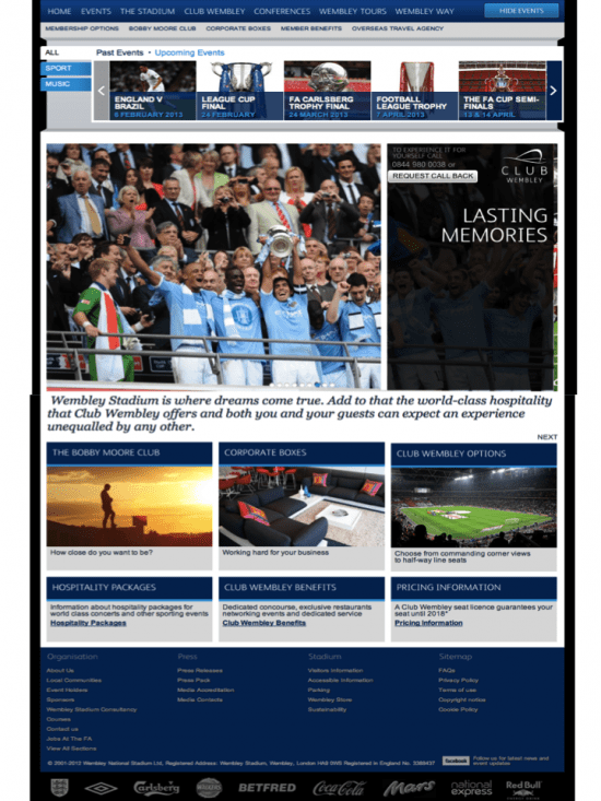
If your reaction was anything like mine, you’ll have been left completely underwhelmed. The audience intent when searching for hospitality packages is to be inspired and reassured that the investment will deliver the desired experience. Club Wembley fails to inspire visitors, instead providing a landing page that make it hard to know where to go next.
Evaluation
- The top links for individual events actually distract you from the content below as there are multiple CTAs competing for attention – these links only lead to tickets for standard event, not hospitality options.
- There is no segmentation of visitor type – what if I’m a large corporate looking to invest?
- No use of USPs – the CTA for “callback” doesn’t actually give you any teaser of what you could be getting.
- Uninspiring copy e.g. “Working hard for your business” under Corporate Boxes – that smacks of lack of effort and if they can’t be bothered, why should we?
Factor 3 - Complexity of the offer
If the product/service you offer is a complex (e.g. B2B technology services), then a shallow landing page where the CTA is immediately in view as the page downloads may not be the best solution.
Why?
Visitors need to understand your value proposition and USPs before they are willing to take their interest further. If you don’t know what is being offered and why it’s relevant, how can you commit to an action? Placing the CTA before this point of certainty has been reached can actually put people off.
However, if your offer is straight forward, then providing too much content can actually confuse visitors and obscure the CTA. Make the page as simple as possible with key information and then focus attention on the CTA.
Example of non-complex offer - Unbounce
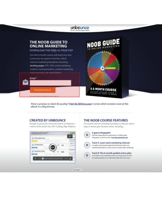
Evaluation
- Simple offer – free download of a marketing guide.
- No commitment on the part of the visitor.
- Strong image makes it clear what you’re going to get.
- Prominent CTA at top of page prompts quick action.
Example of non-complex offer – Eden
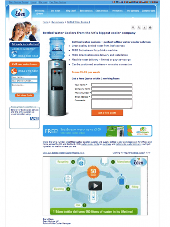
Evaluation
- Clear positioning statement to explain the service.
- Good use of product image to reinforce this visually.
- Bullet point list of USPs and value proposition.
- Simple form high-up the page to request a free quote.
- Secondary CTAs in left hand navigation don’t distract from the primary CTA, the form.
This landing page was tested against an alternative version where the form was lower down the page – this version increased business leads by 179% [Source: Whichtestwon.com – requires membership to view full case study].
Example of complex offer – Ariba e-procurement solutions
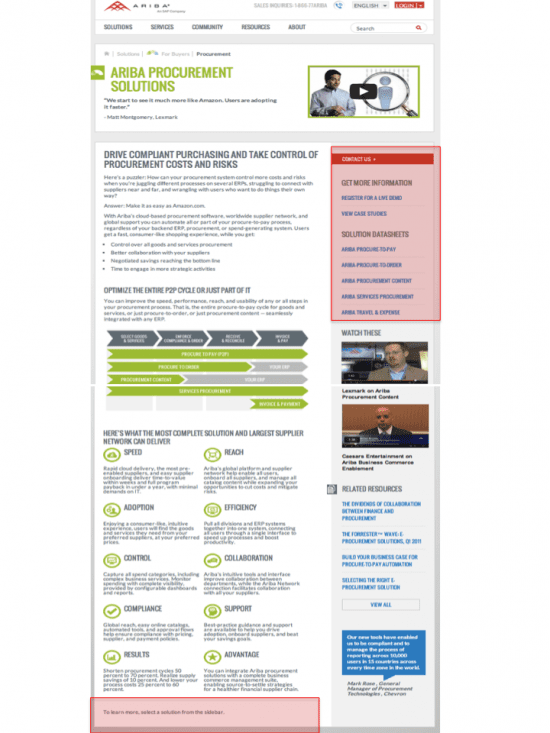
Evaluation
- Complex IT solution will multiple audiences e.g. IT, Procurement, Finance
- Good use of head space for informative video and customer quote
- Good use of key selling points
- Poor CTA – hidden at side and confused by lots of possible links to click
- No clear CTA at bottom of page when visitor is most likely to be ready to take action.
If we look at this landing page in a range of browser sizes, the issue with the CTA is further compounded:
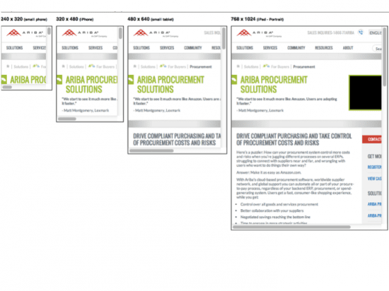
I love Matt Kersley's Responsive Design tool for evaluating landing pages in a variety of browser sizes.
Example of simplifying a landing page to improve results – Baked & Delicious
In the example below, the goal was to increase subscriptions for the magazine. The existing landing page (version A) was long and had lots of competing CTAs, including a contact form and magazine preview. Version B was designed to streamline content and focus on the primary CTA of subscription.
Which version do you think performed the best? Answers below…
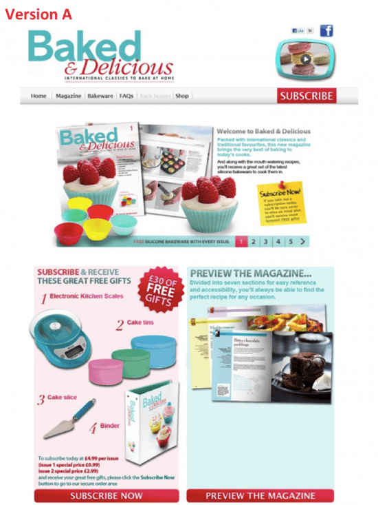
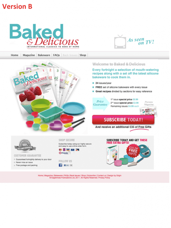
And the winner is…
Surprise, surprise, Version B increased clicks to the next stage by 31.4% and increased final subscription by 17.2% [Source: Whichtestwon.com – requires membership to view full case study].
Key take-away
My key take-away for you regarding CTA placement on landing pages is this: put the CTA where you think your visitors would most expect/need it.
The goal is to make your landing page easy to use and take action on – so think about visitor intent before deciding the optimal layout. And make sure you test – there is no reason not to do basic AB tests even if you don’t have a specialist testing tool. Look at Google Analytics Content Experiments and do some basic testing to learn how it can help you improve landing page performance.
So what do you think? What’s your experience of placing CTAs on landing pages? What has worked for you?
Please drop by and share your comments and experience – we welcome everyone’s opinion and it’s good to debate because there really is no ‘right’ answer, as illustrated by the case studies in this post.
Further reading
We recommend reading KISSmetric’s excellent blog “Why The Fold Is A Myth – And Where To Actually Put Your Calls To Action”.
For a critique of 15 landing pages and why they do/don’t work well for conversion, take a peek at James Gardner’s post on Unbounce, “15 Landing Page Examples Analyzed for Conversion (By a Honey Badger)”.
And take a leaf through Smart Insights' own good practice guide "Creating high-converting landing pages" that I recently helped update.
Thanks, James


