What a high converting landing page needs
Being a digital marketer is simple. All that’s required is to get people to do exactly what you want them to do. That is: act. That act may be as basic as wanting them to click on a CTA button to “learn more.” The act may be a tad more complex, like getting someone to share their personal information with you. Or, the act might be transactional (i.e. getting a customer to buy your stuff).
Unfortunately, getting a person to do what you want, be it online or in person, is one of the most difficult tasks in the world. Some might say, darn near impossible. Among the many powerful tools a digital marketer can enlist to aid in his/her effort to get someone to take action, the most effective is a dedicated page for a single offer.When perfectly executed, landing pages persuade large numbers of people to click CTAs, share their personal information, and purchase your goods or service.
Landing pages persuade people to act.
Landing pages deliver more leads.
- Companies with 40+ landing pages get 12X more leads than companies with less than 5 landing pages. (Source: HubSpot)
Landing pages increase sales.
- Avis saw a 15% increase in revenue, and 603% ROI using targeted landing pages. (Source: House of Kaizen)
A 603% increase on ROI! What kind of devilry is this? Surely that’s a typo.
It’s not. Landing pages work when it comes to getting people to act. Unfortunately, not all landing pages are created equal. The pages that perform the best share essential commonalities and knowing what qualities great landing pages share will get you that much closer to getting more conversions.
Here they are.
Headlines so good they’re almost criminal
Police Begin Campaign to Run Down Jaywalkers
Red Tape Holds Up New Bridges
New Study of Obesity Looks for Larger Test Group
Chef Throws His Heart Into Helping Feed Needy
The above examples are not from landing pages, but they did appear in various newspapers. So why include them in this section?
Because they work.
These headlines stop readers in their tracks. They work because they’re jarring, unexpected, and play with language. They do all the things a good landing page headline does.
What the above headlines don’t do is make the reader fixate on a single thought.
When your ideal customer is not aware of your product or the benefit it offers, then the first step demands you simply make a promise in the headline. That’s the difference between a traditional, more journalistic headline, whose task is to get you to want to read the story, and a landing page headline.
A great landing page headline will cause the reader to obsess over an overriding need. A great headline creates a need. You create a need in your reader’s mind by appealing directly to them. Be it their ego, vanity, fear, hunger, etc.

Great landing page headlines are...
Useful
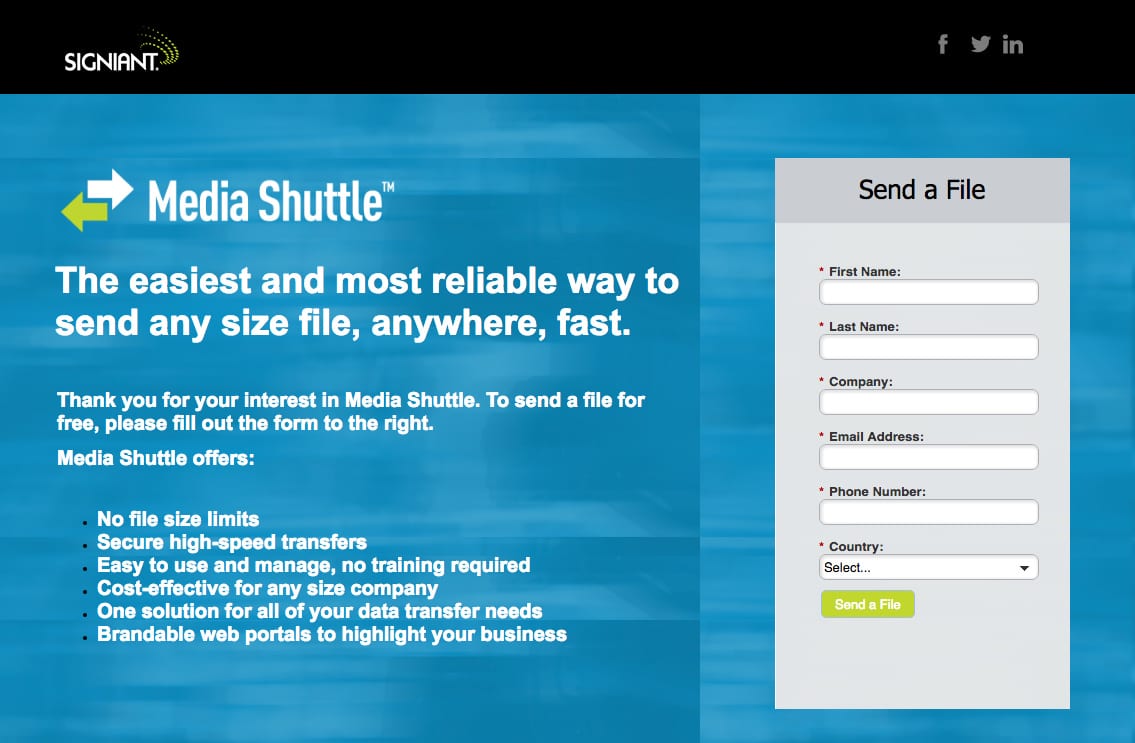
Useful headlines are very effective because they can be immediately digested. Take a look how Signiant’s landing page headline is useful and easy to understand. If you’re looking for a way to send files, wouldn’t this headline help convince you to submit the form?
Specific
A specific headline isolates a feature or benefit, calls it out, and that’s it, like Intuit’s headline:
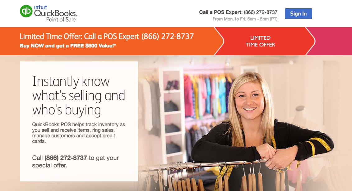
No more thinking required, the reader is ready to engage because your headline spoke directly to their need (in this case, instantly knowing what’s selling and who’s buying).
Urgent
Urgent is, well, urgent. Such as:
- Hurry before time runs out
- Limited-time offer
- While supplies last
- Don’t miss out
- The clock is ticking
- Once in a lifetime savings
- Be one of the first to join
- Season-ending close out
- Get the last of the model year
- We’re moving so everything must go
You’ve seen them everywhere at least a trillion times. Why? Because urgency works. If you’re going to use it, try to be original — and honest. That means, if supplies aren’t limited, then don’t say they are.
Urgency comes in another form, and that is in the get-stuff-done-fast style.
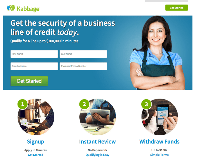
Take the Kabbage landing page below, for example. The headline emphasizes “today” in italics and the subheadline states business owners can get a line of credit in minutes:
Attention grabbing
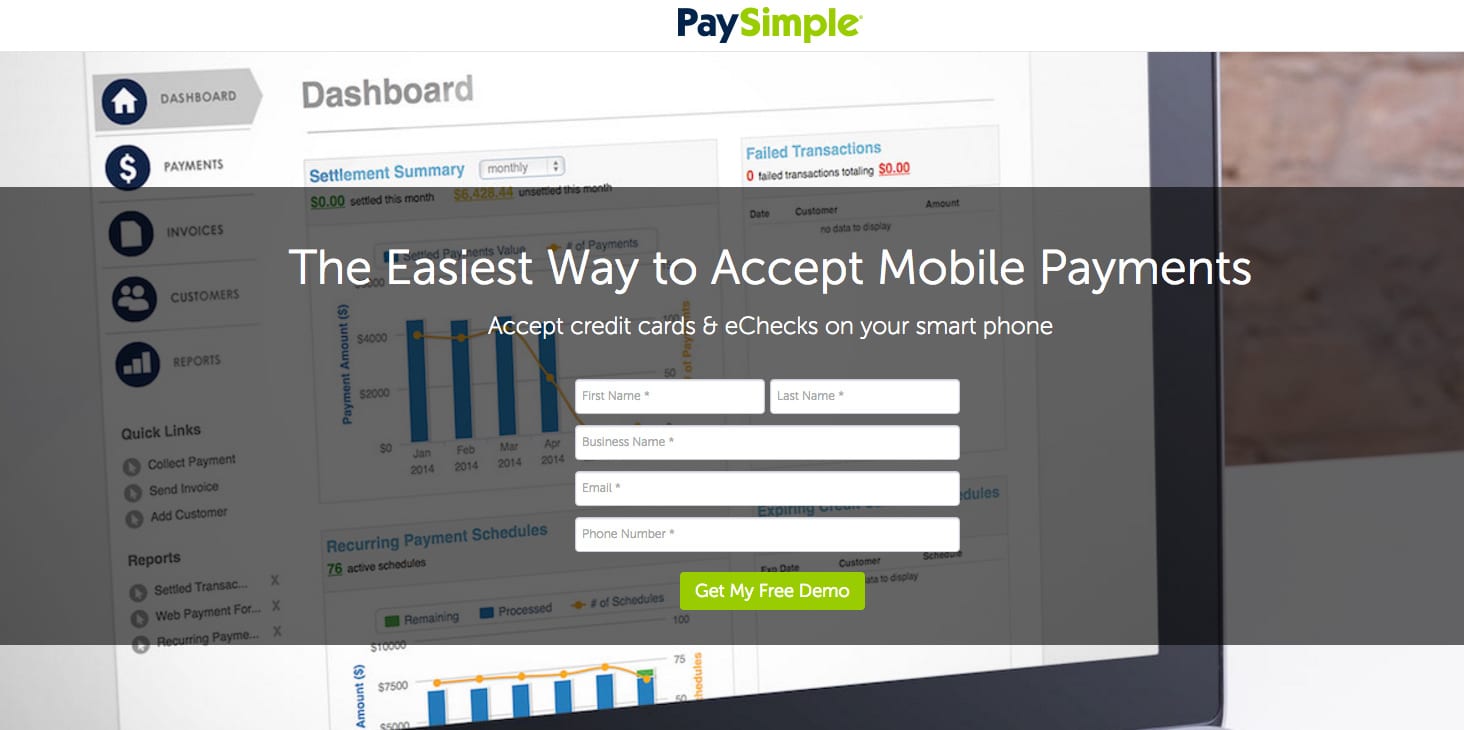
Like an urgent headline, one that grabs your attention is a headline that makes a fantastic assertion, like, “The Easiest Way to Accept Mobile Payments.” If you’re in the market for a way to accept mobile payments, isn’t PaySimple’s headline intriguing to make you want to convert on the form?
Video killed the static landing page
If a picture is worth a thousand words, how many words is a video worth?
Forrester Research says that one minute of video is worth approximately 1.8 million words. Not only is video “louder” when it comes to getting your message across, it’s also more attractive to SEO. As in 53 times “prettier.” (Another Forrester study showed that videos were over 50 times more likely to appear on the first page of search results as part of the blended results.)
When you include a video on your landing page you can demonstrate your product or service in action; sometimes in ways far better than words can ever do. If your business offers a complex product, like, say SaaS, video allows you to thoroughly explain how your offering can make the world a better place.
Video enables you to talk to your visitors better than copy because they don’t need any special punctuation to get your message across. It’s also better suited to tug on heartstrings, or capture and keep your visitors’ attention focused on exactly what you want them to.
To produce effective landing page videos, make sure the video:
- Is professional — Lack the budget to produce a quality landing page video? Then make a gif instead.
- Has the “auto-play” option turned off — no one like’s autoplay. No one.
- Isn’t too long — enough said.
- Follows a script — videos are not a place to practice your improv skills.
- Features a voiceover — one that promotes your company and addresses your customer.
To see these principles in action, take a look at Lingo App and Autopilot.
Improve your image
The images that you choose shouldn’t just be eye-candy. They need to help persuade your visitors into clicking your call-to-action button.
When used the right way images help you:
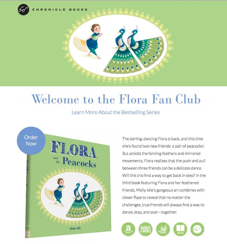
Showcase your product
There’s no denying what is being offered on Chronicle Books’ landing page. The images are pleasantly repeated between the sections and the design is clean, lean, and waiting for you to open your wallet:
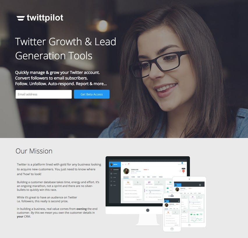
Tell a story about your brand
Everything that appears on TwittPilot’s landing page is telling the brand story:
- Company logo
- The page clearly explains their mission / unique value proposition
- Fonts that match their brand and landing page's goal
- The overall tone of the copy is consistent
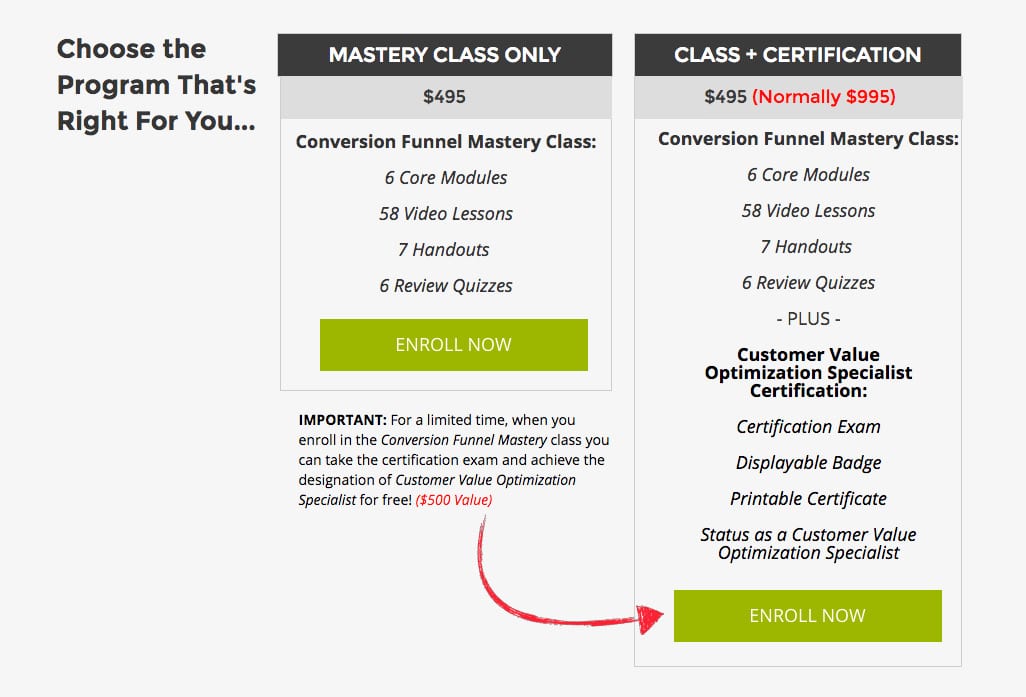
Point toward an important page element, like your CTA
Digital Marketer makes it pretty easy to identify which of their CTAs, they want you to go for (scroll down halfway to see the visual cue):
A little more subtle, but irresistible example is this one by Sallie Mae. The woman’s eyesight directs your attention to the headline and CTA button: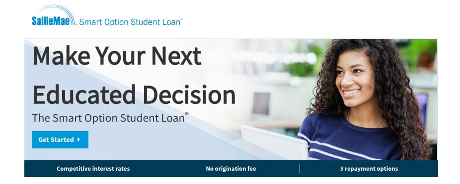
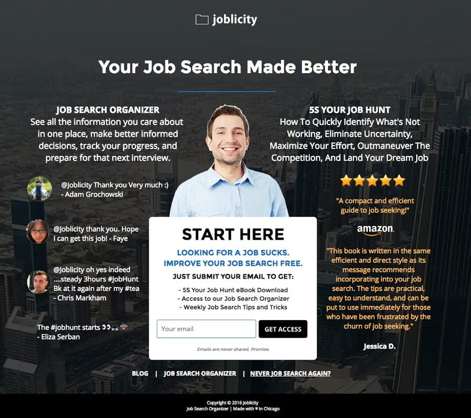
And one more. Every element on Joblicity’s page points your eyes directly at the form:
Add human appeal to your pages
Punchpass shows people exercising as their header image:
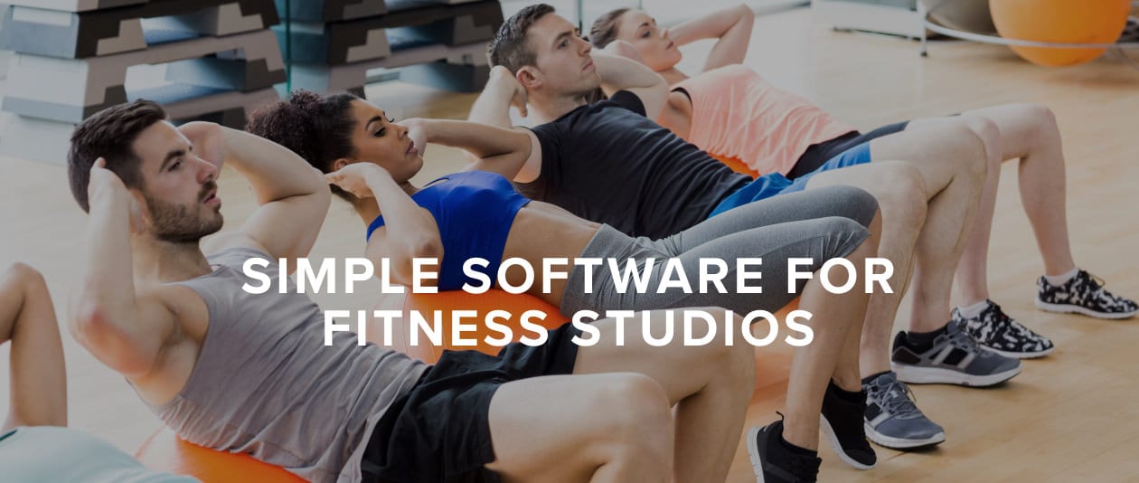
Why does this image work so well?
- Real people are more visually compelling
- Human faces showing emotion elevate the intrinsic value of your product or service
- Human beings enhance branding
- People using your product or service add credibility
- People engaged in activity (fitness) invoke a “call to action”
Conversion-worthy forms vs. Cringe-worthy forms
A landing page exists to collect user data and the best way to do this is with a lead capture form. When your form is designed properly, you make it easier for visitors to convert on your offer.
Your lead capture form must:
Here is arguably one of the most straightforward lead capture landing pages with an undeniably easy-to-complete form:
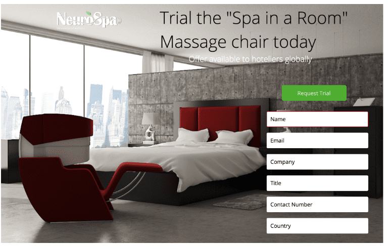
And one more solid example of a well-thought-out lead capture form, this time from Luxury Hotel Association’s Neuro Spa:
CTAs: Your landing page’s reason for being
I’m telling you this as a friend: Excuses and/or refusals to spend time writing great CTAs will kill your conversion rates. Crummy CTAs cheapen the user experience on your landing page.
And, they’re costing you or your client’s money. Probably lots of money.
The better CTA’s come in a variety of forms, but each is intended to get the user to take their relationship with your business to the next level. The more commonly relied on CTAs fall into neat categories:
Discovery
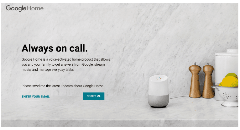
Most often, the reason anyone is on your landing page is because they want to know more about you, your product, or your service. Make it easy for them to get that information with CTAs, that say: “Try Our New Feature” or “Notify Me” like Google Home does:
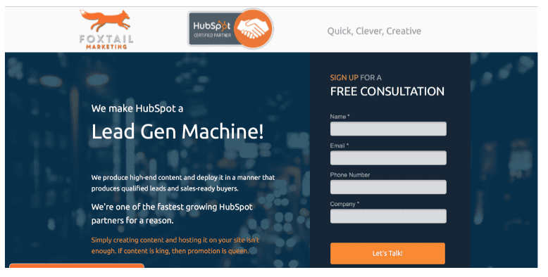
Qualification — This is the CTA you’ve written to nurture a lead. The goal of this kind is to nudge, not poke. Most common version is: “Let’s Chat” or “Let’s Talk,” like Foxtail Marketing shows:
Learn
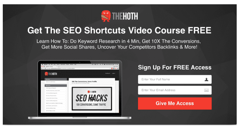
Place all your content on a page and you gain nothing. When applicable, lure landing page visitors further into your funnel by offering them the rest of the story or information they’re seeking. Most common version is: “Read More,” or like The Hoth uses:
DIY
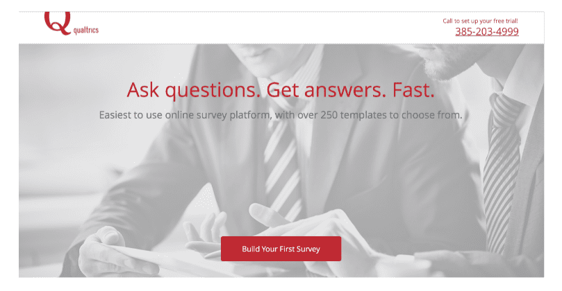
A CTA that adds an air of independence, or exclusivity, increases the likelihood of the user leaving their email address. You know, like Qualtrics does here:
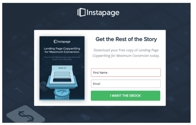
Bribe
There’s no such thing as something for nothing. People know this, but that doesn’t mean they’re not going to come over to your side unless you offer them a “little something.”
That’s where the form submission CTA does its best work. To get a user to enter their info you need to give them something in return. Common bribes are ebooks, white papers, access to gated content.
The most used CTAs for this grouping include: I Want the Ebook, Submit form for free white paper, etc., like this one:
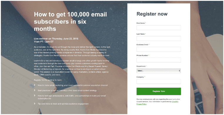
Free beer / Promotion
Throwing an event is like throwing a party. Only difference is, your event requires a minimum number of attendees in order for it to have been a hit. This means you need to raise awareness, drive sign ups or sell tickets.
For landing pages seeking to entice folks to come to your next gathering the language needs to be a straightforward invitation. Like: “Register now” (Upwork example below), or “Yes, I’m in!”
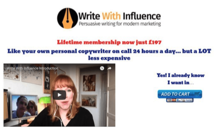
Sold
In instances when you’ve nurtured your prospect to the completion point, that is, selling your product or service, they need the direct verbiage that will direct them and (and their wallet) to the exact place they need to complete the transaction.
Make sure your CTA states this clearly. CTAs that work are: “Speak with a Sales Representative Now,” or: “Add to Cart,” like Write With Influence employs here:
Challenge yourself to be creative using only a few words and to do better than stating the obvious. Your CTAs deserve better than: “Learn More,” “Sign Up,” or “Buy Now.”
People don’t trust words, they trust actions
There’s an old riddle that asks, “What takes years to build and seconds to break?” Yep, you got it. Trust. To turn a visitor into a customer you have to earn their trust. There are several ways to do this.
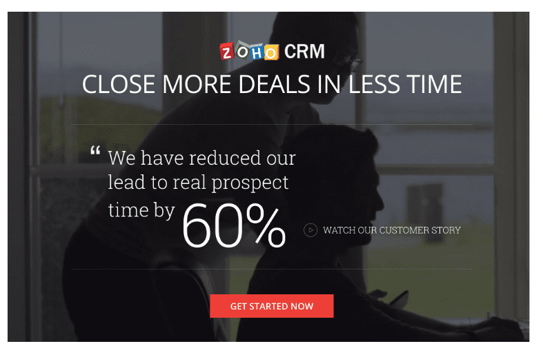
Stats
Zoho CRM’s landing page uses a customer’s testimonial to convince visitors to get started with their product:
Testimonials
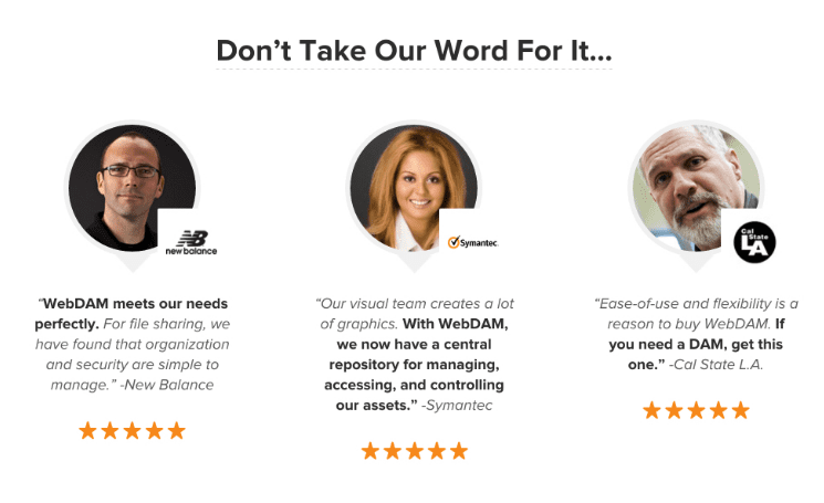
WebDAM not only uses the testimonial, but they also feature the company and person’s photo:
Others include customer badges, placing a link to your privacy policy on your landing page, or providing third-party trust seals from cyber-security organizations, merchant associations, manufacturer seals, etc.
Conclusion
Whether you’re starting out or have been at the landing page creation game for awhile, it should be evident that a lot of thought goes into the creation of great pages. The information provided here is truly tip-of-the-iceberg material. If you’re eager to learn more or want to augment your already solid knowledge, there are scores of extremely informative resources available.
A good place to pick up more knowledge and/or to discover more about what’s going on the digital marketing world, visit the Instapage blog.

Thanks to
Kevin Lynch for sharing their advice and opinions in this post. Kevin is Director of Copy at Instapage, the most-advanced landing page creation solution for teams and agencies. He wants to live in a world where businesses cheaply acquire customers, customers can navigate their way through a noise-free ad space, and children never kick the back of his seat during long flights.


