Recommendations and examples of using style guides to support a CRO programme
When we kick-off a Conversion Rate Optimisation (CRO) programme with a new client we always try and find out what existing guides or tools they have that we can use during our programme. These may be branding guidelines, style guidelines, UI Pattern libraries, etc.
For example, here is a really good description of how Envato, who run the Tuts+ sites, carry out Style guide Driven Development.
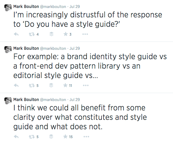
However, the responses we get from clients are wide-ranging. As Mark Boulton (@MarkBoulton) pointed out recently:
We're not going to dive into that debate around whether style guidelines are a help or hindrance here, instead I wanted to give recommendations from a CRO angle and investigate how we can leverage these types of guidelines in order to get better results in testing as well as addressing when it’s acceptable to move off-piste in order to get the best results.
Advantages of using guidelines in CRO
1. Speed
Building both iterative and innovative A/B test concepts quickly without questioning every little detail can be really beneficial. Not having to go to a designer for something as simple as a new button can really save time when conducting tests. This can free up additional time for further tests that can help build up that conversion rate.
2. Consistency
We all know that brand consistency is important, and a style guide, when intertwined with your brand guidelines, can help to make your site reflect your brand in the way you think it should, without compromising CRO.
Further to the previous point, perhaps the most common reasons for preparing guidelines in the first place is to maintain a consistent user experience across the site and across the full spectrum of marketing activity.
From a CRO point of view, it means that as you develop test concepts and your minimum viable product you have a framework to build on. That might be a consistent tone of voice or front end UI elements that can be dropped in quickly from a pattern library. This should remove a range of basic questions in terms of how a button or form should look/behave. Obviously, changes to the pattern may be required to test a hypothesis but we'll cover that in more detail later.
3. A Solid Foundation
A style guide will provide you with a solid foundation upon which to build a library of insights. Hopefully your guidelines have been partly validated through user research or previous A/B testing but even if they haven’t, a consistent starting place for developing A/B test variations that you can update and improve, is a good starting place.
Disadvantages of using guidelines in CRO
1. Costly
A well-documented styleguide can be an expensive investment up front and while many would argue that the benefits are significant, they may not be easy to demonstrate. Then we have to consider the cost of maintaining our styleguides. As you take learnings from A/B testing you will almost certainly need to update your guides with improvements based on winning test variations.
2. A starting set of assumptions
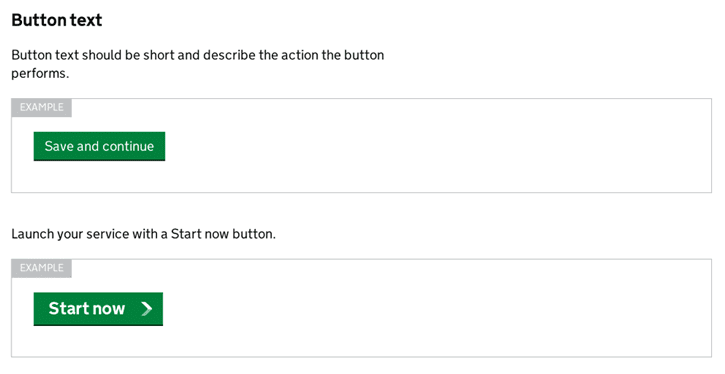
While a high quality style guide may be based on best practice or user research, unless it has been thoroughly A/B tested, it inherently holds a huge number of assumptions. A button should look like this, with copy like that and using this palette of colours. Useful as a starting place, but what if in a specific context it’s not large enough, or the colour is recessive? Part of our task in CRO is to identify and challenge assumptions to push for an optimal experience.
3. Restrictive
If applied too strictly they can restrict your scope for experimentation. Even when the policing standards are not too draconian, following a guide may close minds to more innovative or creative solutions. Some degree of flexibility and autonomy are important in order to allow your team to develop the best solutions to design problems.
Short term vs. Long term effects
Every test that we run is run over a period of time that allows us to make some accurate, statistically significant observations about our primary testing metric over a short period of time. The challenge here is that it is really difficult to account for changes that occur over a longer period of time.
We always recommend testing for a minimum of two business cycles. For many clients who have a clear weekly pattern then this equates to a two week testing period (although this also relies on traffic levels, see my in-depth post here for more). However the impact of some tests may span a far greater period of time. Some tests may lead to a lift in short-term conversions but may harm conversion in the long term. For example, pushing sales messages across a site may increase conversion, but may be harmful for a high-end retailer focused on exclusive, premium products. During a two week period we can't easily account for changes in brand perception or identify the impact on lifetime value. In some instances it may be worthwhile testing over a longer period, but this isn't always practical.
If we want to combat these long-term effects we can do a number of things. Firstly, having a clear understanding of your core strategy will help. It may also help to clearly define the parameters for testing early on. There may be some areas that are untouchable for very good reasons.
Secondly, to factor in lifetime value, I would highly recommend carrying out longer term analytics projects to analyse cohorts and take snapshots of the changes in behaviour over time as a range of site changes are implemented off the back of successful tests.
Thirdly, and most importantly, the evaluation process after a test concludes should carefully consider the full potential impact of implementing a winning variation. A simple equation is:
The cost of implementing the winning variant vs. the benefits, which should be clear based on the test results vs. the risk of implementing the winning variation.
This evaluation should factor in the any potential long-term risks, such as negative impact on the brand.
If the number of tests you can run is heavily constrained I'd recommend carrying out the analysis beforehand but if you are able to, then I’d always advocate testing and trying to obtain more insights.
Examples of branding and design style guidelines
If this post has piqued your curiosity or you want to find out more about Development Styleguides or Brand Guidelines I have collected some examples below that should inspire you.
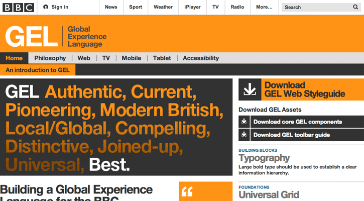
Development Styleguides
If you want an introduction to 'styleguides for developers' I highly recommend this post by @anna_debenham: Front End Styleguides.
Examples:
Branding Guidelines

Thanks to
Matt Lacey for sharing his advice and opinions in this post. Matt Lacey is Head of Optimisation at
PRWD. You can follow him on
Twitter or connect on
LinkedIn.


