Using rigorous A/B testing to optimize your lead capture rate
Now, many people think opt-in forms are annoying and don’t belong on a website. Truth be told - I’ve seen a lot of bad popups and other types of sign up forms that just don’t belong on any website.
I get the frustration many people have with these forms. However, there is one simple reason why you should use them on your website - they work!
There will always be haters no matter what you do, but in this post I’ll share my very best tips and tricks I’ve learned by analyzing millions of sessions, so you can decrease the number of haters and increase the number of leads.
Why use opt-in forms?
I know I’ve already answered this question in short, but I want to elaborate and give you some examples.
95-98% of your website visitors leave your site without converting. From analyzing millions of sessions, we’ve learned that you can decrease that number by 2-4% if you add opt-in forms to your website.
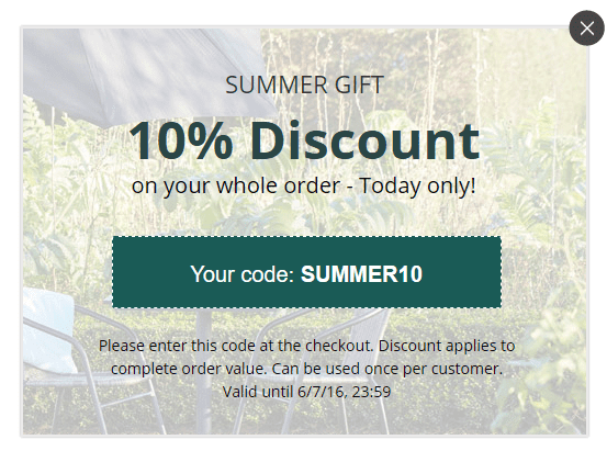
Some companies use opt-in forms to convert visitors into customers by offering a discount code directly in the popup like AJ Products does.
I recommend focusing on micro conversions instead.
If you focus your efforts on converting your visitors into email leads, you’ll get much more value in the long run, and thus increase revenue. Sure - here and now sales are great in the moment, but how do you make sure these customers keep coming back?
That’s why I am a big fan of these micro conversions instead. When you get a visitor’s email address, you have a direct line of communication with them, and you can convert them into repeat customers with your email marketing.
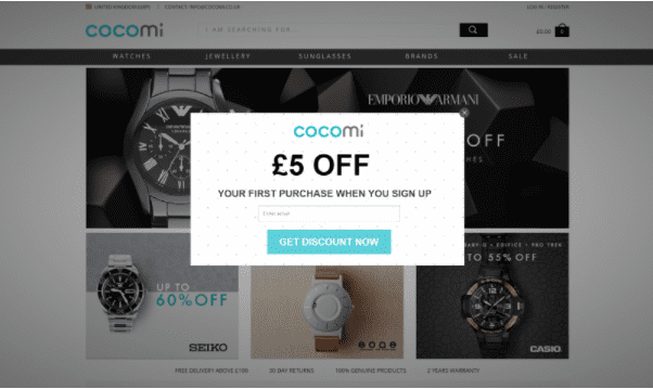
Cocomi has got that down.
People are also more likely to commit to giving their email address than completing a purchase, so you’ll get more conversions (potential customers) when you do micro conversions.
We’ve also done a lot of testing on how opt-in forms affect KPI measures such as bounce rate, overall conversion rate, and more, and we’ve confirmed that opt-ins have no negative effect on these measures.
What type of opt-in forms to use?
The two type of opt-in forms we see most on websites are popups and slide-ins.
As you can see in the two examples above, popups are boxes that pop up on your screen and block the content on the page. These require visitors to take an immediate action (convert or close it down) before they can continue to browse the page/site.
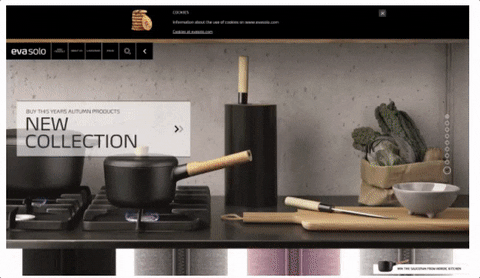
Slide-ins on the other hand, are much less intrusive than popups. They slide in from the bottom of the screen and they stay in the corner of the screen until you close them down.
What makes the slide-in much less intrusive is the fact that it doesn’t block the content on the screen, and you can continue to browse the page without having to close it down.
Here’s an example from Eva Solo.
There are no big differences in conversion rates with the two types. It all depends on your site and your audience. Some websites convert more with popups and some websites convert more with slide-ins.
It also depends on the purpose of your opt-in. If it is an exit-intent opt-in, it needs to be a popup as it is your final chance to convert visitors before they leave and it has to be more aggressive.
Otherwise, you should always test which opt-ins work best on your site.
Creative ways to use opt-ins
The main purpose of your opt-ins should always be lead generation. There are, however, many different incentives you can use to get people to sign up.
You can offer discounts, exclusive deals, free shipping, free ebooks, etc. These are the “typical” incentives used in opt-ins.
I want to show you a very unused, but highly effective way of generating more leads through your content marketing.
Many marketers spend so much time attracting visitors to their site by creating unique and compelling content. But what happens after visitors have read the content? Some (including myself a few years ago) are of the assumption that if people visit a website enough times, they will automatically sign up or become customers.
This might be true in some cases, but it’s not enough to rely solely on this assumption. You need to actively try and convert these visitors when they are most interested, which is when they are reading your content.
Imagine that you have a blog on your sports equipment e-commerce site where you write about fitness and diets. Within that content you can add content upgrades, which are exclusive pieces of content visitors can get access to if they sign up for your newsletter.
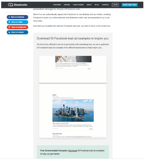
This is from a blog post on Facebook lead ads, and the content upgrade is 50 Facebook lead ad examples.
In your imaginative blog post about how to get started on running, you can add a content upgrade where you offer a free playlist with the 20 best songs running songs. Present your content upgrade in a scroll based slide-in that appears after a visitor has scrolled a certain percentage of the page.
Let’s say it slides in when visitors have scrolled 30% of the page. These visitors are obviously interested in running because they are well into reading this blog post. Offering them an incentive to start running (the playlist) is a great way to get them to sign up.
The content upgrade must always be specific to the page it appears on. It wouldn’t make sense to add this content upgrade to a blog post about yoga.
If your content and your content upgrade has great value, your visitors might even be inspired to buy some of your running gear so they can get started.
You can read much more about content upgrades and how they can be used on e-commerce sites here.
What not to do - the when and how
The key to creating opt-in forms that don’t disturb or annoy your visitors, is to know when and how to show it.
The opt-in technology available today enables us to set a number of rules and conditions to our opt-ins. Many marketers are not aware of these possibilities which is why I want to list them here and help you avoid annoyed visitors.
First of all, your opt-ins should not be triggered the moment a visitor enters your site. Give them a chance to get an impression of your site before you offer them something.
We’ve come to the conclusion that 7 seconds work really well. It gives visitors enough time to form a first hand impression, but not enough time for them to leave your site without being presented with your offer.
Second, you shouldn’t trigger more than one popup or slide-in on the same page. It will only be confusing for visitors and they won’t sign up.
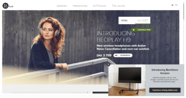
Your opt-ins should not be displayed to existing newsletter subscribers. People who have already signed up are not interested in doing it again. If you want to engage with them, you can show them a slide-in that redirects them to one of your popular pages or products.
Here’s an example from B&O Play.
You shouldn’t have any opt-ins on your checkout pages. You don’t want to interrupt visitors who are about to make a purchase. My experience with popups or slide-ins on checkout pages are that they are perceived as spam, and some people might even leave the checkout because of this.
Lastly, you shouldn’t have any opt-ins on pages where you have other signup options available.
There are also a number of cookie settings that enable you to condition your opt-ins even more.
The number of times your opt-ins should appear is also worth considering. Our data tells us that the optimum is four times. Visitors might have overlooked it the first few times, or they might not have been interested at this point. However, if they’ve ignored your opt-in four times, you can be sure that they are not interested, and thus you should not annoy them with any more.
Also, if visitors have actively closed down your popup or slide-in, they should not be presented with it again. When they actively close it down, it’s also a sign that they’re not interested, and you don’t want to make their user experience bad my keep showing it to them.
What not to do - the content
The content of your opt-in is super important. It’s what convinces visitors to sign up.
I have seen way too many popups that aren’t relevant to the site they appear on which makes me think of them as spam.
Your opt-ins should always be relevant to your website and your products. Don’t offer your visitors a free ebook on hair styling if you sell shoes. It’s self-evident, but I still see examples of this from time to time.
It’s even better if your opt-ins are page specific. The more specific the better.
You can even target your opt-ins for specific visitor segments to make them even more specific. For instance, if your visitors come directly from Facebook, you can have an opt-in form with a special offer for Facebook users.
When you create your form you have to consider the number of input fields you add to it. I get that you want to have as much information on your subscribers as possible, but people are reluctant to give away personal information. Thus, the more you ask for the lower your conversion rate will be.
This opt-in from Mulberry is a perfect example of what you shouldn’t do.
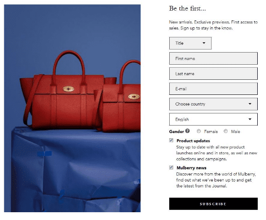
They have six different input fields and two types of checkboxes. That’s just too much. Your opt-ins have to be easy to fill in, and it shouldn’t take more than a few seconds to do so.
Also, why on earth would they ask for both title and gender? When someone enters Ms or Mrs in the title, you know that they are a woman right? Or maybe that’s just me being old fashioned.
However, all of this information is unnecessary at this stage of the signup process. All you really need is their email. You can also ask for their name so you can address them by name in your emails. We’ve seen no difference in conversion rate whether you ask for email, or email and name.
However, these are the only two things you can ask for without decreasing your conversion rate. Our data shows that every time you add an input fields to your form, your conversion rate decreases by 50%.
If you really need all this extra information from your subscribers, you can always send them a follow-up email where you ask them to complete their profile.
This brings me to my next point - the follow-up email.
Once a visitor has signed up, they should get a welcome email immediately. BlueHornet conducted a study that shows that 74.4% of consumers expect a welcome email when they subscribe.
Your leads are most warm when they’ve just signed up, so it’s very important that you try and engage them immediately. If you’ve promised them a discount code, they need to get it seconds after they’ve signed up. The same goes for ebooks, offers, and everything else you might have offered them.
But it doesn’t stop here. I’ve signed up for quite a few things in my life, and it still surprises me that I only receive emails from a small percentage of these businesses to this day, even though I haven’t unsubscribed at any point.
The whole reason for adding people to your email list, is so you can continue to nurture the customer relationship. Customer retention is just as important as getting new customers. Keep sending them emails once in awhile to keep them engaged.
Don’t send an email every day. I can’t tell you exactly how many emails you should send and when. Test it out and see what works best for you.
What to do - the copy and your CTA
Now that I’ve told you what not to do, we should have a look at what you should do.
The copy in your opt-in should always be short, precise and compelling. Make it easy to read and give visitors an incentive to sign up. The same applies to your CTA button.
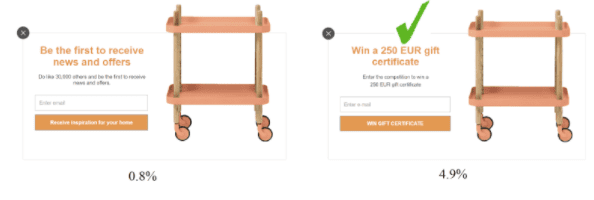
If you offer your visitors a chance to win something, you need to focus on the value of this competition. What can they win? when will the winner be drawn? and what should they do to win?
Let’s have a look at one of our customer’s split tests. This one is from GetInspired.

At first glance there is obvious difference between the two. But if you look closely, you can see that number two has an extra underlined sentence below the headline that says: “We draw a new winner EVERY month!”
Also, the CTA button on number two includes the word “win”. These two small changes has resulted in a 37.93% increase in conversion rate compared to number one.
Don’t ever just write “subscribe” or sign up” in your CTA button. It doesn’t give any value, and it’s not compelling in any way. In the case of the competition, I would just write “win gift certificate”. You’ve already told them in your copy that they will be signed up for your newsletter, so there’s no reason to tell them that again.
So what do you offer your visitors?
The two most used incentives are competitions and discounts. The work because people can save money or potentially get something for free, and who doesn’t like discounts and free stuff?
When you offer your visitors a discount, it can be offered as a percentage or in currency.
Let’s take an example from Floyd.
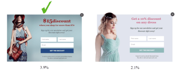
In form number one, they offer a $15 discount when you buy for more than $70. In the second form they offer a 10% discount on any dress. Form number one performed 85.71% better than number two. And why is that?
The discount in number two is much more easy to relate to, as it is a specific amount of money you can save ($15).
In this case there was a huge difference between the two types of discount. However, it might not be the same on your site. I always recommend that you do your own tests to see what works best on your site.
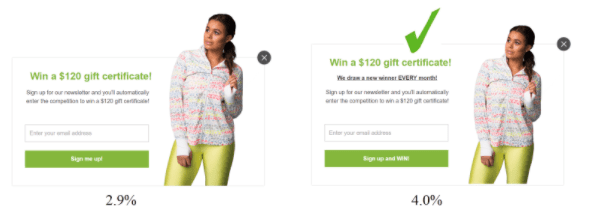
When it comes to the competition there are also two options. You can offer visitors a chance to win either a product or a gift certificate.
Here’s another test from GetInspired to show you the difference.
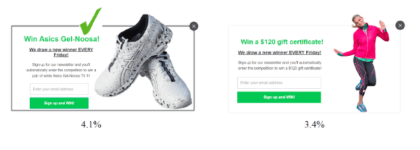
In form number one, you can win a pair of shoes, and in form number two you can win a $140 gift certificate. The form with the shoes had a 20.59% higher conversion rate than the one with the gift certificate.
Again, the competition with the specific product is easier to relate to than a gift certificate. This is very much dependent on your target group and the products you sell. You should always test your incentives and your message before you test anything else such as design, color, etc.
There’s also the case of social proof.
In my opinion, social proof isn’t as effective as it was 3-4 years ago. People would much rather get value than follow the crowd.
I won’t go as far as to say that social proof isn’t effective at all, I just don’t think you should use it on it’s own.
Here’s a split test from Livingshop to prove my point.
The visuals of the forms are the same, but the incentive is different. In the first form the incentive is social proof, and in the second form it’s a competition.
The competition is the ultimate winner of this test with an increase in conversions of 512.50%! I still encourage you to test this on your own site, but maybe try using social proof along with another incentive and see if that has an effect.
When it comes to the design of your opt-ins, they should always match the design of your website. This will make your opt-ins look as if they belong on your website and were made specifically for it, and people won’t see it as spam.
I would also recommend that you use images in your opt-ins to exemplify and enhance your incentive. We’ve seen that images can increase your conversion rate by an average 50%.
Here’s another example from Livingshop who loves testing just as much as we do.
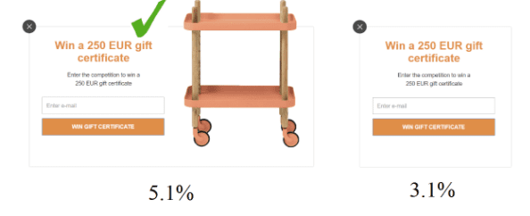
The two forms are completely identical except for the fact that one has an image and the other one doesn’t. The one without an image had a conversion rate of 3,1% while the one with the image had a conversion rate of 5,1%. This is an increase of 64,5% just by adding an image.
I have yet to see a test where the form without the image converts better than the form without, but this doesn’t mean you shouldn’t test images on your forms.
For instance you can test which image performs better like Floyd did with these two forms:
The message is the same in both forms, the difference is the background image. One model is blond and the image is lighter, and the other model has red hair and the image is darker.
The form with the blond model and the lighter colors had a 19.23% increase in conversion rate compared to the darker image with the red haired model.
It’s these small things that could make the difference between 100 signups and 1000 signups, so test, test, test.
Conclusion
Adding opt-in forms to your website is a sure way of growing your email list with relevant and high quality leads.
There are however many different things to consider when you create your opt-ins, to ensure that they improve your user experience and generate valuable leads.
I hope this post gave you some insight into these considerations, and also gave you some answers to the questions you might have had about opt-ins.
On a final note just want to say: TEST! You can never test too much. I can offer you all these best practices, but it will only get you so far. What works for others might not work for you.
I hope you’ve learned a thing or two, and if you have any comments or questions, feel free to drop them in the comments below.

Thanks to
Rikke for sharing their advice and opinions in this post. Rikke Thomsen is a passionate Online Marketing Specialist at
Sleeknote, a lead generation tool for e-commerce. At Sleeknote, we help online stores interact with their visitors to increase additional sales and get more customers. You can follow her on
Twitter or connect on
LinkedIn.


