The evolution of flat design and how its journey so far can shape your online presence
Whatever the goal of your site, it has to have style and substance to succeed, but what if I told you that following one web design trend could help you to achieve both?
Increased browser support for CSS3 saw an explosion of gradients and box shadows, but the web development world is taking a huge leap away from these traditional design details and embracing the clean, crisp nature of flat design. The move sees less vendor prefixes and shorter style sheets, two factors that mean less kilobytes on page load. Here we will explore the key principles of flat design, its impact on user behaviour, experience and ultimately conversion, and unveil how this particular trend is likely to evolve throughout 2016.
Flat design at a glance
Thanks to its minimalistic nature, flat design has been the go-to concept for web designers and developers everywhere, with its clean, crisp, bright and two-dimensional features favoured by small and large companies alike. Unlike previously used design techniques, flat design focuses less on austere principles and more on simplistic options that really emphasise usability. Contrary to popular belief, flat design doesn’t have to mean boring. The cutting of unnecessary clutter at the front and back end means a plethora of advantages can be embraced by those visiting the website and those managing it.
Microsoft is said to be the pioneer of flat design thanks to its use on the Windows 8 interface – a move that was seen by many as a slap in the face of the popular skeuomorphic design modelled by Apple on its iOS interface - and with many flat design heroes following suit, the trend is fast becoming best practice across all industry sectors. With the ever increasing use of mobile devices to browse the web, flat design is certain to be a trend that is here to stay.
Why should you go flat?
With the rise and rise of mobile usage across the globe, more and more people are now browsing and buying on connected devices beyond the usual desktop computer and laptop. M-commerce sales are in their billions in the US alone, which makes investing in mobile compatible design of the utmost importance for businesses looking to grab a fair market share. That’s where flat design comes in…
One of the advantages of opting for flat design over its predecessors is that it scales well to smaller screens, making it a more practical option for mobile optimised websites. The use of white space and the incorporation of simple buttons makes it ideal for viewing on mobile and other devices. The lack of gradients, drop shadows and other details not only contributes to this contemporary look on both desktop and mobile devices, but also makes site loading much more efficient.
The use of fewer images and less complex code means fewer kilobytes on page load in comparison with traditional web design. Dated websites that do not use flat design tend to provide a poor visual which can have a major impact on user behaviour, experience and conversion. According to a recent case study, minimalism increases conversion rates by 261%, with the content-first, mobile-first approach preferred by the majority of users.
In addition to this, solid and brighter colours make for better design and bigger impact, great for clients that wish to make a statement with their brand. Whilst the utilisation of simple illustrations, minimalistic icons, vector artwork and clear typography makes websites using flat design more readable and easier for browsers to interpret, which is perfect for businesses looking to obtain a greater market reach as universal actions can be understood by all customers. This, however, was not always the case.
With its status as the pioneer of flat design came the highlighting of a few inherent flaws. During a usability assessment carried out by the NN Group, participants found some aspects of the metro design of Windows 8 difficult to read, with the interface’s actionable objects the main cause for concern. In its early days users found it almost impossible to distinguish between a label and a clickable command. Now, with an improved understanding and wider use, this ‘quirk’ is a staple flat design principle adopted across many websites.

From a developer or designer’s point of view, the technical side of flat design is also a breath of fresh air. The design process is much more straightforward, and when it comes to developing the design from Photoshop, Sketch or other software there is less to convert thanks to a simple design file minus the layer masks, styles and colour filters. Fewer assets mean the most impressive flat designs can be recreated with simple CSS, and image-wise, scalable vector graphics and icon fonts can be used instead of jpg and png sprites.
Flat design websites are easily handled by all browsers, including older ones that generally cannot support the use of CSS gradients and box shadows.
Is the flat design trend here to stay?
The shift towards the fluidity of flat design hasn’t been a quick one, it has taken several years for this trend to make its transition, with a number of flaws needing to be overcome before users across the world could accept it, particularly in a digital world so abundant with content. The reduction of clutter, however, has turned out to be a welcome refreshment for the consistently connected culture looking to handle this overload of information on a daily basis. Flat design has offered an enviable way to evaluate, consume and ultimately digest what would otherwise be an utterly exhausting amount of content, a move that we generally describe as a visual zen.
There are lots of applications and websites that still rely on the disruptive features synonymous with traditional web design techniques, but as the flat design trend is here to stay, into 2016 these will become few and far between.
The importance of responsive design and the aim to provide brand uniformity across a multitude of devices is what will keep flat design at the top of the trend chart for some time to come. Flat UIs lend themselves well to a vast number of platforms, and make website speed optimisation possible thanks to their reduced page weight and loading time, two factors that improve user experience and conversion rates ten-fold. With the biggest brands, recognising the correlation between speed and sales – retail giant Amazon reported an increased revenue of 1% for every 100 milliseconds of site speed improvement – small to medium sized businesses and those just starting out are also searching for ways to improve page load times, with the implementation of flat design offering an easy and effective way to achieve speed and introduce a brand that is slicker and more stylish than the average.
The minimal design used on flat websites also encourages best practice, with the stripping away of drop shadows, bevels and textures delivering a smart, flexible and more functional solution.
The booming theme market, and the SME’s search for a better looking and better performing website, is also contributing to the flat UI trend’s popularity and longevity in the otherwise ever evolving world of web design and development. Whilst comparing many WordPress themes often means a rather difficult game of ‘spot the difference’, the way in which users consume the web has established various UI design patterns that make these themes a success, with the role of flat design providing the perfect platform for a smooth experience.
What’s next for flat design?
Like many trends, things must move on and the same theory applies to flat design. Despite its popularity, designers are already creating a richer alternative. Pioneered by Google, Material Design capitalises on the advantages of flat design whilst incorporating a few added extras. Described by the search engine as a ‘new style language’, Material Design implements shadow effects to create movement and depth. The result – a more realistic user experience.
The introduction of the Material Design Lite specification in recent months will see this hybrid version of flat design, which is already used widely in app design, become a staple style for websites.
Despite its newer modications, flat design isn’t going away any time soon. Thanks to its cross-device compatibility and cohesion with other popular trends, the long shadows, vibrant colour palette, simple typography, ghost buttons and minimalism associated with flat UIs will be at the forefront of web design for months or even years to come.
The principles of flat design
Research found that whilst good flat design has been proven to increase conversion rates, shape user behaviour and improve user experience, bad flat design can actually reduce discoverability and on-page interaction, so what key principles make flat design a success and how can these be implemented effectively?
- Grid – The grid aspect of going flat is integral to its success and the usability of this popular design trend. The grid can and should be used to define content making it easy for users to digest. Utilising a basic layout, a grid can provide a visual hierarchy with simple alignment and spacing able to support the most complicated structures. Denser grids can be used thanks to the minimalistic nature of flat design, meaning large volumes of content can be conveyed without the chaotic look associated with more traditional layouts. Bootstrap provides a mobile-first, responsive grid system, as this example shows.
- Colour – When it comes to presenting a website or app that is just as vibrant and energetic as the brand your client is looking to represent, flat design certainly reigns supreme. Colour is critical to minimal interfaces, and with the option to use a broader colour palette, your selected hues will have the power to define content and carve out an enjoyable customer journey. To define the colour scheme, testing across an extensive value spectrum is important. View how colours behave in light and dark, and experiment with tone-on-tone and stark type.
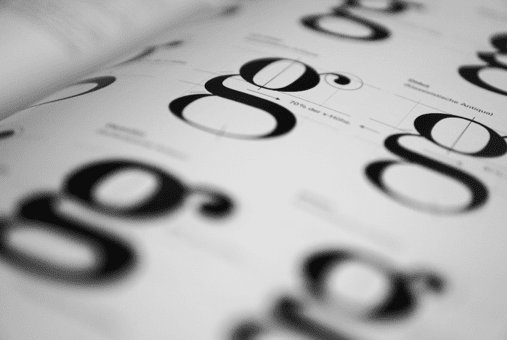
- Typography – Sans serif tends to be the signature font connected with flat websites, but there is a plethora of font families with varying weights and styles that may work for you. Sticking with just one isn’t as necessary as it is with more cluttered websites, and flat design’s clean and crisp layout actually lends itself well to font size and weight extremities. The golden rule, make sure the fonts are fully legible as this will conflict with the flat theme.
- Interaction – Ensuring interaction between interface and user is what the earliest flat websites struggled with, and despite the popularity and wide use of flat design, this is still an issue today. There are however a few steps you can take to improve interactivity. Creating contrast is still possible, even without the use of traditional box shadows, drop shadows, bevels and gradients, by making clever colour choices and alternating font size. Following conventional rules when it comes to placement is also important. Aim to ultimately make the website as intuitive as possible without compromising its simple layout.
- Illustrations – The use of illustrations may sound a little old school, however the preceding flat design principles are only complemented further by the use of vector artwork. Made with flat shapes and distinct areas of colour, the vector style offers the simplicity needed to accentuate the features of flat design. Icon fonts also offer a fitting accompaniment to flat design. No longer do you have to use images as icons, instead icon fonts can be utilised for a crisper appearance across various resolutions.

The flat design heroes – our top 3
We couldn’t talk about the benefits of opting for a flat website without mentioning a few of our design heroes. Our top three spans a number of industry sectors, a fact that backs up just how versatile flat design really is.
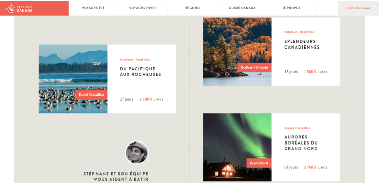
- Parcours Canada – a specialist providing packages to solo travellers, families and couples throughout Canada, the company also excels on the flat design front to offer the perfect online experience. Scoring highly on design, usability, creativity and content.
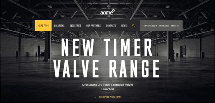
- Acme World – Now for an example from the industrial world with system and service provider Acme. Using a distinct colour palette, Acme has created a clean and simple yet interesting and impactive flat website that successfully communicates its international values and wide-ranging expertise.
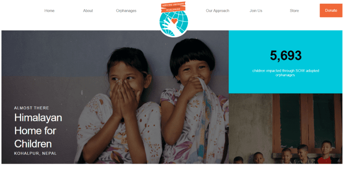
- Serving Orphans Worldwide – Flat design tends to serve the most modern and technologically driven brands, but, as this example shows, it can be human. This charity website uses flat design, texture and emotive imagery with excellent results.

Richard Barker is the founder of full-service digital marketing agency
Harrison Mann. He specialises in search engine optimisation, pay-per-click, content marketing, website design and social media marketing, all of which have been used to help clients from across the country grow their online presence and boost their bottom lines. You can follow him on
Google+ or connect on
LinkedIn.


