An example showing recommended changes for cover image, tabs and apps
As previously notified on Smart Insights, in March Facebook announced there would be a major update to its Facebook brand pages. It has now confirmed that by 6 June all Facebook brand Pages (note brand Pages, not personal Profiles which changed a while ago now) will have a new look. A number of Pages have already been invited to switch on the new timeline design and I've been having a good poke around to share what I've found. As always I'm using the Musicademy Page to illustrate the changes.
Overview of changes
Firstly, whilst it does look quite different, there isn't any majorly different functionality. Facebook has simply moved things around a bit. But inevitably there are some implications for things such as cover image, tabs and apps.
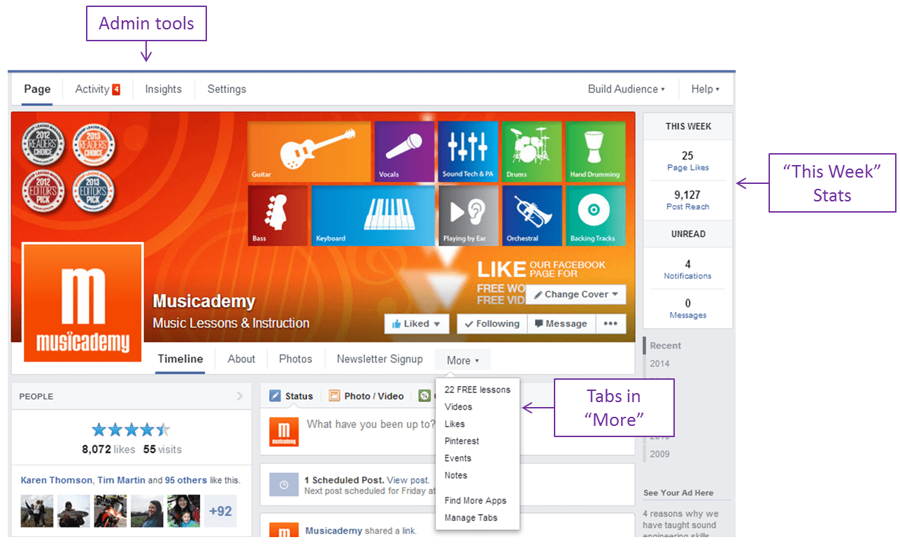
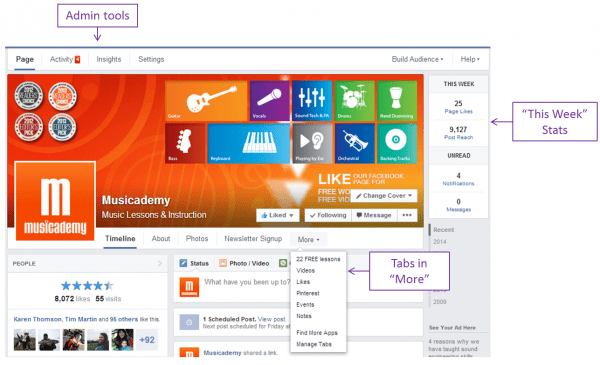
The first thing you'll notice is that there is now a single column for posts and that the business information, photos, videos and apps etc have moved to the left hand column. You'll also see that the admin navigation panel is more subtle than previously.
There's also a panel to the right which tells you what is happening "This Week" on your page. These are quick numbers such as the number of Likes, Post Reach and any Unread Notifications.
What to do with your cover image
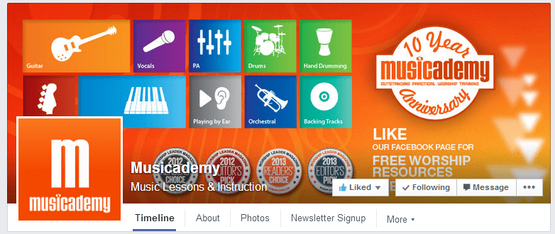
Although the dimensions of your cover image are still fine, you may well find that content is now hidden by some of the new features. Below is a screen capture of how the previous layout Musicademy cover image looked in the new layout:
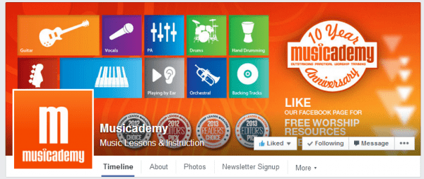
I really max out the information on my cover image. The design reflects the home page of our webstore and neatly covers off the key things we do as well as some awards we've won and some incentive text.
But the new layout made it look horrible. As you can see there are buttons and text all over the image. I also think it's questionable as to whether you really need a logo on the cover image when you've got a square image (often a logo) surfacing to the left.
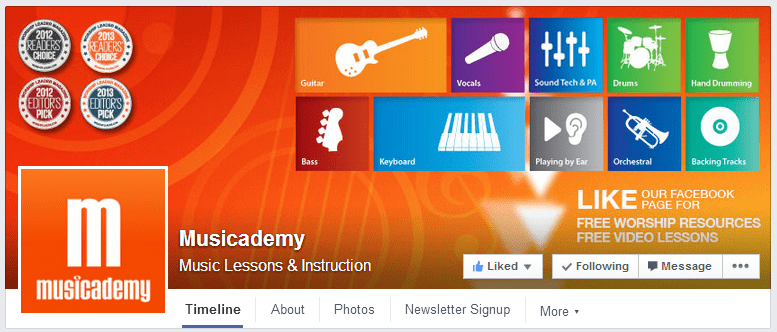
So here's my redesign:

I've really only made minor changes but now the copy and images are far better positioned considering what else Facebook is surfacing over the top of the picture.
We have a subtle white arrow pointing at the "Like" button. I quite like this approach and have seen some more obvious examples on other Pages. You do need to think about how this surfaces on mobile though as the Like button ends up in a totally different place. We're all busy designing our Pages sat at our desks, often forgetting that most of our fans will be looking at the end result on mobile.
Left hand column
Now let's consider implications for the left hand column.
Two of these elements are fixed. People and About will appear at the top of the left hand column so users will see your total fan count, your star rating (if that's enabled) and the number of check-ins (again if you are in the correct category for that option).
You can, however, reorder any of the other sections and this is important as only 3 of them will be visible without the user clicking further.
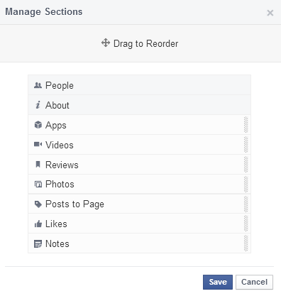
To re-order simply mouse over the top left of any section and you should see a little pen appear in the grey. The word "Manage" will also pop up. Click that and hit "Manage Sections". Below is what will appear and you simply click and drag to re-order each item.
It's your call as to which order to put these in. For my Page, the Apps are most important as these include the all important newsletter sign-up mechanism (I'd prefer an email address to a Facebook fan any day) and a further app which incentivises sign-up (similar to a white paper download).
I'm sure over time I'll develop plenty of opinions as to the order of other sections. For now Notes is at the bottom (they date back many years and have since been surpassed, for us at leas,t with other functionality) and Likes are also very low down (I'm hesitant about brands sending their fans off to other Pages - surely you want them clicking on your content?)
Do review the content of your sections
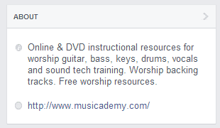
Click "Edit" in the grey bar to make changes within sections. It is worth reviewing what you have here, particularly in the ABOUT section. I have always advocated Pages put their url in their About text. That's no longer necessary as your url will now appear as a line in it's own right (at least on desktop newsfeed). Here's how the Musicademy ABOUT section now looks.
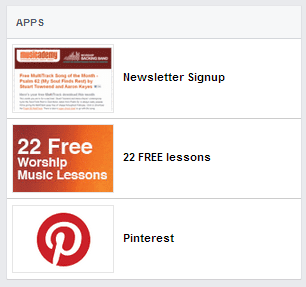
I've also needed to have a play around with my Apps. I'd previously had a number that were only findable on extra clicking on the old layout (remember they showed up mixed in with other "views" such as maps, fan count, videos and photos below your cover image) but as they now have their own section in the new design 3 are now surfacing. One of ours was for an expired competition. This definitely needed deleting before going live with the new design. Here are the three I've currently got showing:
Do check your apps are still working!
One other recent change to flag is that Facebook has recently enforced a requirement to host all app pages behind SSL. If you have apps that reference an external web page which is NOT secure the app won't work. Do test your apps and check they are still functioning and if not do make the necessary changes.
I hope this is helpful - do let us know how you're finding the changes!