A group debate discussing the best way to make your site work on all devices?
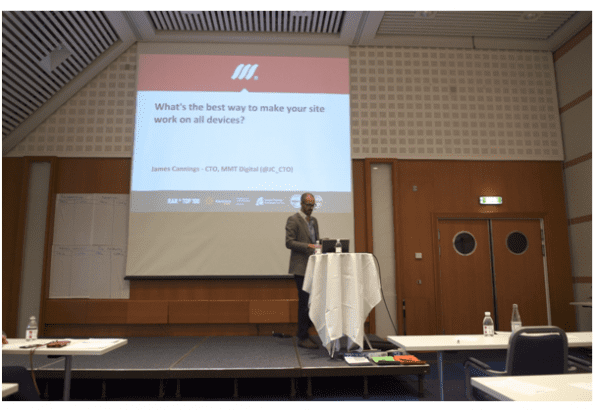
A few weeks ago I had the pleasure of presenting at the J. Boye conference in Aarhus, Denmark about developing mobile optimised websites and applications. In the spirit of J. Boye I had decided to run an interactive session as opposed to the more traditional presenting method of lecturing people on personal experiences.
There was a fascinating cross-section of people from different businesses at the session. Among the 50 that attended there were people from a variety of industry sectors including banking, charity, government and other public sector organisations, pharmaceutical and many more!
The group was mostly made up of fairly senior people working across IT and marketing departments (with a fairly heavy emphasis on digital in their role!). Many, if not all, had some recent experience of being involved with the development of a website, intranet or some other platform where the question 'what are we going to do about mobile?' will have been raised.
Although a small cross-section in the grand scheme of things, I found the data and results that came out of the session to be very interesting so thought I would share it.
Presentation - challenge and options of developing a new digital platform
The presentation started with my outlining the challenges and options that we face today when considering the development of a new digital platform.
Essentially (excluding the development of native mobile applications for now) there are 4 possible options we have when considering how to make our site work across multiple devices:
- 1. We can use Responsive Web Design
- 2. We can use Adaptive Web Design
- 3. We can build a separate mobile site
- 4. We can do nothing and stick with the 980 pixel (or whatever size you like!) grid for desktops.
A key takeaway from the session was that the first 3 options are not mutually exclusive!
Choosing the right option?
In the presentation I used the example of the well-known BBC Sport website (in fact the whole of the BBC website works this way). is the desktop version with mobile users being redirected to the mobile version So this is option 3 right?
Well yes, but it is also option 1 because the mobile site (for tablets and smartphones) is fully responsive. I can’t claim to have been involved with the development of this website but the BBC is well-known for being on the cutting edge of technology so I would bet a few quid (or Danish krone) that they layer on some adaptive techniques to optimise the load speed of the responsive site. So it’s (probably) a nice example of a site that employs all three techniques.
I find that people see this as comforting when they realise that they are not actually facing a fundamental decision about which approach to take and that one approach might somehow preclude the use of another in some way.
Responsive Web Design and Adaptive Web Design
Anyway, all that really led on nicely to the question of what do we actually mean by responsive and adaptive web design?
Responsive Web Design (RWD) was officially coined by Ethan Marcotte in his now infamous (in the tech world!) article in A List Apart in 2010 titled Responsive Web Design. Without wanting to get too technical it is basically a collective name for the use of existing HTML, CSS and JavaScript techniques to deal with three things:
- 1. Media queries to set breakpoints. People will be familiar with the concept of the webpage changing at certain widths. Usually the navigation is changed to fit and blocks of content are shifted around.
- 2. Fluid grid. As the size of the browser is adjusted between the breakpoints the content scales to fit the size meaning that the content should fit on devices where the available width is somewhere between those breakpoints.
- 3. Fluid media. Some technical stuff about how we deal with scaling images when we are working in a fluid grid.
Most people have heard of RWD and many are familiar with it. You can tell if a site uses RWD by loading it in a desktop browser and then dragging the corner of the browser around to see if the page changes to fit the available size. Whilst RWD is tightly defined, Adaptive Web Design, in my opinion is horribly defined.
A quick bit of Googling around will give you a bunch of articles all describing something completely different. Many of the definitions sound so similar to RWD that they effectively render the term completely useless for those who need to understand it well i.e. the session attendees who need to work with their respected development teams to make the right choices for their business.
Here’s my definition of AWD. I use it with my clients and it works well when it comes to helping them understand what the hell we techies are talking about.
AWD is anything that you do to a web page that causes it to 'adapt' to the device that it is being displayed on that is NOT a RWD technique. Essentially, RWD is just one small weapon in the arsenal that we have to make sites adaptive.
So granted, that’s a pretty broad definition, but at least people understand it. We could be talking about a site adapting based on geolocation. It could be (for the techies) using progressive enhancement (or graceful degradation) to make sure some awesome piece of interaction doesn’t cause Internet Explorer to die a horrible death. It could be anything.
Examples of AWD
However, for the sake of my session (and so that we can understand some of the data that came out of it) here were a couple of real world examples of AWD that we commonly use:
- Using server-side adaptive techniques to detect screen widths to serve up an appropriate template for that device.
- Using adaptive techniques to detected devices or screen widths and serving up smaller versions of images to optimise page load times on a responsive website.
- Point 1 is essentially using AWD as a server-side alternative to RWD with the advantage being that the mobile templates can be optimised so that media that is not displayed is not downloaded by the device (as it can be when using RWD).
Point 2 is a common technique (there are a range of techniques to do the same thing) to combat one of the major drawbacks to RWD. Should RWD not be implemented efficiently page load speed (at least page load speed in comparison to a mobile specific version of a page) suffers.
The focus of RWD is too often about making the mobile experience look as awesome as possible with no time (and budget!) spent worrying about whether the user is going to bother waiting for the bloated page to load!
So that was it. The stage was set. Now to make the 50 people at the session do some work.
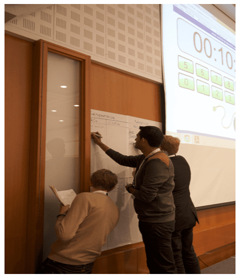
Group exercises - debate about the three options
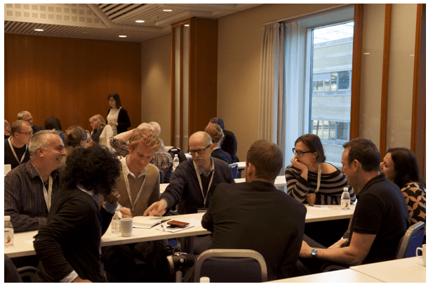
There were 3 exercises that we did as a group but I’m only going to talk about 2 of them. If you’re interested the third one was to get them to look at some real world scenarios that I gave the groups and to come up with some suggestions about which approaches to use.
The point of that exercise wasn’t really in the output (there was no right or wrong answer for any scenario) but just to instigate some healthy debate within their smaller groups about the merits of each approach.

First up we split into 8 groups and I gave them all 7.5 minutes (weird time I know but I had to get this to fit in a 45 minute window and organising 50 people meant the timings had to be fairly precise!) to think of as many pros and cons for each of the 4 different possible approaches to developing websites or intranets. Here’s what they came up with:
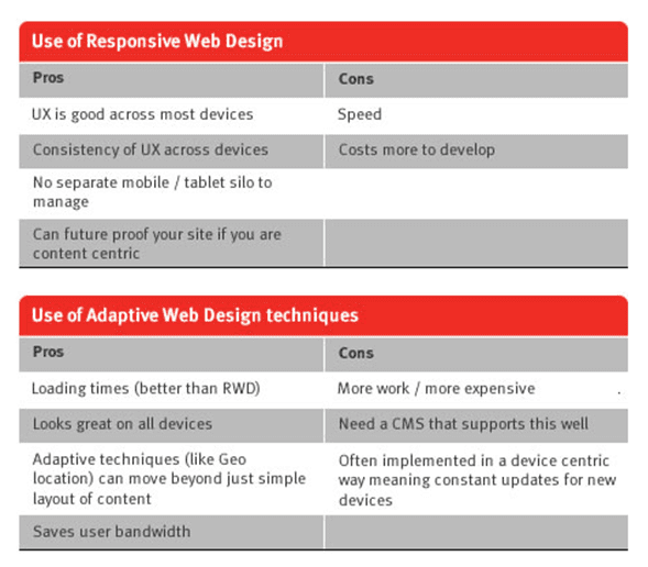
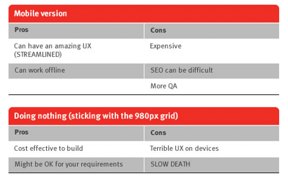
I suspect that many in the audience were not 100% on what AWD was (or perhaps had a very specific definition for it) so most were probably thinking about it in relation to the examples that I had given them. I am going to assume that the person who wrote 'SLOW DEATH' was referring to the fact that doing nothing would inevitably kill off a large chunk of your audience over time rather than some early feedback about what they thought of my session!
I was really pleased to see that 'speed' was at the top of the RWD 'cons'. My session had followed an excellent one from Bob Johnson about the apparent lack of care taken when optimising responsive sites for speed and the enormous financial impact that poor load times can have. Some people had been listening. Which was good.
The point is that it’s important to debate the pros and cons. RWD is often held up as the saviour of everything mobile. It’s probably the best tool we have right now and usually a good default position. But we need to keep raising awareness of the problems that can occur. I must admit that the point about 'content-centric breakpoints' is one of mine.
Over the Summer I talked at Internet World and wrote some blog posts about how we should try to be more content-centric in our approach to RWD and how the tools are starting to 'suck less' which will allow designers to work in this way.
Post-evaluation of the session - six questions on their views on RWD
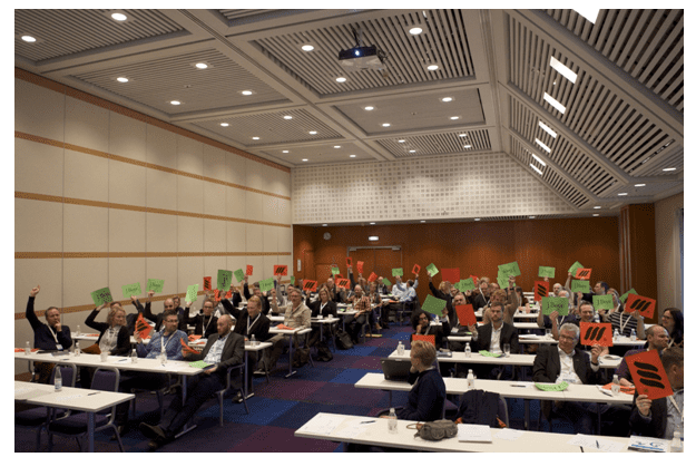
It was then time for the quick fire question round. Now that they had spent 40 minutes listening to me and discussing these approaches I thought I would ask the group 6 questions. The mechanism for voting was inspired by the great 'Ready, Steady, Cook' TV show in the UK. Basically everyone held up a red card for 'yes' and a green card for 'no' (see photos below).
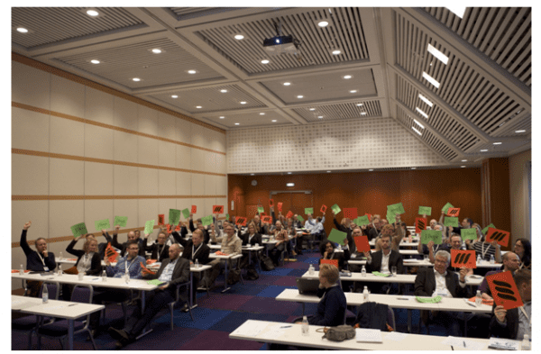
There was no right or wrong answer to the questions because they were all asked in the context of the individuals own website or intranet. The 6 questions were:
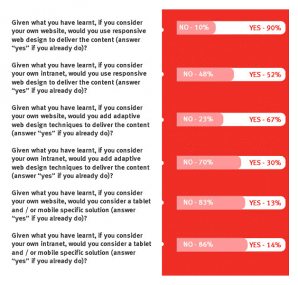
I thought these numbers were fairly interesting (although not entirely surprising). Responsive Web Design was clearly the 'darling of the room' (as someone tweeted after the session!). Nobody wants to build a separate mobile site any more. That’s fine. I accept that. I just hope that a few people came away thinking about the approach that the BBC take and that maybe, just maybe, they might be involved in a project where the mobile UX needs to be so different as to merit a separate site. I’m not sure the 'dreaded mobile silo' should be killed off just yet.
Company Intranets
I’m also not surprised (but I am a little saddened) by the lack of care over going mobile on company intranets. I honestly do understand why. As a founder and owner of a small business I don’t think I would invest time and money into a mobile optimised intranet. However, we don’t really have a lot on our intranet.
For big companies (and there were a good number of people from big companies), I would hope that, as we enter the age of BYOD and a more mobile workforce, many would start to think about the merits of staff having fast access to important internal content on the go. Doesn’t seem to be the case with my group!
Perhaps it’s just because everyone uses SharePoint and they know how badly SharePoint sucks at this stuff. In which case, come and talk to us. SharePoint 2013 is getting better and we have a team that has mastered the art of making responsive SharePoint sites that don’t look awful (i.e. don’t look like SharePoint sites!).
I really enjoyed the session and the attendees really go involved which was great! I am now preparing to deliver an extended version at the start of March in Manchester. This will give us more time to discuss some of the data such as the healthy realisation that RWD has some real negatives (particularly if not well implemented) and that a combination of approaches is perhaps the best way forward!

Thanks to James Cannings for sharing his advice and opinions in this post James is the co-founder and CTO of a Web Development Agency called
MMT Digital. He previously wrote about
new tools for building responsive sites. James is responsible for the development team and carries out a lot of consultancy work to ensure that their clients are getting the best return from their investment in technology. You can follow him on
Twitter or connect on
LinkedIn.


