What is responsive email design?
Responsive design is an approach for web and email designs that ensures the user has the best experience possible, regardless of whatever device they are viewing.
Often you will find that a website viewed on a normal desktop PC will look a certain way, however once the same site is viewed on a tablet computer or mobile device it will look considerably different.
Responsive design will re-arrange and streamline web and email content for these different devices and screen sizes. It helps to minimise resizing, panning and scrolling by the smartphone or tablet user. It may also involve enlarging smaller text as well as making links and buttons actionable and visible. This gives the user a much simpler experience enabling them to engage with the creative and offer in the email.
Examples of mobile responsive emails
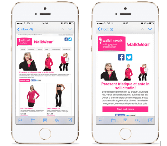
Here is our first example showing the difference between a non-scaled email template on the left and a responsive email template on the right with a simpler single column layout and clearer text and calls-to-action.
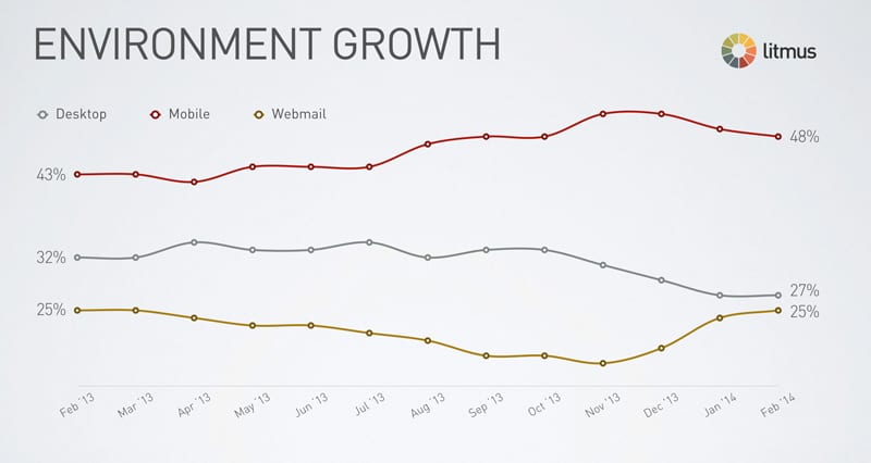
Responsive design has become a prominent concern for web developers and email marketers in the last few years, notably since the release of the original iPhone in 2007, which was the first true smartphone. If you're making the case for responsive emails, check the latest Litmus statistics on emails read on mobile devices which show the dominance of mobile opens.
How has it Responsive Email Design evolved?
Responsive websites have been around for a number of years, however responsive emails are fairly new. For instance only two years ago responsive emails were particularly limited in structure, where two 50/50 columns were arranged into one, with limited functionality.
Now, the possibilities of responsive emails are almost endless. You are now able to include multiple columns of varying sizes, hide and show navigation, include responsive elements inside responsive elements and expanding CTAs.
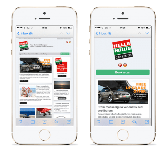
Below you can see in this next example of a responsive email, with two different sized columns, each with a call to action button within the articles. On a smartphone, the panels stack on top of each other, expanding to fill the width of the device, the buttons expand so that they are clear and actionable and the social icons slot underneath the buttons.
Responsive design techniques
There are a variety of techniques which are recommended when creating responsive design websites and emails.
Fully responsive emails offer a great user experience on all devices by rearranging content into a single column.
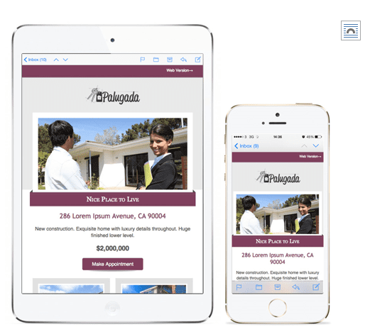
Scalable design doesn’t rearrange the email, it simply resizes it to fit onto a smaller screen as shown by this example.
Mobile First is a philosophy that highlights the need to prioritise the mobile context when creating user experience.
You may also want to consider hide/show navigation, dropdown menus, stack top, fixed position CTA and progressive disclosure.
How does it Responsive Design work?
In the CSS code of the email there is something called a media query.
These clever CSS tags can check out the device that’s opened the email to find out:
- The width and height of the device
- The width and height of the available space
- Device orientation
- Pixel density
Now, armed with all this information, the designer can specify how the elements of the email will be laid out under certain conditions.
For example, if you wanted your content text to show up bigger on small devices you could put:
@media only screen and (max-device-width: 480px) { .content {font-size:20px !important;} }
This would make the font size nice and big on small devices, but stay normal size on bigger devices.
This can be extended to change the layout of the whole email. The ‘wrapper’ can be made thinner on small devices, and If the sections in the email are coded in the right way, they will shift to stack underneath each other.
Limitations
Responsive design emails do not display correctly in all email clients. Some email clients strip out any CSS styles and media queries (which are required in order for RD emails to work) so they will not render correctly.
This is obviously a big problem, as the email will just display in its original format on all platforms, thus making all of your hard work developing it to be responsive, useless.
Designs have to be kept pretty basic in order to be able to flex and mould to different styles, which could mean losing some of the vibrancy and exciting designs that people are becoming more and more expectant of.
It is also worth noting that not every email can be ‘transformed’ into a responsive email. If an email is to be responsive it needs to be designed and built in a particular way; it must conform to a grid layout and image heavy designs with overlapping components (such as below) will not work.
Conclusion
We are entering a new age of email design and developing. With so many device options already available, there will soon be too many to continue adjusting and creating custom solutions for each screen size, device and advancement. That is why you need to consider practicing responsive email design today.
By taking the time to learn and adopt responsive design as early as possible, you will save yourself time, money and resources in the future. Not to mention continuing to keep the customer happy and dedicated to your brand.
To find out more about how you can use responsive design in your email marketing, check out our detailed whitepaper on responsive email design.

Thanks to
Becky Hesilridge for sharing their advice and opinions in this post. Becky is the Social Media & Online PR manager at
Pure360. You can follow her on
Twitter or connect on
LinkedIn.


