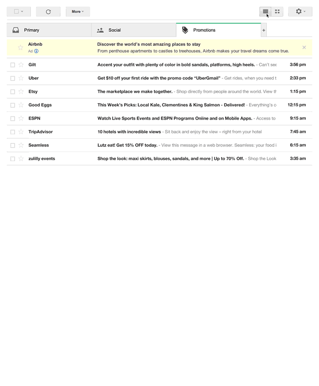
Gmail Promotions Tab Grid View: The Lowdown
Brace yourself, email marketers, Aaron Rothman, Product Manager at Google, recently announced some more major news on the Gmail blog which follows on from Gmail's move to default image display.
The announcement explains that Google is testing a new feature for its email service, making the promotional tab more visual. With one click users can switch to a grid view and can see the pictures used in promotional newsletters straight away.
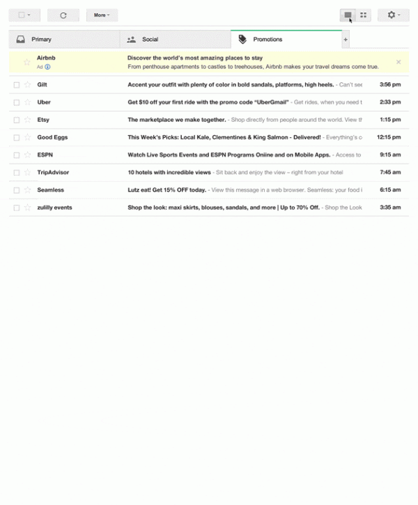
You can see the visual impact from this mockup from Google (click for animation):
The thought behind this and what excites us most is that this will make it easy for Gmail subscribers to quickly scan through their promotional messages and find the ones that look interesting. And why do they look interesting? Because the content is engaging. I more than welcome this exciting change, and it seems others do too. Here’s an interesting tweet on the matter:
Interesting, it appears that Google is trying to assuage email marketer’s fears of the Promotions inbox: http://t.co/MNQ3plUnMv (via @isaach)
Richard Nevins (@hornOKplease) March 25, 2014
Who has access to this?
At its current stage, however, it’s only an opt-in field trial, which you may want to check out, but should the beta-testing prove successful, Google might as well roll it out as a permanent option for all users.
What are the implications of this development mean for brands?
- Another nod to Google+ (will it ever end?!) - the brand’s logo is taken from its Google+ profile. So if you don’t have G+ up to date, get on it.
- This also means they could in future, direct user’s clicks on the logo and direct this straight to G+. We’ll soon find out.
- This opens up a new opportunity to define an image that drives people to open or ‘star’ an email – a potential deliverability / inbox placement metric, although I’d favour an actual open. I guess the use cases for that are thin, but maybe some creative can think of a better one.
- It looks rather like Pinterest, some have noted, which is a good reminder that all Pinterest seem to have ‘cracked’ is layout which can be easily stolen (think Mashable)
- Unless specified in the email (how-to below) Gmail uses an algorithm to determine which image should be shown. And where algorithms (or any kind of marketing opportunity) exists, manipulation will always be attempted. That might be on Google’s part with them charging brands to display a certain type of image, or a GIF, even which we’re yet to test, but imagine it could be super-powerful.
Many brands asked their subscribers to add them to their inbox when the promotions tab was announced. If this feature is rolled out permanently, brands might want to change their opinion and actually might want their emails to be sent to the promotional tab.
An important question that inevitably arises is how it will affect your reporting of open rates? i.e for customers who display this view and see your email image, will that count as an open? If not, email open rates might be impacted. However, we all know that images are highly compelling content and this is where the opportunity lies for brands, as it might just have reached a whole new level for email marketing. We’ll look into this and update you ASAP.
Marketers – you can control how your email is displayed
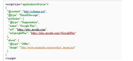
If you want to test using markup to change the image, company name, and logo used (you early adopter, you), here are the instructions as defined by Google, below:
- 1. Replace the word ‘Google Play’ with your company name (ideally your ‘from’ address)
- 2. Replace the G+ link in red underlined below with your own brand’s G+ link.
- 3. Replace the URL in black underlined with your website address.
- 4. Replace the featured image link, in orange underlined below with a link to the featured image itself which must be at least 580px x 400px or it will be made smaller by Gmail.
- 5. Don’t touch anything else. Paste this completed stuff into the <head> section of your email.
Points to note
I asked Daniel Eisenhut, Head of Professional Services, Emarsys for his view on the the implications. He explains the implications as:
'It’s like Pinterest for your inbox. Consumers are far more likely to scan the inbox than methodically run through each subject line one by one – and a picture speaks a thousand words – so think of it like this: you just got another thousand words’ space for your subject line!'
He recommends that
- Subject line length to avoid it being shortened: 75 characters.
- From name length to avoid it being shortened: 20 characters.
He adds:
'Return Path recently advised marketers to stop sending so called 'Move Me' emails requesting users to move their messages to the Primary tab! If this grid test performs well, we might even see 'Move Me Back' emails!. Now the reasons of the tabbed functionality should be more understandable for marketers that now allows Google to experiment with new ways of presenting offers in commercial emails to recipients'.
Please share your comments below or tweet @1uella – I’m interested to debate this.

Thanks to
Luella Ben Aziza for sharing their advice and opinions in this post. Luella is Director of Content & Research at
Emarsys .You can follow her on
Twitter or connect on
LinkedIn.