With the majority of email now read on smartphones, to be effective, your emails have to stand out from the crowd
There are a lot of boxes to tick to design a successful email. It needs to be on brand, it needs to stand out, it needs to work on multiple devices and it needs to deliver enough value that customers don’t just hit unsubscribe when it arrives. The design also needs to be effective on a mobile inbox. As the latest stats from Litmus on Email reading platforms show, over 50% of email opens are on mobile.
A lot of things can go wrong.
But with the channel still delivering higher ROI than any other – an average of £38 for every £1 according to the DMA - getting it right can have incredible results for your business.
So, where do you start?
Here are 5 key steps to designing an email that converts which we look to follow in my team at AlchemyWorx.
1. Be enticing
Your email lands in your customer’s inbox while they’re on the train, or making dinner, or watching TV. Now the first thing you need to do is convince them to open it.
There are three main components that go into creating a great first impression and getting your email opened:
Your sender name – This may be a brand name or individual, but either way it should tell subscribers exactly who you are.
Your subject line – As the first and possibly only change to engage, it needs to be irresistible. A lot has been written about the optimal length - recently Mailer Mailer reported that subject lines between 28-39 characters see the highest open rates - but meaning and originality are just as important. Keep a list of different subject line tactics to spark new ideas and stop them becoming repetitive. Once you have some options, use Touchstone to virtually test them and find the one that will generate the highest open rate.
Your pre-header text – Appearing after the subject line in clients like Gmail, pre-header text is essentially a second chance to convince subscribers to open. It should work in conjunction with your subject line to add another component to your message – although not all customers will see it so your subject line should work independently too.
Here is a great example:

2. Be readable
Great news – your great first impression has worked and a subscriber has opened your email.
Now you need to make sure they can read it.
With over 51% of opens in Q3 2015 occurring on smartphones and another 14% on tablets, mobile friendly or mobile first design is essential.
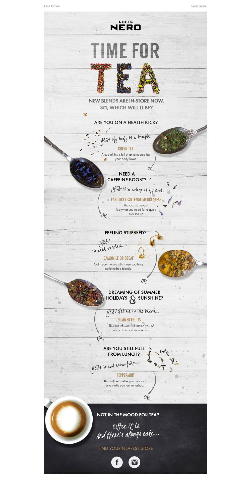
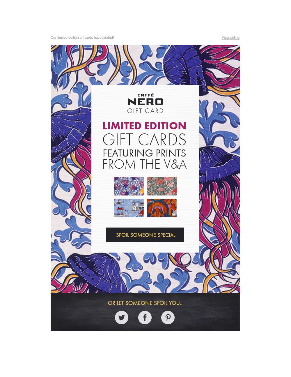
Take this Caffe Nero email, for example. It has been designed so the key content is within a 320px frame (generally the lowest screen size) so it will look great and be easy to read on mobile. The tablet and desktop versions then simply show more or less of the surrounding detail.
 If resource is a concern for making every email mobile-friendly or mobile-first, a master template might be beneficial.
This is a pre-built selection of content areas that are mobile-optimised and ready to use. All you need to do is select the sections you want each time. Here’s an example, and how it looks on desktop and mobile.
Desktop:
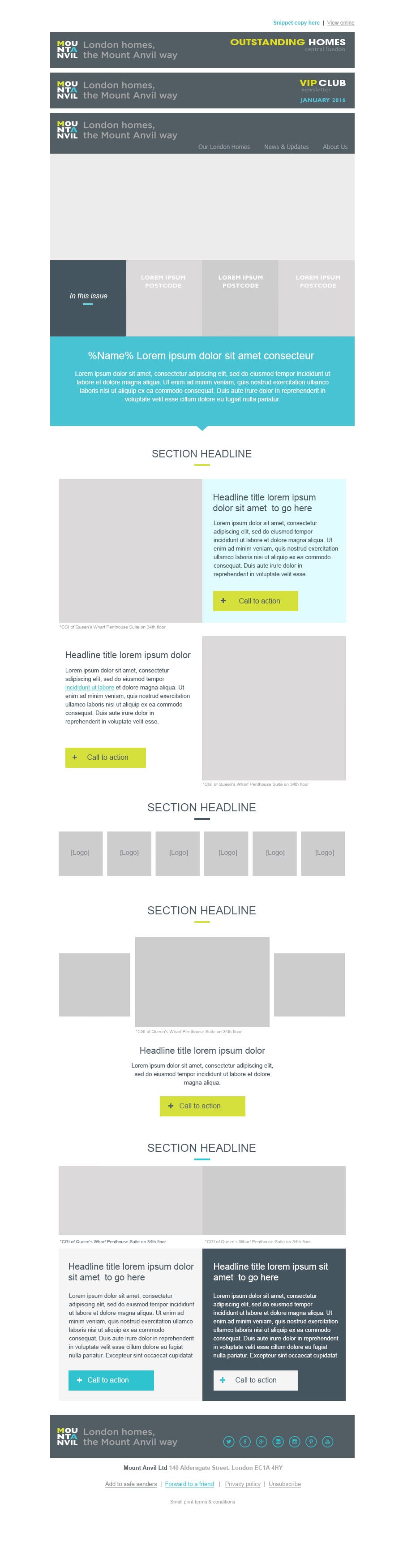
Mobile:

Notice that the fonts are a minimum of 14pts so they are readable on mobile, and CTAs are a thumb-friendly minimum of 44px x 44px.
3. Be clear
Your customer has opened your email and it looks great on their device. Now you need to get them to interact.
As your reader will most likely be skimming your email rather than reading, you need to draw them into the key areas.
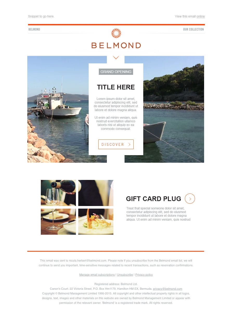
This can be done through creating a content hierarchy, and using visual cues such as colours and lines to draw the reader’s eye in. For example, in the below email the arrow draws the reader from the header into the main message and, if they still haven’t clicked at that point, onto the secondary content.
Once you have drawn your reader in, you need to tell them what the email is about with short, clear copy.
Your reader should be able to understand the key message from the headline and CTA alone, and remember you only need to say enough to encourage your subscribers to click - everything else can be done on your website. Keep your copy live text so your message will come across even if images are blocked.
4. Be relevant
Now your customer is clear on what the email is about. The question is, is your message relevant to them?
Customers expect personalised communications, and data from Experian shows that when they get them they are much more likely to engage. So your email needs to be – or at least appear – tailored.
There are many ways to achieve this.
You can use dynamic content to show the most relevant articles, display membership numbers or feature previous purchase details.
Or you can deliver contextual personalisation such as geo-targeted maps or live weather feeds through tools such as Movable Ink, Liveclicker or KickDynamic.
Of course the most basic way to personalise is in the subject line. Experian found that just including a name in the subject line boosted open rates by 29.3%, but you don’t have to stop there. See what other data you can use too - for example a purchase reminder might include the brand or product name, and an events listing might reference the customer’s city.
All of these small touches turn your well-designed, well-thought-out email into a relevant, personal communication.
5. Be memorable
Now you’ve got the basics sorted, the final step is to make your campaign into something that makes a statement.
Beyond opens, clicks and conversions, every email is also a branding opportunity, so be creative and deliver something valuable!
Exactly what this is depends on your brand and industry. It might be creating a sense of community with a live social feed, it might be showing off your fun side with humorous copy, or it might promoting products through an effective gif or cinemagraph like below:
Either way, putting in that extra effort and creativity is likely to help you stand out against your competitors.
That’s it!
You now have an effective, engaging email that will give you the best chance of maximising your ROI and delivering a great customer experience.
The most important thing when following these five steps is to remember who your customers are.
If you already know that your subscribers mostly open on desktop, make sure you focus time and effort on that design. If you know that your database is mostly Outlook users, prioritise effective copy over GIFs and images that won’t be supported.
They key is to your customer in mind at every stage, and if in doubt test, test, test.

As Content Lead within the creative team of
Alchemy Worx's Creative Team, Natalie Littlewood has worked with brands such as Aviva, Tesco, Tommy Hilfiger, Caffe Nero, Allianz, Feel Unique and Carphone Warehouse. She is passionate about discovering what makes our client’s audiences tick in order to craft copy that resonates with them.


