To execute operational reporting best practices, it is important, first, to get back to basics and remember the purpose of operational dashboards
Operational dashboards help CEOs, department heads and frontline employees assess performance, spot trends and offer actionable insights based on the data presented. Good operational reporting and intuitive dashboard design give busy executives and employees the information they need at a glance, allow more time for BI analysis (rather than merely finding data) and can even shorten meetings to improve employee productivity.
What contributes to good operational report format and solid dashboard design? Moreover, how should it vary from user to user? To execute operational reporting best practices, it is important, first, to get back to basics and remember the purpose of operational dashboards.
Download our Premium Resource – Measuring and reporting on client campaigns
Our guide shows you the building blocks of ‘data-driven marketing’, ensuring that data that is important to your client is captured in an effective manner across channels and campaigns for reporting.
Access the Measuring and reporting on client campaigns
What Is Operational Reporting?
Operational reporting supports the everyday functions of a company with key analytics by accessing the online Operational Databases instead of analytics derived from a data warehouse. Important business analytics could include for example, total sales, leads, ad conversions, new customer acquisitions or end-of-day balance sheets. Productivity KPIs such as daily account audits, daily travelers’ logs or products manufactured could also apply, depending on the industry.
Operational reports help company leaders make daily, weekly or monthly course corrections; improve business processes; and measure the efficiency and success of individual employees, departments and the entire organization.
Following operational reporting best practices helps leaders find the information they need quickly and efficiently.
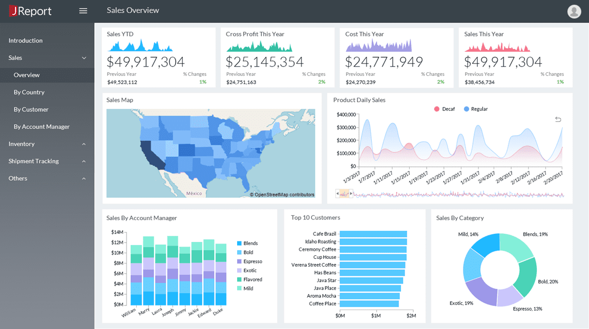
Effective Dashboard Design Puts KPIs in Clear View
Determine your KPIs before you embark on creating the dashboard. A well-designed dashboard puts the most significant KPIs at the top of the page in an easy-to-find format. It should not take anyone more than five seconds to find the most critical KPIs — even if it's their first time looking at the dashboard.
Once users have found the essential data, they should be able to dig deeper to find historical data and comparisons that help them spot trends. Putting too much information across the top of the home screen can obscure the most relevant data points. More detailed data should be available by scrolling or with just one click.
Why the Inverted Pyramid Format Works for Operational Dashboards
Journalists, college students and other writers have followed the inverted pyramid format for centuries. Operational dashboard designers would do well to adopt the same practice to share information with their colleagues. Organizing information into an inverted pyramid helps the presenter tell a story.
For example, in a blog post, the headline is a broad overview of the article's topic. The subhead, or even the opening of the story, provides a bit more detail. The rest of the content conveys more specific details and examines the why behind the main topic.
In operational dashboards, an inverted pyramid shares the most crucial information first, provides context for these insights at the second level - as well as exploring historical trends - and then digs deeper for an analysis of the details at the third level, providing actionable insights to improve the top-level data.
Choose the Right Data Visualizations for Your KPIs
While top-level BI data is often presented as numbers, metrics on the second and third levels are often conveyed with graphs and charts. Limit these points to no more than five to seven visualizations per level to keep your dashboard from looking cluttered, ensuring your audience can absorb all the information.
Data visualizations might include historical data, comparisons or greater detail about the top-level KPIs. These visualizations should tell a story about what works in the company or department, what needs improvement and how to approach changes.
The granular data visualizations that make up the third level of the operational dashboard should spark discussion, creative ideas and further exploration by team members.
Follow These Tips for More Intuitive Operational Dashboards
The inverted pyramid is only the first step toward a more intuitive operational report format. Presenting information in a well-organized, easy-to-read format across the report leads to greater business insights and, ultimately, improved performance.
Even if you are not a graphic designer, there are a few design principles you should know and follow when you design operational dashboards.
Maintain a consistent colour theme
Using too many colours on your dashboard can lead to information overload and confusion. Choose a colour palette and rely on different shades or saturations of the colours in that palette to differentiate information. Make sure there is enough contrast between the shades to convey the information clearly at a glance.
Choose the right data visualizations
Should you use a pie chart, line graph, heat map, bar graph or plain text to convey a specific data point? For single, important numbers such as gross sales, simple text may be the best solution. When comparing data points, a bar graph might work most effectively. Line graphs might be the best choice for spotlighting trends or comparing data in different regions or results using different tactics.
If you are unsure which data visualization to choose, operational dashboard design software can make suggestions to guide you down the right path.
Share the most relevant data
Before you even begin creating your dashboard, determine the most relevant KPIs and supporting data. Your KPIs will vary based on the users or the types of operational reports you create. A dashboard for the sales department is different from a dashboard for the C-suite, especially when you get into the weeds with data analysis.
If you create one dashboard with multiple types of operational reports, use filters to separate the data, letting the user see the information they need with just one click.
The types of operational reports you share depend upon your industry and your audience. A clear understanding of operational reporting best practices and each department's unique data needs will ensure your operational dashboards lead to performance improvements.
Jinfonet Software provides the JReport product suite, a Java reporting solution that delivers highly customizable business intelligence. JReport’s sophisticated reporting engine seamlessly embeds into any application and empowers end users to make better business decisions by helping them visualize and interact with their data.