10 hidden factors that could be affecting your Conversion Rate
Many elements come into play when you are seeking to improve the conversion rate of your website as part of a site conversion optimisation strategy. You may already appreciate the importance of testing major changes such as the offer, call-to-action buttons, placement of product pictures and headlines.
However there are other technical features of a landing pages, which if not implemented correctly may also damage your conversion rate. In this article I define 10 factors which are less well known but could easily be compromising your success. The examples I will include cover both classic landing pages for lead generation, in B2B for example and also Ecommerce sites.
Ten steps to improving conversion on your website
1. Utilizing a CAPTCHA
Everyone is familiar with these...
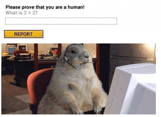
A lot of web users hate CAPTCHA codes, which comprise of typically distorted combination of numbers entered to show that you are in fact human (and not an automated spambot setting up an account to create comment spam). To stop this, CAPTCHAs have unfortunately turned out as the primary method of detecting automated form submissions.
It’s important to always remember the fact that CAPTCHAs are hated just as much as spam. The unfortunate bit is that these combinations of numbers and letters have become the most popular method of fighting automated submissions and so many sites continue to use them. You may want to explore alternatives though.
An interesting survey was conducted by Moz last year showing that turning off CAPTCHA allows fewer spam mails to get through, without losing conversions along the line. There were nearly 160 failed conversions after turning CAPTCHA on again.
If using a CAPTCHA on forms to prevent spam you can try disabling it only temporarily and check if rate of conversion increases. NuCAPTCHA is an alternative to CAPTCHA present on the market. It promises to fight spam effectively, while also preventing conversions from eluding your form.
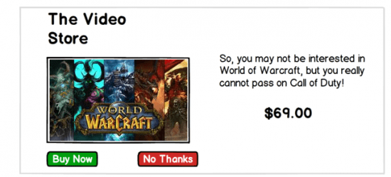
2. Applying the regular Call to Action text
You may have tried replacing 'Buy' with 'Add to Cart' call-to-action text or 'Get a Quote' with 'Find out More' for instance. Indeed, small alterations like these could improve conversion rates significantly.
Even then you still can go deeper. Did you know for example, that Dell made $25 million extra in sales by simply replacing three little words? Their initial call-to-action 'Learn more' which is frequently used, they changed to a more interactive phrase, like 'Help Me Choose'.
Those three words though small, provided crucial leads to understanding at which point a user was in the purchasing process. They already were certain of buying a computer and thus didn’t require to 'learning more'. They instead were closer to finding the RIGHT computer. As such 'help me choose' was more ideal and practical to them.
How are you able to apply call-to-action button text for propelling users forward through the process of conversion? Another retailer made a change to the purchase process described by Jared Spool at UIE which de-emphasised registration where the button text change saved $300 million.
3. Keeping from Changing the Call-to-Action basing upon User’s Behavior
Though a bit more advanced, this tactic is still quite practicable in the sense of obtaining a constant rate of conversion. Consider a situation whereby the user is not really ready yet to take action. Perhaps they may have questions unanswered or are 'simply looking.' Such times are the best for you to assess their behaviour and ask therefore 'how may I still assist?'
Is there another step which you could take to help them feel more relaxed about executing that first move?
Can you offer free orientation on how to apply your product, or maybe a free webinar on ways of using your services to impact their business? You may as well try out a coupon they could use to make future purchase?
Most importantly, do not hold on until your prospect decides to leave the page before springing some kind of notification on them. Web users get quickly turned off by a dialog box screaming 'STOP! Take a look at our special offer! Click on OK to close down this window or CANCEL in order to remain on the present page.'
Wait, for what?
This statement is the equivalent to having a toddler cling to your ankles in panic as you are exiting the toy aisle.
4. Failing to Show Policies Up Front
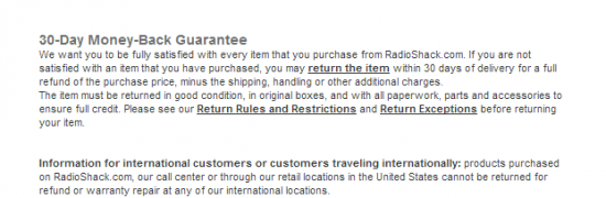
People hardly like hearing that returns are honoured only when unused, untouched and unopened. It is important to show your refunds returns guarantee, policy and privacy policy up front.
This not only demonstrates your integrity and transparency, but also offers the visitor a clear picture of just what are the rules of your company, before they decide on a particular action.
If you want to really shine, remember including the phone number, address and real name of your contact. Avoid any attempts if possible, of forcing the visitor to wade through endless murk which characterizes 'Customer Service Helpdesk.' For even more security and credibility, back up the policies you have with seals of trust like Hackersafe and Verisign.
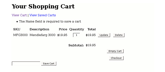
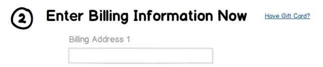
5. Not offering clients Shopping Cart Convenience
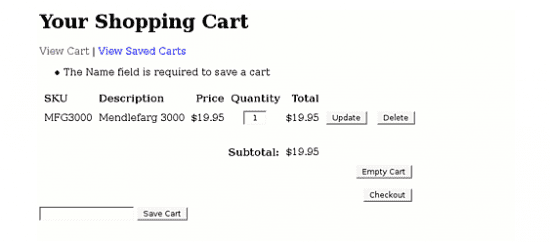
The majority of customers fill their shopping cart with different products then pause for several days while thinking of what to purchase next, or just hold on for their next paycheck. Once back, they get disappointed at the sight of their empty cart. Your customers should end up spending significant periods of time shopping on your site, especially now that cookies are widely accepted online.
Allow guest shoppers to fill their cart then keep it for a set time period without requiring buying or registering. You can achieve better prospects in fact, if able to tie in this convenience with 'social recommendations', ratings, reviews and ability to forward the page to their addresses on email.
Make use of 'social recommendations' in addition to this, such as '80% of customers surveyed would recommend this item to a friend'.
By doing that, you remove every kind of obstacle possible, while laying the flexibility and convenience on thick. Be prudent and give internet users multiple rational reasons for backing up their purchase online and show them how smart a decision they are making trading with you. This is very critical since the web visitors are unable to touch, try out or try on any product you offer them any other way.
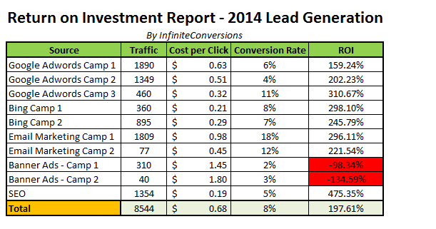
6. Failing to track your changes

You do not necessarily require a costly system for testing, measuring and evaluating the manner in which changes affect your rate of conversion. You do, however, need to know how every form of change you make affects the page and entire site through using your analytics system.
For instance, increasing size of product images on site may lead to loss of traffic due to longer loading time. It may as well allow customers who were only browsing more detailed assessment of the product and offer them greater motivation to make purchases.
What you get to lose in sheer traffic terms here, you gain also in conversions. You should use a simple Excel spreadsheet to help in identifying the 'testing chain' changes which resulted in improved overall conversion rate.
7. Noting paying close attention to Font Style or Size
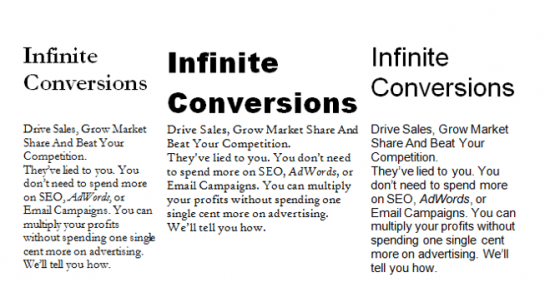
Font style in some way resembles a designer’s preference more than something which would cause a dip in conversions. Users would just leave and take their business somewhere else, if font size proved too small.
Most modern browsers today permit users to adjust their text accordingly, even though most individuals do not even know that this is achievable. Reading fonts which have 'feet' on the letter edges (like Courier and Times New Roman) get eyes tired faster on screen, thereby making Verdana or Arial (fonts lacking any 'feet' on them) better choices.
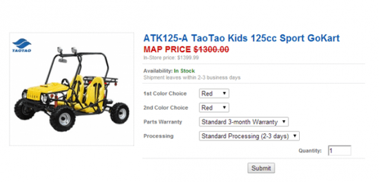
8. Inviting Coupon Code Use without employing any Coupons
Nothing is probably more distracting than trying to complete an order before suddenly noticing a promotional code or coupon form field. Your reader may subconsciously think that someone is getting a better deal than them somewhere in this case. Since most people enjoy being given discounts, your visitor will stop in-between the ordering process to seek for coupon codes.
To avoid this, do not show coupon codes at your front page only, but fill in one at checkout for the customer. Shoppers appreciate the discount or freebie even when something minor and continue ordering without having to feel interrupted.
9. Selecting a poor background colour

Granted, colour psychology affects how we perceive websites as well as our impression of them within the initial few seconds. Most sites err in terms of caution by selecting typical blue background plus a white content area. This is a popular choice which makes it more difficult distinguishing your site from others.
In recent times, there has been a surge towards bold, bright, high contrast hues together with simple and direct statements offering clear impressions to internet users.
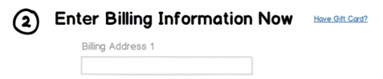
10. Failing to use Natural Language
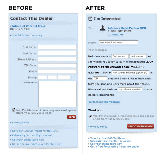
Forms have evolved a lot from standard grey buttons and text fields. They now more naturally blend with the site design and have interactive prompts.
Search Engine Land carried an article stating that using natural language in a form could increase conversion rate by 25-40%. Although the example above may be more difficult to complete.
Such friendly forms are known as 'Mad Libs', named after the road trip fill-in-the-blank game for children. The term arises from the way in which these forms adopt a conversational tone when inviting web users to complete them.
I hope you have found some of these ideas useful. Have you witnessed any unique or unusual factor on your site that increased the conversion rate? Please share your experience with us in the comments section below.

Thanks to David Rosenfeld for sharing his thoughts and opinions in this blog post. David is an Analyst at
Infinite Conversions, a digital agency focussing on improving website results through conversion rate optimization.