What do you think are the worst mistakes in website design today?
I'm a firm believer that one of the best ways to learn effective digital marketing is to review examples of good practice in digital marketing from other companies - like this example of good practice in landing pages.
But we can also learn a lot from mistakes that are commonly made. I hope the Smart Insights blog can help marketers avoid the time,money and stress involved with these mistakes by getting digital marketing right first time or fixing problems which mean missed opportunities.
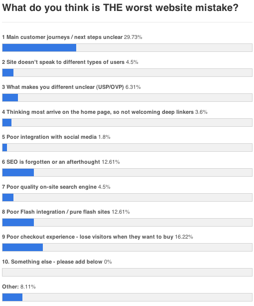
So what are the worst mistakes? Well, last week I gave a choice of 10 and you kindly gave me your view on the worst. This is what you thought:

Well we've got a clear winner which is the main customer journeys / next steps unclear. So definitely something to watch for there. I'm not sure why this is a clear winner. Perhaps it's because designers like symmetry, but with a balanced design nothing stands out. Perhaps it's because there are so many different factions in the company arguing for priority for their content/products/promotions that nothing stands out. Why do you think designs #fail this way?
"Focus on Five" An example of good practice in home page website design
The Landing page example above shows one way to tackle the problem of unclear journeys and proposition, but what about the home page? Here's an another example that my friends Conversion Rate Experts tipped me off about after recommendations on conversion rate / sales optimisation had been implemented as part of a project. I have added some good practice tips on the home page.

To summarise, this is what this design does right for me. It's not "high design" but it is user-centred with relatively little clutter and clear customer journeys.
1. Focus on Five! My simple mnemonic showing not to overload with content and give clear visual priority - I have added the garish green boxes.
2. Get the users on their journey! I like the combination of search and browse navigations in the top left and the brands encouraging
3. Make your offer crystal clear. The strapline gives this run-of-site and the Sale+merchandising visuals explain this further.
4. Encourage trust. A clear containers for this is essential for a less well known brand.
5. Encourage action. Clear calls-to-action and the time limited offers help here
More web design mistakes
We also got these free-form comments to the poll - especial thanks for these!
- Too many words, unclear navigation Poor navigation and clutter of text/information
- Page Clutter
- Don't tell the user who you are. On the homepage.
- Lack of depth. Minimalism is nice, but not at expense of real content.
- Poor Navigation Usability
- Forcing users to 'sign up' or give unnecessary personal detail
- Point 2 and 3 together - answering what's in this for me, why should I guess?
Clutter is a concern here, but some comments point to the need for sufficient depth, showing the challenge of getting the balance of design right for different types of users.
Learning good design by reviewing bad design
Do you remember WebsitesThatSuck.com? I think I was there in the late 1990s, it was full of horrendous flashing pink banners and splash pages. Its strapline was something like "learn good web design through studying bad web design". Which I think is still a great philosophy for learning across all of digital marketing. We learn through looking at how the best practices compare to the worst practices.
Well, the site is still around, although the worst crimes against design are a lot rarer and more subtle today. But real horror shows are not unknown, the example below is taken from their compilation of the worst site designs of 2010... No comment necessary.

Your ideas on design mistakes?
Learning from bad designs is still a useful approach to learn and there is certainly room for improvement in many sites, this one being no exception!
So I thought it would be interesting to start a discussion about what you think are the most common website design mistakes. I'm particularly interested to hear about those which mean that the site fails to meet it's goals; it's a marketing or business #fail.
So what do you think are the worst website design crimes you still see most often?
Here's a starter. For me, one of the worst mistakes from a marketing POV is...
Thinking everyone arrives on the home page, so messages about your brand aren't available across the whole site.
TIA! Dave Chaffey


