Brand logos are highly memorable and become a symbol of your company, service and products. This is why you need to create a good one
All famous companies have a trademark. It increases recognition and sometimes even determines the success of the company. A special combination of colours and symbols can capture the brand for decades or become another faceless corporate sign.
So how do you find a balance between brand involvement and recognition? How do you create a logo that will work for your business? In this article, we will introduce the rules and a step-by-step guide to developing a corporate symbol.
What is logo and why does your brand need one?
According to psychological experiments conducted at the University of Amsterdam, 67% of two-years-old and older children are able to recognize the brand by the logo. A well-designed sign means brand recognition, which is true for all age categories.
An e-commerce logo is a combination of visual elements and (possibly) text designed to fulfill specific goals. It tells the audience what your company is doing. Ideally, it should become a symbolic component: for one look to be enough for the emergence of the necessary associations. Remember the symbols of famous brands, you don't even need to write the name of the company under them for them to be recognizable.
Download our Business Resource – Brand vision and identity playbook
This playbook will enable you to define your approach, branding expert Debbie Inglis explains a structured approach to review and define your brand identity to make it more appealing to customers.
Access the Brand vision and identity playbook
Why is a logo needed?
First of all, it is needed for trust and recognition. That is exactly what start-ups and experienced companies want. The Venngage and SurveyMonkey teams surveyed 1,000 adult consumers in 2019. They created six types of logos and asked the audience to say which design inspired their confidence. Here are the results:
- There is maximum confidence in characters with a dominant company name.
- Consumers trust colour if it is associated with the color scheme of the industry (green - pharmaceuticals, etc.).
- A successful logo evokes the same level of trust among people of different age categories, among men and women.
So what does this mean? The correct design of the e-commerce logo makes the brand universal. It can appeal to the entire target audience and it will fulfill its functions.
Requirements for an e-commerce logo
A logo is not a picture for a gallery. The artist does not know in advance whether people will buy it or not. A business does not have that luxury. The success of a corporate symbol is the result of multi-dimensional development. In the process of creating a logo you need to consider the main requirements:
- Uniqueness. All simple characters with obvious meanings are already used and registered. Creating a unique sign is difficult, but real. In most cases, you can do it with the help of semantic and visual metaphors.
- Simplicity. The logo is used on the site, on business cards, the letterhead, promotional products, packaging, signs, in advertising and the media. Therefore, it will need to be suitable for both large and small scale, but in each case, it is important to maintain recognition. You need to use a minimum of detail and gradients, a combination of three colours maximum, good scalability.
- Compliance with business topics. To achieve associativity is difficult. It should be a symbol or colour associated with your industry in general and the brand in particular. A classic example: a snowflake symbol for a refrigerator manufacturer.
- Adaptability. We have already talked about this in the second paragraph. A corporate symbol should retain recognition, detail and simplicity in any format: from the favicon in the browser to a huge banner on the facade of the office.
- Originality. How do you make an e-commerce logo original? Make it memorable and recognizable. You also need to ensure it evokes positive emotions.
Types of logos
What is the best type e-commerce logo? Let's look at the most common options for emblems. They are divided into three general categories: textual, graphic, and combined.
Textual
Nearly 30% of modern brands prefer this option. Types:
- Abbreviations. This is an option for long company names that contain a few words, as fitting all the words in one logo is unrealistic. Therefore, it is appropriate to use the first letters of each word. A successful abbreviation with the correct combination of font and colour becomes a symbol of the brand - often people don't even realize that it is also deciphered!
- Brand name. If it is capacious, short, and memorable, then it is quite possible to use it as the main element of the logo. Font and colour are important for the text. The type of font creates a mood, for example, it is better to use a strict line for a construction organization, and for an entertainment institution you can try writing in italics.
Graphical
They are less common than text and combined (6% of the total). The reason is obvious: there is a big risk that a large portion of your audience will not be able to associate the usual “picture” with the brand. Graphical logos include:
- Symbols/signs: The example of a bitten apple immediately enters our mind. A symbol should carry a meaning, a clear idea and evoke unambiguous associations. The promotion of a symbolic logo is usually a lottery. It may “shoot”, or it may not be remembered.
- Characters: An example is KFC's Colonel Sanders. A person, animal, national or local symbol (if it is not prohibited) is used as a recognizable character. The logo performs the same function as a mascot for a baseball team: it maintains the spirit of the brand, increases recognition.
- Abstract elements: Geometric shapes, symbols and lines are used instead of the usual images. For example, the “wing” symbolizes a famous sports brand. On the one hand, inventing abstractions is not difficult. On the other hand, it is necessary to achieve associative correspondence. In general, abstract e-commerce logo ideas are recommended for international companies. With neutral symbols, it’s easier to enter the world market without fear of offending people’s national and religious feelings.
Combined
They are applied by 64% of the brands. This type includes images and text. Types:
- Text and graphics: A world-famous fast food joint has chosen this option. The recognizable icon in the shape of a large “M” is complemented by the full name, and both elements create a universal effect. Moreover, each element can be used individually: a concise symbol for business cards and websites, the full version - for signboards and banners.
- The emblem: The logo in which the text is placed. For example, do you remember the symbol of your college or university? In 90% of cases, it is exactly like that. The traditional logo, quite rich in details, is suitable for educational institutions, public services, and car manufacturers.
What to consider when designing a logo?
DesignBuddy conducted research on global company’s logos and made next interesting conclusions:
- 95% of brands use one to two colours for their logos.
- 41% of them preferred stylized spelling of brand names.
- 93% of global companies have logos which are not “lost” when decreased.
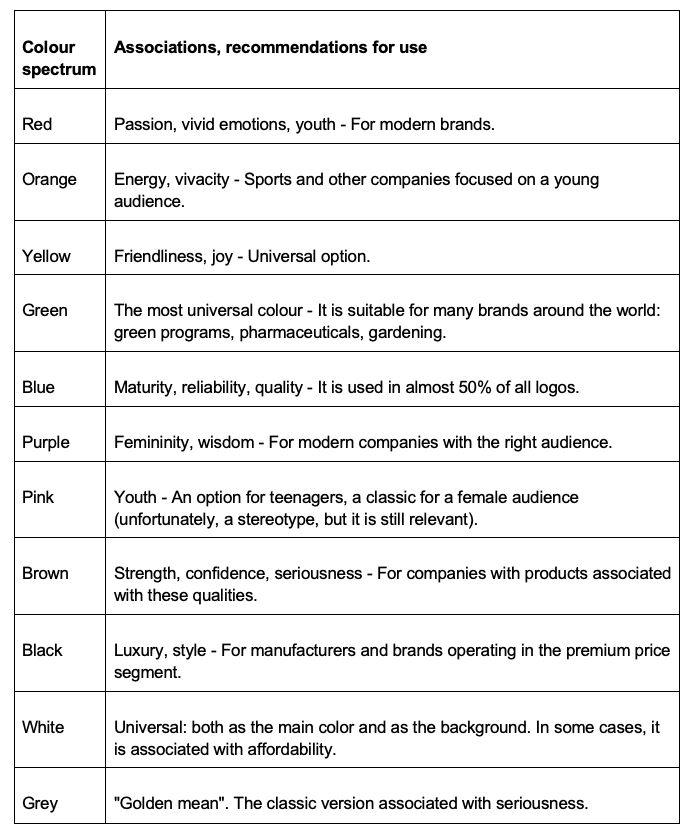
Colour is the determining factor for success. It evokes the necessary associations. Here's how the selected shades affect the audience:
The process of logo development: A detailed guide
How to create an e-commerce logo? Let's go this way step by step:
- Analyze the brand - Describe your company in one or two sentences, define goals, the value of your product. Do you already know your target audience? Based on this information, determine the qualities that the logo should convey to your customers.
- Study your competitors - Who are your main rivals in the market niche? Why are they better than you (or worse)? What are your differences? Do you like their logos? Why? The analysis will help prevent the copying of other people's ideas and mistakes.
- Define the options for applying symbolism - At least, define the most common ones. For example, if you have only an online business, you do not need to puzzle over creating a universal logo. Use any colours. If you are a carrier, your logos will be decorated with car cabs. This means that large, bright elements are important. Continue with the same logic.
- Compare different concepts - Create options with different color combinations, font types, symbols. They can be 10, 100 or several hundred. You need to find the most successful option. Test the best ideas on colleagues, target groups.
- Get feedback from potential customers and prepare files with the final design. Have you launched a new logo? Congratulations - now is the time to study the audience’s reaction. Make polls on social networks and on the site. Analyze frequent comments and make design changes. Now you can prepare all the necessary options: on a colored background and a transparent one, in sizes for printing, posting on social networks and websites.
Ways of creating a logo
You can hire a designer, tell them marketing conclusions, the ideas and let them draw a few dozens of options. However, even though this way has its advantages, it is expensive and time-consuming: usually, it takes a few weeks.
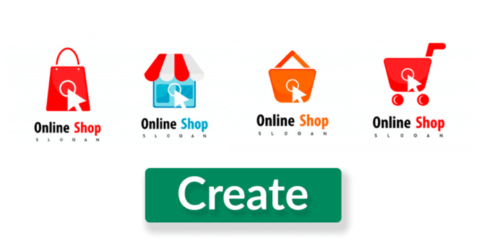
Another way to create an e-commerce logo is to make it online, for example, on Logaster. This is an automatic e-commerce logo generator that offers exceptionally unique options. It is enough to enter the brand name, choose the field of the business, and determine the appropriate color scheme. Next, you can select the appropriate logo from the list of generated ones. The advantage is that the service immediately creates options for the different formats: for printing, posting online, etc.
Another way is to place an order on a freelance website. For example, at Designcrowd, the contractors first fulfill the order and then the customer determines and pays for the most successful idea. But remember: you will have to pay even if you don’t like any of the ideas.
Conclusion
Logo design is a complex set of marketing operations. Take the time to analyze your company and audience in detail. Try different options. Avoid copying other people's ideas. Use the proven recommendations for choosing the type and color scheme of the logo. Don't forget that a brand name is part of a focused branding strategy. Therefore, equally develop all the elements of the brand.
Anna Kuznetsova is the content marketing manager at
Logaster. She possesses hands-on experience in writing about technologies, marketing trends and branding strategies. In his spare time, she is always happy to travel and learn about the world and new cultures.