Oxfam Ireland's new responsive design
With the dramatic increase in mobile site users all businesses are experiencing, there has been a lot of discussion of responsive design as an approach.
Responsive design gives the option to deliver a great experience for smartphone, tablet and desktop users without the need for creating a separate mobile optimised site or apps. So it can be a cost-effective solution.
If you want to learn more about the approach I recommend this primer on responsive design approach shared with me by Dan Croxen John.
Examples are often the best way to understand the potential of an approach, so in this post I focus on a single example which shows the benefits of the approach.
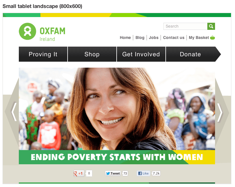
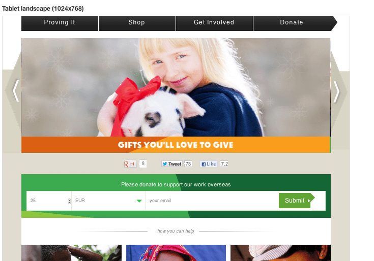
Oxfam Ireland responsive design example
I saw this Oxfam Ireland example mentioned in the excellent LinkedIn Web Managers Group and thought it was an interesting example of a responsive design that was worth sharing.
It was shared by Keith McManus, Digital Communications Manager at Oxfam Ireland who was sharing the approach and asking for feedback. I thought it was a good example to include since I know many Smart Insights members work with charities and not-for-profit organisations, but it’s of wider interest too.
I’ll let the screengrabs do the talking. It's worth viewing the site adjusting your browser to see how promotional banners and Oxfam gifts are removed/added as the viewport changes. A little more on the tech approach to follow….


The site was created on the Drupal Open Source content management system popular with many charities by Ireland-based design agency Annertech.
Keith explained to the web managers group commented on the in-house approach:
"The creative and front-end design was carried out in-house, by a team of two. Designing in a responsive way did take quite a bit of additional time (putting it crudely, we essentially designed 4 different websites based on different widths).
Now that it’s live however, it’s business as usual from a website/content management point of view. All new content automatically displays appropriately on different devices, so well worth the investment".
I captured the screengrab examples using the excellent free Web Developer Toolbar from Chris Pederick. I use it on Chrome, it’s available for Firefox too and is useful for onpage SEO also.
What do you think of this example? What are your experiences of responsive design? Do you think it’s useful in a range of situations, e.g. retail, travel and financial services sites or only for some like non-transactional sites or blogs?


