Planning your Responsive Web design
You will have noticed that responsive web design has become a real buzz phrase in 2013. However, responsive design is not a new concept, in fact far from it. Making something that looks great on all browsers and across all platforms should be the benchmark for all web design. Reaching that benchmark requires Designers and Developers to slightly alter their outlook on a project.
There are a number of practices you can adhere to which will help to ensure your site is viewed in the best possible light. Below are some pointers both planning and technical.
Planning your Responsive Web Design
Responsive doesn’t just mean ‘squishy’. The majority of users will view these sites on different platforms, but won’t switch between them.
Just make sure the user can view the content in the most effective way. Alternate versions of sites are just as effective as a site that re-scales.
Responsive web design takes time and thought. It requires logical planning to work out how a layout might function across desktop, phone and tablet. Often the best solution is to add in an extra element to the work process.
Creating different layouts at the design phase means any development has something to closely follow and match. Also, detailing functionality at the initial UX phase will allow you to know what is required at later stages.
Having set structures and designs before development means you have something to work towards but by no means should these be rigid. It’s what works when live that counts so be prepared to be flexible, within reason, with your designs as what works on page will not always work in situ.
Switching structures within the one site requires a catalyst and in-turn an action. The breakpoint refers to the point at which elements will be rearranged according to the device you are viewing the site through.
It’s important to realize that some elements will need to be moved when switching between say a desktop view and a smart phone.
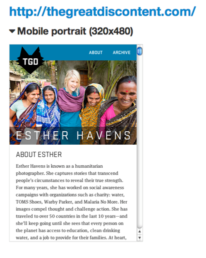
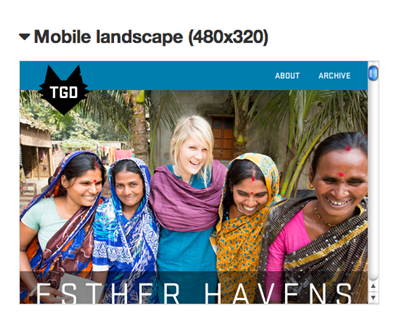
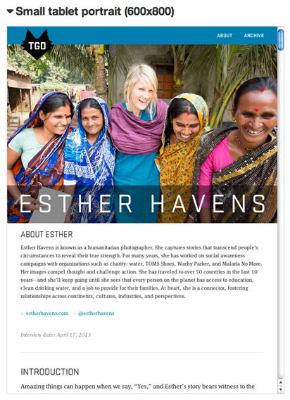
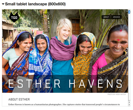
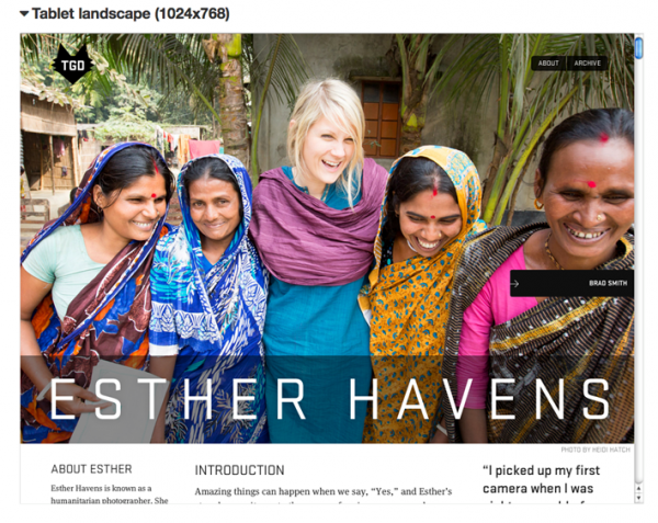
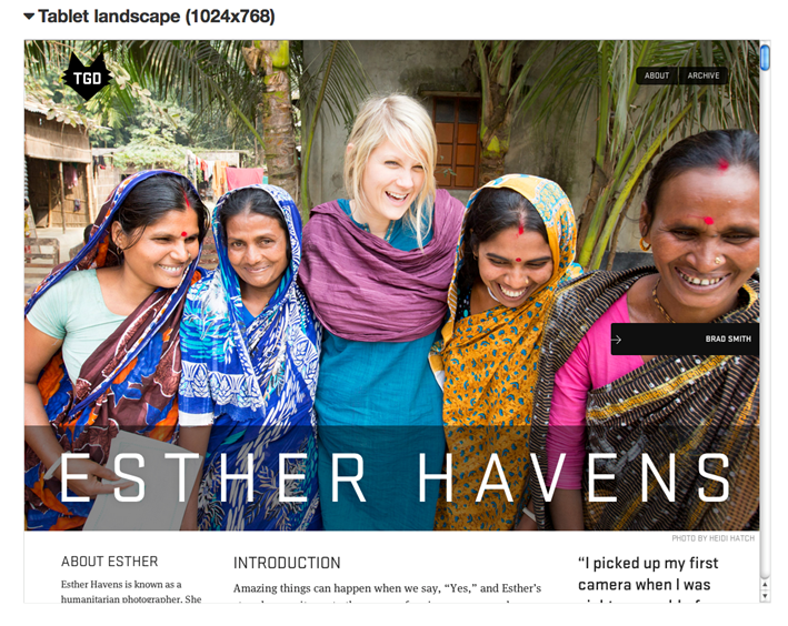
Great Discontent showcases RWD across platforms
The Great Discontent is a good example of this feature. The pagination floats within the image area but when switched to the mobile version, the arrows move to the bottom of the page as not to obstruct the image.
Sensors
Responsive design is all based around a series of sensors, which activate different views or structures accordingly. So when planning out your site, consider these sensors in detail as they will be the difference between responsive and sluggish.
The best sensor is the user’s preference. The more you know about a user, the more tailored and responsive your site can be, in-turn making their experience better overall.
This example uses sensors to detect the time at which the user is viewing the site. The layout and styling then responds accordingly, going dark at night.
Loading techniques can also be used to respond to a user. Conditional loading queries the user’s conditions, mainly regarding screen width and resolution; then, if certain conditions are met, the appropriate content is loaded. People mainly use this technique to load responsive images and media.
For example, if the sensor indicates that the user has a small screen, then you could load an image with smaller dimensions, rather than one for larger displays, which could waste bandwidth and (depending on the user’s connection) increase loading time.
Design is about meeting a need in a way that is visually pleasing, but also that works to meet the needs of the user. This is the base motto of responsive design.
The process itself might be difficult, it might add extra expense, but considering the wide spread of different platforms people are now using to view web content, it is a must. There are now more people viewing sites on mobile devices than there are viewing on desktops so going responsive is the right choice.
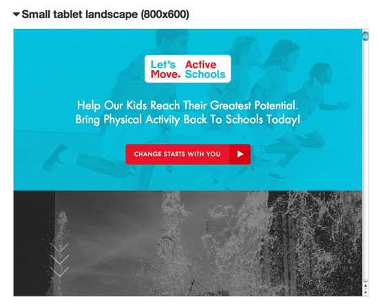
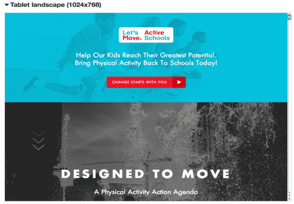
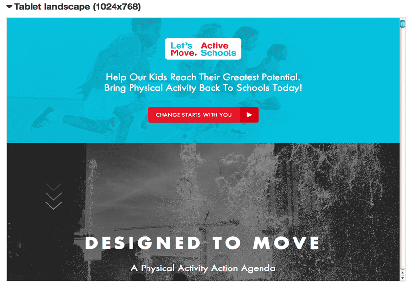
Examples of responsive web design
Here are some more examples to give you some food for thought:
Resources on Responsive Web Design

Thanks to Mark Donington for sharing his advice and opinions in this post. Mark Donington is the Lead Designer of
Higher Ground Creative You can follow him on
Twitter or connect on
LinkedIn.


