Best practice UX, UI and design principles from inside and outside the world of financial services
Finance is something that affects all of us is one way or another nearly every day of our lives. As the internet has continued to grow and give rise to new platforms, mainstream banks and emerging players alike are giving consumers more choice than ever to bank, save and manage their finances online.
Download our Business Resource – Financial services marketing trends guide
In this guide, we examine the key trends, customer behaviours and new digital innovations which are shaping the future of the financial services (FS) sector.
Access the
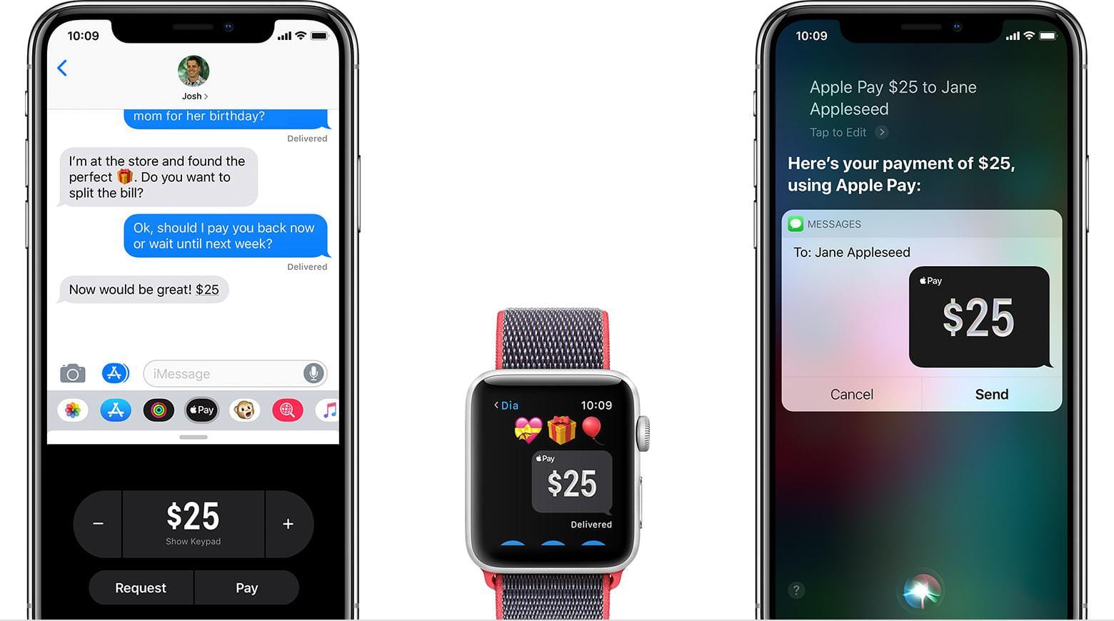
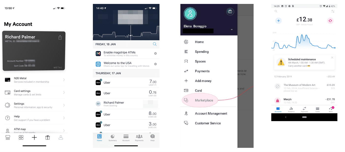
Mobile, in particular, has opened up many new opportunities to interact with our finances. At the touch of a button (or fingerprint), we can pay for things on the go (e.g. Apple Pay), make quick and easy payments, manage our budget and review spending by category:
For nearly all major finance brands, it’s becoming essential to have a mobile app. I’m one of a growing number of people who rarely visit a high street branch of my bank, opting instead to use an app rather than an internet bank to manage my day-to-day finances.
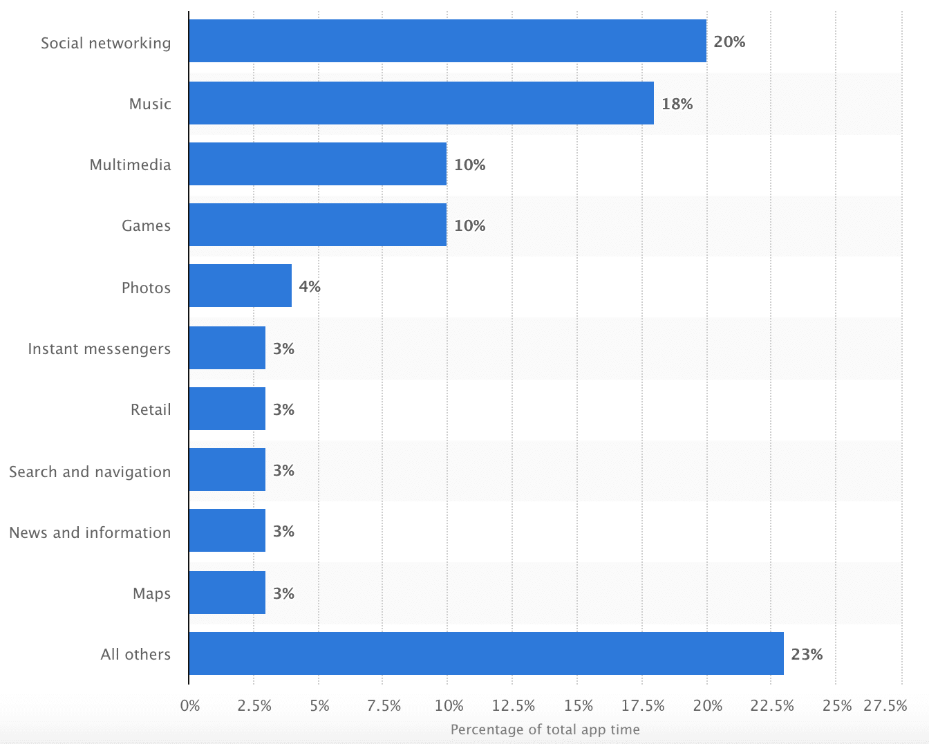
Although mobile apps are considered to be important, there are varying degrees of quality across the banking spectrum. While all major banks and building societies provide balance checking, person-to-person payments and branch locators, many have very functional prompts and messages that limit opportunities to deepen relationships.
With the increasing threat of digital challenger brands such as Monzo and Starling putting mobile at the heart of their offering, all finance brands need to keep on top of the trends and deliver value for consumers.
Within this post, I’d like to explore the current state of mobile banking and provide an overview of best practice in-app communications, key trends in UX design and what we can learn from those leading the way in this space.
How consumers use banking apps
Mobile apps can provide a huge variety of functions for consumers. If we consider Facebook, Messenger, Amazon or Twitter (four of the most popular mobile apps), they give users the ability to message friends, buy and purchase in-app and see real-time updates. However, it’s important to consider what someone is looking to achieve when using an app.
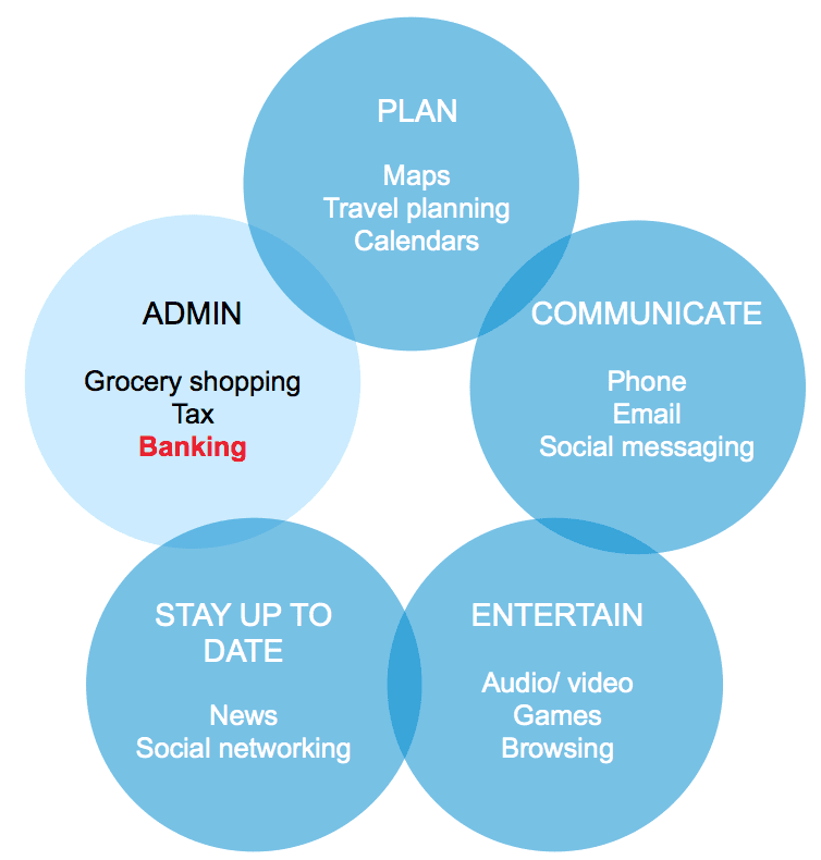
Mobile banking offers significant advantages over other channels, such as in branch, telephone and website: it’s quick, convenient and secure. However, the context is still important: for most people, using a banking app is a highly transactional experience, where the priority is achieving the primary task quickly and efficiently.
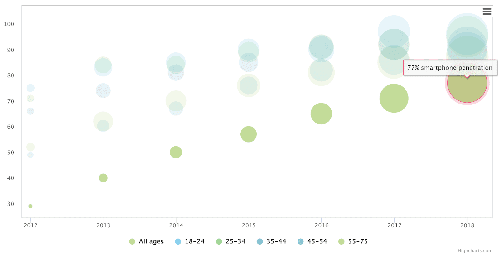
In comparison to other activities, people spend only a fraction of the time banking.
It’s also worth noting that whilst app users tended to be younger in the past, the gap is closing, illustrating the importance of an app that appeals to a broad consumer base.
Five areas of focus
I recently blogged about the different elements needed to make a successful app. Whereas that post looked at apps in general, here is a short list of areas to consider for banking apps more specifically. There are five areas of focus:
- UI
- Messaging UX
- Content
- Functionality
- Personalisation
1. UI
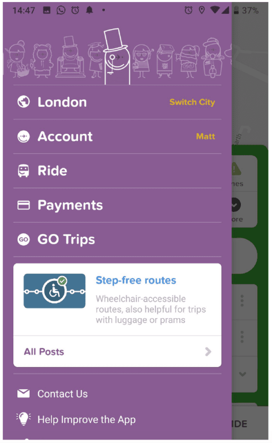
The majority of high street banks have a similar approach to UI: strong use of the brand’s primary colour and a tab menu. However, some brands such as Nationwide Building Society deviate from this standard, with a more limited use of the brand’s primary colour and navigation managed by a ‘hamburger’ menu in the top left corner.
The challenger banks have a different approach. Their apps tend to have a darker, stronger UI that uses secondary colours, tone of voice, animation and illustration.
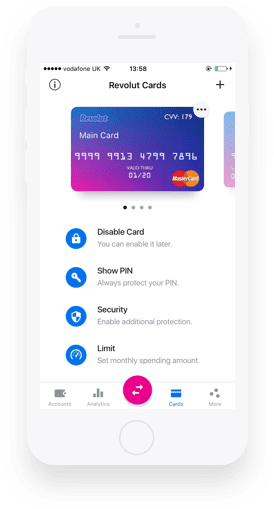
Revolut’s brand uses white as a dominant colour but also adopts several UI devices to ensure their app provides a vibrant and engaging experience:
- Strong use of primary and secondary colours to provide visual hierarchy.
- Depth to distinguish dismissible notifications from the core UI.
- Playful visual tone, particularly with the use of illustration.
- Selective use of animation to show data is up-to-date.
2. Messaging UX
Finance and non-finance apps tend to use one of two approaches to messaging:
Interruptive messaging
Interstitials or dismissible messages that deliberately seek to interrupt the user’s attention.
Non-interruptive messaging
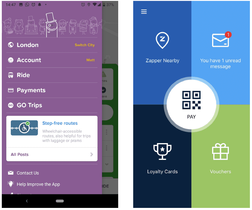
Messages that sit outside the main attention areas of the UI. One approach to non-interruptive messages is ‘dot’ notifications, such as those seen on Facebook or LinkedIn, designed to subtly catch the user’s eye without being distracting.
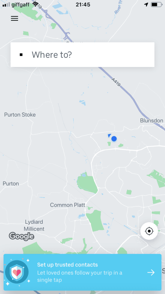
Uber’s app has two main messaging formats. The first sits on top of the map and is often colourful. Since the ‘Where to’ bar is the attention area at this point, the message is non-interruptive but a strong use of colour makes it highly visible.
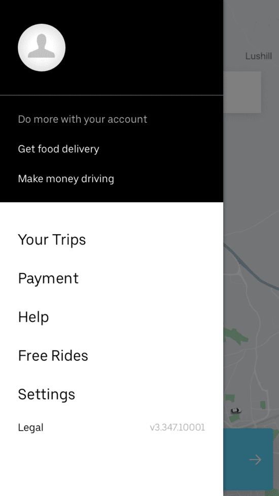
The second sits inside the navigation drawer and therefore has less visibility. But it’s given a prominent location: Uber is confident this offer will be of interest to you, so it isn't hiding it.
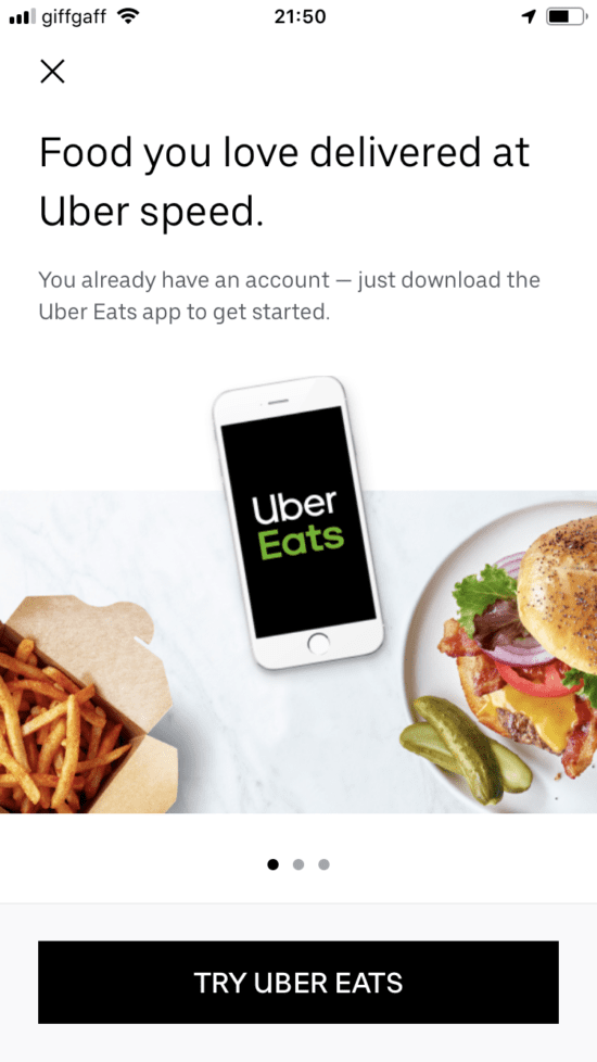
Uber is investing in its ‘Uber Eats’ proposition. But in the app, the promotion of this is carefully worded as a customer benefit: ‘Get food delivery’, rather than a more explicit name-check of their own brand, which may not mean much to the user.
3. Content
Most brands use app messaging to promote products or partnerships. But some have invested in their app content, seeking to broaden the range of user jobs the app can meet.
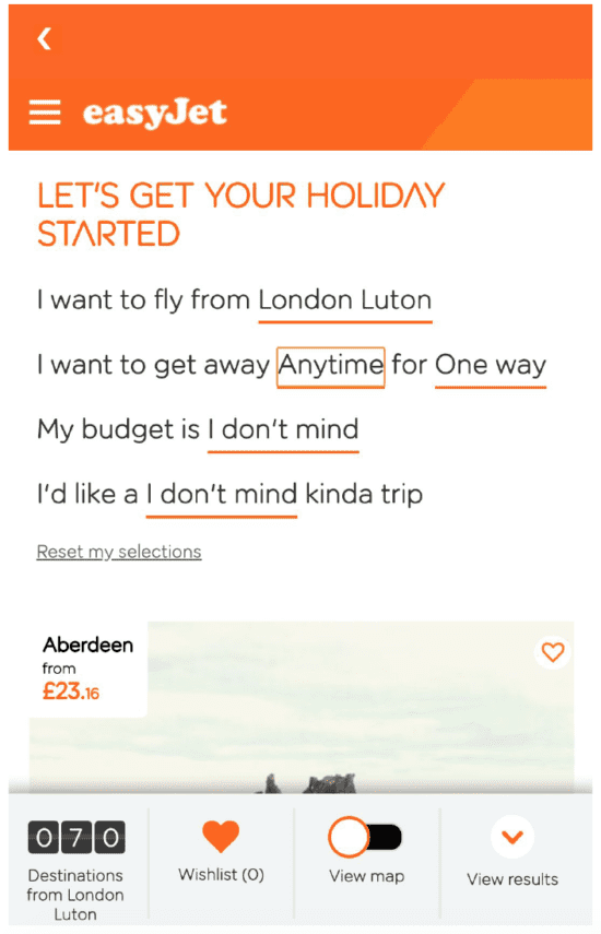
EasyJet’s app has an ‘Inspire me’ feature that allows the user to set controls and suggest destinations that the user may enjoy. Where most brands would link to a website for this, easyJet harnesses the power of the app UI to make a highly engaging piece of functionality.
CityMapper has a content strategy based on building a conversation with its customers and the wider community. By promoting features of the app (and linking to ‘All Posts’), they can tell users what’s new without being seen as ‘spammy’.
4. Functionality
The arrival of challenger banks has fuelled a growth in banking app functionality. Where all apps were once equal, this is no longer the case, with the newer upstarts raising the bar and thinking differently.
Some interesting examples include:
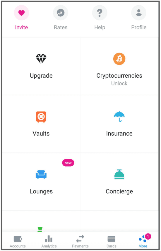
Tiered membership model
Digital brands have championed the tiered membership model and the challenger banks have adopted the same mechanic to drive revenue and loyalty. Revolut’s new ‘Metal’ tier is promoted heavily in the app, partly by highlighting functionality that is currently ‘locked’ to non-members.
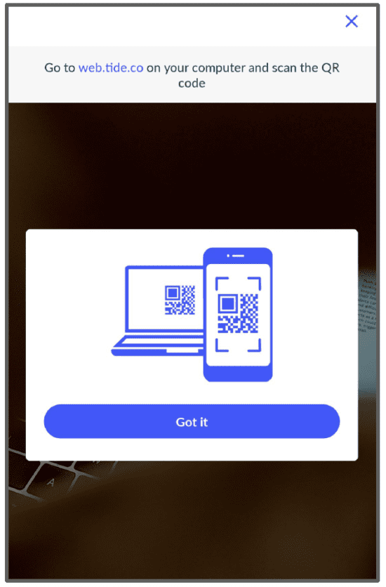
Desktop authentication
Today’s mobile phones include sophisticated biometric authentication tools, making them a more secure and convenient way of accessing digital banking than traditional desktop passwords. Tide uses the app to allow the user to log in to the website in one click by displaying a QR code on the website.
PSD2
The implementation of PSD2 into many UK banking apps has the potential to bring with it important changes to the banking sector. Users can choose which interface they prefer to their bank's. Unless a bank’s app is at least as good as the competition, they risk losing traffic to a competitor’s interface.
There is also the potential for third-party banking interfaces to become more popular than those of the banks themselves. Just as hotels have become separated from communicating with customers by Online Travel Agents (OTAs), banks may find they have fewer customers to talk to.
5. Personalization
Brands outside the banking sector are using innovative tactics to tailor their apps for specific user needs. This could be an interesting area of development in the finance space.
App functionality to gather user data
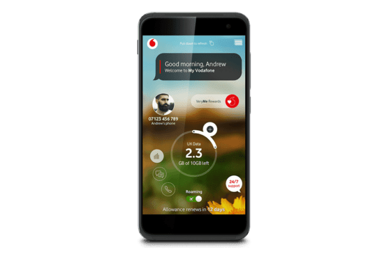
Vodafone’s ‘VeryMe’ feature allows users to quickly choose topics of interest to them so that the app - and future promotions - can be tailored to their needs. The feature is fun, quick to use and highly interactive, increasing the chances the user will complete it. Vodafone can then harvest the data the user supplies to personalise communications on other platforms.
Use context to help the user
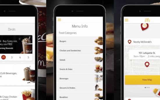
The McDonalds app uses user location to switch functionality. When the user is away from a restaurant, it allows them to order a takeaway (while helping them find the nearest restaurant). As the user gets to a restaurant, the app switches to help the user pick up their takeaway.
Summary
Financial services touch our lives on a daily basis and it’s never been easier or more convenient to interact with our banks. Mobile apps are playing an increasingly important role in banks’ channel mix and it’s now essential to have an app that not only performs basic functions very well but goes above and beyond.
The challenger banks are leading the way in innovation, with mobile-first propositions and cutting edge UX and design. However, both smaller and more established banks can take inspiration from brands outside of financial services and adopt UI and UX best practice from some of the leading tech firms, including Facebook and Uber.