My recommendations on the 10 most useful features
As you may have heard, the latest version of Google Analytics has just launched in Beta mode (you can sign up for the beta here) [Dave Chaffey has a separate post discussing whether it's worth switching or not in the Google updates 2011 summary]
This post takes a look at why Google Analytics is changing, then breaks down some of the bigger changes, with screengrabs, comparisons, and a quick guide to the biggest of the new features. I've broken the post down into 10 features, with the biggest & most complicated new feature last.
Why Change?
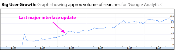
It's almost 4 years since the last big change to the overall interface of Google Analytics ('v2' in May 2007). In the interim, 2 things have happened that would cause Google to want to update the interface.
First Reason to Change - interest & user growth has been huge for Google Analytics:
Second Reason to Change - Google have added lots of extra features without really changing the interface.
Here's a list of just a few of the extra features since the last big rejig of the interface:
- Adsense Reporting
- Advanced Segments
- Advanced Table Filtering
- Annotations
- Custom Reporting
- Event Tracking
- Extra Goals
- In-Page Analytics
- Integrated Adwords Reporting
- 'Intelligence'
- Mobile Tracking
- Motion Charts
(Not to mention 'outside' elements like Website Optimizer, the API, etc.)
Over this time, there have been a few tweaks to the layout, but essentially all of the above have been shoehorned into an interface that wasn't designed for them. Whenever that happens to a piece of software, things gradually get more confusing - and usually most confusing for the newest users.
What do Google Say About the Changes to Google Analytics?
Here's the "why we're making changes" paragraph from Google's latest announcement (emphasis mine):
"Our goals for the new version are to make it easier and faster to get to the data you want and to enhance the Google Analytics platform to bring you major new functionality. Many of the changes in the new version are the result of your feedback. For example, you can now view multiple advanced segments without needing to also use All Visits. You’ll find some of the other most requested features like multiple dashboards in the new version as well."
And... here's what they said 4 years ago when they last made large changes to the interface:
"We've redesigned the reporting interface for greater customization and collaboration. This should make it easier for businesses and website owners to find and share the data you need to make informed decisions. The new version presents data more clearly and in context, so you can look at a single report to gain insights rather than having to pull up several reports to understand what action to take."
In other words - both changes were essentially about making it quicker & easier to find useful data. This time around they say there is 'major new functionality' too. Let's take a look at the features to see whether that's true:
Feature 1. Dashboards
Google themselves have written a blog post about the dashboard updates , which is worth a look - even if just to get a look at some of the metrics for GoogleStore.com in their screengrabs.
Here's how the new standard dashboard looks:
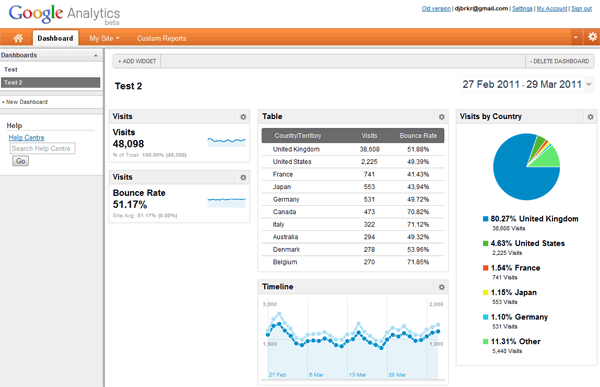
The new features here are:
- The ability to have multiple dashboards. Eg - you could set up one for 'goals & sales', one for 'content & adsense', one for 'visitors', one for 'SEO', etc.
- You can now start with a 'clean sheet'. The old dashboards had a set of standard elements for the top half of the page.
- Include virtually any 'sitewide' metric/chart / graph table on the dashboard.
- Add extra lines to reports. Eg, as you can see in the above screengrab, there are 10 lines of countries listed, as opposed to the old 5.
Bad bits:
Sadly, you can't yet export dashboards or email them. I suspect that will be one of the biggest uses of them - set up a 'Merchandising' dashboard to automatically email to your buyers each week, an 'Exec Team' dashboard to automatically email out to a group of directors each week, etc.
Additionally, you can't apply segments to dashboards at the moment. That's a very sad omission. (though it is more than made up by one of the other new features)
Feature 2. Widgets/Gadgets
Much like the old dashboard, each new dashboard you create is made up of various widgets (or 'gadgets' - they refer to them as both). Unlike the old system, you can add these directly from the dashboard itself using an 'Add New Widget' button. Here are the 4 options currently available when you choose to add a new widget:
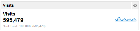
Widget Type 1 - 'Metric':
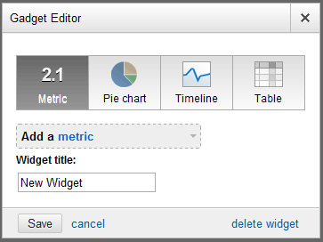
(note it calls it a 'Gadget' at the top & a 'Widget' at the bottom right).
Here's an example if you choose 'visit' as your metric:
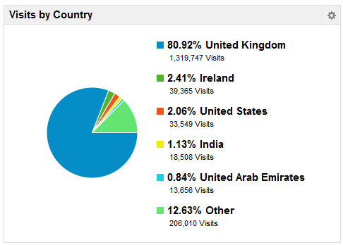
Widget Type 2 - 'Pie Chart':
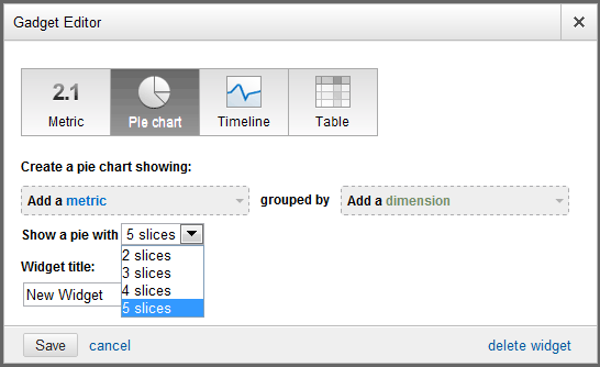
These are the standard Pie charts we're all used to. Here's an example of a Pie chart widget showing 'Visits' as the metric, 'Country' as the dimension, with 5 slices:
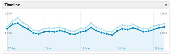
Widget Type 3 - 'Timeline':
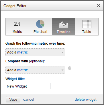
This is the type that appears as standard at the top of most GA reports. For example, here's one comparing 'Visits' with 'Visitors':
Widget Type 4 - 'Table':
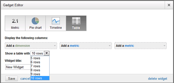
Drawbacks of Widgets:
Google themselves hint that dashboards/widgets are not yet as good as they should be. Not only can you not apply segments and filters at a 'dashboard' level, you can't do it at a 'widget' level either. So, for example, it's not possible to add a 'keywords' Widgets filtered to exclude your brand terms. I suspect (or at least hope) that things like that may come at some stage.
On the plus side, you can do the usual date comparisons on these to see how things have improved/declined over time.
Feature 3. Cleaned-up Navigation.
Top Navigation
Here's how the old top navigation used to look:

This has been reworked, but kept very simple. Here's the new top navigation:
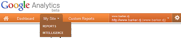
The right-hand side consists simply of a single 'profile selector', and the cog is a 'settings' button.
This is nice & simple, and leaves things very scalable for additional elements to be added in future.
Left Navigation
For power users, most changes to the left navigation won't make much of a difference. For occasional users (and people new to Google Analytics) it is far easier to understand & remember where things are.
Here's the 'visitors' left navigation area old vs new:
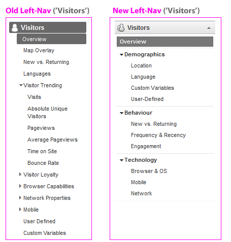
One left-navigation tweak that will make a difference to power users is that all of the menus expand & collapse. Previously - if you wanted to jump from one report to another, you'd have to jump to it via another report. Now, you can jump straight from (say) the 'Mobile' report above to an 'Organic Search' report, without having to wade through the 'traffic sources overview' as you used to.
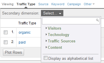
Feature 4. Improved use of Advanced Segments.
'Advanced Segments' have had a nice update in Google Analytics v5.
If you are a regular user of Advanced Segments, you'll have despaired at the inability to compare 2 segments without the 'All Visits' segment automatically being applied. Thankfully, this has been fixed - you can now compare 4 advanced segments without having to use any hacks to get rid of the dreaded 'All Visits' issue.
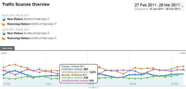
Here's an example of the 'Visitor' report with 3 segments applied:
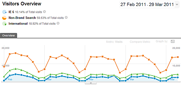
Some of the changes there include:
- In all reports, a little pie chart appears top-right to show you what % of traffic you're looking at. This is particularly useful when advanced segments are applied (see above), giving you an 'at a glance' comparison of them each. Very nice for screengrabbing & pasting those into documents too.
- You can drag those pie charts up/down. This updates the data further down the page, meaning if you want to organise 3 or 4 segments as a 'mini funnel', you can now do that.
- When you edit an Advanced Segment, you now do so without leaving the report you're currently looking at. This is a big time saver for me.
Another nice addition is the ability to compare multiple segments over time. Here's an example showing how it looks when you do that:
That's often something I want to do - eg. compare 'PPC Traffic' & 'Natural traffic' for Feb 2011 vs the same for Feb 2010. It's nice to be able to get that all in a single report now.
Feature 5. 'Trending' Search Terms (etc).
Another nice new feature is the ability to trend different search terms against each other. For example, if your site sells 'Sony Laptops' & 'Toshiba Laptops', you can view a trend graph plotting the search traffic you've received for each of those terms. Previously to do that you'd have to set up a custom segment for each, or drill into each one individually & compare the graphs. Here's a rough example showing how this is displayed now:
There's similar functionality in other reports - eg, you can trend traffic from Facebook against Twitter in the 'Referral Traffic' report, or trend the growth in your iPhone traffic vs the growth in your Android traffic over time.
Other Search Updates
2 other changes worth noting around 'search' reports.
- Capitalization now makes a difference. Whereas older reports would lump together 'Sony VAIO', 'Sony Vaio' and 'sony vaio', the new interface reports those each separately. I had a poke aroundfor an option to switch it, but couldn't find anything. I can see myself adding filters to fix it if there really is no option to change it.
- Another change - there's a new 'Term Cloud' visualisation, showing word clouds of search phrases. For example:
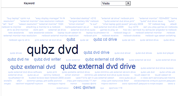
Though these are interesting, 'term clouds' only seem to work with full phrases. It would be nice to have the option of clouding by individual words. For example, in the above, you may see 'qubz' as one of the biggest words, then 'dvd', then 'external', then 'cd', etc. Instead, there's a lot of repetition of very similar phrases - making it hard to pick out patterns.
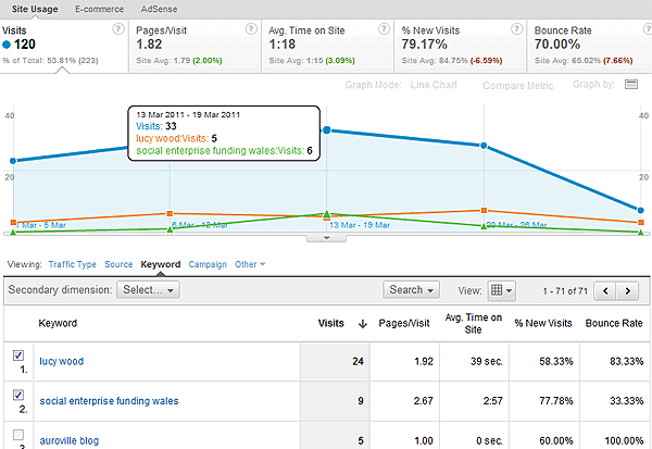
Feature 6. Improved Report Layouts
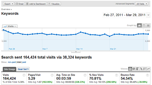
Reports have been cleaned up & the visual hierarchy of information is far, far clearer. Here's just one example - the 'Keywords Report'. The following 2 screenshots represent the same information.
Old Version
New Version
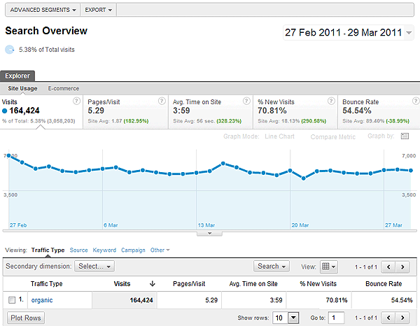
Here are a few of the changes there:
- It's easier to understand where you are. For example - I like the use of those little 'You Are Here' triangles, indicating exactly what you're looking at, & the pie chart saying "you're looking at X% of overall traffic here".
- Easier to switch between graphs.
- Eg, above, if I want to switch from a graph line showing 'Visits' to one showing 'Bounce Rate', I just click on bounce rate. Previously, I'd have to dig around in dropdowns to do that.
- Incidentally - where it says 'Graph Mode: Line Chart' in the above graphic, you can switch to 'Motion Chart'.
- Alternative options are visible immediately, rather than hidden behind dropdowns.
- eg, above we can switch from 'Site Usage' to 'E-commerce' underneath explorer.
- Or underneath the graph lines, we can switch from 'Keyword' to other dimensions like 'Source', 'Landing Page', etc immediately.
- Filtering has become 'Search', and the buttons to move to next/prev page have moved up the page.
- Actually I'd like to keep the old filtering method in addition to the new - here it's quite hidden away. It means extra fiddling around for even the simplest filter.
There are some other great little features, like being able to keep drilling down very simply. For example, below is the system they've added to jump around between different dimensions:
This is great in that it hides most of the complexity from the average user, while allowing people who use it a lot to do exactly what they need very quickly.
Feature 7: Contextual Help
If you've ever trained non-technical people in using Google Analytics, you'll know that it's not been the most friendly system for new users to get to grips with.
Below is a single example of the many things they've done to address this in the new interface. This is the 'contextual' (left nav) help area that appears in the 'visitor overview' report. Not only has this leapt about 300 pixels further up the page in the new interface, it is actually quite useful.
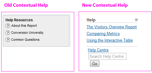
One of the flaws of Google Analytics was always that there was no smooth path taking users from "I know nothing about this tool" to "Ok, I'm confident using this". Simple ideas like 'good contextual help', along with the changes in simplifying the interface, move it much further toward being genuinely user friendly. It's obvious that Google have been quite 'user-centric' in the way they've put the new interface together. For example, look closely at the image above & you'll even see there's a little 'hide this help' icon there for the 0.001% of users who are offended by seeing contextual help info.
Feature 8: Better Account/Profile Selection
The update to the way accounts & profiles are handled should speed things up for people managing multiple accounts. This great little profile switcher tool appears at the top-right of every page:
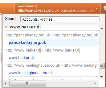
You can narrow that by keyword search, hide/unhide accounts, etc. This is a great improvement on the old system, where to find something you'd often have to switch account, wait for a full new page load, then switch again to a profile, then dig around for the report you wanted.
Another nice addition is that it remembers what you were looking at. Eg, if you're in the 'languages' report in one profile & you switch to another profile, you'll land straight into the 'languages' report over there. That sounds tiny, but is a real bonus if you're switching between accounts a lot.
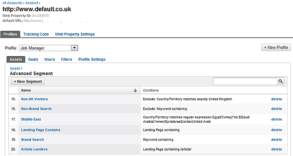
Feature 9: Consolidated 'Account Admin' area
The whole Account Admin area has been redesigned & is far easier to get around.
One particularly nice part of this is a new profile-specific 'Asset Manager' section, containing all Advanced Segments, a list of all Annotations (great!), and all custom alerts for each profile. Here's the 'Advanced Segment' manager there (note the dual layers of tabs for 'Profiles', 'Tracking Code', etc & then for 'Assets', 'Goals', 'Users', etc):
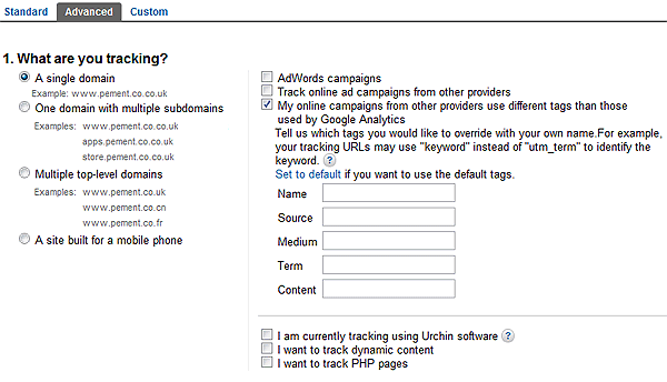
Another nice extra is an expanded 'tracking code' area, that helps you through adding things like cross-domain tracking, mobile tracking, converting coremetrics (or other) campaign tagging code so that it's usable in Google analytics, and much (much) more. Here's a screengrab:
Feature 10: Custom Reports
And finally, leaving the best, biggest and most complicated update for last, the updated 'Custom Report' system is the real 'game changer' in the new version of Google Analytics.
As Tim Leighton-Boyce points out here, the updates to Custom Reports mean Google Analytics now has a completely customisable 'reports & dashboards' system that leaves any of the standard dashboards in the shade. This is a real 'enterprise level' feature, that competes with the more expensive web analytics platforms.
WARNING: It's worth mentioning that this is a
far more complicated feature than any of those mentioned above, and definitely warrants its own blog post(s). This is a very useful feature, but not the easiest to get your head around. To give an overview - here is a brief explanation and a 'basic' illustrative example purely to show how powerful this is. [note: Justin Cutroni also has a
great post on this feature]
Custom Reports Overview
'Custom Reports' is the 3rd tab on the top navigation within the new interface. When you click it, you're presented with a screen like this:
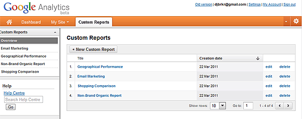
As standard, there are no reports in there. You have to click '+ New Custom Report' to get started. At which point, you're given a screen like this:
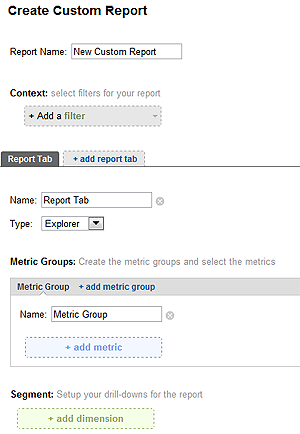
The above setup screen is broken down into several areas:
- Filters: We can add one or more 'filters'. This is key. For example, we may now set up automated regular reports looking just at 'email traffic' or 'visits that landed within the /blog/ area of our site', or any number of other segments of the data.
- Tabs: We can then add more than one 'report tab'. For example we might say - I want a 'visitors' tab, and a 'content' tab, and a 'goals' tab (all within whichever filters we've set above - eg. looking only at email traffic).
- Metric Groups: Then we have multiple tabs of 'metric groups'. For example, we might include 2 metric groups: on the first tab 'Visits', 'New Visits', etc so that we can see how well we're doing at driving traffic, & then on the 2nd tab 'Revenue', 'Transactions', etc so that we can see how well that traffic is turning into sales.
- Dimensions: Finally, we have 'dimensions' to drill down into. For example, we might want to look at 'Landing Pages' to see which landing pages result in most visits & sales. Or we may want to look at 'Product Category' & within that drill down into 'Sku'
From this, we can build quite sophisticated report suites, with multiple tabbed reports within tabbed reports.
I realise that's probably very confusing in plain text, so here's a quick example that may illustrate.
Custom Reports - An Example
As just one example to illustrate how you might use the new Custom Reports, here is the setup process for a little report for "Non-Brand Organic Search".
In this we included 3 'Report Tabs':
- Search Terms. (so that we can see which non-brand terms are driving my visits & sales)
- Product Performance. (so that we can see which products are selling best via natural search)
- Landing Page Performance. (so that we can see which landing pages we should fix & which we should aim to repeat!)
Centralising all of this kind of data into one place, and - importantly - being able to filter it as standard - is really useful for actual analysis work & putting together genuinely actionable reports.
How the Report Looks:
The following screengrab shows the front page of our example report:
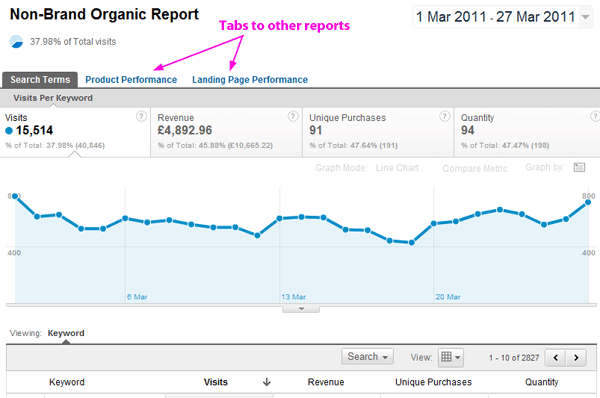
Above we see the 3 tabs, followed by a graph, off the bottom of the screengrab is the table of data. All of this is filtered to show only non-brand organic traffic, so that we can see how our SEO activities are paying off.
How to Set Something Like This Up:
Here's a quick description, with screengrabs, showing how to set up a similar custom report in about 10 minutes.
Report Tab 1: Non-Brand Organic Report - 'Search Terms Tab' Setup
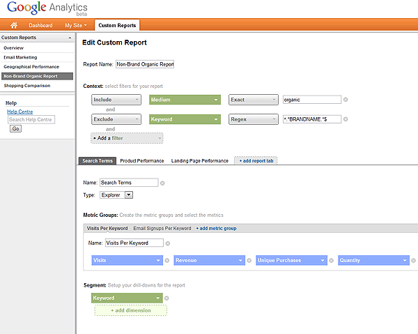
Above, in the area with the top 2 green boxes, we've set the report to 'Include' only the medium 'Organic' & to 'Exclude' keywords matching the brand name (for the example we've replaced this with 'BRANDNAME').
- Underneath that, we've then set up a tab called 'Search Terms'.
- Below that, where it says 'Metric Groups', we've set up 2 groups: One called 'Visits Per Keyword' & one called 'Email Signups per Keyword'. In other words, we're interested in "which keywords are driving visits in general?" & "which visits are driving email signups?". In 'email signups' (not shown), we tracked a particular goal.
- Below that - in the row of blue boxes, we've set up the 'Visits Per Keyword' group to show me 'Visits, Revenue, Unique Purchases & Quantity'.
- And finally, in green, we are interested in the 'Keywords' driving all of this.
Report Tab 2: Non-Brand Organic Report - 'Product Performance Tab' Setup
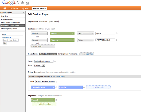
- This is quite similar to the first report tab. The bottom half of the report has different values, where we are looking at 'Product Revenue' & 'Quantity', and viewing this by 'Product'.
- Again, looking at the top half of the tab, this is restricted to the medium 'organic' & keywords excluding my 'BRANDNAME'. These filters stay constant across all tabs within a report.
Report Tab 3: Non-Brand Organic Report - 'Landing Page Performance Tab' Setup
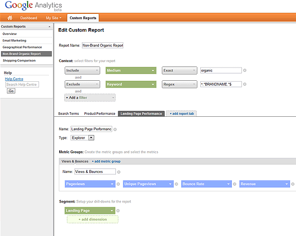
- The above is quite similar to the first and second report tabs, but - if we look at the bottom half of the page - it is set to show 'Pageviews, Unique Pageviews, Bounce Rate & Revenue' for each landing page. (again, we're only looking at non-brand natural search here. ie, we can see which landing pages work best when someone lands direct from search engines)
Custom Report Summary
This is just a simplistic example, showing how we can use the new 'custom reports' to pull together very actionable data without much effort.
Just from this simple example, we can answer questions like:
- Which were our biggest search terms from Natural search last week?
- Which were our biggest performing products from Natural search? (& how does that differ to the past)?
- Which landing pages are over/underperforming? (and therefore, which should we fix & which should we copy?!)
These are all things that were available before in Google Analytics, but would require us to spend 30 minutes each and every week drilling through reports to get to them. Here, we have them centralised at the click of a button.
Summary
Hopefully this gives an idea of much of the new functionality in Google Analytics & what you can gain from it. There is plenty more in there - largely good, with some minor bad bits.
The new interface is still in Beta, and many things are quite obviously missing (eg. emailing of reports). Even so, it is a big leap forward in ease-of-use, in functionality, and in its ability to give you simple information to help improve your website & your marketing.


