Analysis and actions showing the best ways to increase your conversion rate
An abandoned basket is exactly as it sounds; it’s when a visitor who already added a product/service to the shopping cart then, for whatever reason, abandons their shopping cart and never proceeds to make a purchase.
At best this is very frustrating; at worst it can be a business critical problem for your ecommerce site.
However, it’s not all bad news; your visitor at least managed to find your website and even went as far as selecting a product to add to their shopping cart.
This is a solid foundation to build on, but how can we reduce these instances of online shoppers abandoning their baskets?
Find out where customers are exiting from your checkout flow
Your “checkout” flow describes the entire process of buying a product via your website, from to adding an item to basket, through to completing payment.
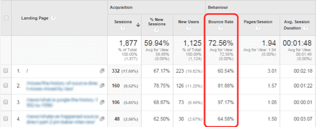
A good place to start is by identifying poor bounce rates across key sales pages on your site. You may have multiple landing pages for different products, perhaps all differently designed, so you’ll likely have different bounce rates figures.
Look into the behaviour section Google Analytics and find landing pages. From here you can easily identify pages with a high bounce rate.
Try combining Google Analytics with the Page Analytics extension for Google Chrome. This handy app will generate an overlay on your website showing the click through rates (CTR) for all the links on your page.
Using this data you can easily make a call on which links on the page are worth keeping, links that may need removing (as they generate few clicks), or perhaps you may need to consider giving popular links even great visibility on a page to maximise CTR.
The above methods will give you some useful data which will enable you to make some informed decisions on what might be affecting bounce rates and causing abandoned baskets.
However, there’s no subsite to being able to visualise how users are interacting with your pages – this is where heatmaps come into play.
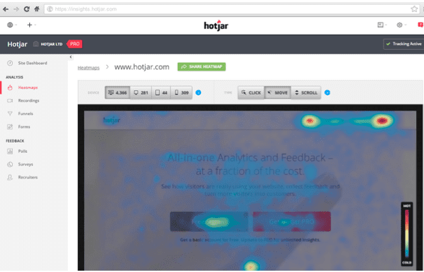
A heatmap can demonstrate where customers are most commonly clicking on a page, or even where the average cursor position is. This data can help solve common problems such as…
- Identifying non-clickable elements users are actually trying to click (such as an icon that looks like a button)
- Are your most important content and elements below the fold – is this affecting CTR?
- Are non-important elements of the page attracting too much attention from your visitors, thus impacting important call-to-actions?
Why might visitors not convert?
By this point you might have some clues as to when and why customers are dropping out of your checkout flow, so now let’s take a look at why they aren’t converting.
Ask yourself these key questions when trying to identify poor conversion rates:
- Is it totally obvious what action a customer is supposed to take? Customers often need a little helping hand when landing on a sales page. Is it really that obvious to them? Make call-to-actions stand out and ensure visitors know exactly what to do.
- Did your visitor expect to land on this page? If your visitor clicked through to your sales page expecting to see “Playstation games”, they will quickly bounce if the page is actually about “Playstation consoles”. Be relevant! Don’t use irrelevant hooks to trick customers into clicking, as ultimately traffic gleamed from this means is pointless.
- Does the page answer all potential customer questions? Try to include as much information a customer will need to make an informed purchase. Try including an FAQ on your landing page – this is a great way to work in some keywords, boost your word count and stop the temptation customers might have of finding the information they need by searching elsewhere online.
Get customer feedback
There’s no substitute to genuine customer feedback, so start engaging your loyal regulars to get their thoughts as to how you can improve.
Use in-page polls and prompts to catch customers as they are going through the sales funnel, this way you can catch useful feedback as it’s fresh in their minds. It’s possible to catch this information via a timely non-invasive pop-up / pop-under.
Alternatively get real people to test your site, something that livetesting.com offers using their pool over a million testers. You can then analyse videos of these users navigating your site before they then answer a few questions about their experience.
There is also a way of trying to negate instances of abandoned baskets in real time; use live chat. Live chat usually takes the form of a simple pop up module that’ll appear on a landing page – often after a visitor spends a particular amount of time on a page without taking an action or, conversely, have taken a particular course of action.
If a visitor has been stuck in your checkout flow for a while, it might be safe to assume they are having some trouble, at which point you can save the day buy guiding them through to the checkout using live chat.
Use abandoned basket emails
Even if your efforts decreased instances of abandoned baskets on your site, you’ll still inevitably have customers that inexplicably bounce from your site after adding a product to the shopping cart.
However, you still have a chance to reach out to these customers.
Abandoned basket emails allow you to contact customers to give them a friendly reminder that they left something behind.
You can approach this in a couple of ways; try asking the customer if they needed some help, or if had any questions about the product before they commit to buy it.
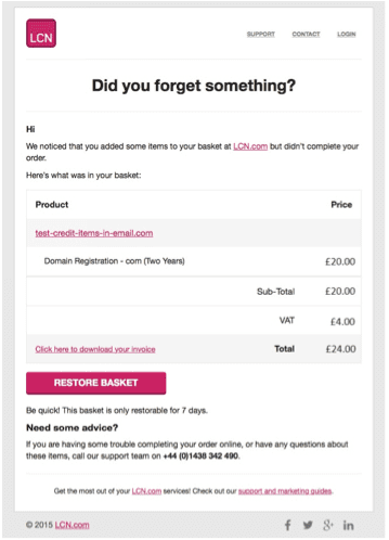
(Above: The LCN.com abandoned basket mailer)
Or perhaps the customer needs a further incentive to push them towards that checkout page; trying offering a tempting discount on the product they were interested. If you do decide to offer money-off a product, make it time sensitive to instil a sense of urgency.
How to improve on-site conversions
Using the above methods you can start to understand why your conversion rate might not be as high as it could be – now it’s time to start improving that all-important metric.
A fantastic conversion rate is the holy grail of any marketer. You could have all the traffic in the world but a conversion rate 0% is not going to make you any money, so in some cases it makes more sense to improve conversions rather than chase traffic. Fix conversions first, and then bring in the traffic.
Here are few fundamental things to consider when trying to boost conversions on your site.
Make your site faster
A slow website is a common cause of a high bounce rate. Nobody waits for a slow site to load and an agonisingly slow page can cause customers to lose faith in your site / company all together.
“If they can’t even get their website working properly, why would I buy from them?”
Google’s PageSpeed Insights and YSlow will give you some ideas on what is wrong with your site and how you can get things moving faster.
For more details on speeding up your site check the LCN guide to PageSpeed Insights
Improve your call-to-actions
Call-to-actions (CTAs) are vital for instructing your visitors on what do on your page. Once on your visitors has landed on a page is it clear what the next step is? Are they supposed to add something to the basket? Check a radio button? Move on to another page? Sign up to a newsletter?
CTAs often take the form of buttons which act as simple visual clues for visitors. The positioning of CTA buttons is key, especially if they represent different actions for different products. Button size and colour can all have an effect on click-through-rates – however, copy arguably plays the biggest part in creating the perfect CTA button.
For instance, common CTA button copy might be something along the lines of “Subscribe now to receive our newsletter”. Let’s take a closer look at that CTA.
- “Subscribe”: This is the action your user should take. This should be simple and leave the visitor in no uncertain terms about what they need to do.
- “Now”: This creates a sense of urgency to encourage the visitor to take action ASAP, whilst they are on the page.
- “To receive our newsletter”: This adds some context to your CTA. It goes without saying that you won’t get many subscriptions if you do not make it clear what user will be subscribing to!
Conclusion
These are just a few ways of improving conversions and reducing the problem of abandoned baskets. For a more in-depth guide take a look at my original post on conversion rate optimisation.
Low conversion rates and frequently abandoned baskets may be a sign of a poorly designed or confusing website, but there are positives – people are finding and engaging with your site in the first place. Now all you need to do is get to work and improve.

Thanks to
Ricky Law for sharing their advice and opinions in this post. Ricky is Marketing Exec at
LCN.com You can follow him on
Twitter or connect on
LinkedIn.


