New mobile ranking factors report from Searchmetrics shows the key differences
The summer of 2015 is when Google searches on Mobile Devices exceeded that of personal computers world-wide for the very first time. A landmark in the world of Search, and something not only Google are looking to capitalize on, but something all business owners and marketer should (at the very least) be aware of. “So what does this mean for me?” I hear you cry.
Looking at it from the perspective of a Webmaster, Business Owner, SEOs and content marketers, it raises the question of strategy.
Do we follow a ‘One size fits all’ strategy addressing both Desktop and Mobile under one roof, or do we begin to use a separate strategy to tackle mobile search as a separate entity?
In short, I think it’s time we look to use two strategies which we'll discuss. Using the ranking factors below, should certainly aid you on your path to developing a separate Mobile Optimised strategy.
The first Mobile Ranking Factors report from Searchmetrics (Signup required), a technology provider for enterprise SEO and content marketing analysis, revealed a number of elements which have an impact on mobile search.
This may come as a little bit of a shock to some after the furore of Mobilegeddon (21st April 2015) and the relatively lacklustre impacts it appeared to have. However, there was some interesting data pulled from this.
Prior to the update, Searchmetrics identified that of the sites in the top 100 pages ranked by SEO visibility, 80% were found to be ‘Mobile-Friendly’. Following the update this number increased to 90%, highlighting that sites had started to take more notice of the update.

The SearchMetrics report goes on to identify the three factors that impact how mobile-friendly a site is: the technical aspects, the User’s overall experience and the content on the site.
Technical Aspects
The report suggests that these have a particularly large influence on the mobile rankings “due to limited bandwidth and smaller display areas on mobile devices”.
As the report has many facets to it, here's a summary of the best practices. Let's now delve a little deeper into some of the more interesting findings.
- Smaller files sizes
- Fast loading Mobile URL's
- Minimal use of flash
- Fewer keyword domains
- Fewer redirected pages
- Mobile Specific URL's
Site speed was one technical component where there was a clear difference between the top 10 highest ranking pages and the rest. With an average loading speed of 1.17seconds for a site in the rankings from 11-40, compared to 1.10 seconds for a site within the top 10. As already predicted, it is clear that the faster a site loads, the better it is for your rankings. To check how your site performs on site speed, use the PageSpeed insights tool by Google

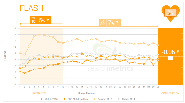
Flash is becoming increasingly outdated and still cannot be rendered by a large portion of mobile devices. Unsurprisingly then, there is a large drop in, not only mobile sites but desktop sites too, thanks to the introductions of HTML5. With only 5% of the top 10 ranking mobile sites integrating Flash in their landing page, suffice to say flash is out. Leave well alone where possible!
The keywords in your domain appear to bear relatively little significance, with regards to ranking. In fact looking at the top 10 ranking sites, they appeared to have fewer keywords in the domain. It's suggested to focus more heavily on becoming a recognisable brand rather than relying on keywords.
Surprisingly the length of the URL appeared to show that the longer URL's were ranking higher, on average than shorter ones. It was suggested that this was because some had mobile-specific URL's e.g. m.example.com or mobile.example.com. In general, it is still better practice to have URL's that are as short as possible.
User Experience
One of the key differences between mobile and desktop is quite obviously the size of the screen. With a smaller area used to present what is essentially the same information, it's important for the user to be able to navigate and use the site without any difficulty.
Much like the section above, here's a summary of the best practices
- Larger Font Size
- Either Responsive Design or dedicated mobile versions of sites will rank better in the SERPs
- Fewer Structural and Interactive elements, with more unordered lists, however with fewer bullet points
- Less ads
- Fewer internal links
- Less Images than desktop
The world of web design has been awash with the buzzwords Responsive Design since the end of the noughties. Meaning plenty of sites have been built with this pretence over the past couple of years. Unsurprisingly enough then, the graph below highlights how proportionally more sites in the desktop results integrate responsive design than in the mobile SERPs. The key takeaway from this, is that no matter if your site is responsive, or even has a separate mobile version, it is of paramount importance to offer users the optimal experience on every device.

The average Number of Internal Links has increased in both mobile and desktop over the past year. The report suggests this can in part be attributed to the fact content is becoming more comprehensive, offering more sources and points of reference. It is noted however that the number of internal links is far lower in mobile content, to that compared to Desktop.

The Structural Elements of the page have shown to impact rankings quite significantly, with high-ranking mobile pages using fewer interactive elements with more unordered (bullet pointed) lists per page being favoured.
Content
The mantra of content is king is still relevant in this day in age and proves to be a significant ranking factor across both desktop and mobile. After all, why would someone visit your site, if the content you have on it, doesn't answer their query or peak the interest?
As per the previous two sections, here is a summary of the report...
- Text on mobile is on average longer than in 2014, however still shorter than desktop
- External Linking Keywords have decreased
- Ranking URLs in mobile results use more semantically closely related terms, compared to last year.
- Percentage of semantically more distantly related terms has also increased.
- Mobile content is more demanding in terms of Flesch readability
- Proof terms are a prerequisite for good rankings for both mobile and desktop. Relevant terms can
make money pages more holistic – setting you apart from the competition
As screens have ever so slightly increased in size with the mainstream introduction of Phablets, it appears so has the word count in mobile content. An increase from around 700 words in 2014 up to 870 in 2015, it's clear to see that longer content is now more appealing. However, it's important to note that although longer in form compared to mobile last year, it has a significantly lower word count than desktop.

Although the number of keywords used within the body of the text increased from 2.7 to 5.48, the amount of keywords linking to external sites links has seen a significant drop from last year. With higher ranking sites, using on average 7 keywords in external links, compared to that of 12 last year. If possible, avoid references to external sites using keywords you to be relevant to and rank for.

Rather interestingly, the data collected by this report suggests that the more demanding the read, the higher the rank on mobile. This is expected on Desktop, again reiterating the opening statement of this section - Content is King, however, to see the increase on mobile is somewhat a surprise, given the context that we are using mobile devices usually demands us to be concentrating on two things at once. i.e. Figuring out which stop to get off at the bus, trying not to bump into people on the street etc. However, there it is for all to see.

One additional finding that was of interest, which didn't fall into any of the above categories, was the correlation between strong social signals and high rankings, whether or not it is causal or correlational is up for debate i.e. Strong content is better, therefore, has more social shares, therefore, ranks better or... Strong content ranks better, therefore, has more social shares.
It's certainly something of note and will be interesting to see what the next report will show. Hopefully, we'll find out a few more details in the future.
If you have any other points you think are worth a mention or want a more detailed review of any of the sections, let me know in the comments below.


