Are you ready for the Google Mobile-friendly algorithm change which could be 'bigger than Panda or Penguin'?
Back in November 2014, Google gave its first guidance about the impending algorithm changes to affect mobile SEO which were summarised in this Smart Insights alert. More recently, Google has been unusually specific and has revealed on its blog that there will be an algorithm update on the 21st April 2015, that will expand their use of mobile-friendliness as a ranking signal.
How much difference will the mobile-friendly update make?
The indications are that this will be a major change with Google describing it as 'significant' in their alerts. Then, in this alarming quote, Google's Zineb Ait Bahajji said at SMX Munich that the upcoming mobile-friendly algorithm update will impact more sites than their Panda or Penguin algorithms. Although this sounds alarming it is to be expected since Panda and Penguin targeted a limited set of sites using spammy tactics, while this will affect all searches on mobile - that's why Google says it's significant.
Since we're now getting close and the impact is significant, this post is another reminder to explain the changes and impact according to Google so you can check the likely impact to your site or your clients and be in a position to explain it? Let's start with the big picture.
Will the update affect all pages on a site?
Google has announced that this update will take place in ‘real-time’, meaning that if changes are made to make websites more mobile-friendly, as soon as the changes have been indexed by Google the benefits will be realised.
Google has also said that this algorithm update will impact sites on a page-by-page basis, meaning that only those pages that are not mobile-friendly will be impacted, rather than the wider domain.
This will mean that websites not deemed to be ‘mobile-friendly’ will suffer from reduced visibility within organic search results. It’s also possible that this reduction in visibility may extend to desktop as an additional incentive to webmasters to improve mobile experiences. We'll explain how you can test your pages are mobile friendly below.
Why is Google implementing these changes?
At present, Google considers that the experience of some sites featured in the mobile search results are simply not good enough for the increasing majority of people now using Google on their mobile devices.
Despite the promotion of YouTube, Android and Google+, Google is still heavily reliant on AdWords to generate the majority of their revenue. If a search does not offer value to users, then they may end up going elsewhere, representing a risk to Google’s revenue stream.
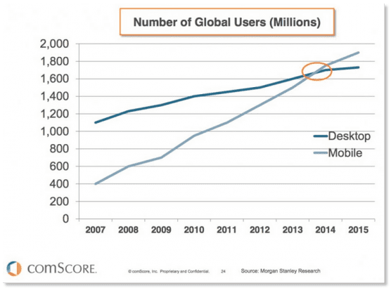
At the moment, mobile search results largely match desktop and are typically ranked based on the merits of the desktop site based on the combination of on-page and off-page ranking factors. However, it seems Google believe this isn't acceptable with the tipping point of mobile traffic outstripping desktop traffic by Q2 2015 already passed.
Google does not want to be serving half of its users with sub-optimal search results and are therefore making efforts to mitigate this issue.
Case study - Eurostar
Here's an example where both desktop and mobile search results for the query [trains to paris] return Eurostar as the top result (as expected), but the experiences are different:
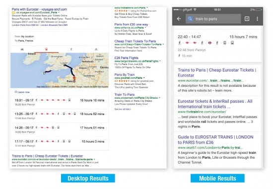
However, the user experience between desktop and mobile differs greatly. The desktop user lands on the Paris route landing page. The page provides the user with information about the route and offers the ability to start the booking process. The mobile experience, on the other hand, is much different. The search listing indicates that the user will land on the same, or at least a similar, page:
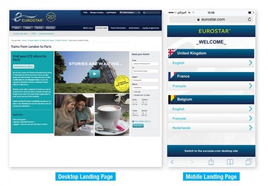
But instead the user is instantly redirected to a page where they must select their language, despite having arrived from Google UK. Furthermore, once the user has selected their language they are re-directed to the mobile homepage. Whilst this webpage does enable them to navigate to the page they ultimately require, overall it is a poor user experience.
How can I check whether our sites will be affected?
Over the past few months, Google has put some effort into informing webmasters about the performance of their mobile websites and alerting them to the issues they may have through different tools including.
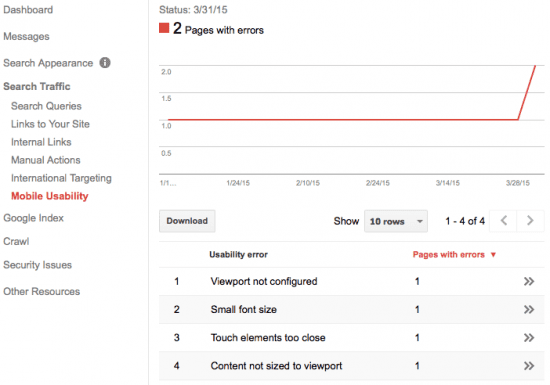
- 1. Mobile usability report - within Google Webmaster Tools, Google now details webpages on your website with errors for mobile users, going into detail, e.g. when buttons are too close to one another.
- 2. Mobile-friendly snippet - Google start to signpost mobile-friendly websites in mobile lists next to the meta description. If your site is missing these 'Mobile-Friendly' labels you are likely to have a problem come the 21st of April.

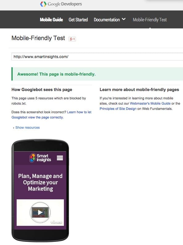
- 3. Mobile Friendly Test. A mobile diagnostic tool available on Google Developers - run this for your home page for starters and then every main page template on your site:
- 3. Fetch as Google tool. Also in GWT, use the Fetch as Google Tool to see how Google crawls your site.
- 4. Automated messages - Google has sent emails to webmasters with sites offering a poor mobile experience suggesting they take a look at GWT.
- 5. Notification of update - it is rare for Google to confirm an algorithm update, let alone give advanced notification and a specific date, and this provides an indication of their desire to give webmasters an opportunity to make improvements.
How to prepare for the algorithm update
Here are five recommended actions to prepare for Google’s April mobile algorithm update:
- 1. Be mobile ready - make sure you have a mobile-friendly website using the tools above and that the user-agent handling and redirects are handling Googlebot correctly.
- 2. Understand the current importance of mobile traffic to your business - evaluate mobile traffic volume and quality using segments in analytics to understand the proportion of your traffic comes from mobile.
- 3. Review behaviour metrics - analyse how your mobile traffic performs on your website. Benchmark key metrics including bounce rate and time on site to understand which pages require improvement.
- 4. Check for notifications - check Google Webmaster Tools to see if Google has sent a notification about your mobile experience.
- 5. View the Mobile Usability Report - with Webmaster Tools, look at what errors Google are reporting and what pages they apply to.
Most brands know that they need to be ‘mobile-friendly’ but there are many ways to embrace mobile. Google prefers certain approaches over others so it’s worth exploring options that will prove a win-win for you and your customers.


