Set up an automated dashboard that will streamline your reporting process
Google Data Studio is a free reporting and data visualization tool which you can use to pull in data from multiple online data sources and present it via easy-to-read and interactive dashboards.
Launched by Google in mid-2016 and out of beta in October 2018, Data Studio offers far more flexibility than Google Analytics in terms of the type of dashboards you can create. While Google Analytics dashboards can only display data from within Analytics itself, with Data Studio you can pull together data from multiple sources and display it all in one place.
It’s tempting to dive straight in and start adding elements to the blank canvas that’s now in front of you. Before you do that, take some time to decide what data you need in your report and how you’re going to present it.
How to create reports with Google Data Studio
This blog is an excerpt from our Data Studio Quick Win. After you've decided what information you want to visualize, use our Quick Win to learn how to create reports in Google Data Studio.
Access the quick win
Decide on your dimensions and metrics
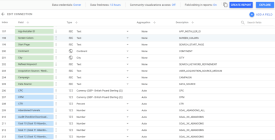
Right off the bat, you need to know is the difference between dimensions and metrics. Knowing the difference will help you decide what date you want to visualize that will create an insightful report.
Dimensions: What you choose to segment your data by. For example, if you wanted to create a table to show which countries your website visitors came from and how many visits you got from each country, then Country would be the dimension for that report.
Metrics: Items of data you choose to show in you report for each country – for example, number of sessions, average visit length, etc.
Know you data's story
It’s tempting to dive straight in and start adding elements to the blank canvas that’s now in front of you. Before you do that, take some time to decide what data you need in your report and how you’re going to present it.
On its own, data is just a collection of numbers. And a report or dashboard that only shows data – even if that data is presented in colourful graphs – can be overwhelming, boring, confusing, or all of the above.
To make your data come alive, you should tell a story with it. To do this you need to think about who your audience is and what information is important to them. Then you need to present the data clearly and explain what it shows or what theories it supports in a simple and unbiased way.
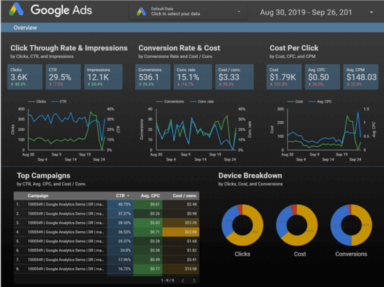
Decide on your KPIs
The first step to deciding what data you need in your report is to be clear on what your business goals are and how you are planning to achieve those goals. To give a simple example, let’s imagine you run a SaaS (software as a service) company that uses Google Ads as its main way to acquire new customers. One of your business goals might be:
To increase monthly subscription income by 10% each month without increasing the Google Ads acquisition costs per customer
Potentially a tall order, but how would we know if we were on track to achieve that goal? What KPIs would be important for us to monitor? In all likelihood:
- Total subscription income
- Google Ads cost per acquisition (CPA)
Those two KPIs on their own are enough to know if the goal is being achieved, but they won’t give any indication of the reasons for success or failure. In other words, they can’t tell a story on their own.
The level of income from subscribers will be affected by how many new people sign up each month (customer acquisition) but also by the customer retention figure. The CPA will be affected by factors such as the cost per click on Google Ads and the conversion rate.
It would therefore be sensible to include a few additional KPIs such as:
- Total number of subscribers
- Number of new subscribers
- Number of dropped subscribers
- Cost per click
- Google Ads cost
- Conversion rate
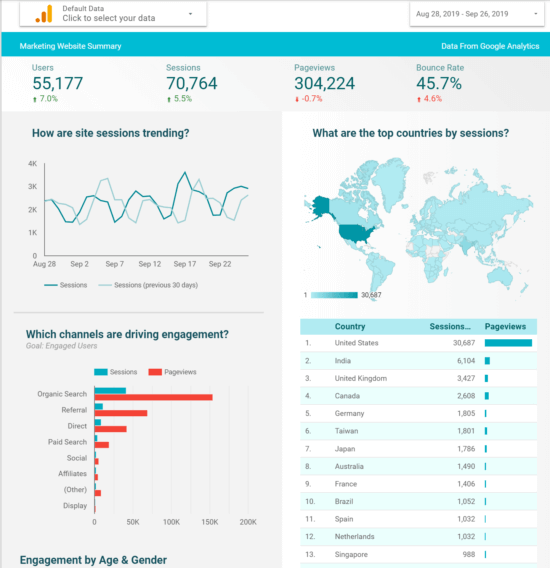
Visualize your data correctly
Google Data Studio has many chart types available and choosing the right one can mean the difference between chaos and clarity. When you know what you want to visualize, think carefully about the best way to bring the dimensions and metrics to life. Some example options are presented below:
- Table: Show individual values of a particular dimension (e.g. how much of each particular product was sold over a period of time)
- Time series chart: Show how values fluctuate over a set amount of time (e.g. how much of a product was sold on each day over the course of a month)
- Bar chart: Visually display how individual values compare to one another (e.g. how well different colours of the same product sold)
- Pie chart: Show how something is constituted of different amounts of components (e.g. User base is 60% Female and 40% Male)
- Geo map: Show how your results fare based on location (e.g. number of UK sales vs rest of Europe or global)
Keep these steps in mind and you'll be spending less time reporting your results and more time improving them!


