 Having started my career as a web analyst and working with data on a day-to-day basis, I see massive opportunity in what we can learn and how we can improve online performance by using data effectively. However, “how” we use data to make decisions is a wide-ranging scale and it can be all too easy to go from traffic, to visitors, to clicks and transactions in your analytics platform and not pay the appropriate attention to what is actually happening in between. Not micro-conversions in this instance, but the psychological filters consumers employ as they interact with and process your website. Both consciously and (more interestingly perhaps) sub-consciously. Perception, emotion, anxiety and more.
The common saying goes that analytics can tell you ‘what’ is happening, but cannot tell you ‘why’. User Research can give you fantastic insights into what motivates or influences decision-making, but it can’t ever tell you the whole story. Psychological principles and persuasion can have a significant impact on users onsite behaviour and can be effective ways to improve conversion.
Experimentation through A/B testing allows us to introduce different psychological principles and measure the impact. We won’t always get qualitative feedback on why something worked, but when we control other factors with a scientific approach and empirical learning, we can identify the impact of psychological and persuasion principles on user behaviour and conversion rates.
In this post I want to share five tried and tested psychological principles that have worked countless times in different verticals and contexts. Then I’ll introduce four less commonly used principles, which you may never have considered before or which might make you think differently about how you approach a problem. For each principle I have included some practical examples that you can apply and test on your website.
5 Popular Retail Persuasion Techniques based on psychological
1. Anchoring/Pricing
In general we are pretty poor at placing a value on something without context or a reference point. Anchoring is one technique that can be extremely successful in impacting how we evaluate the relative value of a range of products or services. There are three key elements to Anchoring:
- The perception of price is often based on the context
- We don’t necessarily make rational decisions and the power of suggestion is important
- We tend to avoid extremes
When making decisions between similar products with different features and prices we like to think that we are making sensible and rational decisions based on our carefully thought-out requirements. However, we are influenced by factors such as the relative value of other products on offer or products on offer elsewhere.
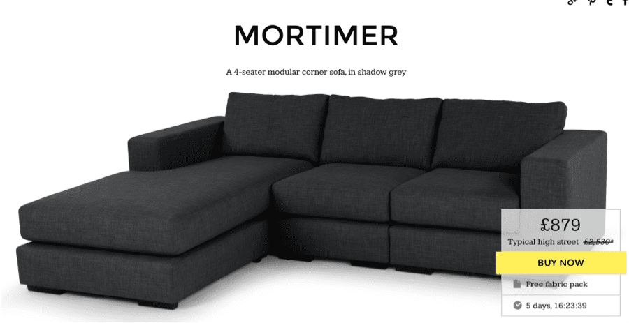
Made.com use this principle particularly well. On their product pages they include a “typical high street” value, which immediately places some context around the actual price, making it seems very reasonable in comparison. Creating favourable comparisons for our products or services can be an extremely successful technique.
Go and Test it:
- Test adding a competitor or alternative price for comparison
- Introduce a more expensive product for comparisons that make the product in question appear reasonably priced
2. Social Proof
Social proof is the idea that we are likely to follow the patterns and behaviour of similar people in new or unfamiliar situations. This can work in a number of ways online. This could simply be by increasing customer’s confidence in a product or service based on the fact that they are widely used. You may have felt or heard this type of sentiment before: “Lot’s of other people use this service, so it must be good.”
Very simple ways of using this effect is with simple proposition messaging, such as on the AA homepage, where they have the following USP message:
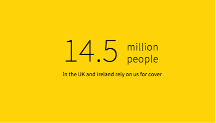
This has the effect of reassuring us that 14.5 million people are unlikely to be wrong and the AA must be a company that we can trust or other people would have moved on.
Go and Test it:
- Add a “People who viewed this product bought” feature
- Introduce case studies from satisfied customers
- Display contextual user details to allow users to identify with the reviewer
3. Scarcity/Limited Duration
You will no doubt be familiar with examples of this from your own online experiences. Scarcity dictates that we infer value in something that has limited availability or is being promoted as being scarce. This can work brilliantly in combination with the Limited Duration effect, which says that given a choice between action and inaction, a limited time to respond increases the likelihood that people will participate.
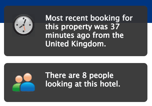
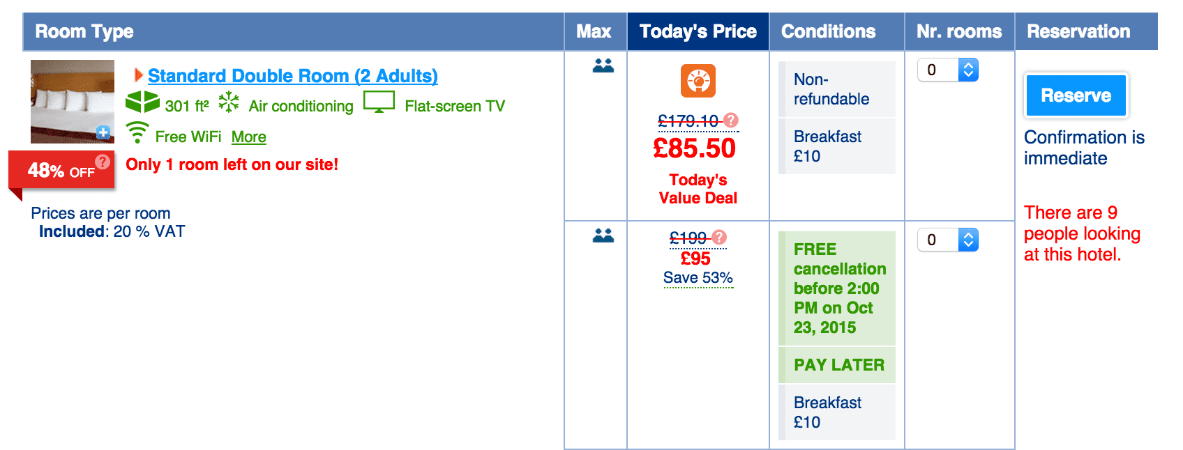
Booking.com use this principle brilliantly. Features such as “X number of people are viewing this product” and “Most recent booking on this product was X minutes ago” and “Lock in a great price for you upcoming stay - Prices in Manchester have gone up since yesterday. And there’s more: “Secure your reservation today!” and use of red on messaging such as “Only 1 room, left upon our site!” and “there are 9 people looking at our site” which introduce or build urgency. All of these messages are carefully designed to reduce our tendency to shop around and put off decisions until later, which therefore can have a significant impact on conversion.
Go and Test it:
- Introduce “X left at this price”
- Consider limited duration promotions: e.g.”Free delivery this weekend only”
- Test adding a countdown timer, e.g. “Next day delivery ends in 02hrs:10mins”
4. Loss Aversion
Loss aversion is a cognitive bias first described by Amos Tversky and Daniel Kahneman, that refers to people’s tendency to strongly prefer avoiding losses than acquiring gains. Most studies suggest that losses are twice as powerful, psychologically, as gains. In practical terms it means that users’ purchasing decisions are significantly more complicated when there is an exchange of the users hard-earned money for an item when the value of the product or the value to them is not completely clear.
For example, current TV advertising for supermarkets in the UK seems to be almost exclusively focused on demonstrating the relative high cost of shopping compared to competitors. This does not guarantee that we are getting the best deal by shopping with them, but gives us confidence that we are unlikely to be taking on unnecessary losses or paying an excessive price in comparison. They are controlling the comparison in a favourable way and highlighting the potential risk of shopping elsewhere.
For online services or software, free trials can be a great way to mitigate the apprehension created by our aversion to loss. It can also work in combination with limited duration effect to create a fear of missing out on access to a good deal or limited product.
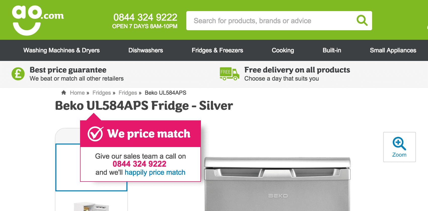
When we get close to deciding on a product and we’re considering moving through to checkout we may be concerned about paying over the odds for a product when it could be available at a lower cost elsewhere. AO has recognised this instinct in users and deal with it in an interesting way. If you copy the product title, it is likely you are about to search for it elsewhere. Therefore when you highlight the product title they present a message to say they price match and present you with a number to call to guarantee the best price.
Go and Test it:
- Introduce messaging to address users concerns when they are on the verge of spending their money with you.
- It sounds very basic, but focusing on the benefit to the user of the product or service and not just features can elevate the decision from a clinical, cold one to a more emotive decision that they can identify with.
5. Authority
The persuasion principle of Authority states that we want to follow the lead and advice of a legitimate authority. When we are continually bombarded with marketing messages and proposition messaging which is prepared by the retailer, a more impartial perspective can be really valuable to consumers. Customer reviews are a part of this, but reviews from expert commentators or respected organisations can be extremely influential.

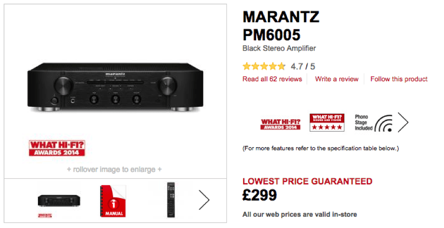
Richer Sounds use authority badges and messaging effectively across their website. In their global header next to the primary logo they have the Which? Awards 2015 logo. Which? Are held in high regard and trusted by many consumers, so this lends credibility to Richer Sounds. They also have expert third part reviews on their lister and product pages from What Hi-Fi, which gives you an unbiased perspective on the quality of the products on offer.

Hidden Hearing use celebrity authority figure Dr. Hilary Jones to endorse their products and promote their expertise. They also display messaging and badges of credible industry organisations.
Go and Test it:
- Collaborate with authoritative individuals or organisations and shout about it on your website. You might even be able to arrange a trial period with your authority figure in order to test the impact first.
- Test adding in “as featured in” or “recommended by” content
5 less-well-known alternative techniques
As well as the common ones above, I have selected five more that are less common, that you are less likely to be using already and that can be used to great effect.
1. Limited Access
Limited access is a cognitive bias that dictates that we naturally desire things that are perceived as exclusive or belonging to a select few. This can be used in a wide range of ways to make your proposition more attractive or to change the perceived value of your product or service.
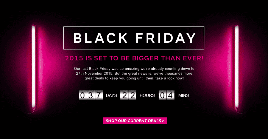
We know all about the chaos that descends on crash sales like Black Friday, when consumers can get whipped up in a frenzy to buy highly discounted products for a fixed time period or until they are sold out. The limited access to those prices is communicated widely and used to encourage consumers to buy within a fixed time period.
Another use of this technique could be to introduce ‘Rare’ and ‘Limited’ ranges. This can be a compelling prospect for users, particularly if there are conditions presented that make people feel they have qualified and are part of a select group. In a recent user research session looking at a site that sells art prints, a user said:
“If I can't have the real thing, then it would be nice to have something that 2.5 million people haven't got on their walls. I don't mind paying a little bit extra for rare and limited items.”
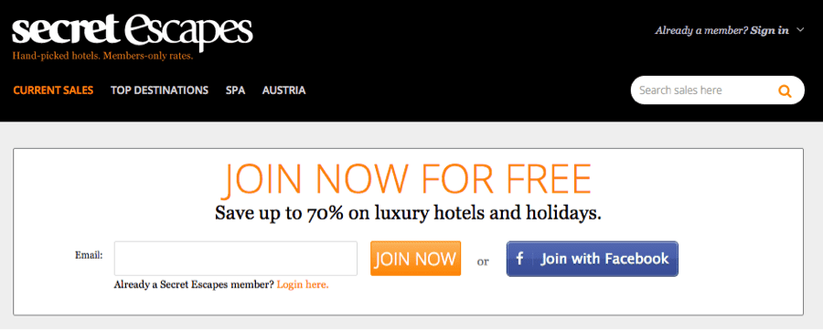
Members only access sites like Secret Escapes benefit from the perception of exclusivity. Their unique value proposition [link to smart insight post on UVPs] reads “Hand-picked hotels, Members-only rates” immediately introduces the concept that you might be able to get a deal that is not available to others. Being part of an exclusive group can add a feeling of excitement and positive emotional response, despite the fact that in reality the barrier for entry to Secret Escapes is low and the deals are in fact widely available to those who seek them out. The effect of creating the perception of limited access can be extremely compelling.
Go and Test it:
- Test introducing a product range for VIPs
- Give early access to a new range to an exclusive set of users, e.g. competition winners, social media followers, VIPs, etc.
- Test clearly communicating the quantity of products available for a short-run, limited or rare products
2. Curiosity
Certain functionality and information requires absolute clarity (such as pricing and additional charges for example) but in other areas of the websites, piquing interest and leading them down a path to find out more can lead to a more engaging experience.
When teased with a little bit of information, people will often want to know more. Sometimes a puzzle or a fascinating concept that requires investment and effort to solving it can be an exciting prospect and lead to a rush when the puzzle is solved.
Are there scenarios when you can tease someone to take the next step and create an intriguing experience? These techniques need to be used with care and attention, but when done right they can build a more engaging experience.
This page from Invision is fun. It creates excitement by introducing a puzzle to solve as well as a level of appreciation of the creative execution. While it may seem trivial, it can warm users to engage further and take in the proposition far more than most of the default style landing pages with CTAs that you see elsewhere.
Go and Test it:
- Test headlines and copy that create intrigue giving hints and making users want to explore, e.g. “This seasons must have X” - view all
- Carefully introduce unexpected interactions or creative ideas in to the user interface
3. Collecting & Set Completion
Collecting simply means that where there is interest, people like to amass units that add to or complete a set. Similarly Set Completion dictates that the closer a collection is to being complete, the more we desire collecting all of the pieces.
As well as thinking of all the strange and bizarre things that people collect, this could just as easily equate to visiting the top 10 restaurants in your city to buying every album by your favourite artist. When products are arranged in sets or collections it can be extremely compelling to see that you have acquired all of the items. In the offline world, many of you will remember collecting a full set of free toys from McDonalds and how important it felt to get all of the characters or toys in the set. Some company’s products lend themselves very well to this type of behaviour such as Games Workshop where products are in clearly defined categories and ranges. Many retailers have features such as ‘complete the look’ which may appeal to some users who view the products as a set or value items that have been carefully selected to go together.
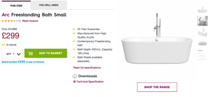
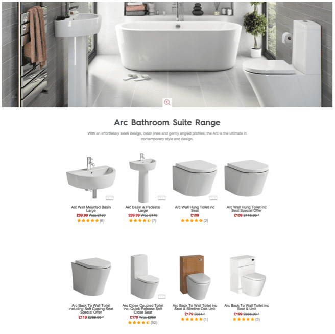
While not strictly something that we collect, Victoria Plum make it easy for you to shop within a range from a single product page. They include a clear 'shop the range' call-to-action (see above) that takes you to a clearly laid out category page (below) that displays other products in the range.
Go and Test it:
- Test a “Get the Look” feature
- If you have in-depth consumer data about previous purchase behaviour you could personalise their experience to promote products that would build their sets.
4. Positive Mimicry
Positive Mimicry can be used as a persuasive technique, or can be effective in aiding comprehension. It simply means that we can learn by modelling our behaviour after others. A simple case study could help users through a complex online journey or scenario where the steps and required actions are not overtly clear.
In one test that we ran on a forum site (where the main objective was to increasing posting) we ran experiments to guide users through their first post in order to familiarise them with the website. We also prepared moderators to engage with them and set an example of how to behave on the site, provide help and tips. In social contexts like this it can also work well to reward people who ‘model’ good behaviour.

Equally, on sites like Vimeo and Apple, the ‘staff picks’ indicate that their staff are using, reviewing and selecting their favourite products. This is partly their way of modelling desired behaviour.
Go and Test it:
- Consider opportunities to reward users who model the desired behaviour on your site
- Introduce a Staff picks feature or content block
5. Variable Rewards
This might be the most off-the-wall suggestion, but it could easily be used in an effective way. “Random” rewards make more powerful motivators; they seem scarce and unpredictable (and they are less likely to interfere with intrinsic motivation).
Add a little bit of randomness to you promotions. Not for the sake of it but because it can generate excitement and act as a motivator. This could be “Get a 5%–50% off voucher” for your next purchase. We probably all suspect in these scenarios that we are more likely to get a 5% off voucher than 50% off, but somehow the potential of 50% off is more compelling that say a straight 10% off.
 During promotional periods such as Black Friday, retailers like Very.co.uk have used variable rewards to introduce urgency and intrigue to their promotions. For example, during the 2014 Black Friday promotions they had massive discounts on six specific products each hour, and hinted at the next products to be discounted with an outline graphic. Rather than simply listing all of the sales items from the start, they used a combination of limited duration to create urgency, curiosity as to what the next product might be and variable rewards to create intrigue for consumers waiting to see what the next discount would be.
Go and Test it:
- Run a promotion or campaign with a variable reward - e.g. 5% - 50% off
Conclusion
Hopefully, you can take some of these principles away and start using them on your site to move beyond simple usability and functionality improvements and to building a persuasive and engaging experience that benefits your users and helps you to achieve your online goals. I’d love to hear of any successful experiments inspired by this post.
Resources
Going Deeper:
- Predictably Irrational - Dan Ariely (Amazon)
- The Psychology of Price: How to use price to increase demand, profit and customer satisfaction - Leigh Caldwell (Amazon)
- Cognitive Load: We distill the latest behavioural economics & consumer psychology research down into helpful little brain gems. (Visit)

Thanks to
Matt Lacey for sharing his advice and opinions in this post. Matt Lacey is Head of Optimisation at
PRWD. You can follow him on
Twitter or connect on
LinkedIn.


