How price, type size, position on page and the colour of prices can all impact on whether people click the buy now button
The ultimate goal of marketing, of course, is to get people to buy. That means, that in an online context, actions that marketers can take to influence the pressing of a “buy now” button are desirable.
But how often do we focus on what seem like trivial things, such as the size of the type used to show the price? Psychological research shows some interesting factors about the way prices are displayed. Get the display of prices right on a web page and you can affect the chances of that “buy now” button being pressed.
There are several factors which I shall cover in this article:
- Should prices end in an odd numbered digit?
- It is not the last digit that matters, but the first one
- The sound of prices influences clicks
- Choosing the right type size can increase sales
- The colour of price displays affects men more than women
- Should your prices be on the left or right of the page?
- Do you even need to tell them it is a price?
Of course, it's assumed you will have determined the price points you want to charge using market research or considering Kotler's Pricing Model. I wont be looking at price setting in this article, rather ideas on how to communicate prices through creative and copy.
Should prices end in an odd numbered digit?
It seems that almost everywhere you look online you can buy things for $97, £147 or €27. It seems as though we have forgotten that prices can end with a digit other than 7. Some people argue for ending in a 9, suggesting that £9.99 “feels” cheaper than £10.
Logically, of course, we know that £9.99 is as near £10 as you can get. But our brain doesn’t always work on logic. It appears that we “round up” even numbers, but “round down” odd ones.
So when we see £9.99 our brain, subconsciously, perceives this as getting further away from £10 – we think there is a growing gap, influencing us to buy because it looks like the price is getting cheaper. When you end a price in a 7 instead of a 9, the gap seems even bigger to our subconscious. That means you tend to get higher conversion rates when prices end in a 7 rather than a 9, explaining the preponderance of the figure 7 in online pricing. So why wouldn’t you end in a 5 or a 3 or even a 1? That’s because these digits bring in to play other psychological factors, such as the sound of the number or the influence of the first digit, rather than the last one.
It is not the last digit that matters, but the first one
The impact of odd numbers helping “round down” a price in our subconscious only tends to work when the last digit is high – such as 9 or 7. When the last digit is low the impact of the first digit becomes important.An example will help explain this.
Let’s imagine you gave a product you want to sell for around the £30 mark. If you sell it at £29.97 you benefit from the “rounding down” of the last digit, the 7. But what if you made the last digit a 1? You would get slightly higher profits from each sale by selling at £30.01 and you could argue that people would “round down” because of the final odd digit, thereby seeing a price lowering effect. That is true. But the problem now is the first digit, 3. That’s obviously bigger than 2 and hence you end up with a conversion issue.
The first digit in a price “frames” the buyer’s mind.
When the first digit is a 2, as in £29.97, we start with a low price in mind. To our subconscious mind, £29.97 is considerably cheaper than £30.01, even though there is only a few pence in it. The psychological gap between the two is much more substantial than the real gap because the price starts low and ends up rounding down. In reality what this means is
- you need to price with a relatively high last odd digit in order to keep the first digit as low as possible.
But that still doesn’t answer why 7 is more popular than 9. After all, more profit is produced by ending in 9. The issue is to do with how our mind hears prices.
The sound of prices influences clicks
Research shows that the vowel sounds in prices influence whether or not we think they are high or low figures. So the digit 9 has a long vowel sound in the “nine”. Whereas 7 has short vowel sounds.
Researchers at the University of Chicago identified this phenomenon when testing what people thought of discounts.
They found, for instance, that when a $10 item was discounted to $7.66 it was perceived as cheaper than the same item discounted to $7.22. It was found that this was due to the impact of the sound of the prices.
Two is a longer sound than six and it appears that the length of the sound of the price influences how big we think it is.
- When setting prices you need to say it out loud to work out the length of the price sound.
When people read your website a part of their brain comes into play known as the “phonological loop” which basically means they hear the price in their head when they look at the display on the web page. You need to ensure that what they hear is short, not long.
Choosing the right type size can increase sales
It’s not just the length of the sound of the price that make a difference, though. It is the size of the type you use. This is more straightforward – big type is equated with big prices and small type is perceived as a low price. So if you proudly display your prices in big type because you want to make people aware of your deep discounts, what their subconscious brain sees is something large.
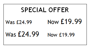
Consider what many websites do by showing the old price, struck through, and the new lower price. Frequently they size the new price as bigger than the old price to emphasise the discount. But this has the reverse effect on our brains. If the old price is bigger than the new lower price, then this is the logical way around – the type size reflects the decreasing price.
If you have lower prices you need smaller type than items which are higher priced. Using type proportionally for the varying prices you have can help increase conversion rates.
The colour of price displays affects men more than women
Of course, web designers will probably not agree, saying you need consistency and that each design element, such as a price display, must look the same. And if you think you’ll have arguments with designers over type size, there are other factors they are bound to disagree over, including the colour of the type and what position on the page the prices should appear on.
When you consider colour you can find all sorts of advice on so-called “colour psychology” on the web – much of which is, frankly, made up assumption.
Think about what is said about the colour red. You will find plenty of references to it being a “stop” colour and advice saying it shouldn’t be used if you want people to proceed, such as putting things into a shopping basket. That’s why you can find endless examples of green buttons for shopping online, based on the theory that green means go.
Sadly, the theory is wrong. Green means your brain can be relaxed – subconsciously it is taken as a signal of not having to react. Whereas red is a subconscious signal that you need to act quickly. At traffic signals you need to be quicker to deal with a red light than a green one.
In nature, red is a sexual signal in many species, demanding fairly instant activity to ensure reproduction. In other words, deep inside our brains the colour red is coded as “act now” – not stop…!
If you put your price displays in red, you can get greater take up of what you are selling because it makes your website visitors act more quickly.
The problem is, because of the significant influence of the use of red in nature as a sexual signal, you tend to find that men react to prices in red more than do women.
Should your prices be on the left or right of the page?
Having had your arguments with your web designer over type size and colour, you now need to prepare yourself to discuss which side of the page the price will be displayed on. Our brains tend to see things on the left of the page as in the past and the right of the page as in the present, or the future. That’s the influence of reading left to right – in countries where they read right to left, the psychological impact of time passing is the other way around.
- If you are showing discounted prices they need to be on the right of the page, with the old price being on the left, to demonstrate that passage of time effect.
- If it is a new product, prices on the right reflect the newness, helping to influence conversion rates.
- But old, established, evergreen products could benefit from prices on the left reflecting their historical value.
Do you even need to tell them it is a price?
Interestingly, there is also some evidence that if you leave off the currency display from prices, that also influences sales. Telling people this item is 97 compared with telling them it is £97 is back to the issue of framing again – the first price does not put notions of spending cash into people’s minds. Whereas the currency sign focuses the mind on spending – something that people do not wish to do. You may well find that sales go up when you don’t actually tell people how much it is.
Of course, all of this discussion applies only in situations where you need to display prices in a competitive environment. If you are working in the luxury brand sector you don’t even need to display any prices, let alone worry about how you put them on a web page. In fact, there is even research that suggests you might be better off not displaying prices at all..!


