Persuasion techniques and examples to improve conversion
'You say tomato we say tomayto', 'c0mmunication breakdown', 'do you speaka my language', 'my baby’s gonna write me a letter'........? It’s funny how song lyrics, when paired with a catchy melody are easy to remember, bulging with emotive meaning.
How easy would it be, fellow webmasters, if there was an easier way to mainline understanding between a website and its target customers? Without the need to carefully group masthead, hero banner, top navigation, product description and call to action button?
The truth is web design and written text are like an arranged marriage. They barely know each other, they’ve never met and then suddenly there they are sharing a bed (or a webpage) for the next however many years.
Top tips for persuasive design
Page composition is often decided way before the body copy has been written - or vice versa. This rarely makes for a persuasive experience. In fact the art of persuasion is as much about carefully considered page composition as a cunningly placed special offer or product description. So, without further ado, here are my three top tips for persuasive design:
1. Clear hierarchy of goals
Have a clear hierarchy of goals; each page needs a primary objective, and this should be explicit to the user.
It should be clear what the main purpose of that page is: Do you want them to log-in or register? Do you want them to sign up for an email or submit an enquiry?
Don’t confuse your users with secondary calls to action that are nice to have, but aren’t going to generate any extra business.
The main call to action should be upgraded and the secondary call to action clearly assigned with a supporting status.
Case study of Chapman Freeborn
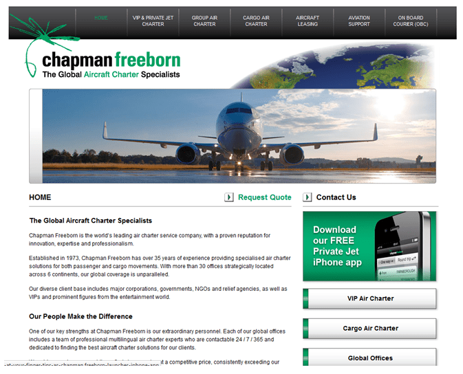
In the example below, consider the Chapman Freeborn site design from 2012:

So, what does Chapman Freeborn want the user to do on this page? It looks like it’s to get users to download their FREE (capitalised/shouting) Private Jet iPhone App. Meanwhile, the main business CTA ('Request Quote') is relegated to a text link in the same font size and on the same horizontal plane as the internal 'contact us' link.
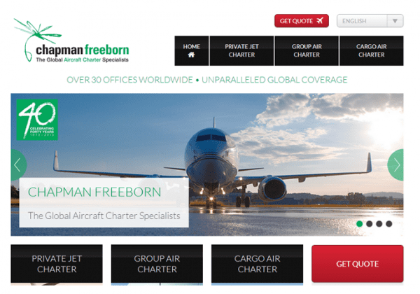
Fast forward to the Chapman site of 2013. The app download has gone - long since consigned to the dustbin. The quote CTA has not just one, but two main buttons, with urgent language ('get' quote) rather than the half disinterested 'request' quote. The evolution from an untested, unoptimised page to a fresh modern homepage via extensive testing and re-design is now complete.
2. People Skim
They don’t read. Here’s the thing, you’ve probably read less than half of this article. I mean really read as opposed to gazing through it, assigning meaning to certain sentences.
A survey by Harald Weinreich suggests that on the average web page, users read at most 28% of the words during an average visit; however 20% is more likely.
Jakob Nielsen then applied this data to create the following two graphs:
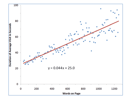
The chart above shows the average time users spend on pages with different word counts. Unsurprisingly users spend a greater amount of time on pages with text heavy copy; however
Nielsen revealed that on average they spend only 4.4 seconds more for each additional 100 words. Based on Nielsen’s assumption of 250 words per minute, his prediction is customers will read 18% of its content.
The second chart features a formula calculated from this data outlining how much on average of the visible text content could be read within a certain time frame. The formula allows for a fixed time of 25 seconds plus 4.4 seconds per 100 words. During a page visit, users are not reading all the time: some of the visit will be spent understanding navigation, images and so on. The chart below shows the maximum amount of time spent reading:
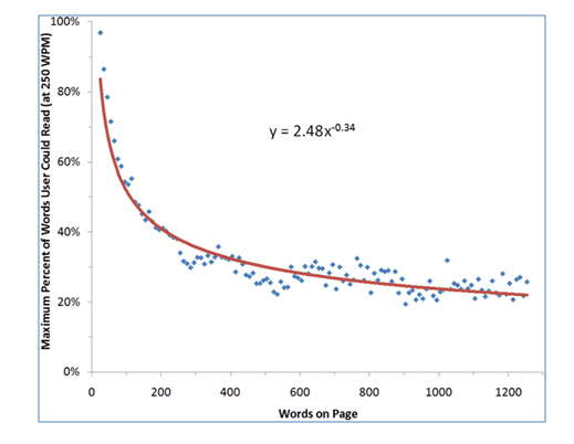
There is a huge drop off on longer pages: on an average visit, users read half the information on pages with 111 words or less.
Given the dataset in this research the average page contained 593 words; so on average readers could read 28% of a webpage if they devoted all their time to reading. Nielsen rounded this down to a more realistic 20% of visible text.
Instead of assuming that your customers are going to read every word, determine the key points of your proposition as they are the easiest factors to read and understand.
The priority should always be a clear and descriptive heading, a strapline outlining the key benefits to the customer and a strong paragraph opening. Bulletpoints are more likely to be read. 'Creative' marketing waffle is not.
3. Signposting content
Effective signposting of key content areas is a major part of persuasive design. This applies to the whole page composition including the wireframe stage of design.
So many sites start with blank blocks on a wireframe diagram: hero banner, action block, masthead and CTA. But it’s how these are put together that can make or break a successful page design. It’s worth considering some of the most likely on page elements that are expected to attract eye attention:
- 1. Faces: human beings are pre-programmed to identify and look at faces, so if you are using human subjects in photos these are going to attract instant eye attention. The image composition can have a big impact on your users, having faces staring directly at you is highly personal. In many circumstances, this is appropriate, for example on charity sites looking to create empathy. However, a face looking to the side can help navigate the eye towards the direction of a call to action button or carefully positioned offer.
- 2. Colours: humans automatically group together elements of the same colour, assuming they represent a similar concept. If you use the same colour on a page for dissimilar actions you are likely to confuse the user. A classic example of this is when the brand colours are used for buttons to log-in but also to purchase. Use distinct colours for distinct actions.
- 3. Space and Contrast: Space and contrast: areas of high contrast create significant eye attention as it’s easy for the brain to absorb.
Clever use of wording on an opaque background over a product image is always going to make it difficult for the brain to dismantle and absorb all of the layers of meaning. Key parts of the on-page narrative need their own space to be absorbed.
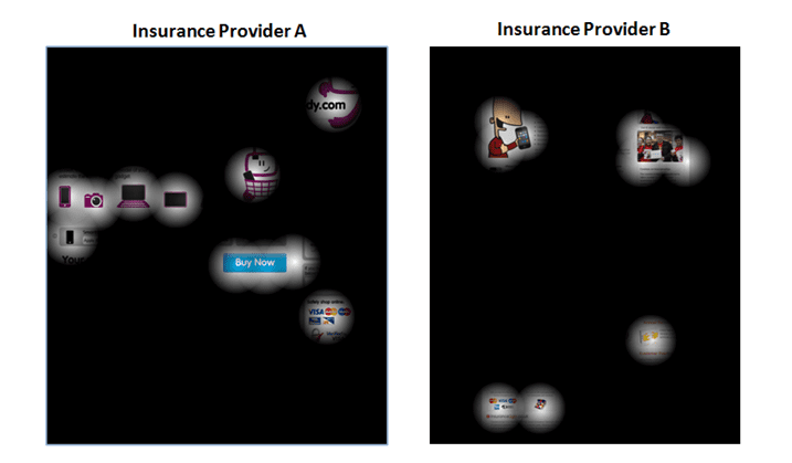
Look at the two examples of opacity maps from two insurance providers. Using advanced predictive heat mapping tools we can predict where the eye is going to fall.
- In Provider B’s design the main hero image is a cartoon graphic and the supporting sidebar showing a group of people receiving a cheque both attract eye attention. However, none of the other important on page elements are noticed.
- With Provider A, the high contrast product graphics of the laptop, camera, tablet and phone attract considerable eye attention, as do supporting elements like the credit card logos and the main CTA. The page is designed so there is almost a visual staircase built for the user moving from left to right across the page with the eye finally resting on the call to action.

Webmasters have a complicated challenge to satisfy all the teams who contribute turning a webpage on a wireframe into a living, breathing business tool. Each department whether they’re artistic, linguistic or commercial has a separate but pivotal role in bringing their ideas together.
Composition is vital for building an experience that is clear in meaning, visually compelling and user friendly. After all, communication is much, much more than words.

Thanks to Joe Doveton for his advice and opinions in this blog post. Joe is the Head of Client Services at
GlobalMaxer, UK’s leading Cultural Conversion expert. He has 17 years industry experience, working alongside a number of high profile brands including STA Travel, Manchester United, Vodafone, Sony and Panasonic. His area of expertise ranges from traffic driving disciplines (online advertising sales, ad planning and buying, ad networks, SEO & PPC) to site-side optimisation (web analytics, usability, conversion, AB and multivariate testing). Regularly speaking at conferences world-wide on all facets of multivariate testing and conversion, his ‘know-how’ on how conversion patterns vary across cultures is second to none. Editorial credits include UX Magazine and I Gaming Business Magazine to name but a few.Moreover, Joe recently worked on a cultural conversions chapter for the renowned CRO industry bible ‘Landing Page Optimisation’ by Tim Ash (2012). In addition, he is also one of the main speakers at Conversion Conference Boston 2013.