What makes a good ecommerce landing page?
So, what does make an effective landing page for an Ecommerce site? Well, I’m going to give a typical consultant’s answer – "it depends"; on the campaign and your goal for the landing page. That’s not being evasive, it’s the truth; not all landing pages are born equal. For example, some marketers invest in prize draws and competitions as marketing tactics to drive data capture for their eCRM programs, so the landing page needs to focus on making it quick and easy to enter. Typically ecommerce landing pages are used for tactical marketing campaigns (e.g. from AdWords, Display Re-marketing or Email marketing) and are designed to drive sales making use of existing site page templates.
A good ecommerce landing page should satisfy the following criteria:
- The creative design is consistent with the marketing campaign that generated the visit.
- The copy and CTA are consistent with the marketing campaign.
- The page is structured to make it easy for the visitor to access key information and make an informed decision.
- There is a clear onward journey should the visitor decide to take further action.
 Recommended Guide
:
Creating high-converting landing pages 2013
Our 88 page Ebook by James Gurd and Dave Chaffey features a workbook format with checklists and over 50 examples, including many from Ecommerce sites.
Download our Landing page optimisation guide.
Typically there are 3 ways to generate a landing pages:1. Create a bespoke new page for a marketing campaign.This gives the greatest creative control and allows you to tailor the message and the content to suit individual campaigns. It also allows you to be flexible in the design pattern by customising HTML, avoiding the dependency on existing page templates.
Please note that you can create a bespoke page on your website and also on social media. Facebook is used by marketers for prize draws and competitions, as this type of campaign is well-suited to the social channel,
2. Use an existing webpage.
This is the path of least resistance – you point visitors to an existing webpage. This is often done for paid search where there is an existing product or category page related to the search term you are bidding on. You can also use filtered pages to match the page content to the campaign e.g. paid search ad for “women’s Diesel jeans” directs to the Women’s > Jeans page that has the attribute filter for brand=Diesel applied.
3. Set-up a custom search results page.
This is used when there isn’t an exact match web page already existing. Retailers create a custom search results set using a pre-defined site search term, then use the search results page URL in the marketing campaign. This can work well for custom gift lists.
In this blog post I look at case studies of what I consider to be good and bad to help illustrate these 3 options.
A caveat I need to point out – without access to the web analytics data behind these landing pages, I can’t validate my analysis. My evaluation is based on my own experience of optimising landing pages and the wealth of case study material I have read over the years. Still, it would be foolish to claim to be 100% right….
Bespoke Ecommerce landing page examples
Email campaigns often require new landing pages, especially for lifestyle brands where promotions aren’t always related to specific products.
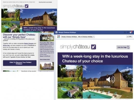
A good example is this email campaign from Simply Chateau Holidays promoting a prize draw to win a holiday. The creative is carried through to the Facebook landing page with CTA repeated for consistency. You know as soon as the page loads that it’s the right place.
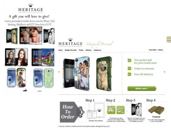
Another example from Heritage Personalised Stationery demonstrates a well-structured landing page with strong USPs and a clear CTA but failure to pull through the main campaign message. They have created a sub-domain for this product that is also linked to from their main domain homepage.
Note how the landing page helps set expectations of what the customer has to do; it clearly marks out the 4 steps required to order. This is a useful technique because unexpected multi-stage order processes can increase abandonment, so it’s sensible to make this transparent.
Existing web pages
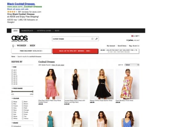
Surprisingly ASOS is my bad example. For a Google paid search ad for the search query ‘black cocktail dresses’, they drop visitors onto the generic Cocktail Dresses category page. The first product isn’t black and only 2 black dresses are visible when the page first loads.
Perhaps this is deliberate and testing has revealed higher conversion when customers see the whole range vs. a filtered page with black only dresses. However, from a good practice perspective this isn’t intuitive as it forces the visitor to take the further action of refining by colour to get the product list they were searching for.
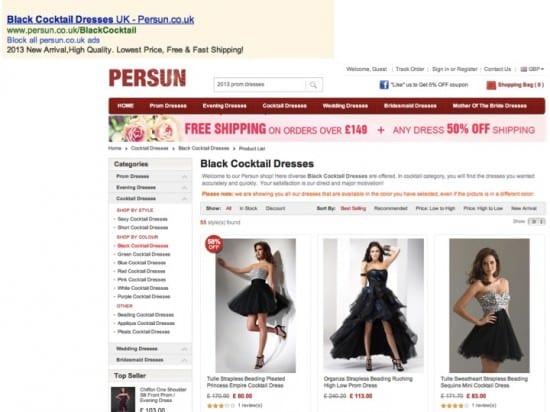
Persun on the other hand deep links you to its Black Cocktail Dresses landing page. They have added helpful text that explains that all the dresses you see are available in black, even if the image showing isn’t an exact colour match. This isn’t ideal as you would expect the website to default to the image of the black version of each product on this page.
What’s interesting to see is that none of these examples uses enclosed landing pages. By enclosed, I mean pages that remove all the standard site navigation elements and focus purely on the campaign message and CTA. This is something I’ve seen B2B marketers use more often.
Made.com is using retargeting via ad networks to target people who have already visited their website but not bought. The ads link bank to contextually relevant landing pages. In the example below, having previously browsed the sofas section of the website, I am shown an ad for sofas & armchairs that takes me back to where I left off.
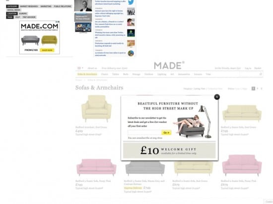
Interestingly, they use a pop-up offering a £10 welcome gift that requires email sign-up. I’m not a fan of disrupting the user journey like this. However, given that this is shown to customers who have visited but not yet bought, it could work in persuading people to sign-up and get that discount. I’m not convinced because the £10 voucher isn’t compelling given the price range for sofas & armchairs. I’d love to see data on how many people sign-up and spend vs. exit.
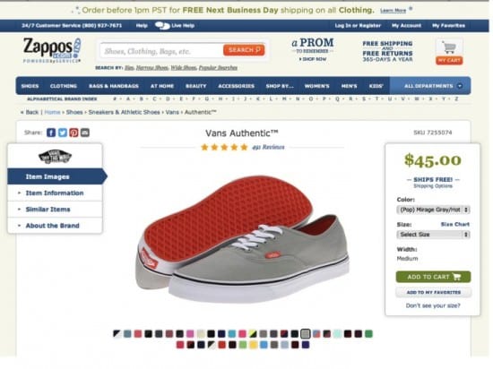
I love this example from Zappos (thanks to @dannydenhard for suggesting this). It’s for a product-level landing page and ticks the box for many reasons:
- Nice big, high quality product picture.
- Free shipping message is prominent and the delivery promise is reinforced at the top of the page.
- Good visual sign for the mind blowing range of colour options (which display a thumbnail when you mouse over).
- Quick links on left to reveal more product information.
- When you scroll down you can access product recommendations and customer reviews.
Custom search results
It’s hard to find examples as these landing pages disappear quite quickly as they’re often used for short-term tactical campaigns, such as paid search activity around events.
I know a retailer who used this solution every week for their ‘Deals of the Week’ promotion. They set-up a site search term ‘dealofweek’ and then each week associated the relevant products with this search term. They then used the site search URL as the link in their marketing campaigns. Sadly they’re not doing this anymore so I can’t show you.
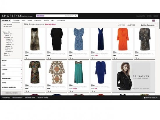
The example below from Shopstyle is a landing page for the search query “biba dresses” on Google. You can see that it takes visitors to a search results page matching that query. The advantage of this solution is that you don’t need to invest in landing page design and build. The disadvantage is that you have limited control over the page content as it uses an existing site template.
Key take-away
My key take-away for you regarding ecommerce landing pages is to ensure there is consistency with the campaign creative and content.
If someone is responding to an advert for black cocktail dresses, make sure the page they click through to gives them exactly that. The more you make people work to complete a goal, the greater the risk of people giving up.
The goal is to make your landing page easy to use and take action on – so think about visitor intent before deciding the optimal layout. And make sure you test – there is no reason not to do basic AB tests even if you don’t have a specialist testing tool. Look at Google Analytics Content Experiments and do some basic testing to learn how it can help you improve landing page performance.
So what do you think? What’s your experience of using/creating ecommerce landing pages?
Please drop by and share your comments and experience – we welcome everyone’s opinion and it’s good to debate because there really is no ‘right’ answer, as illustrated by the case studies in this post.
Further reading
Thanks, James


