A checklist of 10 best practices for creating infographics for marketing
You'll be all to familiar with infographics, so I won't bore you with an explanation. Some argue that infographics can only be about data visualised (charts, comparisons, Venn diagrams, graphs, flow-charts etc). Suffice to say that we believe the term covers more than just that and includes any graphics that explain something, a concept for example. For us, if it's visual, useful or entertaining and sharable, it's an infographic!
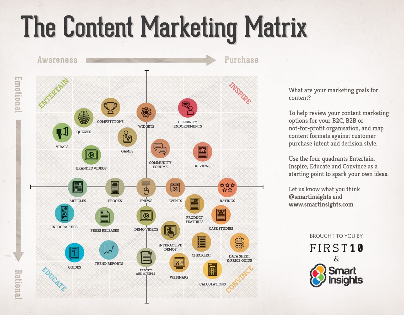
We used that approach for our Content Marketing Matrix infographic and the inbound marketing process which aren't classic data infographics, but we got good feedback that they were useful and they were shared.
So this is how Dave Chaffey and I see it, here is our checklist for creating the perfect marketing infographic. I've also written a follow-up on promoting infographics.
We will illustrate it with extracts from our B2B Marketing infographic.
Our 10 tips for effective marketing infographics
- Purpose - Don't create an infographic just because it's cool. I mean, it is (or can be) cool, but you also need to have a point. It needs to be a part of an over-arching communications plan or be tied to something that matters to your brand. I know it's stating the obvious, but it is tempting for people to want an infographic to satisfy magpie syndrome, rather than something that your audience will actually value. Infographics, we find, work particularly well when they're a part of a campaign, content visualised differently or bringing a new dimension to some information. Either way - you want somebody to do something, so make sure that's clear before you proceed.This infographic was to support our 7 Steps guide, so we used the same title and wanted to make sure that the 7 Steps were useful even if someone had no interest in the guide - it's important to get the Sell-Inform-Entertain balance right.

- Key messages- Keep it relevant, simple and short . The whole point of an infographic is to, well, make the point. Don't do more than you need and let the art, concept, story or data get in the way of the message. What do you need the main hook to be - the key insight - and what is the end message you'll deliver? And, remember who the message is for - a HR manager or maybe it's audience such as graphic designers - you want somebody to think something. The more targeted, the better.Well this infographic didn't turn out short, in fact you seem to get rewarded for providing more depth. We did design it to have clear visual focus on each section with a carefully defined message at the top prompting the reader to think about their approach.

- Communications - Remember AIDA? Attention, Interest, Desire and Action. There are other iterations of that here. The point here is only to drive home that infographics are pieces of marketing and sales communications more than anything else. So give them a 'storyline' or narrative, hook the user and guide them through - then inspire them to do something! All good stories have a beginning, middle and end. Infographics deserve the same treatment. Introduce the problem at the beginning of the infographic. From there, back it up with a strong idea or actual data. End the infographic with a conclusion, and the all important call to action. Here's ours:

- Design - Remember that we're aiming higher than a better designed PowerPoint or Excel document. The design is ultimately what piques interest and attracts attention. An infographic, which breaks up the text while still communicating valuable content, is a welcome change to most content across the 'net. It makes research, learning and discovery more entertaining and, well, fun! Choose a complimentary colour palette that is able to tie elements together to create a cohesive look, and still be striking. Make effective use of lines and graphics to pull the viewer’s eye down the page and onto the next piece of information. Be conscious of where you want viewers to look. Keep text to a minimum - as with most content online this matters most here.
- Use data - Of course, you’ll be impressed by an infographics design, but you need to be blown away by what you’ll learn, otherwise what was the point? You could always read an ebook, report or long blog post, yet infographics with key insights are much more useful for the time-starved who need the summary. Infographics that visualise data are also more shared, we've found this on Smart Insights too. With this in mind, use citations and have real transparency as to where the data has emerged from, research it well. It really bugs us when we read an infographic and we can't follow-up or substantiate the data. We mistrust infographics that don't point to a source with a methodology about the data collection.
So we took care to carefully credit the sources in ours:
 Earn the next click - Infographics are (we hope!) quickly digested because they explain and address the valuable ideas, facts and statistics that your audience really want to know. By the nature, it’s of course true that you can’t relay as much information in an infographic as you can in other marketing materials. So consider infographics as a teaser to more detail for those that want it, what is by definition a call to action; encouraging users to take the next step and read or download the guide, blog post, e-book, video or whitepaper.
- Build in sharing- The basic step is to ensure you're making it as easy as possible for your visitors to share the infographic via social media platforms. Again we'd suggest that a clear call to action at the end of your post, "if you enjoyed it, please consider sharing …" is easy and often not done. Similarly, make reposting the infographic and linking back to your site as easy as possible, and the best way to do this is to supply a HTML embed code. An embed code will ensure an easy way of re-publishing your infographic, that there's a link back to you - it also allows you to control the anchor text. We've found the Pinterest button helps sharing apart from our standard social sharing buttons.

- Innovate - If you have the resources and want to do something extra special (read: more likely to be used and shared!), interactive graphics such as this timeline of Middle East protests is seriously engaging over a static graphic. It's pretty smart in how it guides us into wider site content, the call to action is built-in. There's obviously a great deal more expertise and skill, yet the pay-off is pretty impressive for such a large amount of information. This info graphic on the future of car sharing is similarly impressive in terms of the crafting - just scroll from left to right to watch the infographic unfold before you.
- Promote it - Encouraging people to link to or share your infographic is great, and you can continue the process of active link-building after initial publication. The easiest way to build links via an infographic is to submit it to the numerous infographic distribution sites, almost all offer a credited link back to the original publisher. There are a lot of sites that do this including Visual.ly, Cool infographics and Daily infographic. Another great way to build links to your site via the infographic is with guest blogging. So as long as you're writing unique copy to accompany the infographic with each guest blog, you've no need to worry about duplicate content. Find a list of relevant sites and get in touch with the site owners or editors. This is hand-picked back-link building. It goes without saying that you should promote the infographic via your own (and your network's or team's) Twitter, Facebook, Digg, Reddit, Pinterest, LinkedIn and StumbledUpon accounts - particularly if you have active profiles. And, please don't forget email! The easiest way to email would be to present a key hook from the infographic with a link back to your site for the full image.
- Branding- Last but not least - be clear about who made the thing in the first place, a clearly visible 'made by you' is too obvious a thing to not miss.

We hope this checklist is helpful for when you're creating infographics. Is there anything obvious that we've missed and you would add to the list?


