Getting the website design style balance right
There’s often a preconception that designers and digital strategists do battle on a daily basis, but in our experience, this is simply not the case. Great websites require both sides to debate their points to reach the best conclusion – a healthy balance between design, functionality and persuasion. There are many different page types which make up a great website, each requiring a different strategic and design approach. In this blog post, we will look at a sample of pages from both perspectives with a view to finding that sweet spot where both are balanced and both combatants are happy.
The Homepage
-
Creative-led design example
This is where you grab the viewer’s attention. This may be your only chance to keep the new visitor on your site / side, so you need to be direct and achieve an impact using these types of techniques:
- Clean and simple messaging is key here. Don’t bombard people with too many elements such as CTAs or forms. Draw the user’s eye to the essential pieces of information by keeping a good level of space around the page.
- Large-scale image backgrounds are a great way to introduce a mood and feeling to the page. You can say a lot more through a great image than you can through collating various design assets.
- Introducing movement is another great way to keep a visitor's interest.
HTML 5 can be utilised to animate certain assets throughout. This usually works best when linked to scrolling, so the user is instigating the movement themselves. This also gives them control to an extent, which is always appreciated.
- The importance of typography should also not be underestimated. Google fonts and services such as Typekit allow for a much greater choice in live fonts. People have moved on from using just Arial throughout their sites, so grab the opportunity within the homepage to really showcase some beautiful typography.
Combining two fonts can often create dynamic and visually stunning content so don’t be afraid to experiment.
-
Logic-led design example
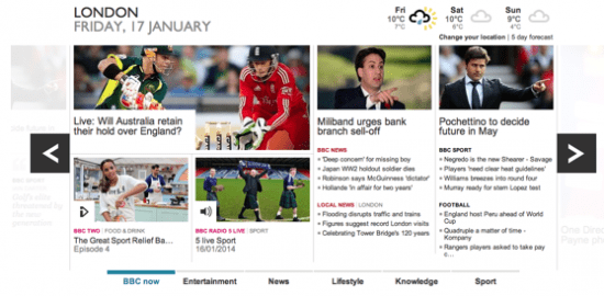
Source: BBC
A homepage is probably the most important landing page of your website acting as the gateway to the rest of the site. As such, a homepage must above all be absolutely clear and intuitive, but also enjoyable to navigate. To reach that ideal, there are a number of things you need to take into consideration. To kick things off, focus on the experience of your customers/users. Let that dictate how you structure and lay out the homepage. But I’d go a step further than satisfying their needs. Exceed them. By doing so, people won’t just use your website or application because they need to, but because they love to.
The simplest things survive. To achieve simplicity on your homepage is far more easily said than done. The same little voice in our heads that makes us keep all kinds of unnecessary stuff in our homes is the same voice you have to battle with here. Often there is so much information that you want to get across, but so little space to do so. Here you are simply going to have to be ruthless in order to separate the most important information and exclude anything not absolutely critical at first glance.
Treat your homepage as a summary of the most important information on your site and leave the rest to secondary pages.
Blog templates
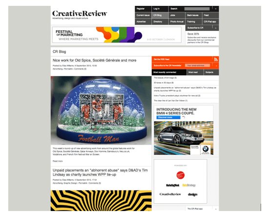
Source: CreativeReview
The blog represents a direct link to an individual or company’s news which is often both personal and intertwined with industry relevant trends. Hence, blogs should be a bit more flexible in their design than your standard info or product page.
Although the meat of an article is often the copy itself, it’s the images that catch a person’s eye. It’s always a good idea to have a large lead in image for each blog article.
This makes the overview blog page a lot more engaging and also gives you the chance to add more meaning to your article via a considered image, illustration or diagram. Typography can really make a difference on a blog.
As the page is predominantly copy, utilising different fonts, weights and styles will enhance the overall readability of the page tenfold. Using one font size and weight throughout makes an article dull and therefore means the content needs to be even more engaging to keep people reading.
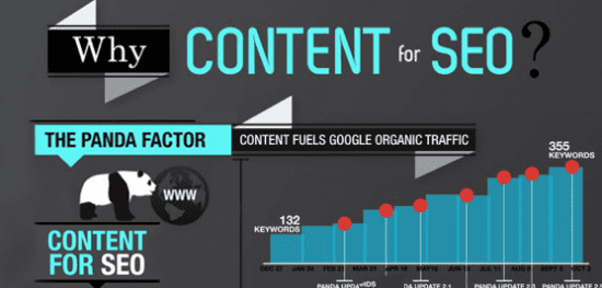
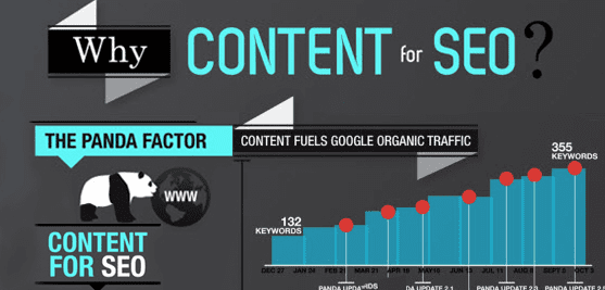
Source: Reventador.co.uk
Google has embarked on a quest to offer users the most relevant content to their online searches. Panda and Penguin are just the tip of the iceberg. As a result, your blog page has moved from being an interesting part of your website to being downright critical. Not only does it keep your website dynamic, with consistent, fresh content (which positively affects your rankings) but it should also enable you to push that content on social media channels.
However, be sure to make the content relevant for the problems, the user is looking to solve. If you are looking to start blogging, take that focus as opposed to a product-orientated focus. If you’ve succeeded you’ll have become a highly valued source of information for your clients. This is a fantastic position to be in, when they are actually looking for your service to fulfil their needs.
Consider this, people trust what they know. If your content hits the right nerve with the user, they’ll accredit you by sharing or liking your content, which acts as a catalyst for everyone they know to sit up and pay attention since it’s coming from a trusted source.
Contact forms
-
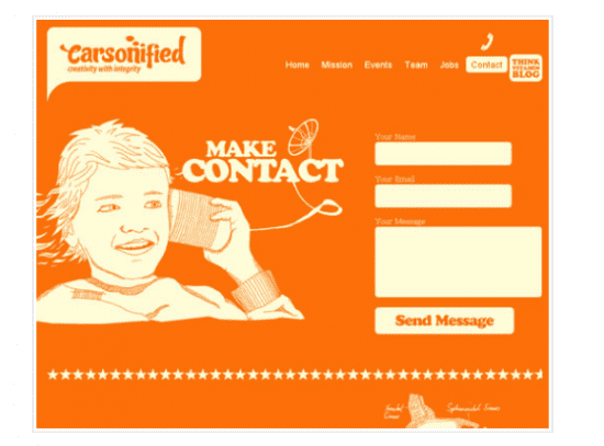
Creative-led example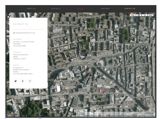
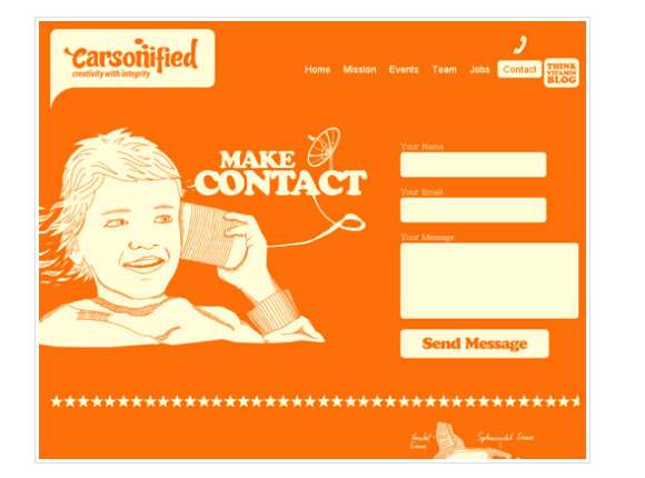
Source: Matterofform.com
Now obviously there is a practical reason for having a contact page but that doesn’t mean it has to be boring. Try thinking of a different and innovative way of communicating your details.
- Full-scale maps are a great way of adding interactivity.
- Another good example is to show your details on a business card or perhaps hand written onto an image or photo that represents the company.
Flash can also be used to great effect by bringing life to ordinary and dull details. There’s no reason why each address line can’t be animated into the page, which also draws attention to the eye. The fact is, this page usually has minimal information so use this to your advantage and create something that’s visually stunning.
Source: Onextrapixel.com
For many businesses, especially in the service sector, your ‘contact us’ page is your money maker. It is the page that leads to people getting in touch, and ultimately converts visitors to the site into hard-earned cash. As such, it is almost unthinkable not to include a ‘contact us’ page on your site.
Your ‘contact us’ page also legitimises your business and lets potential clients know that you’re the real deal.
There are a couple of things that you should consider including on your contact page:
- Firstly, you’ll want a direct line to your office/ customer service team. As the first point of contact, this is a crucial role for the business and should be held by someone who is professional, friendly and whose knowledge base encompasses all services.
- Secondly, you should consider including the location of your offices and perhaps a Google map to make things easier for your customers to find you.
- Thirdly, a contact us form should be included for those who are unable to pick up the phone to call for whatever reason if relevant.
- Another element that you could include would be the Opening Hours of the business. This gives an indicator of when the client can expect a response, in the event that they have gotten in touch during out of office hours. It helps to manage expectations.
With these important elements, you should be able to prevent any insecurity that people may have when engaging with your business for the first time and also help secure the first inquiry into your products/services.
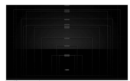
Responsive
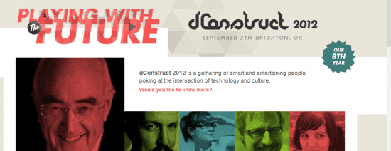
Source: 2012.dconstruct.org
Responsive sites tend to be dictated by functionality. However, this is by no means an excuse not to make the site look great. There’s no reason why you can’t have movement and interactive touches on responsive sites. HTML 5 can really play a part here.
The ability to move the user through the site via animation will add a level of engagement that standard static sites just don’t achieve. Remember that blocks of information or images are the way to go. This allows you to move areas wholesale when different views are initialised.
It’s important to remember that some users will view the site on desktop and hence they will at times test the transition between views when minimising the browser. This is your chance to try some really nice movement between views. A sprinkle or two of javascript will give you that extra bit of wow factor your site deserves.
Source: lazaworx
Responsive design is a very hyped phenomenon and in 2013, there weren’t many digital design discussions you could visit without the term being used. For me, there are three main reasons why responsive design is important:
- 1. Firstly, moving to a responsive website allows you to support a wide variety of screen sizes. The first thing we tend to think of is mobile, but it is much more than that. Obviously mobile is crucial and is becoming an even larger portion of internet traffic every day, but responsive websites also address the wide variety of desktop screen sizes out there. Large ones, small ones, projectors, screens with high resolutions and screens with very low resolutions. Ultimately, everyone will be getting the best experience possible given the device they are using.
- 2. Secondly, you are future-proofing your website. It is inevitable that new screens and devices will come to market. If we consider what has happened over the last decade in terms of the variety of devices, isn’t it worth investing in a plan that will accommodate another likely influx of devices which could otherwise render your digital real estate obsolete? Ever heard of the ant and the grasshopper?
- 3. Lastly, responsive designs offer value for time and money. If you were to consider building your site now and try to optimise later or even build a separate mobile site – chances are you are going to have a much higher cost. Not only that, you will have to spend considerable additional time to achieve what you would have achieved if you simply integrated responsive design into the current design and build of your website.
Summary Creativity vs Logic
Each page style has certain elements which are really important to highlight. The key is to push the boundaries so each page is as visually stunning as the last, whilst driving behaviour towards the most important calls to action. Users need to be engaged and keeping their focus should be your ultimate aim. A site that achieves this will give the user time to soak up the key pieces of information that need to be communicated, by simultaneously putting them at ease with the simplicity of your information hierarchy and capturing their attention with great design.
Like the two parts of your brain, creativity and logic in web design come together to create a fuller product – you can’t have one without the other. Logic allows you to think commercially and focus on the needs and user journeys of potential clients but creativity allows you an outlet to achieve those needs in the best visual way., and crucially grab attention!

Thank you to Maggie Majstrova for her sharing her advice and opinions in this blog post. Maggie is a Studio Manager at
Higher Ground Creative. With a background in Account Management and Web Development, she writes on better web building, all things search engine marketing, and how they affect business overall. You can connect with her at
LinkedIn or
Google+.