Techniques to optimise your ecommerce sites for higher conversions and increased social media engagement
Creating an ecommerce website from scratch can be daunting. The task of creating, populating and launching the site is one thing, but launching it in such a competitive space is another. To begin with, you’re probably not going to compete with a 163 million page site like Amazon. This ecommerce giant has taken years of nurturing and development to get to where it is today and consistently dominates the online space. Instead, you need to start small; find methods of harnessing the small pool of users available to you and capitalise on any quick win opportunities out there. Here are 5 ecommerce tips to help you get started with:
1- Be conversion led from the get-go
Striking the balance between being design-focused and being conversion-focused is a tricky consideration to get right for any ecommerce site, let alone one starting up. Of course, you want your site to be branded, modern and sleek but you shouldn’t get lost in this. You need to consider the user-journey throughout the site and ultimately, getting those users to convert. The first place to get this right is on your homepage.
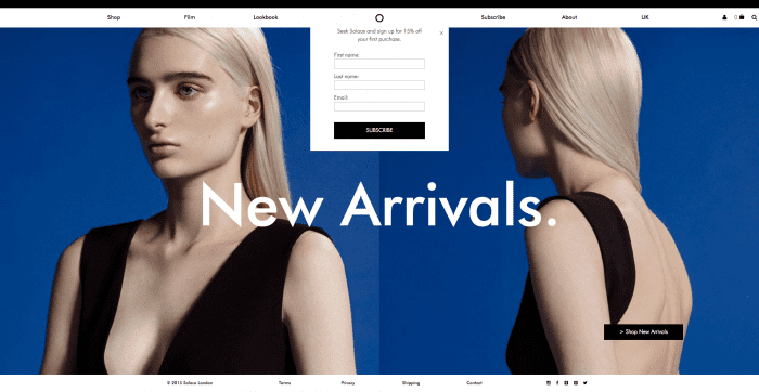
This ecommerce site above selling women’s dresses is an example of how not to optimise your homepage for conversions. The user is greeted with a large banner, covering 95% of the screen, with a text overlay saying ‘New Arrivals’. At this juncture, it’s difficult to determine what has newly arrived. Nothing on the site indicates that it is a women’s clothing store, let alone one exclusively selling women’s dresses.
Only 3 indicators exist communicating to the user that the site is an ecommerce store:
1) The ‘Shop’ link on the navigation menu on the top left hand side
2) The basket logo on the top right hand side
3) The ‘>Shop New Arrivals’ call-to-action button on the bottom left hand side
All these 3 indicators are lost within the top corners of the screen. The user has to work to get to some form of product to even start the conversion journey. Although everyone loves a good game of hide and seek, your ecommerce website is not the place to do it. This is a great example of design taking precedence over purpose.
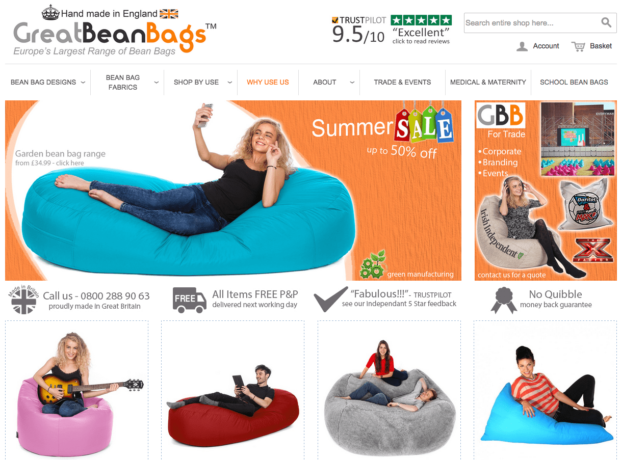
This bean bag e-commerce site is an example of a business getting it right. As the user lands on the homepage, they are immediately greeted with product. It’s not pushy or in-your-face either. Products are situated below banners that have enough design edge to give this company’s website branding. Notice the trust signals and USPs (unique selling points) around the page too. The colour contrast of their Trust Pilot rating makes it easily visible while the signage stating how all items come with free postage and packaging is one of the first things you see.

Having a branding and design edge is essential but don’t let it cannibalise your business focus. By the same token, ensure your homepage offers enough content to keep your users engaged but don’t swamp them. Get the balance right to avoid falling at the first hurdle
2- Consider your mobile strategy

Danyl Bosomworth recently wrote how we’re way past the mobile tipping point and he’s right. In 2015, your site now needs to be mobile-friendly. Statistics on mobile and more specifically, mobile commerce, have flooded the internet for some time now and the exponential growth predicted by many economists has proven to be exactly on-point.
Now in 2015, mobile users have surpassed desktop users. 1.91 billion people around the world own a smartphone with this figure expected to grow to 2 billion by 2016. As far as mobile commerce is concerned, 62% of smartphone users have made a mobile purchase in the past 6 months. It’s also become an integral part of the purchase process, with 80% of users using their device as another avenue to browse.
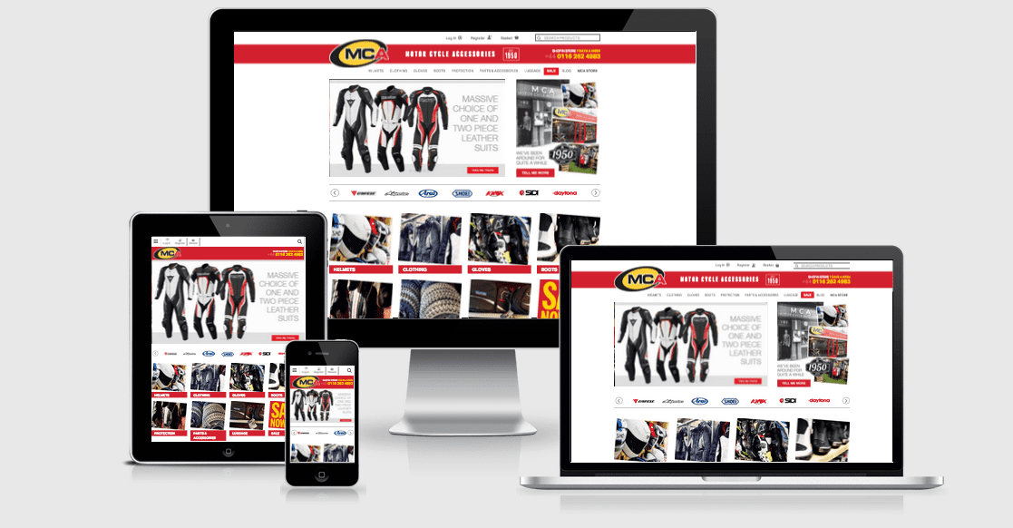
The reality is, if your ecommerce site isn’t optimised for mobile, you’re simply disregarding a large proportion of potential traffic. This motorcycle accessories retailer, who only launched online in April 2014, has already seen mobile and tablet account for 39% of their total online revenue. It’s also attracted an additional 66,000 visitors to their site since launch, according to their Google Analytics data. Optimising for mobile devices has allowed them to market to an audience they perhaps previously wouldn’t have known.
With Google changing their search algorithm in April 2015 to reward mobile configured sites, everyone is now fully onboard the mobile band wagon. Even I, a self-confessed mobilecommerce-technophobe, made my first purchase on mobile just last week. For help on optimising your ecommerce site for mobile, read Google’s Mobile Guide.
3- Make product pages your own
A lot of ecommerce product pages will naturally follow the same format. Product titles, images, product descriptions and ‘add to basket’ buttons are featured on almost all, but there is a whole host of additional content you can add to make your product pages really shine. Consider trying these ideas below:
-
Writing original & engaging product descriptions
This is where several ecommerce product pages fall short. Duplicate product descriptions, usually copied from the manufacturer’s site, is an all too familiar issue for SEOs. Writing original copy not only benefits your search engine performance but it also injects personality into your pages, differentiating you from the competition. Try adding some uniqueness into your product descriptions by detailing your experiences with particular products, e.g. what you like most about them. It may be a daunting task, writing original product descriptions for potentially thousands of products, but if you chip away at it month by month, the results will speak for themselves. Bullet points alongside blocks of copy improve readability too.
-
Using high resolution imagery
Small product imagery is frustrating for users purchasing online. A hi-res image can prove a great conversion tool as it’s the most tangible thing a user has to visualise the product in a world where they can’t actually pick up and handle the product. Try adding several hi-res product images, taken from different angles, to benefit the user experience further. Zoom and spin functionality will likely be appreciated too.
-
Including customer reviews
User generated content has massive benefits online for several reasons, but in the product page environment, it’s a great way to establish trust with your customers. It shows users that customers have purchased securely from you before, with no hassles, and have been pleased with the service. Obviously, you need to think twice about including negative reviews - especially if you’re selling your own products - but if you decide to do so, maintain your reputation by actively replying to comments.
-
Creating further informational resources
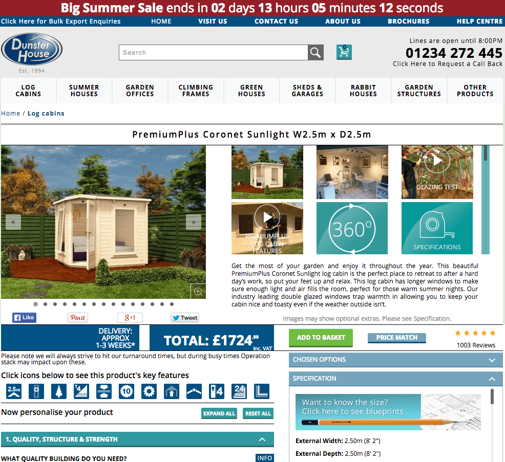
This will really set your product pages apart. Adding resources like videos, how-to guides, buyers guides, size and fit guides etc, is great content to add to your site and can prove integral to the conversion path. Check out this garden building retailer’s product pages for example, they go way above and beyond a product page’s usual line of duty, adding several pieces of informational content to the page.
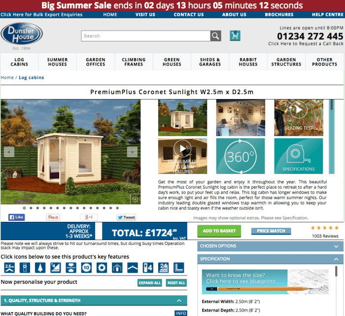
Again, it’s all about building those trust signals. You’re providing a well-informed customer experience that offsets the major flaw of online retail, i.e. users obviously not being able to evaluate your products in the flesh. This type of content also increases the chances of your site being naturally linked to and shared online.
-
Adding stock, payment and delivery information
It’s a very frustrating user experience when users add items to their basket to then find out the products not in stock, isn’t deliverable to their area or their preferred method of payment isn’t supported. Help your customer out by illustrating all this information on the product page. This will reduce your abandonment rate and pave the way for more conversions.
-
Using prominent call-to-action buttons
The product page is the final piece of the puzzle before the user enters your checkout. Bridge the gap seamlessly by using prominent call-to-action buttons. Make sure your ‘add to basket’ buttons are sizeable, attractive and visible amongst the rest of the page. Try giving the buttons a different colour scheme to the remainder of the page to make them stand out better. Use a larger, bolded font to aid the visibility further. Consider using ‘add to wishlist’ style functionality to encourage users to revisit your site.
Encourage users to share your products by adding social share functionality. Make sure the major social sites are covered as well as the more visually focused platforms, i.e. Pinterest and Instagram. These come with the benefits of having a user base that’s more retail focused.
4- Spend time thinking about why users are abandoning your checkout
Abandonment rate is a metric that plagues many ecommerce marketers. It’s something they’re always refining, streamlining and optimising to ensure no barriers are being presented to the user. And it’s no wonder really, getting users to convert online is an extremely difficult thing to get right. Did you know that 98% of website visitors never convert and from those that do, 70% don’t make a repeat purchase? It’s time to start thinking like an ecommerce marketer and spend time analysing your checkout.
Start by examining how long your checkout process is. The key goal here is to ensure it’s as simplistic as possible and doesn’t drag on. Start by reducing your amount of checkout pages. It’s not necessarily a case of reducing it to 1 page - many sites try this and the content often becomes cramped - but try condensing any superfluous pages together. This will eradicate unnecessary page load times and negate any abandonment issues due to users waiting around.
You can use account creation functionality to make repeat purchases even quicker, too. Users can save their personal information upon registering and be presented with it immediately next time they login. All that’s left is for them to click the final ‘make payment’ button. You can do this by including third party payment systems too, like PayPal and Amazon Payments for increased ease and flexibility.
It’s also a good idea to remove any possible distractions within your checkout area. Common tactics include removing the header, footer and any other on-page links that may navigate the user away from the checkout. Be sure not to stray too far away from the aesthetic of the website though, as this might discourage and confuse the user.
If a user is considering leaving your website, either from the checkout or just a regular page, consider installing an exit intent lightbox to salvage something from them. The lightbox could be a newsletter sign-up, in order to grow your mailing list, or simply a promotional code to encourage some repeat custom. Yieldify specialise in this form of promotional code light box and are well worth checking out, especially if you do not have the resource to program an exit intent lightbox yourself.
Keep refining and trying different approaches to see what conversion methods work for your checkout. Ecommerce marketing isn’t all about attracting new customers; it’s also about influencing and directing customers correctly once they’ve landed on your site. Consideruser testing services and analysing data on Google Analytics to make more informed decisions regarding your abandonment rates.
5- Be creative with social media
Used creatively, social media can go way beyond your average 140 characters-a-day posting. All that’s required is a little inspiration and in some cases, boldness. With the right ideas and execution, you can encourage your social media followers to become customers on your site.. And the best part is, it can be totally free. Here’s 3 ideas to get your creative juices going on how to promote your ecommerce store on social media:
The beauty of ecommerce stores is you’re dealing with commodities. It’s nothing abstract like a service; you’re dealing with tangible items that your customers interact with. This can easily be translated into some kind of competition where you ask your customers to use your products in a certain way. Execute the competition with a hashtag to pull all the entries together and that’s about it. You now have yourself a competition that’s not resource heavy. Be sure to understand the promotion guidelines from each social network before starting a contest.
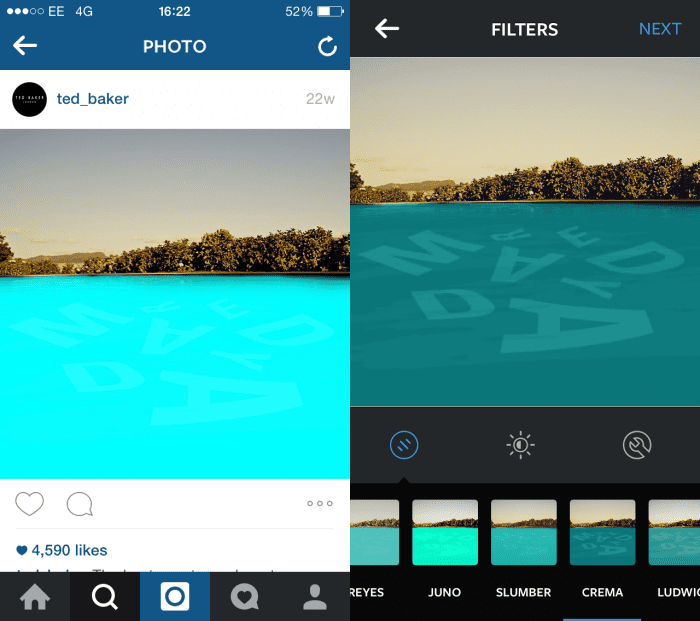
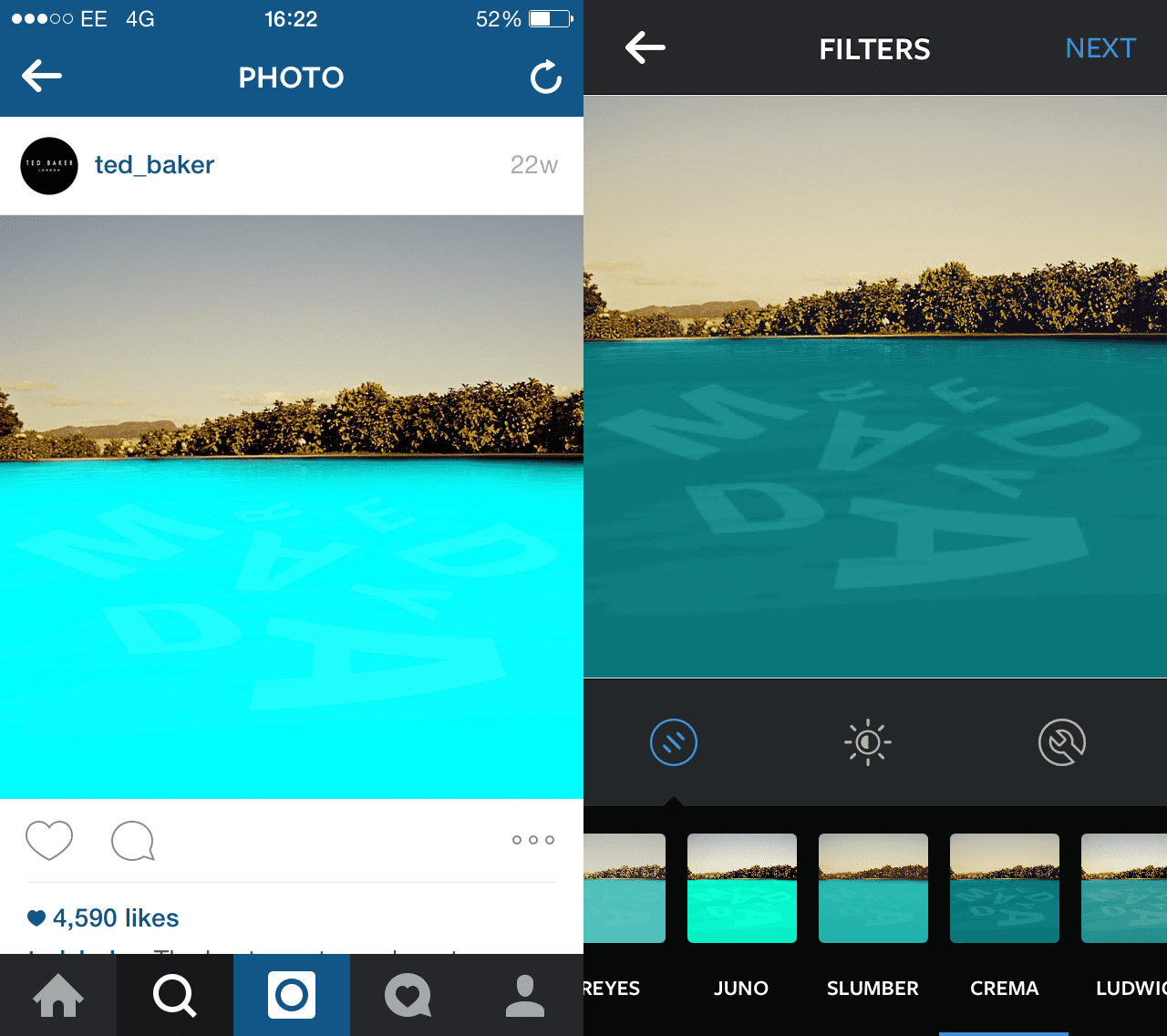
More and more brands are starting to use social media to advertise their promotions. Couple this with a creative approach, and you have yourself an engaging social media campaign. Ted Baker did this perfectly in early 2015, going to Instagram to promote their Spring/Summer 2015 collection. They invited users to regram images onto their feed and by applying a filter, it revealed a secret promotional code.
It doesn’t have to be as ‘out there’ as the Ted Baker campaign either. Create an image featuring a promotional code and turn it into a jigsaw using this free online tool. You can then share the unique URL on social media. Alternatively, post the promotional code onto social media and state how it’s valid to the first 50 users who input it. Whichever approach you do choose, you’re likely to see increased engagement rates as your incentivising your follower base.
This might be easier for those with a physical store but still achievable to those without. Encourage users to send in photos of themselves with their newly purchased product. You can then post these on your social media channels. This provides very shareable content as their friends and family will be inclined to forward the post onto their followers. This budding East Midlands based skateboarding business employs this strategy regularly on Instagram and Facebook and with great results. Their Instagram feed now has over 4,000 followers which is an impressive feat for a small ecommerce site.
The idea is to look beyond the immediate function of the social media site and use its capabilities in a creative way. It’s difficult to think outside the box on demand, but with a little online research, you can adapt an existing creative social media campaign and apply it to your business.
So there you have it; 5 tips for optimising ecommerce sites in 2015. There’s always going to be a whole host of other things you can do, but these suggestions are based on issues I consistently come across. It would be great to hear your thoughts and other suggestions you may have in the comments below.

Thanks to
Petar Jovetic for sharing their advice and opinions in this post. a Senior Account Executive at
Impression Digital, a leading digital marketing agency based in Nottingham. He specialises in SEO, with a particular focus on ecommerce, and has worked with a broad range of clientele, from local businesses to large established brands You can follow him on
Twitter or connect on
LinkedIn.