Tools for benchmarking and comparing average media mix or percentage of different traffic sources between websites
Naturally all digital marketers want more (quality) traffic. This begs the question where do we find this traffic? What is our optimal mix of online media?
One approach to answering this question is to turn to the traffic sources report in Google Analytics. Where Google Analytics benchmarking once again presents your mix of referrers relative to others in your category. Your relative performance is shown under the Audience menu accessed via the Benchmarking option like so:
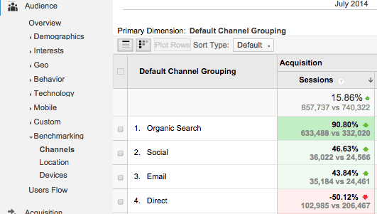
If you're not familiar with these, the four main traffic sources reported at this level in Google Analytics are:
- Search traffic – This is separated into natural or organic and paid search (Adwords)
- Referral traffic – This is traffic from other sites which have direct links to your site
- Direct traffic – Direct traffic results from URL type ins, bookmarks or when email marketing isn’t tracked. These days direct traffic will also include non-browser traffic from visitors clicking on apps for reading social messages like Hootsuite or Tweetdeck or other mobile apps linking to a site. See the details from Tim Leighton Boyce in the comments for why "direct traffic" isn't really an appropriate term because of 'dark social' in his excellent post "If social media marketing is so big - where is all the traffic".
- Other/campaigns – Campaigns include Adwords when linked to the Google Account and any other campaigns like affiliates, display ads and email campaigns when these have had marketing campaign tags attached. In this compilation Adwords is included under search engines.
Bear in mind that the mix will vary dramatically according to any number of factors, that's the problem with averages... In particular large brands tend to have a much higher proportion of direct traffic, often >> 50% in my experience as people enter the URL direct. You'll also see that direct traffic is higher if email campaigns haven't been tagged when they are then added to the campaign or other category of sources.
Examples of the percentage mix of visitor sources to websites
It's rare for data to be published which comparing the mix of visitor sources, i.e. the relative importance of different traffic sources driving visitors to websites. This is a recent example which is typical for retailers in my experience.
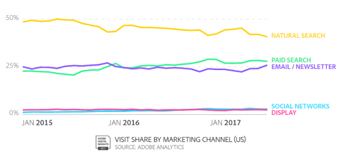
- Location: US Retail
- Date: Published Autumn 2017
- Sample: Top 250 US retailers (so representative of common consumer behaviour)
- Source: Adobe Retail Industry report
This retail visitor acquisition data shows that organic search is in the number one position, but declining in importance as Google has made changes on desktop and smartphone search to make organic less prominent. Paid search has increased as organic has declined. Email remains a strong performer. Due to their lower intent and clickthrough rates social media and display don't drive significant volumes for these larger businesses. Affiliate
Another example industry media mix average is the Custora Ecommerce Pulse (no longer published), showing orders by channel as below.
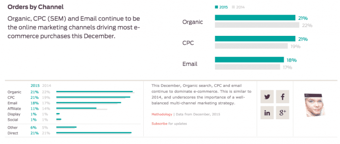
It's a compilation of traffic or media sources from some of the top US retail sites which drive sales. Email is a more important source than for the Adobe data since this is based on orders from existing customers.
If you find one source of traffic like search traffic dominates, then there may be an opportunity to work to build other traffic sources like using outreach to other sites to build referral traffic. There's a risk if "too many of your eggs are in one basket", particularly as Google changes its algorithms...
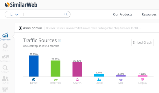
Another source of data that can also help with benchmarking your mix to larger sites in your sector is Similar Web which gives this type of visualisation. Bear in mind that since this is tracked through a plug-in rather than campaign tags, the percentage of email and social media referrers may be under-represented.
As you use tools like this and review your analytics make a summary of the most effective channels like the Bullseye framework shown in our post on reviewing customer acquisition sources visually.
Which tools do you recommend for benchmarking traffic source or percentage of digital media referrers?


