Examples of engaging Facebook ads, and those that fail to stand out
The ultimate goal of any Facebook ad is to catch someone’s eye with the right combination of stunning visuals and compelling copy.
You want the ad to stand out against the background noise of news, politics and status updates.
And there is a lot of noise right now.
The ad copy could be great but the visual has to be even better.
Because that’s what will be seen first.
Now that almost every news site, company page or blogger uses compelling visuals, standing out has become more difficult.
But I have come up with a few tried and tested tips to help you create a winning Facebook Ad visual.
How to use Facebook Instant Experiences (Canvas Ads)
Learn the ins and outs of Facebook Instant Experiences with this Quick Win. From set-up to optimization, this guide will help get you up and running with Facebook Experiences in no time at all.
Access the How to use Facebook Instant Experiences (Canvas Ads) quick win
1. Include a product image
If you are using a Facebook Ad to show off your product you should probably include a shot of your product. Right? In most other marketing channels that would be a no-brainer. But when it comes to Facebook Ad visuals some people may have missed the memo.
Because some people think that they can use a stock image or a few lines of text to create a winning Facebook Ad visual. Wrong. For example, recently I have seen some brands either us a somewhat related stock image:

Or just the slightly better vague stock image with some random text overlaid. But in this case the internet's favorite pet can not make up for a bad Facebook Ad visual:
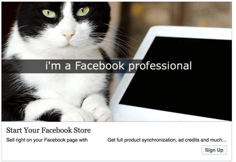
But if I took a look at these just for a few seconds, like your audience will, I would have no idea what they are trying to sell. That is not good. And I know what you are thinking after seeing those examples, both of them are advertising nontraditional products.
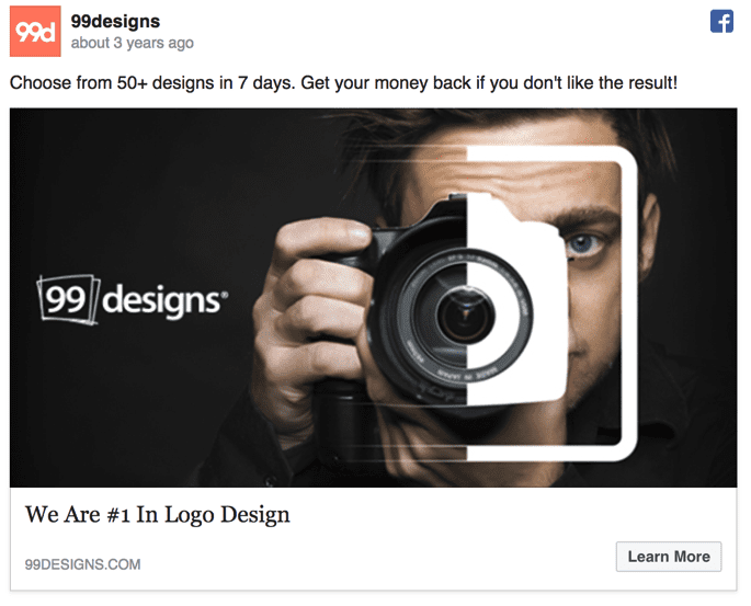
Actually, they are both virtual products, which is why I picked them. In this day and age, many marketers are trying to sell products that you can not hold in your hands or see. I do not see that changing anytime soon, in fact, it will probably get worse. That makes it hard to include a product in your Facebook Ad visual when you technically do not have the traditional definition of a product. It is difficult for sure, but not impossible. Just take a look at the simple but effective way 99Designs showed off their logo design service.
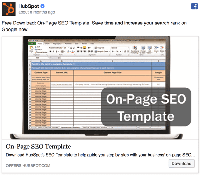
Or you could be like Hubspot in the example below and include a screenshot of the product. This approach can be extremely useful for products that have a very beautiful or easy to understand interface as well.
Finally here is an example from one of my campaigns for an Ebook about creating social media images.
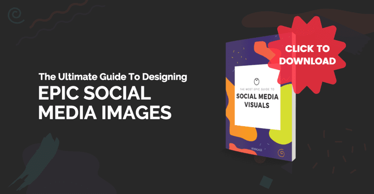
In this ad visual we decided that the best way to show off the ebook was to create a virtual book cover. Plus it turned out that this Facebook Ad visual was one of the most clicked in the whole campaign. Oh, and you can use this template here if you want to create a Facebook Ad visual.
Just remember that it should not be just about showing off your product or catching a customer's eye, this approach will also help give the readers quick context. That is invaluable when attention spans keep shrinking and distractions on social media increase exponentially. And finally, if you are advertising a physical product there is no reason why it should not be in your ad!
2. Use legible text and fonts
It is common knowledge that Facebook Ads visuals can only include text that takes up to 20% of the image. And that definitely causes some headaches for even the most seasoned social media marketer. Because it is hard to not only grab someone's attention but also inform about your product them in few words.
That is why some marketers decide just to shrink the size of the text to fit more in. And if you are paying attention to the title of this section that makes it barely legible. Like this example that shrunk the most important part of their text, the savings, for some reason:
As you can see the font is very light, the text small and the background color too light, which when all are combined makes it even harder to read. Something like this is not going to stop someone from scrolling right over it in their Facebook feed.
Here is another example of using the wrong text in your Facebook Ad visual but in this case, it is all about using the wrong font colour:

In this case, the font blends into the background image pretty easily and does nothing to grab the reader's attention. In contrast, the text on this Facebook Ad from Clearbit jumps off the page and is easy to read:
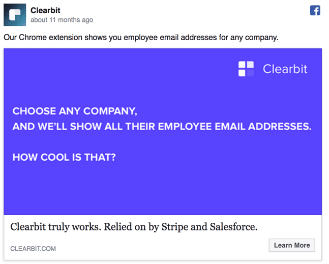
They used a dark background, a bold font and an acceptable text size, which makes this a great visual. I will show off why dark backgrounds are so important in the next section too.
To make it very easy to read they not only use large and in your face text, they also use two different font weights. This makes it even easier to read, and we have seen this work very well in our Facebook Ad visuals.
I would also recommend using a white font, it sticks out on about any dark background.
Like on this visual that comes from one of our past campaigns and performed very well.
As you can see it uses white font, two font weights and very large text to make it incredibly legible. And people are able to quickly read this and react while scrolling through their feed. Unlike some of the bad examples, we saw above. Unlike some of the bad examples, we saw above.
3. Dark and bold backgrounds are your friend
As you are probably well aware of by now, the background colour of the Facebook feed is white. Which helps it look clean and beautiful on almost any screen. That does not mean that your Facebook Ad visuals use a white or light colour scheme to fit in. Because that is exactly what will happen, your ad visuals will just blend into the background.
People will scroll over them without even noticing your product and you will have wasted a nice chunk of money. And as many props that I have given Hubspot in this article, sometimes they just have a bad Facebook Ad visual:

This is something that does not grab my attention at all and blends into not only the background of Facebook but the text of the ad.
Honestly, you are not sure where the ad text ends and the visual begins if you take a quick look. So I would recommend taking their hiccup and using it for your gain by never using a white background in a Facebook Ad visual. The same can be said about this ad from Blocks about using white backgrounds:
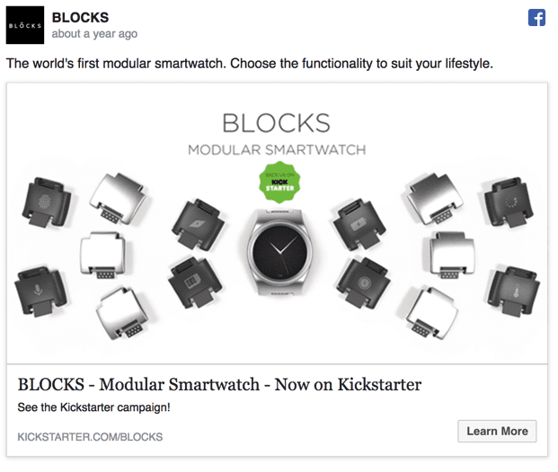
It may look incredibly clean and futuristic while you are designing it but a white background will rarely ever work on Facebook. Instead, I recommend very dark or bold backgrounds for your Facebook Ad visuals. Anker, the portable battery company, did just that in their ad below and it looks fantastic:
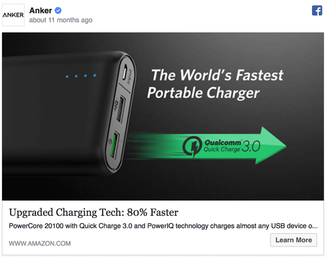
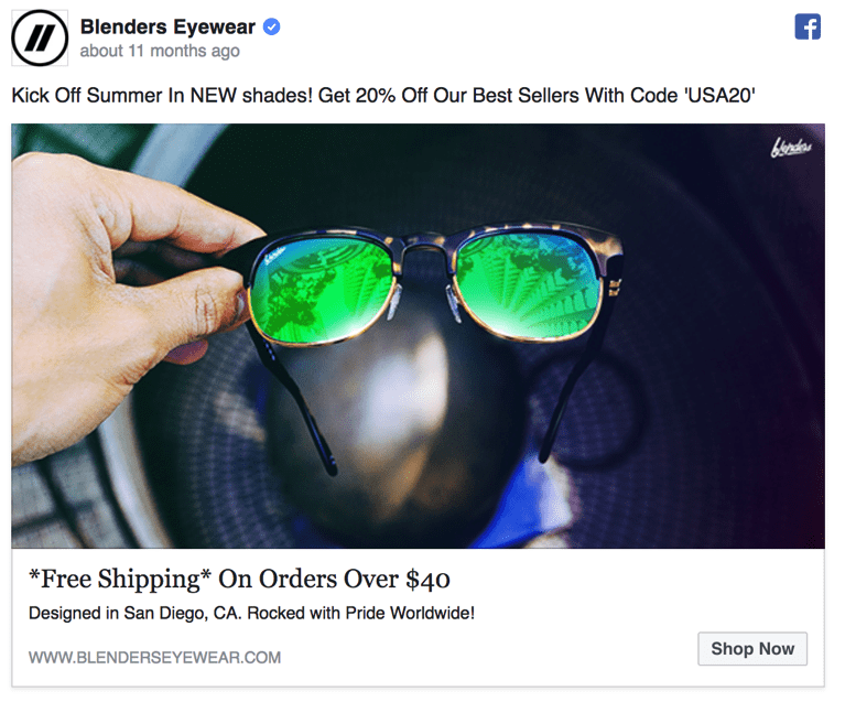
Plus the white text really pops off the screen and blends into the clean aesthetic that you see on your Facebook feed. Additionally, it does not have to be a static dark background, you can also use an image with darker tones for your Facebook Ad visual. Like the team at Blenders Eyewear did below:
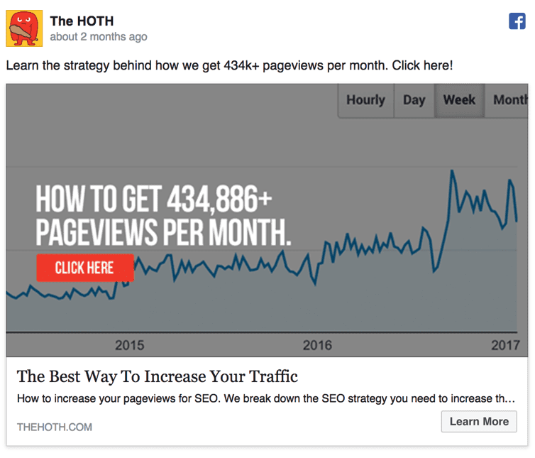
And if you can not avoid using a white or lighter background, just throw a dark colored gradient over the image. It is one of the oldest tricks in the Facebook Ad or really any social network game and the team at Hoth used it perfectly.
4. Do not forget icons and graphics
Using icons to add something extra is one of my favorite design tricks I use while creating infographics, and they translate to Facebook Ads as well. They can be used to catch the eye of your reader and direct them to a part of your ad, like a call to action. Or icons can become the focal point of your Facebook Ad visual in which the text latches onto. And they even can be used to add a bit of context to the ad without using any extra text.
It really is up to you, and since there is not really a wrong way to use icons I will jump to the good examples! In this first Facebook Ad from Southwest airlines, they masterfully use a simple icon to draw your eye to the low price of the flight:
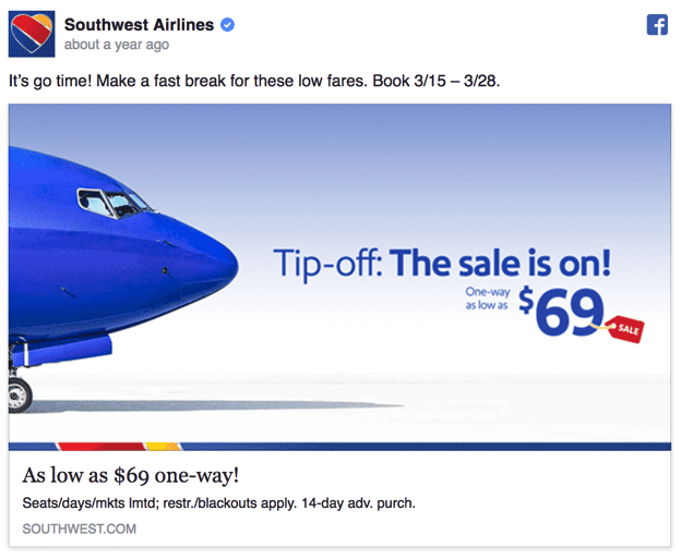
Without the simple sale icon, I think a lot of people would not even notice the price and keep scrolling. Next, we have an example from one of the Venngage ads in which we used an icon as the main focal point.

Using icons in this way really helps your visual look balanced and also sets the tone for what the ad is about. And finally we have one from the team at Hubspot, where they use just a simple Instagram icon to add quick context to the post:
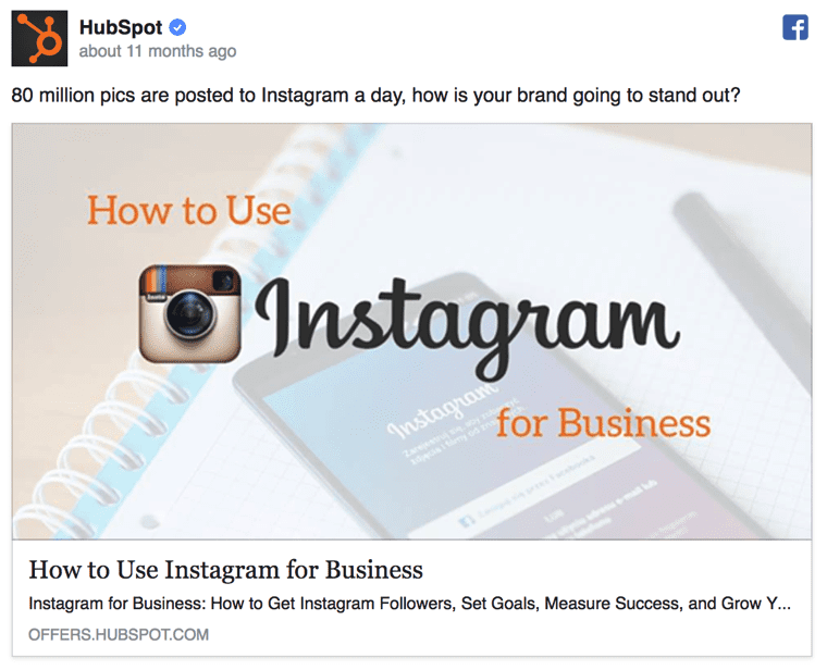
With that very recognizable icon they are able to put the reader in the right mindset and use it to prepare them for the rest of the add. I would recommend using the same approach if your ads have something to do with another very recognizable logo or icon.
Conclusion
There you have it, my personal guide to creating better Facebook Ad visuals. You should be set if you:
- Include a product image
- Use legible text
- Feature a dark background color
- Do not avoid using icons
I will be using these tips in all of my future Facebook Ads and I hope you will too.
And if you need some more guidance on creating your own Facebook Ad visuals I recommend checking out our e-book on the subject here!
Facebook advertising guide
Learn how to set up Facebook Ads and target your customers with effective messages to boost your sales.
Access the Facebook advertising guide

Thanks to Ryan for sharing his advice and opinions in this post. Ryan McCready is a content creator at
Venngage. He went to the University of Arkansas and graduated with a degree in economics and international business. Now instead of studying the economy he writes about everything and enjoys stirring the pot.