An in-depth case study from our work with Conversion Rate Experts, including before and after images of winning A/B tests
It's fair to say we talk a lot about how you can improve your digital marketing results here at SmartInsights. It's kind of our thing. I like to think nobody does it better. But those who talk the talk should also be made to walk the walk, else how else do they know their advice is actually relevant and applicable to real business?
Since we're always talking about the need to optimize across the whole customer journey and constantly test messaging to boost your conversion rate, we worked with Conversion Rate Experts to do exactly this. We wanted to share what we did and the changes we made with you so you can make similar improvements to your own sites which can deliver big boosts to your CRO.
Start out with deep research
Stripped down to its basics, conversion rate optimization (CRO) is simple. You just need to be able to answer these two questions:
- Why aren’t my visitors converting?
- What should I do about it?
The mistake most businesses make is to skip straight to question 2. They start guessing what to do to increase their conversion rate, and in our experience this usually ends in failure.
Successful businesses know that taking a visitor-centric approach is key to growing fast. We spent lots of time conducting in-depth analyses to get inside the heads of their visitors. We used the following techniques:
- We became the customer. Not just going through the funnel (though we did that, too—and recorded it), but living the entire customer journey.
- We reviewed data that had already been collected—from existing feedback mechanisms, customer service teams and previous customer surveys.
- We interviewed real visitors to the website, recruited using a popup.
- We recruited qualified prospects, and asked them to go through the funnel as part of a usability testing programme.
- We used tree testing to analyse the navigation and information architecture on the website.
- We studied visitor behaviour, using analytics, heatmaps and session recording tools.
- We designed a series of surveys and polls to gather data on visitors and customers. We also used them to collect testimonials that we could use on the website.
Long pages providing detailed information to the customer beat simple landing pages
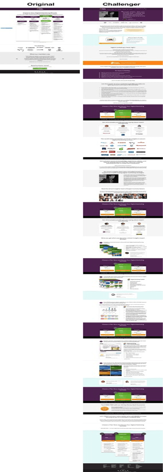
We designed a new page that visitors would see before the pricing. It presented the offer and included all the key appeals and objections we had identified during our research.
Here it is, alongside the original page. In an A/B test it generated 157% more paid memberships:
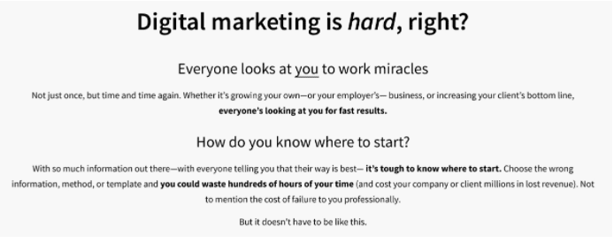
Why did this approach work?
Reasons it won #1: We entered the conversation already happening in the prospects’ heads
Before you can sell something, you need to get your prospect’s attention. You need to interrupt them—make them sit up and take notice.
One of the most effective ways to do this is to enter the conversation already going on in their head. If you can get your visitors nodding along in agreement, not only have you got their attention, you’ve subtly positioned yourself as being on their side. That’s a powerful position to be in.
Reasons it won #2: We used anchoring to address price objections
Good and bad, there’s a lot of free advice available on digital marketing. Smart Insights’ prospects know this, and so had strong objections to paying for the service.
So how do we compete on price with these sites?
Answer: we don’t. Instead, we positioned ourselves as the online equivalent of getting a personal consultation from the world’s best digital marketing experts.
Then, we put a value on this and used it as the price anchor. Compare the price of a Smart Insights subscription to the cost of having Dave and the team visit you in your office, and suddenly it becomes extremely low.
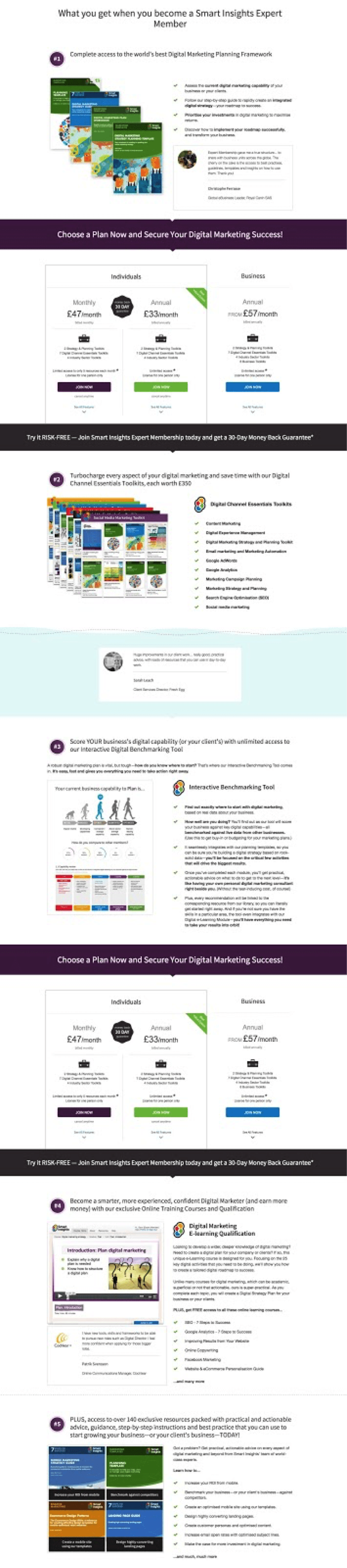
Reasons it won #3: Mention every valuable benefit of membership
If you’re close to a product or service, it’s easy to overlook—or take for granted—the value it provides.
When we talk to customers, they often highlight features or benefits they love that weren’t communicated on the website—and it’s no surprise that sales usually increase when we explicitly mention these features or benefits.
That’s exactly what happened with Smart Insights. Members get a lot of great stuff, and when we asked them what they liked best we received loads of different answers.
This made us excited, so we made a list of all the stuff that you get as a member, and how it can help you. Then we added the list to the new landing page:
A new navigation increased paid memberships by 75%
A good navigation should reflect how your visitors expect to find things, so someone new to your site can easily find the information they need.
Supermarkets are experts at navigation. They organize complex information in a way that means you can walk into a huge building for the first time and find a single product among hundreds of thousands—usually in seconds. (Unless you’re looking for eggs—we can never find those.)
When we conducted usability tests on the Smart Insights website, we identified a group of visitors for whom the information architecture didn’t reflect their mental model.
What those visitors didn’t tell us was how to fix it. So we used tree-testing to analyse the routes prospects were taking through the navigation to solve common problems, and then came up with an optimized version to test against the control.
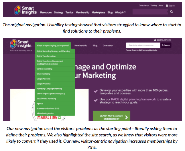
Never turn a blind eye to what your visitors are telling you. The original navigation was based on the industry standard, so it was a bold decision to test something different. Thanks to this willingness to fly in the face of convention, memberships increased by 75%.
Tools we used
Here are just a few of the tools we used on this project:
For tree-testing, we used Treejack.
Now you know the tricks and tools used to conduct rigorous A/B testing and CRO you can get started on your own CRO projects. We'd like to say a massive thanks to Conversion Rate Experts, who's in-depth research, attention to detail and novel thinking were invaluable throughout the project. They really are industry leaders in what they do.


