Think about your website design. Do your customers like it? Why do they use it? What emotions does your website logo evoke?
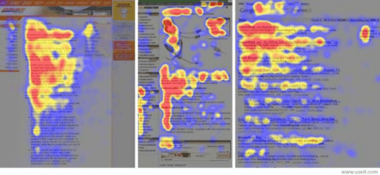
Perceptions are unique and critical. They are virtually snap judgements. It takes only 50 microseconds for us to get an impression about a web page and sometimes only 17 ms according to Google’s research. The user interface of your website determines the perception of your brand, because 94% of the overall perception is design driven. More than just being well built, a website should be a form of visual art. It should naturally combine the science of aesthetics and your business principles.
Improving results from your website guide
Read how web design can affect a wide range of your website's KPIs with our guide to improving website results. Learn how to audit your site, make changes to key pages, and uses Google Analytics to measure your success.
Access the Improving results from your website guide
What should a pleasant interface structure look like? Let us consider the psychology of shapes and their influence on your visitors.
Psychology of logos
How customers view logo shapes
They say that logo is king in your website design. Is that really so?
Logo is practically a word that stands for your brand, as it derives from the Greek word “logos” that means “word”. Similar to words, logos stir our imagination and feelings. The ability of a logo to evoke emotions can have an effect on the way visitors treat a certain service, product or company.
A powerful and influential logo may be quite simple, but in fact, it can convey more than you think. For example, Nike’s “swoosh” is one of the most recognizable logos, though it’s so simple. But it suggests a strong feeling of movement.
Our subconsciousness responds in different ways to various logo shapes:
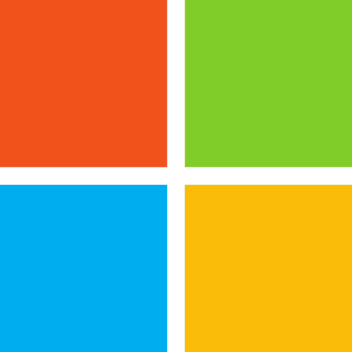
Squares = stability
Straight-edged shapes such as rectangles and squares seem organized and stable. For many people, they remind a house that further recalls pleasant feelings of sweet home. That is why people feel comfortable and trust the brand. Squares can convey such values as trustworthiness, balance, and order.
Human eyes tend to scan the world in a rectangular box manner, thus, such shapes are subconsciously familiar and aesthetically pleasant.
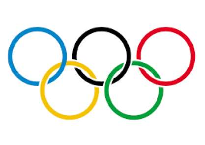
circles = harmony
Circular shapes look full and organic. Circles are smooth and they help create a feeling of unity and cooperation. Their association with safety and peacefulness makes us consider them beautiful. We actually tend to prefer circular objects from early childhood. As a behavioural science expert, Eric Jaffe, mentioned: “Roundness seems to be a universal human pleasure”.
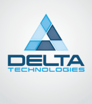
triangles = power
The sharpness of its angles makes an impression of a strong and powerful logo. Such designs are frequently used for religious, legal or scientific institutions.
Triangles also evoke the feelings of superiority and greatness, mostly because they can remind us of the ancient pyramids and refer to a two-dimensional space. However, they can likewise suggest conflict and risk, when you invert them.
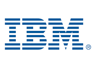
horizontal lines = calmness
When horizontal lines are part of the elements of the logo design, we get a calming and tranquil effect.
Horizontal layout hints are connected with harmonious earth vastness. They actually produce an effect of openness and broad opportunities.

vertical lines = strength
Vertical lines are by contrast more aggressive, but at the same time they convey professionalism. Similar to squares, vertical lines signify balance. Though, it’s closely related to the competitive meaning.
In the terms of logo design, verticals can be effective in sectors that aim at masculine, domineering purposes.
50% of admired companies have rectangular shapes, while 22% have squares, and 20% have circles.
Now that you're aware of the particular meanings and psychological influence shapes have, that is still not enough. To know how to reach your customers with your website logo design there are still more deep insights into psychology with Gestalt theory, F-shaped and Z-shaped patterns, Scan Path, and psychology of fonts.
Gestalt Theory
There are 6 different theories associated with the Gestalt theory:
- Similarity
- Continuation
- Closure
- Proximity
- Figure/Ground
- Symmetry and order
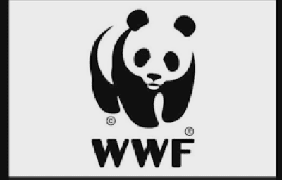
The above logo of The World Wildlife Fund is a bright example of the closure principle of Gestalt theory.
The theory claims that the human eye completes the visual elements to form a whole that obtains comparatively more meaning. Similarly shaped objects become the field for imagination that actually fills in the gaps that are missing.
The principle of multi-stability is also often used by famous companies. It’s based on the ability of the eyes to catch two different things, however, with one dominance.
The profile of the Spartan helmet and a golfer merge in one image:

F-shaped pattern
The predictability of the human eyes gives you a chance to understand how visitors will most likely read your page. People perceive text from the left to the right, thus, the first thing that impresses them at once will be on the left side of the page.
Use the following scheme of the F-shaped pattern to make accents on your web page:
- First, readers perceive the page through the horizontal scanning of the top of the page from the left to the right;
- Then, the second horizontal scanning takes place at a lower level, therefore, the first paragraphs of the text are the most important;
- And finally, it goes vertically forming an F-shaped pattern.
The Z-pattern
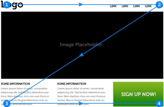
One more hierarchy pattern of the visual psychology, Z-Pattern, concerns pages that are not text centred. The top of the page is scanned as a horizontal line. That is why, usually websites have a menu bar there. Similar to the F-pattern, people will pay attention at the objects of the upper horizontal layout.
The habit of reading left-to-right and from the top gives a chance to trace the pattern further. When our eyes reach the end of the first horizontal line, they go down and left. After that, they repeat a horizontal line on the lower part of the page.
That is the reason call-to-actions are usually put in the right bottom corner of the website if the page does not contain any text.
Scan Path
In fact, most people prefer to scan than to read. All the time when we start reading, a Scan Path occurs. It is a natural pattern followed by our eyes.
We virtually break sentences up into saccades (scans) and fixations (pauses). Typically, our eyes move across a page for approximately 7-9 letters before a pause.
Why does this all matter?
It is crucial for designing the text (font, spaces, line length, etc.) and the way words will look on the interface because you can directly influence the reader through the layout.
Psychology of fonts
Understanding the psychology of fonts includes not only the font families and their meanings, but also knowing how our brain perceives and deciphers spaces, font sizes, and many more aspects.
Familiar fonts
Build trust with familiar fonts.
The more familiar your visitors are with the font on your website, the more likely they will trust you and your brand. That is why many designers choose Impact or Helvetica as classics.
You can simply lose your audience if you go too far with the font. That happened to Gap when they changed the font of their logo. Later, because of the huge outburst of reaction on social media, they had to switch it back to the old font.
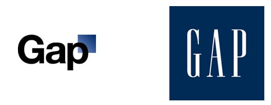
New GAP logo vs old GAP logo
That does not require you to use the same fonts that competitors use. You can use fonts that are similar to or derived from the most common ones.
Fonts vs tastes and smells
Quite shocking, the fonts you use on your website can influence more than just the visitors’ sense of sight. A designer Sarah Hyndman spoke about impressive associations and how fonts ignite smells and tastes.
Delicate fonts are more suitable for perfumes, as their curves convey the feeling of fragrance and lasting effects.
For instance, some fonts may refer to foods flavours:
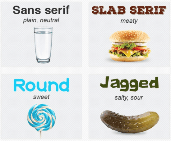
Thus, when choosing a font, do not forget about its impact on other senses too.
Conclusion
As far as the shapes are concerned, you already have a clue how important those are for your brand image. But what about other factors? You should be able to match not only the logo shapes and fonts, but incorporate appropriate colours as well. So many elements should be used in coordination, as each of them contributes to your image in the eyes of your audience.
There are no clear-cut rules for your web design. Skeptical as it may seem, the answer is still “it depends”. It is quite frustrating because you should consider many factors that influence your visitors. You can’t avoid cultural peculiarities in website design either.
Notwithstanding the ambiguous nature of a web design, the most essential part is the context. That is, what your brand is about, what purpose you have set, and what mood or feeling you want to.
Thanks to Clair Ray for sharing advice and opinions in this post. Clair is a researcher in Sociology and Psychology, member of
Ultius scientific group, tutor in German and French. You can follow her on
Twitter